
A wordmark that looks comfortable on a dark presentation slide can become faint on a midtone photograph. Changing only the background is a useful early proof because it exposes a relationship that a single flattering mockup can hide.
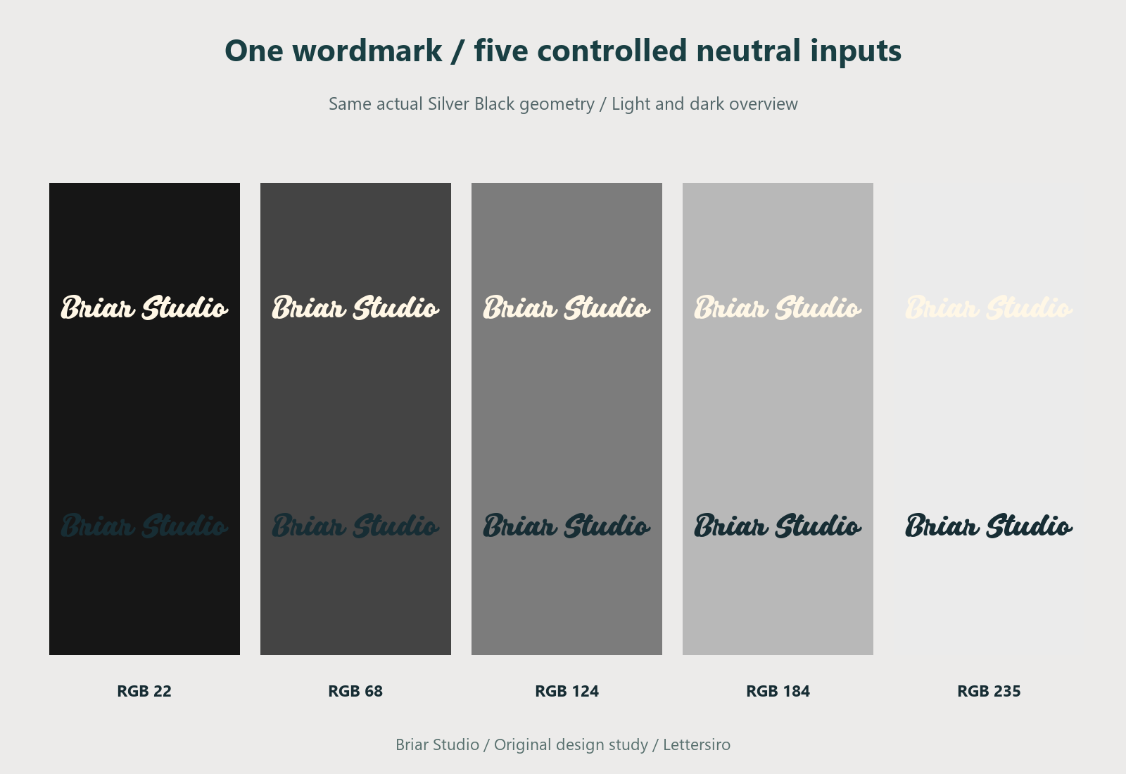
This study places the same fictional Briar Studio name in actual Silver Black lettering across five neutral background values. The initial proofs hold the letterforms, size, and position constant. They are controlled native illustrations, not participant-test results or a claim that a logo has passed an accessibility standard.
Define what remains constant
Use one approved wordmark file or one exact text setting. Keep the same dimensions and position in each comparison. If you enlarge the name on a difficult background, you have changed more than the background relationship and made the first comparison harder to interpret.
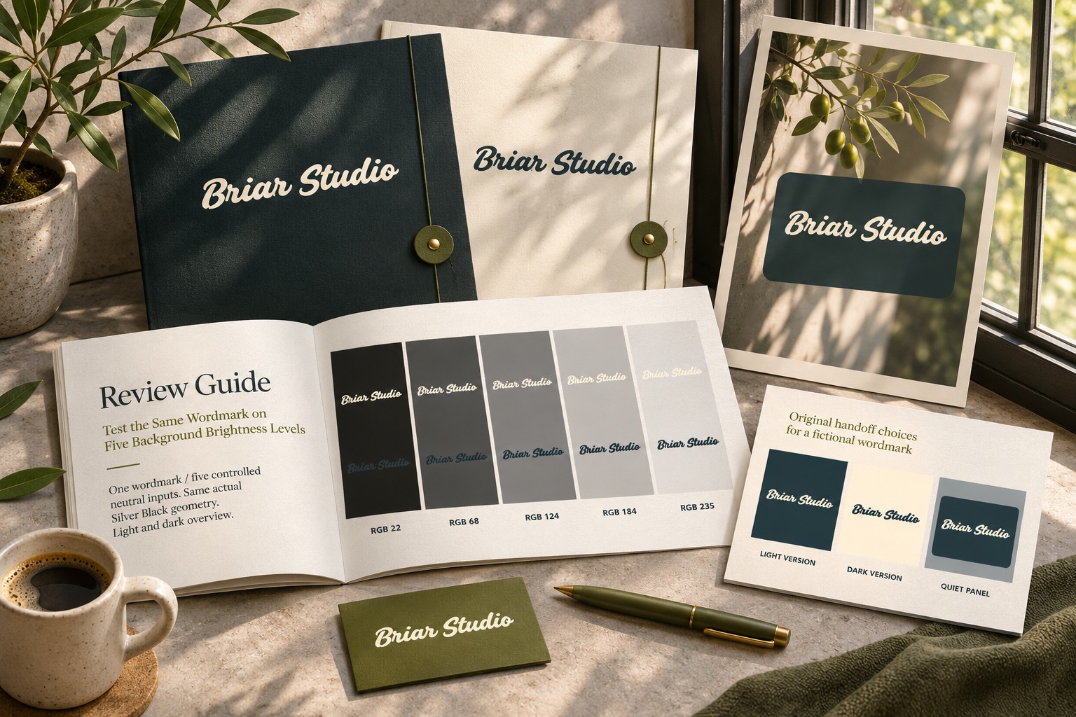
Record the background values used. The native studies here use five neutral RGB channel values: 22, 68, 124, 184, and 235. Each neutral has equal red, green, and blue values. These are controlled input values, not evenly spaced perceptual brightness steps or measurements of a physical material.
Compare a fixed light version first
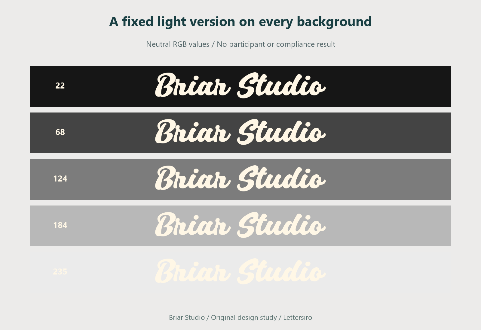
Place the same light wordmark on every background. Inspect where the strokes become less distinct and where the counters or connecting lines become harder to follow. Keep the complete word visible. A dramatic crop of one letter cannot show whether the name still reads naturally.
Do not label the most attractive example as a universal solution. The first sheet answers a narrow question: how one fixed treatment behaves against those five neutral values. It does not yet tell you which treatment should be used on every brand color, photograph, or material.
Repeat with a fixed dark version
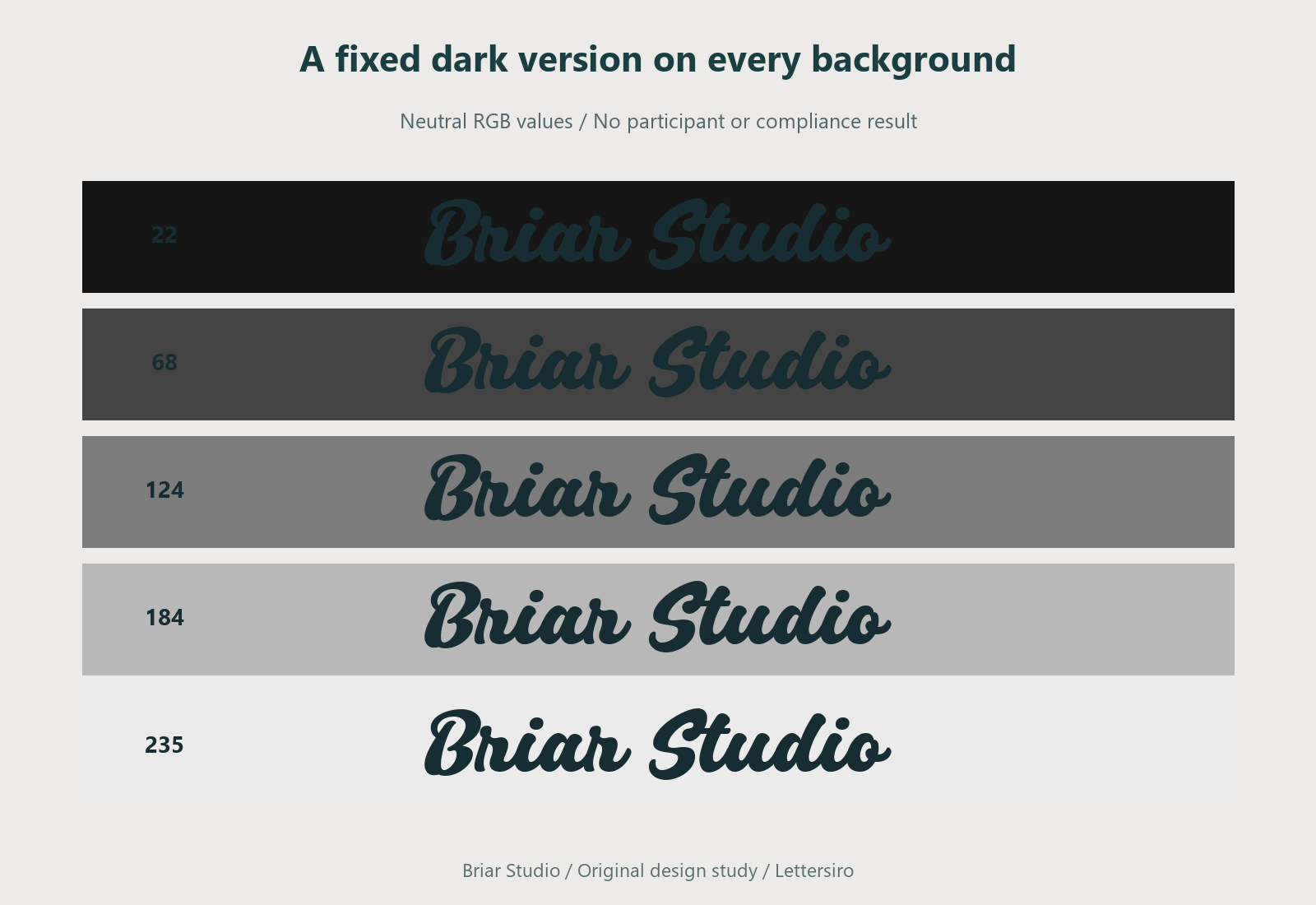
Keep the geometry unchanged and switch only the wordmark color. Compare the new sheet with the light version. This reveals where an alternate treatment may be useful without changing the identity's shapes or spacing.
For a production system, save approved light and dark assets with clear names. Explain their intended backgrounds and preserve the same proportions. A team should not have to recolor an improvised copy every time it places the identity on a new slide.
Inspect a compact version separately
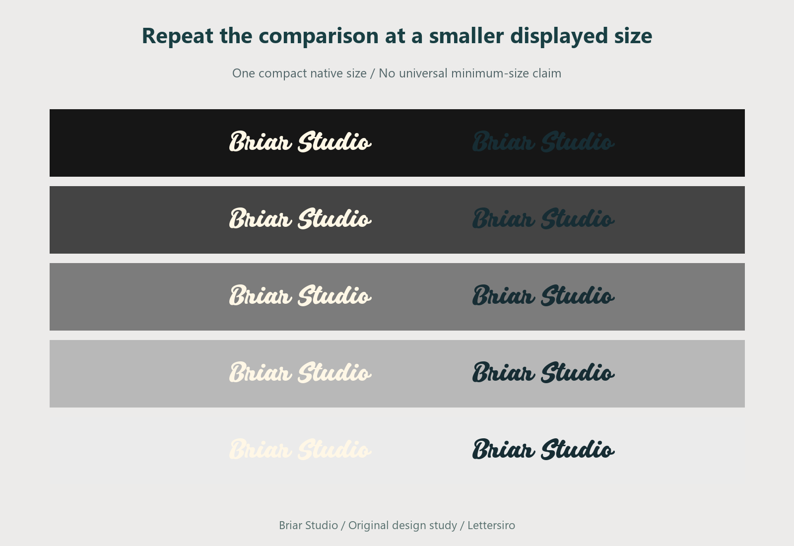
Reduce the complete identity and repeat the background comparison. Thin connections and fine details can become less distinct at a smaller displayed size. Keep the reduced examples at one consistent size so the comparison remains useful.
Check the actual delivery medium as well. A browser preview, a print proof, a projected slide, and a manufactured sign introduce different conditions. The neutral digital panels in this article are an early design tool; they do not simulate all of those environments.
Add a demanding image area
A neutral patch is predictable. A photograph can change from dark to light within the same word. Place the identity over a representative image and inspect the entire lettering area, including connecting strokes. Moving the name to a quieter part of the image may preserve the design better than adding several layers of shadow and outline.
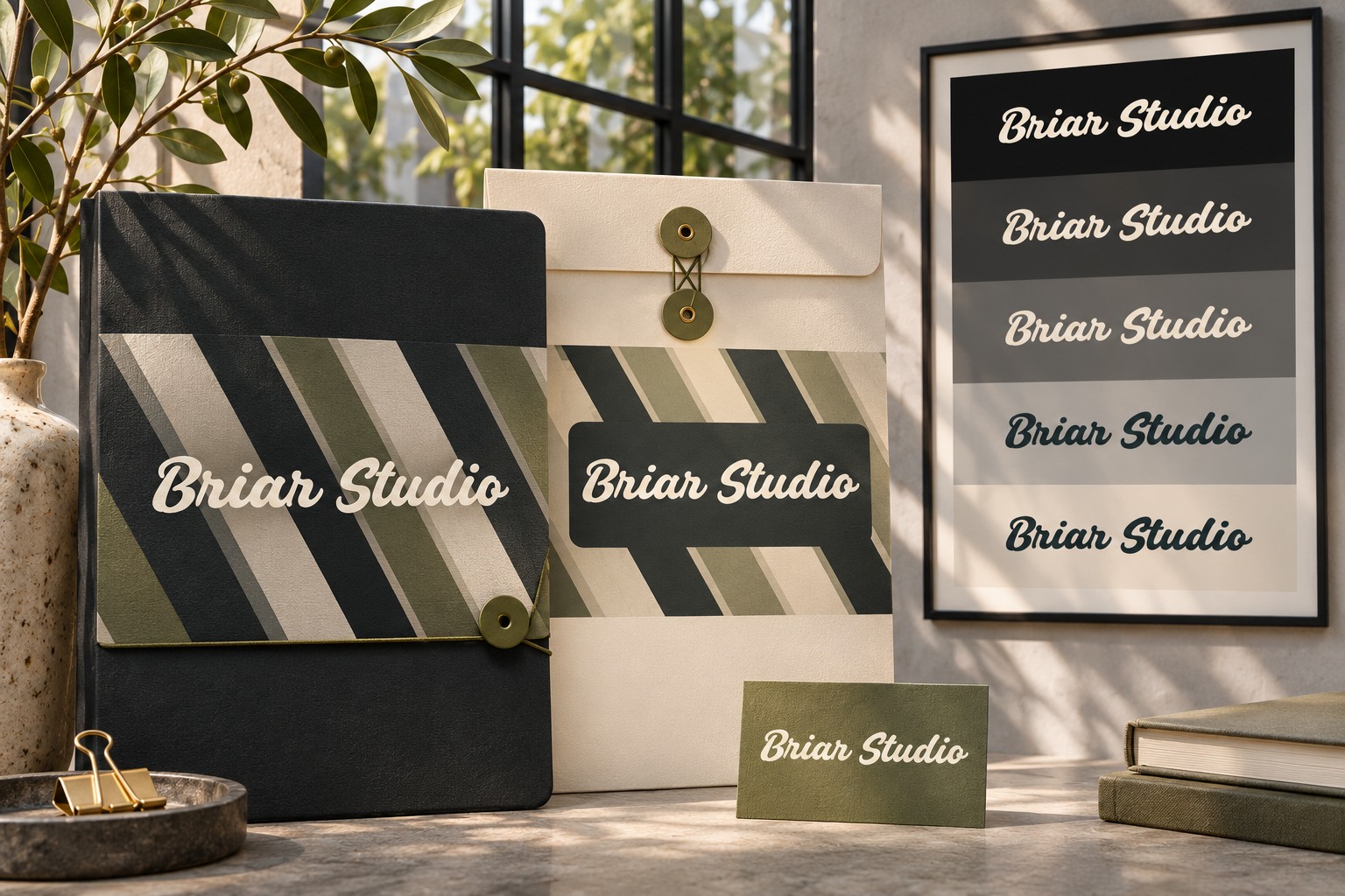
A deliberate backing panel is another option to inspect. Give it enough room to feel like part of the layout. Avoid a narrow halo that only follows the letter edges unless that treatment belongs to the approved identity. The original geometric background below demonstrates the difference between a quiet area and a fluctuating one.
Separate brand review from web-text requirements
This sheet supports visual judgment about an identity. It is not a substitute for checking the requirements applicable to text and interface elements in a real website. W3C's contrast guidance explains the relevant distinctions, including the treatment of logotypes. Review the actual content and its role instead of applying one label to every branded element.
For the identity review, ask someone unfamiliar with the project to read the name without being told the spelling. Note the background, displayed size, and specific hesitation if one occurs. Keep those observations separate from the RGB inputs. A reader's response and a digital color value describe different evidence.
Try your wording in the Lettersiro Logo Tester and inspect the actual Silver Black files in the application where the identity will be used. Save the comparison sheet beside the approved assets. The practical result should be a clear placement decision: which version to use, on which background, and when the composition needs a quieter area.