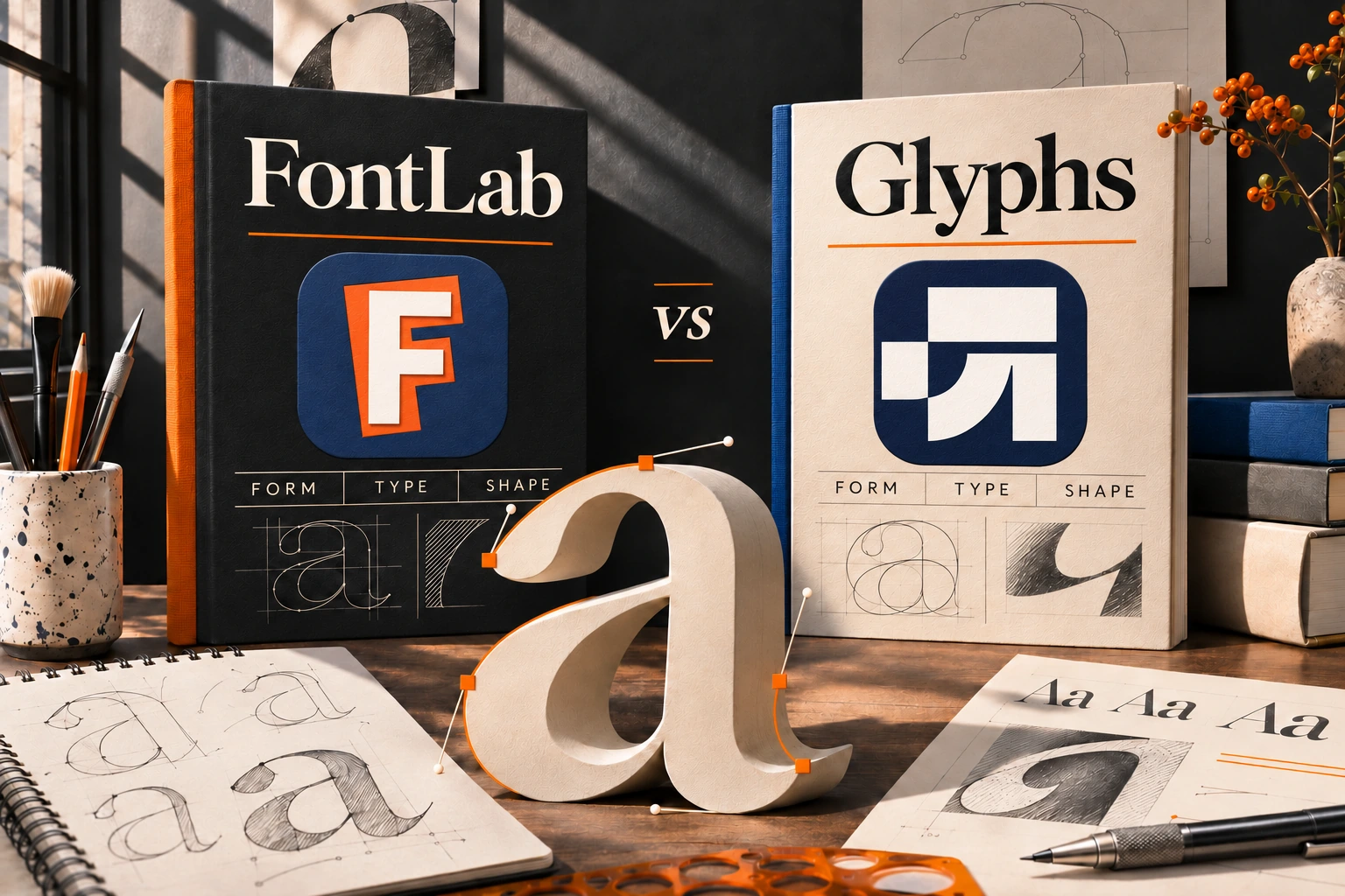
Choosing between FontLab and Glyphs is really a decision about how you want to make fonts. The right editor should help you draw confidently, judge spacing in real words, build a family, and deliver files that behave properly outside your studio. An impressive toolbar matters most when its tools fit the work you actually do.
This FontLab vs Glyphs comparison looks at platform support, drawing, kerning, variable fonts, extensibility, pricing, and practical production decisions. The official sites currently present FontLab 9 and Glyphs 4. Product information was checked on November 11, 2026; prices and release requirements can change. Start with the current FontLab product page and Glyphs website when evaluating a purchase.
FontLab vs Glyphs: the quick answer
FontLab deserves an early place on your shortlist if you need a professional editor on Windows, or want to work across Windows and macOS. Glyphs deserves close attention if you work on a Mac and want to explore its contextual drawing, family-building workflow, and extension ecosystem. Both can serve serious type design; the useful question is which one makes your particular production tasks clearer.
The comparison below concerns the full applications. Glyphs Mini is a separate, reduced product and should be evaluated against a smaller brief.
| Decision | FontLab 9 | Glyphs 4 |
|---|---|---|
| Editor platform | macOS and Windows | macOS |
| Drawing approach to explore | Outline editing, stem controls, and measurement | Editing in word context, pen points, and star nodes |
| Spacing and kerning | Contextual review with the Superkerning panel | Contextual kerning and visual kerning groups |
| Family production | Static and variable font workflows | Static and variable font workflows |
| Extending your workflow | Scripts and integrations; check release compatibility | Python scripts and plug-ins; check release compatibility |
| Best trial question | Can I complete my real project with these controls? | Can I complete the same project comfortably on my Mac? |
These are workflow distinctions, not measured speed scores. The feature references are the official FontLab 9 overview, Glyphs 4 introduction, and Glyphs handbook.
1. Platform support: choose a tool you can actually run
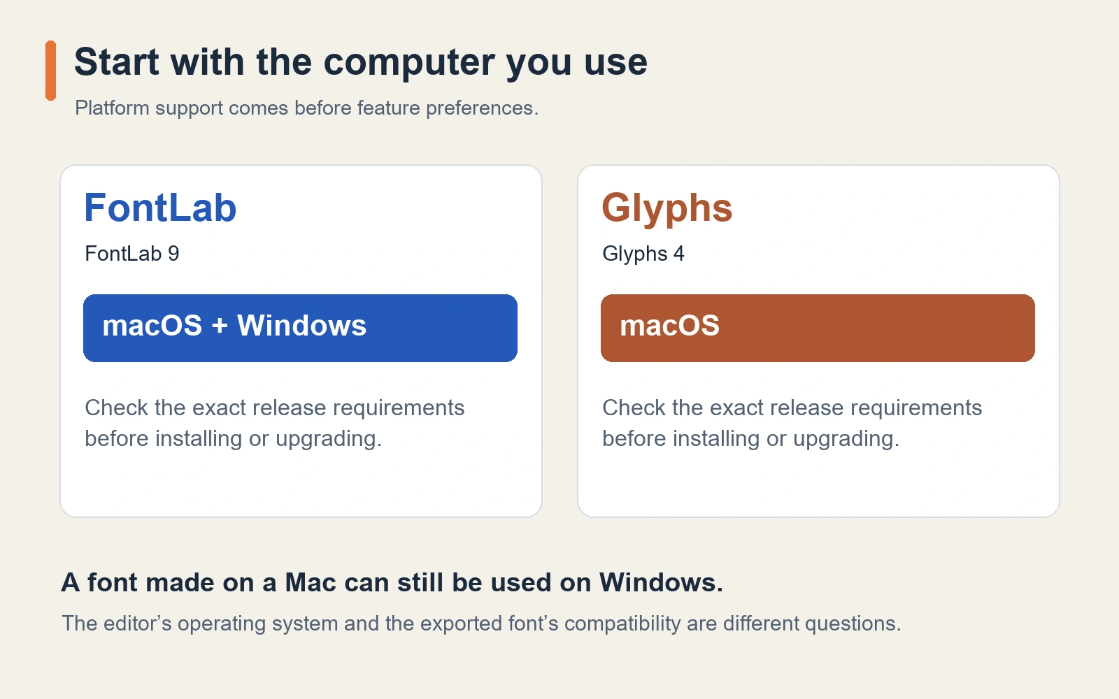
If your main machine runs Windows, the platform distinction may settle the first stage of the comparison. FontLab supplies Windows and Mac versions. Glyphs 4 requires macOS 12 or later according to its current purchase page. A Windows-based designer should include the cost and disruption of changing computers when considering a Mac-only editor.
For a mixed-platform studio, think about collaboration as well as your own desk. Who opens the source project? Who maintains the build? Who investigates a problem when the font reaches another application? Agree on a working format and a responsible person for final exports before a project becomes complicated.
Check the requirements for the exact release you plan to install. FontLab's installation guidance explicitly distinguishes current-release requirements from those of earlier versions. A working older installation does not establish that a new major version will run on the same machine.
Also separate the editor from the output. A font created on a Mac is not automatically a Mac-only font. Its exported format, features, licensing, and behavior in target applications determine whether it is suitable for a particular delivery.
2. Drawing tools: compare the adjustments you repeat
A good drawing test starts with letters that expose your habits: a round bowl, a diagonal, a difficult join, and a curve you tend to revise repeatedly. Work through those shapes in both editors where your hardware allows it. Notice how easily you can select the intended points, preserve an existing relationship, and understand what changed.
FontLab 9 introduces a Stem tool for moving, rotating, and changing detected stems while adjusting connected contours. That is worth testing if much of your drawing involves repeated structural changes. Its official feature description explains the scope of those controls.
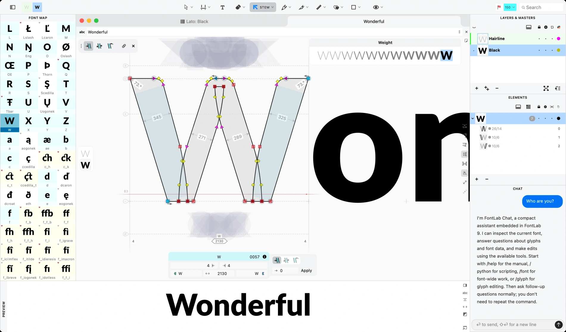
Glyphs 4 adds pen points for flexible strokes and star nodes for curvature-smooth transitions. Its updated sidebar also brings more navigation and interpolation controls into Edit view. Explore these through the vendor's Glyphs 4 introduction, especially if your work includes lettering, monoline forms, or reusable shapes.
Do more than make one attractive letter. Revise a small set together, then return to an earlier decision. A workflow that makes relationships understandable during revision may be more valuable to you than a dramatic first demonstration.
3. Spacing and kerning: judge words, not isolated letters
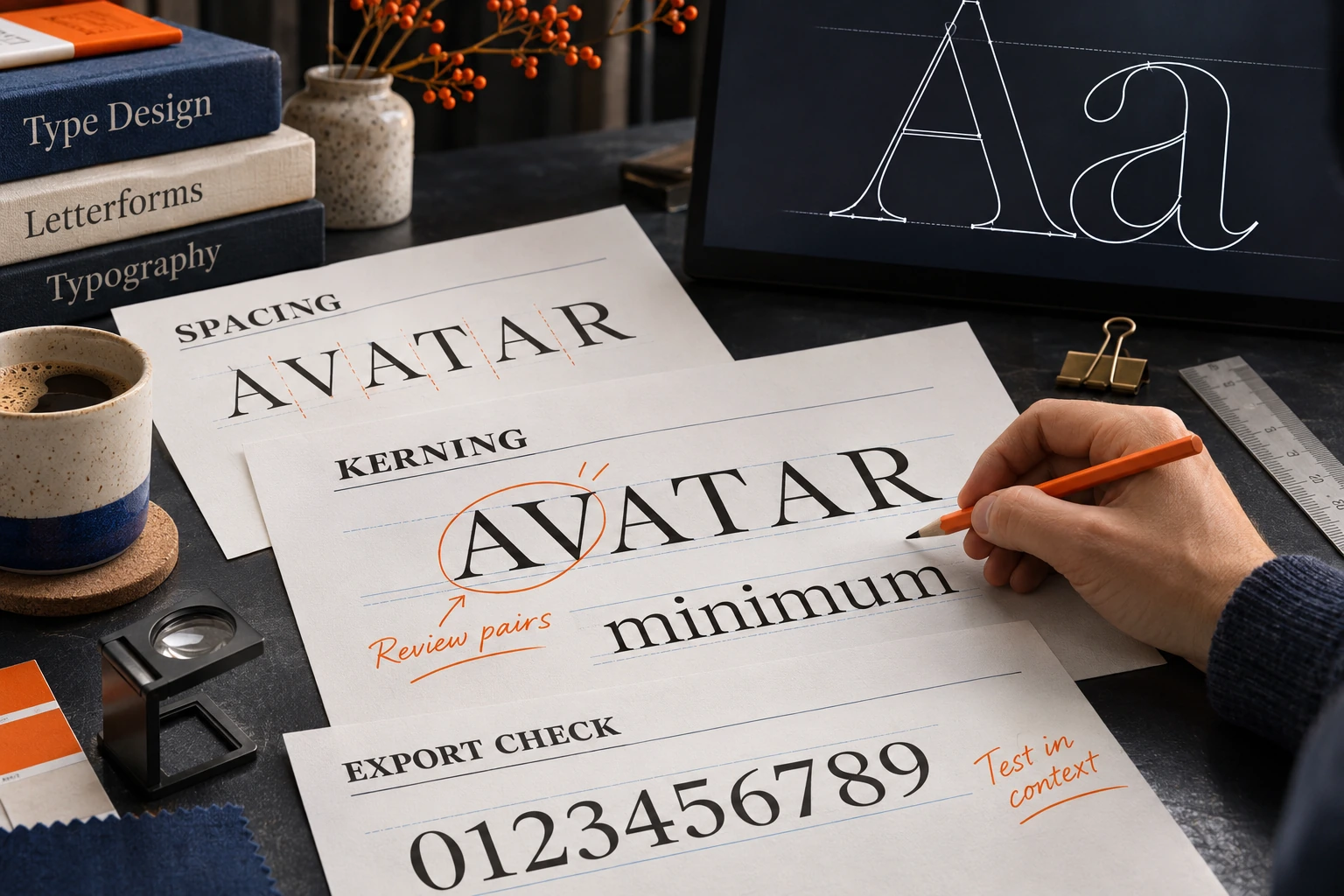
Spacing establishes the regular rhythm around glyphs. Kerning makes targeted adjustments to particular pairs or groups. A font can have beautiful outlines and still feel uncomfortable when those relationships are inconsistent.
FontLab 9's Superkerning panel presents pairs in words and supports reviewing class relationships. Glyphs 4 includes visual kerning-group organization, while its kerning tutorial explains the distinction between group relationships and exceptions. Both approaches need a designer who checks the result beyond a single representative pair.
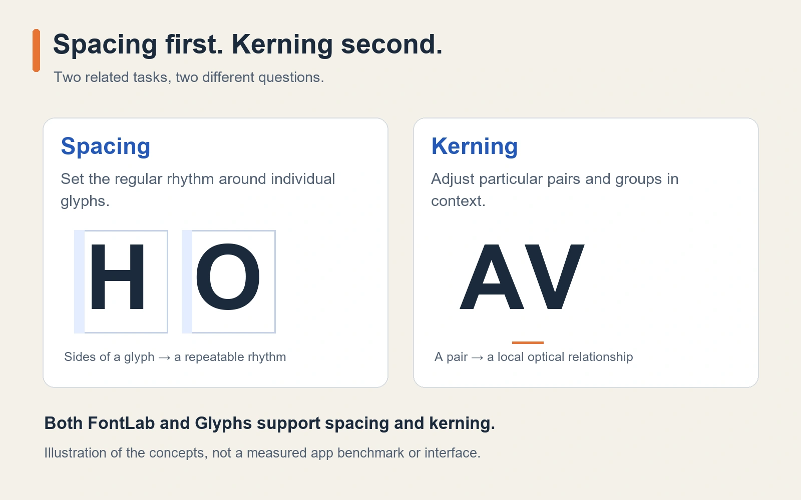
Build a useful test list: repeated shapes, diagonals, punctuation, accented letters, numerals, and words relevant to the intended audience. For a script face, examine connections and alternatives in meaningful words. For a text family, read paragraphs at realistic sizes. Expanding a test list is often more revealing than endlessly polishing AV.
During a trial, ask how quickly you can locate an exception and understand its relationship to the group. Any automatic proposal is a starting point for review. The final judgment belongs to the words your users will set.
4. Variable fonts: inspect the space between masters
Both full editors support variable-font production. That capability deserves a practical test if you intend to build a family with changing weight, width, or other design dimensions. A project with two convincing endpoint drawings can still reveal awkward shapes in between.
FontLab 9 introduces Sigma, which gives designers control over how corresponding points travel between compatible masters. Glyphs supports master-based family development and interpolation review. See FontLab's Sigma description and Glyphs' variable-font guide for the underlying production topics; the latter contains historical notes, so follow current documentation for current menus and fixes.
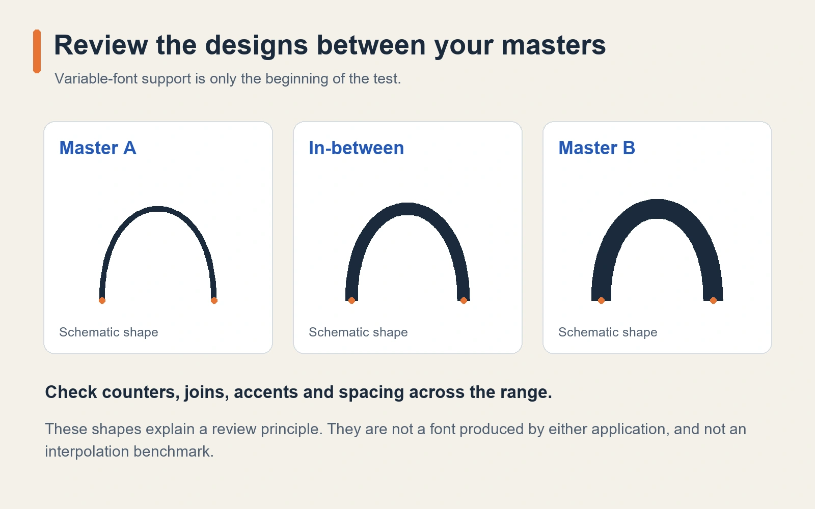
Test intermediate positions deliberately. Look for counters becoming too tight, joins gaining unwanted weight, accents losing their relationship to the base glyph, and spacing changing unevenly. Try a compact, representative family before using a huge production project as your first experiment.
Your decision should include how well you can diagnose a problem, not simply whether a slider moves. A convincing variable font requires design judgment throughout the range and testing in the environments that will use it.
5. OpenType features, scripts, and automation
Both applications extend beyond drawing outlines. Their value also lies in organizing a working font: substitutions, positioning, repeated construction, and production tasks. Glyphs documents feature code in its OpenType features chapter. FontLab 9 introduces visual lookup editing and debugging, described in its feature overview.
Consider the tasks you repeat often enough to justify automation. Renaming glyphs, checking a set of production details, or applying a controlled change across a family can be good candidates. Start with a small, inspectable operation on a copy of the project. Keep a clear record of what it changes.
Glyphs has a substantial plug-in and Python-script ecosystem, presented through its learning resources. FontLab also supports Python-based extensions and integrations. For either editor, verify that the particular script or plug-in you depend on supports the version you plan to use. A familiar extension may matter more to your workflow than another item in a marketing comparison.
AI tools are another area to evaluate carefully. FontLab 9 presents Aidus as optional assistance, and Glyphs offers Glyphs MCP for connecting an assistant to a working font. Inspect proposed changes, understand any service requirements, and retain control over the source. Neither feature establishes that one editor can automatically deliver a finished, well-tested typeface for your brief.
6. File exchange: opening a project is the first test
FontLab 9 documents support for opening and exporting Glyphs files, including version 4 and packages. It also describes conversions and reports unsupported content. This is useful interoperability, but it should lead to a representative exchange test rather than an assumption that every editable construction survives unchanged.
Glyphs likewise warns that some newer features cannot be stored in older file-format versions; see its format settings. Save a native working copy before exchanging files or changing a source-format version.
For a collaboration test, check outlines, components, anchors, kerning, features, family settings, and an actual export after the transfer. Record any conversion you accept. An editor that opens a file successfully has passed an important first step; your production requirements determine the remaining checks.
7. Pricing: compare the whole working setup
At the time of checking, FontLab lists a US$499 lifetime FontLab 9 license and a US$139 four-month starter license. The vendor describes the latter as 129 days from activation, with one payment and no automatic renewal. Its free trial is 10 days. These details come from the current FontLab pricing and trial information.
Glyphs lists €319 for Glyphs 4 and a 30-day trial. Its purchase page separately lists Glyphs Mini 2 at €49. Mini is a reduced edition: the handbook introduction notes limitations including interpolation, extensibility, and export choices. Do not assume the lower-cost product covers the same brief as the full application.
Keep currencies, applicable taxes, educational eligibility, and upgrade terms separate in your comparison. A perpetual license for a major version does not automatically mean every future major upgrade is included. Check the current Glyphs purchase page and FontLab's terms for your situation before buying.
The purchase price is one part of the cost. Add any hardware change, training time, essential extensions, and the work needed to move existing projects. Choose on the total setup you can maintain, not the smallest number printed on a product page.
8. A fair trial: use the same small project
Give each application the same manageable brief. Draw a short character set with rounded and diagonal forms, add a few accented characters, establish spacing, and review selected kerning pairs. If family production matters to you, include a second master and inspect the intermediate shapes.
Then make an actual export and test it in a layout application you use. Check the intended OpenType features and read the font at more than one size. Keep notes about the adjustments that felt clear, the controls you had to research, and the problems you could explain and fix.
Avoid scoring an editor by how familiar its shortcuts feel in the first ten minutes. Also avoid dismissing repeated friction as something you will certainly solve later. Use the trial to identify which learning investment is worthwhile for the work you expect to do.
Lettersiro's perspective: FontLab is part of our toolkit
Lettersiro uses FontLab for some of its fonts. It is part of our font-making toolkit and gives this comparison a practical connection to the work behind a foundry's catalog.
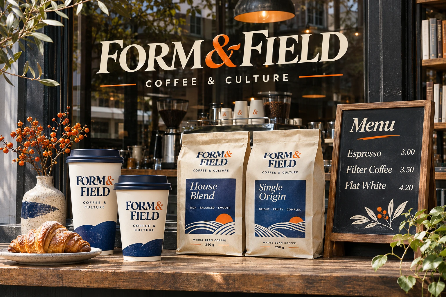
The finished result still has to work for the person using the typeface. A logo needs dependable letter relationships. Packaging needs readable product information. A font family needs coherent behavior across its intended styles. Choosing the editor is one decision within that larger process.
You can explore the Lettersiro font collection to see the kinds of design work a foundry ultimately puts in the hands of customers. The specific statement here concerns Lettersiro's use of FontLab; the version and feature comparisons in this article come from the linked vendor documentation.
Which font editor should you choose?
Choose FontLab for your shortlist when you need Windows support, want to compare the same editor across Mac and Windows, or find its drawing and production controls a good fit for your project.
Choose Glyphs for your shortlist when your workflow is Mac-based and its contextual editing, family development, and extension ecosystem help you work with confidence.
For a beginner, the strongest choice is the one you can run, learn, and use to finish a modest, well-tested first font. For an established foundry, source compatibility, repeatable production, and the team's existing knowledge may carry more weight. A small real project will tell you more than a universal winner badge.
FontLab vs Glyphs FAQ
Is Glyphs available for Windows?
Glyphs 4 is a Mac application. FontLab supplies both Windows and macOS versions. Check the exact release requirements before planning an installation.
Can both applications create variable fonts?
Yes, the full applications support variable-font workflows. Evaluate master compatibility, intermediate designs, and exported behavior with your own project. Glyphs Mini has a different feature scope.
Does using FontLab guarantee a better font?
The editor provides tools. The typeface still depends on design decisions, spacing, language coverage, technical work, and testing. Lettersiro's use of FontLab describes a real tool choice, not a promise of automatic quality.
Is a Glyphs font limited to Mac users?
The editor's platform does not by itself restrict the audience for an exported font. Deliver the formats and features your users need, and test them in the intended applications and operating systems.