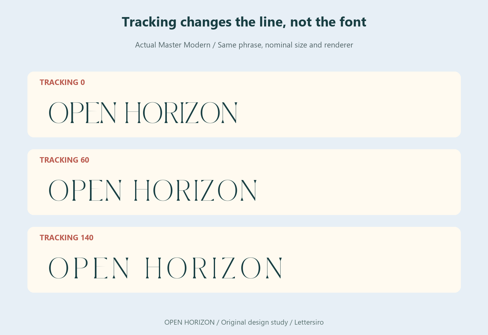
Increasing tracking usually makes a headline occupy more horizontal space, but the result also changes its rhythm. A phrase can feel calmer, more fragmented, or less connected to the material beneath it. The measurable width of the line and a reader's impression of its openness are related questions, not interchangeable results.
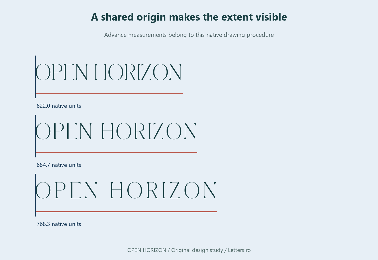
This controlled visual study uses OPEN HORIZON in the real Master Modern font. It compares the same wording at the same nominal type size with several spacing inputs. The controlled comparisons are native font proofs, not screenshots of an application's text engine. The applied announcement scenes are illustrative mockups. No participant study was conducted, so the article makes no claim that readers preferred one setting or perceived a particular percentage change.
Separate the setting from the outcome
Tracking is an instruction that changes spacing over a selected range. The width you observe is an outcome of the wording, glyph advances, spacing, and text engine. Two phrases with the same number of characters can begin with different widths because their letters have different shapes and advances.
Adobe documents Illustrator's tracking and kerning values in thousandths of an em in its spacing guide. That is a relative unit. Applying a setting to a large headline introduces a larger physical movement than applying the same setting to small text. Always inspect the result in the intended composition.
Hold useful variables constant
Use one exact phrase, one font file, one type size, one case treatment, and one rendering method for the first comparison. Keep a zero-tracking control. Then change the tracking input while leaving those other choices alone. If you change the wording and type size at the same time, you cannot attribute the resulting width difference to tracking alone.
The proofs here make those controls explicit. Their measurements describe the native drawing procedure used for this article. They should not be copied as a promise that another application will report identical bounds, especially when kerning, shaping, or alternate glyph selection differs.
Distinguish advance width from visible ink
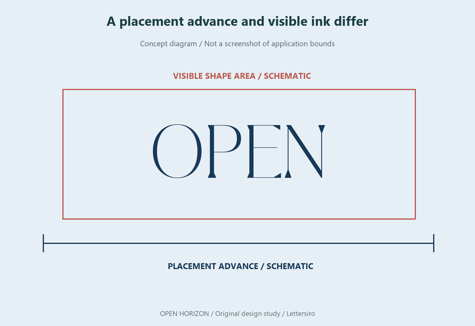
A line's advance is the distance the renderer moves while placing the characters. Its visible ink bounds describe where the drawn shapes actually appear. Sidebearings, overhangs, punctuation, and swashes can make those two measurements differ. This is one reason a mathematically centered line can still invite a visual adjustment.
When reviewing a headline, ask which width matters to the decision. A text frame may need to accommodate the advance. A sign layout may need enough clearance around the visible shapes. A comparison of visual balance needs the complete composition. Avoid treating a single number as a substitute for those different checks.
Put the wider line back into the layout
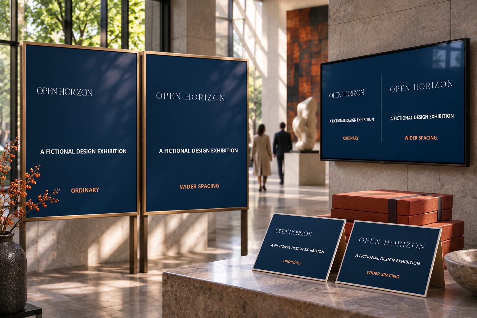
A line that looks attractive by itself can compete with the surrounding information once its width grows. It may approach the edge of a panel, overtake a supporting line, or create a weak word gap. Inspect the relationship between the headline and the content beneath it after every substantial spacing change.
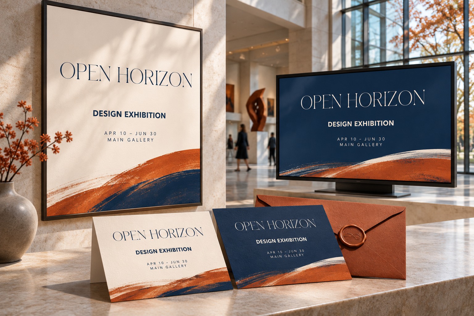
For the fictional OPEN HORIZON announcement, the same text area is used for a compact and a more widely spaced arrangement. The comparison is not an argument that open spacing is always better. It asks whether the added width supports the intended hierarchy or forces the rest of the page into a less useful position.
Change the phrase before approving a rule
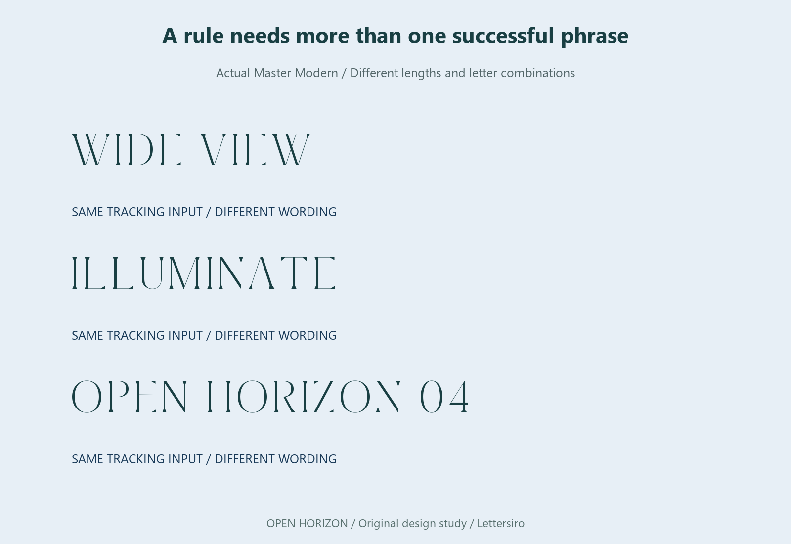
A brand system needs more than one successful headline. Try a short phrase, a long phrase, and a line containing narrow and wide letters. Include punctuation and numerals when the campaign requires them. A spacing value that looks balanced in OPEN HORIZON may be awkward in a much longer product announcement.
Record the situations in which a style is intended to be used. A short all-cap heading and a sentence-length subheading may deserve different rules. It is more useful to define those roles than to assign one tracking value to every piece of text in a campaign.
Make the final judgment at the delivery size
Reduce the complete composition and inspect it on the target medium. Look for isolated letters, a distracting word gap, and supporting information that no longer has a clear relationship to the heading. If you print a proof, note its dimensions and viewing conditions instead of assuming a large browser preview predicts the result.
If a reader check is useful, show alternatives without announcing which one you expect to win. Ask for the exact wording and where the reader hesitated. Keep those observations separate from your width measurements. They answer different questions and can lead to different revisions.
Begin with your wording in the Lettersiro Logo Tester, then use the actual Master Modern files in the application where the work will be delivered. Preserve the ordinary spacing version beside the chosen treatment. The useful outcome is a headline whose width, rhythm, and place in the layout all serve the same communication goal.