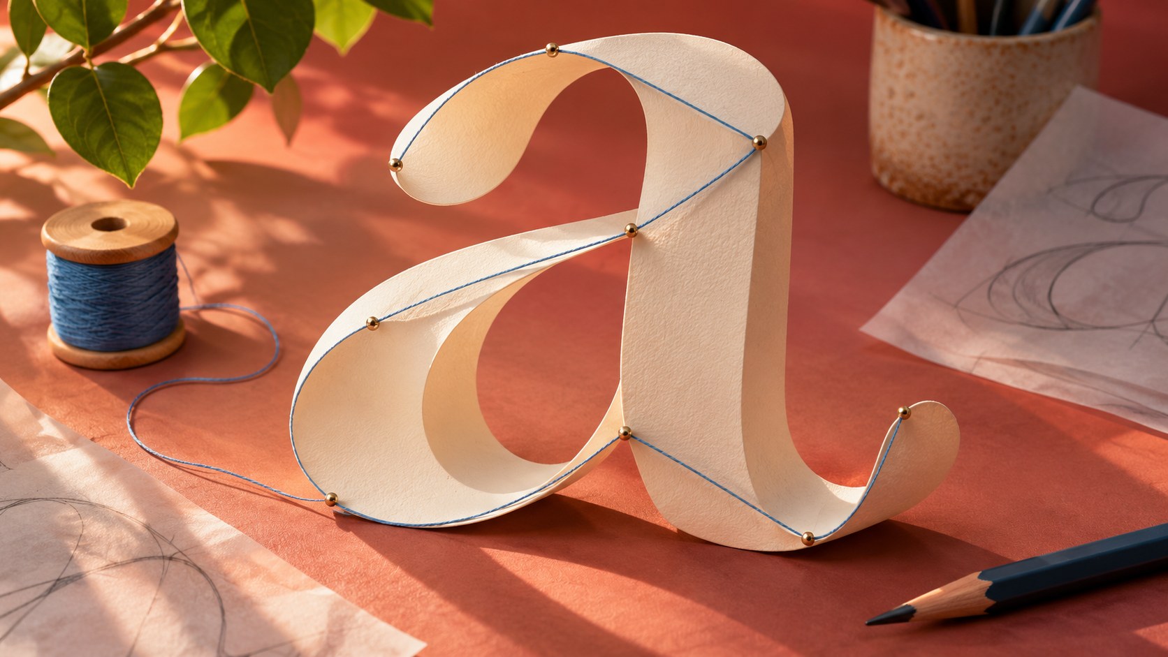
A smooth letter on a poster begins as a set of shapes stored in a font file. Enlarging those shapes reveals contours, points, and spaces that are almost invisible at ordinary reading size. Reading an outline can help a designer understand a letter's construction, but the point diagram is only one view of the typeface.
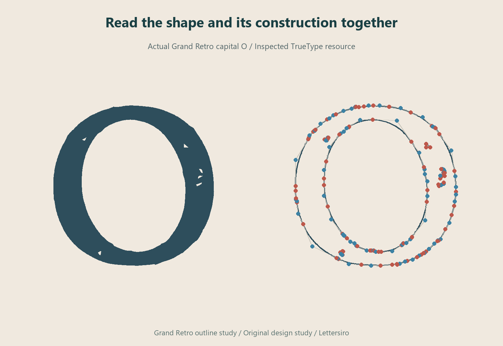
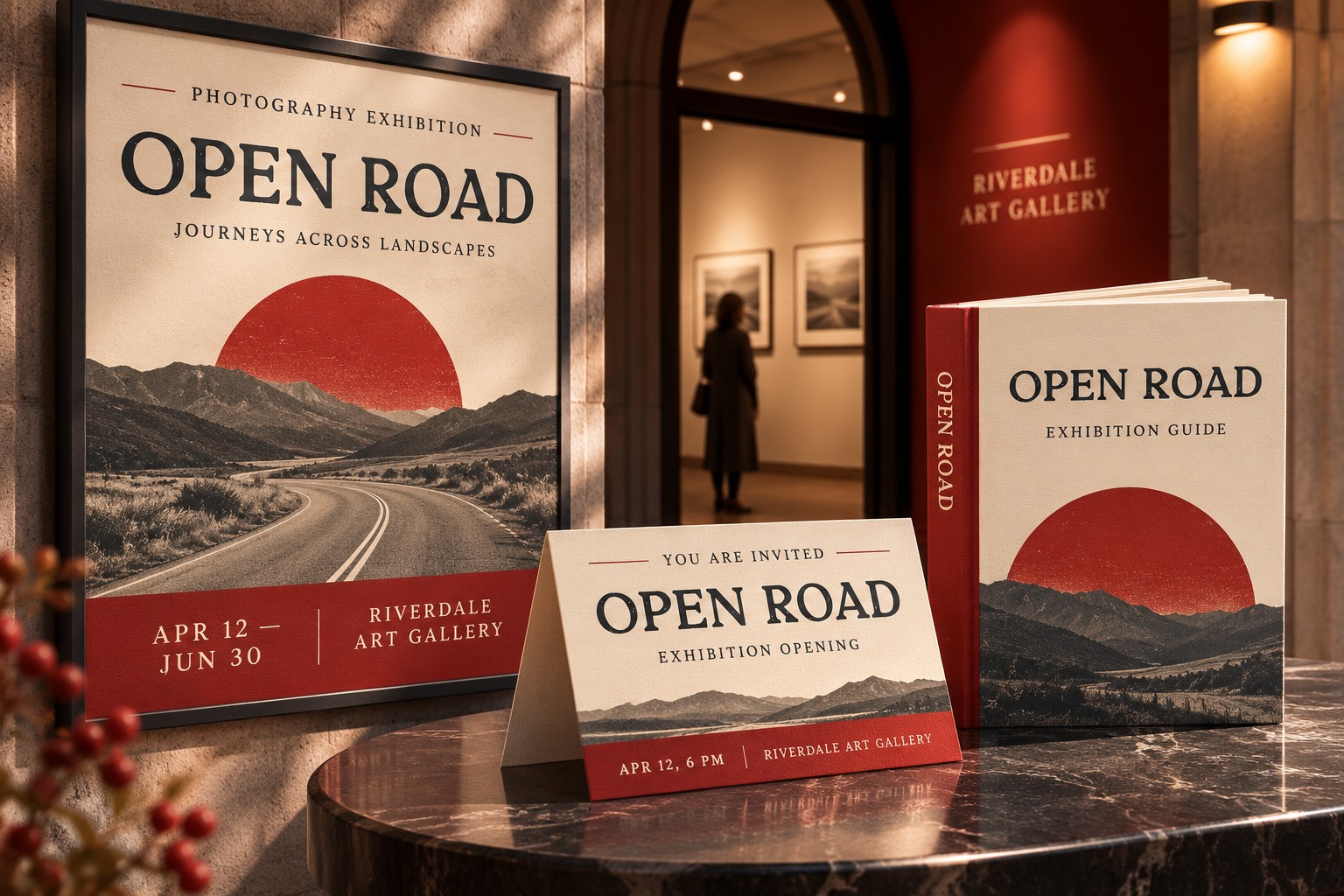
This article inspects an actual Grand Retro TrueType file supplied through Lettersiro's existing font resources. The native inspection figures use its real glyph data and rendered letterforms. Applied exhibition concepts are shown separately. They do not reconstruct a designer's private drawing history or claim that an outline was created in a particular sequence. The example is a file inspection, followed by practical visual proofs.
Start by identifying the file you are inspecting
Record the family, style, version, and the source of the file. A product can contain several styles or formats. Two files carrying a similar public name may not have the same outlines, spacing, or revision. Keep the inspection tied to one file so the observations can be repeated.
The inspected file identifies its family as Grand Retro and its style as Regular. Its internal units-per-em value is 1000. These are properties of this particular resource, not a promise that every file distributed with the product has identical metadata. The native illustrations below use the same file throughout.
Distinguish contours from control geometry
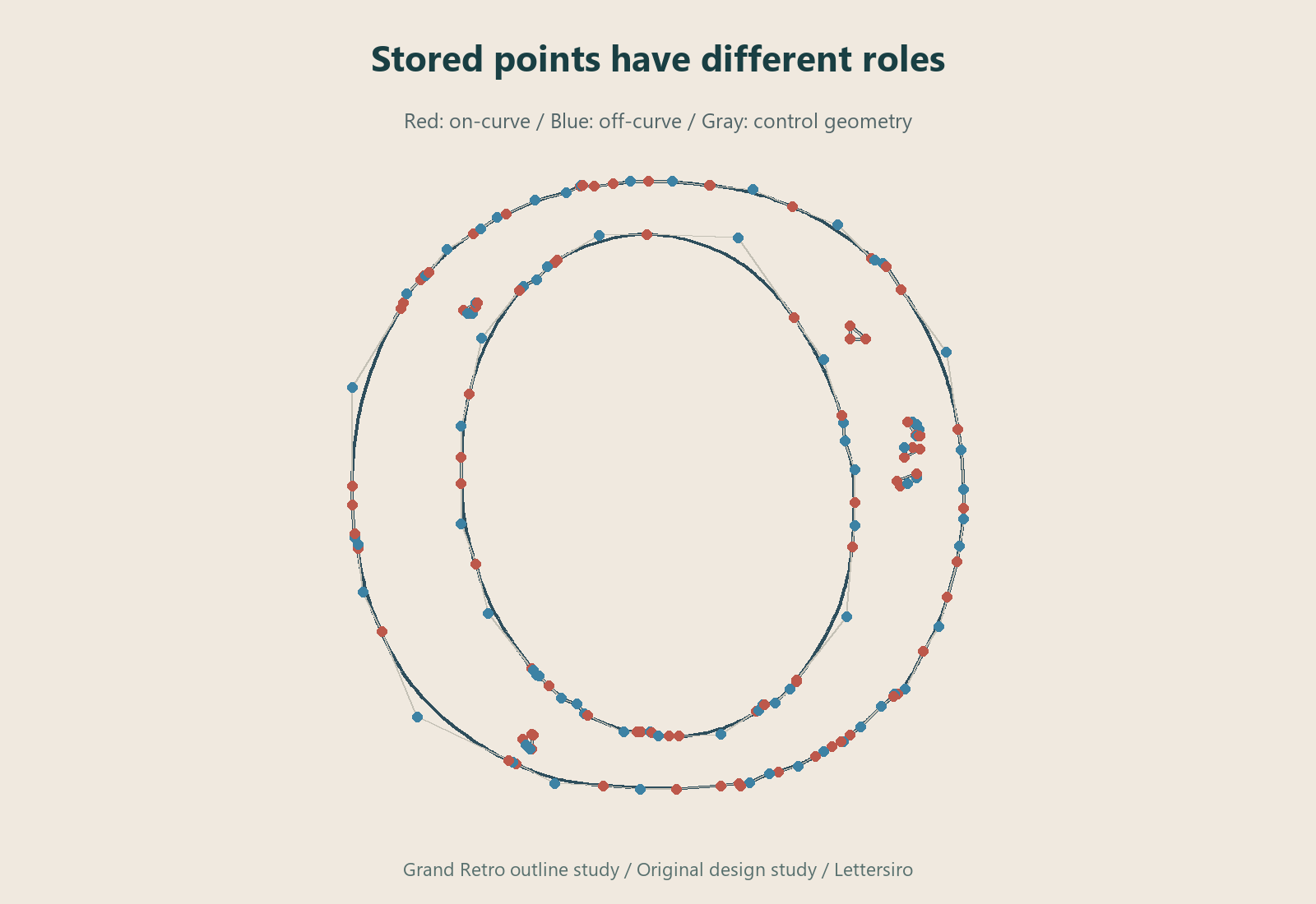
A contour describes a closed boundary of a glyph. A letter can contain an outer contour and an inner counter, as well as other parts. Control geometry helps describe the route of the curve; it is not all intended to appear as visible ink. Joining every stored point with straight segments therefore does not reproduce the smooth finished outline.
Microsoft's TrueType fundamentals describe the use of on-curve and off-curve points with quadratic curves. The outline-format comparison distinguishes this from the cubic curves used in CFF and CFF2 outlines. This study concerns the TrueType outline in the inspected file.
Read the empty space as carefully as the stroke
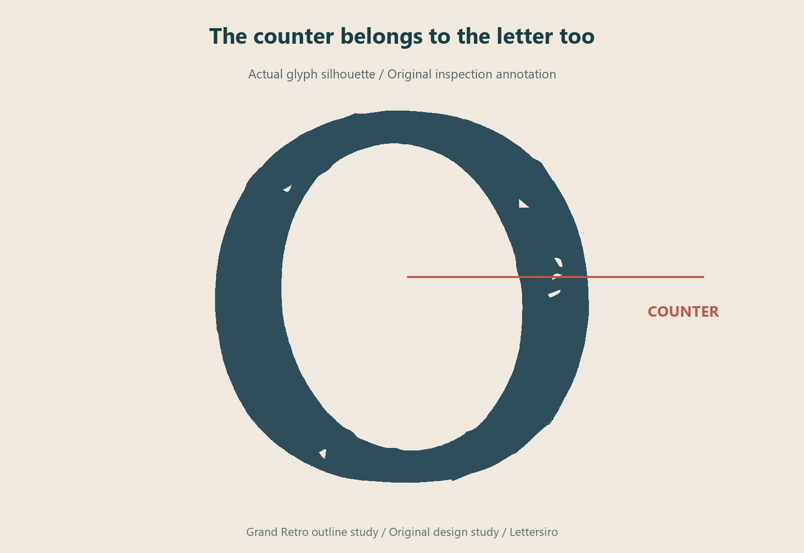
The counter inside a letter contributes to its character and its behavior when reduced. Look at how the inner shape relates to the outside: whether it is centered, how the stroke changes around it, and where the transitions feel tight. A letter is not just a black silhouette; its white spaces are part of its structure.
Compare the isolated shape with nearby letters. A counter that seems unusual alone may make sense within the typeface's overall rhythm. Avoid declaring an outline defective because it differs from a geometric ideal. The useful question is how the shape functions in the actual letter and in a word.
Return to words before drawing conclusions
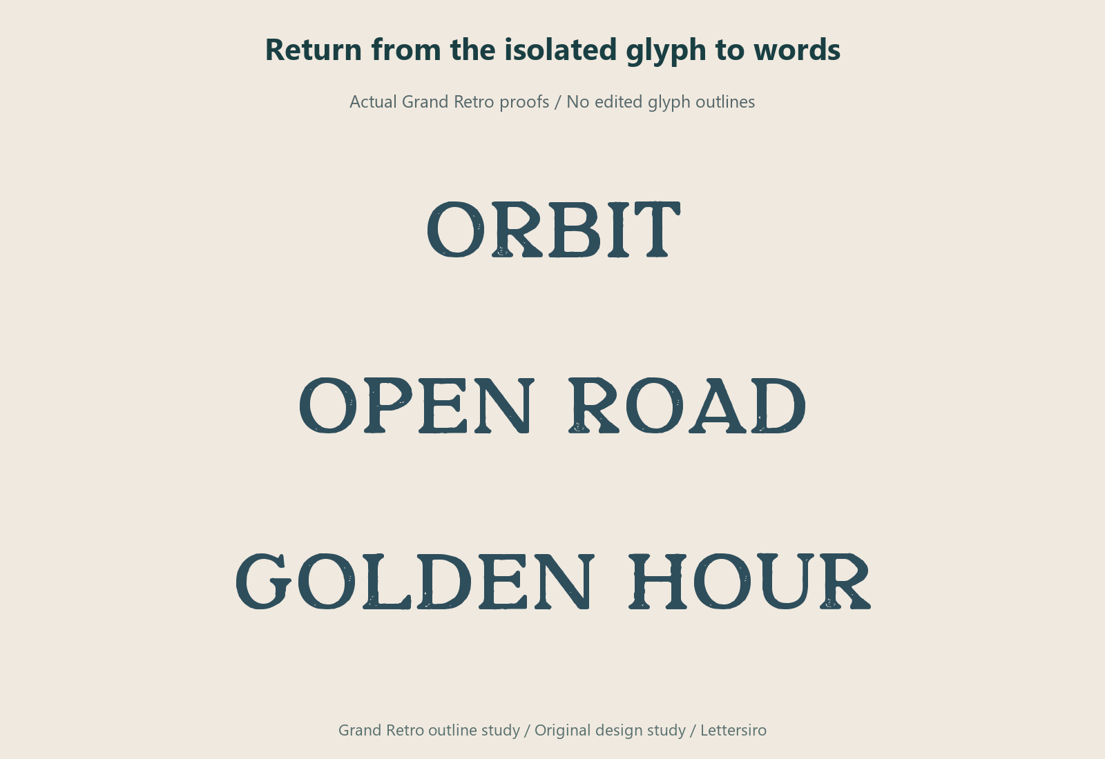
A capital O can be interesting to inspect, but a display face is usually read in combinations. Set several real words that include the inspected letter. Look at the gaps before and after it, the neighboring verticals and diagonals, and the silhouette of the full phrase.
The fictional examples here include ORBIT, OPEN ROAD, and GOLDEN HOUR. They are ordinary native font proofs with no manual edits to the glyph outlines. Their purpose is to connect the enlarged inspection to a reading context, rather than treating the point diagram as an independent quality score.

Inspect more than one rendering size
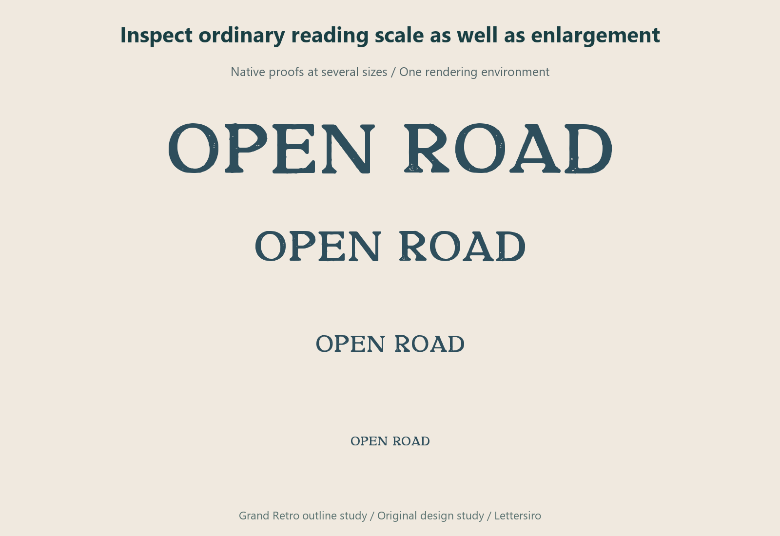
Reduce the type and look again. Fine details that are obvious in a large outline view can merge, soften, or become visually secondary at a smaller size. A rasterized preview also depends on the rendering environment. A single screenshot is not a universal prediction of how every application or device will display the font.
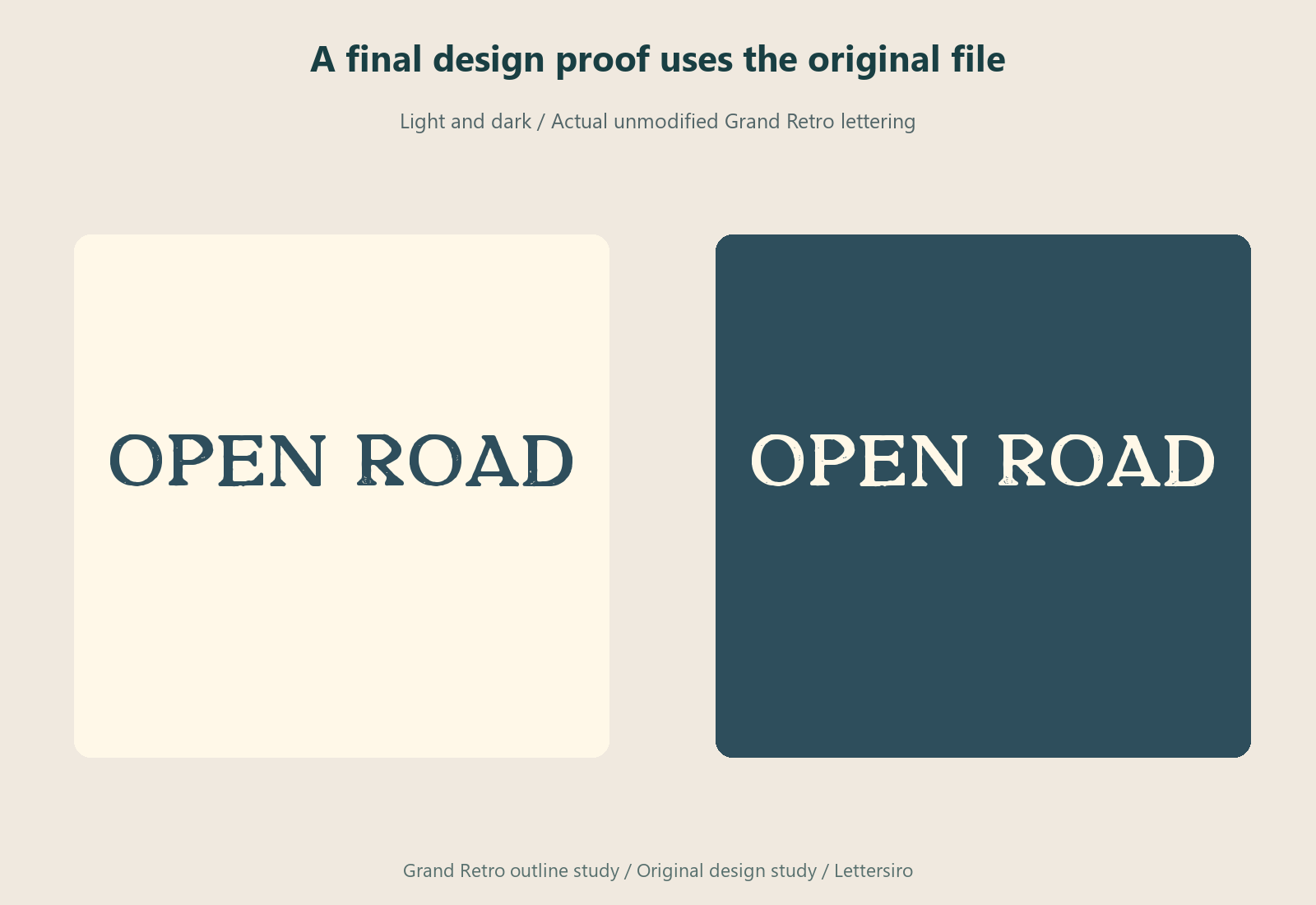
Use a clear light and dark comparison when both are relevant to the project. Inspect the actual file in the target application before approving production artwork. If the work will be printed or manufactured, obtain the appropriate proof for that process rather than relying on a native diagram in an article.
Keep inspection separate from modification
Reading font data does not require changing it. Preserve the original file and your observations. If you need a customized identity, work within the applicable font license and keep the resulting artwork distinct from the font resource. Do not redistribute a modified font merely because a vector editor can expose its letter shapes.
Explore the actual Grand Retro product and review the Lettersiro license options for your intended use. An outline inspection is most helpful when it produces a better question: how a counter behaves when reduced, how a curve relates to its neighbors, or which proof the real project still needs.