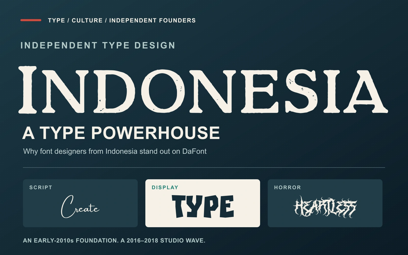
Open DaFont and Indonesian names appear everywhere: in script fonts, brush lettering, playful display faces, horror alphabets, and the author directory itself. Letterhend, Lettersiro, MLKWSN, Din Studio, and DM Letter Studio are part of a much larger creative scene. Their visibility raises two questions: when did Indonesia become such a prolific source of type designers, and why did this particular business take root?
The clearest answer combines an early foundation in lettering and graphic design, a wave of independent studios during the middle and later 2010s, and an internet distribution model that lets small teams reach international customers. An important grassroots catalyst also belongs in that story: Lettersiro’s font-making ebook, remembered as “Kitab Merah.” Its circulation through Facebook helps explain how the opportunity reached people considering a new creative career.
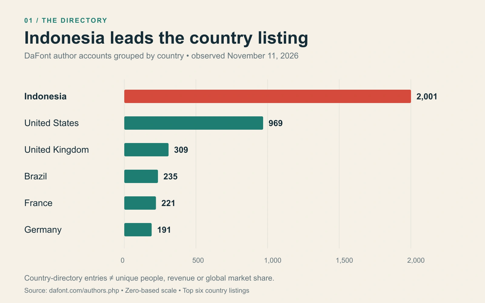
Indonesia leads DaFont’s country directory
On November 11, 2026, our direct check of DaFont’s author directory found 2,001 entries under Indonesia, 969 under the United States, and 309 under the United Kingdom. Indonesia led the country listing, with more than twice the US count.
Author accounts can represent people or studios, and brands can share founders. This establishes the largest listed country group, rather than a census of unique working designers or a measure of national revenue, font quality, or global market share.
Downloads tell a different story. In the same day’s live all-time author ranking, Khurasan—Syaf Rizal—was seventh with 76,929,789 downloads, while Måns Grebäck held first place. Din Studio appeared at number 70 with 17,409,135. Indonesia’s large author base therefore coexists with major international designers at the top of the cumulative chart. A download is also not a purchase or a unique customer.
Khurasan’s own Creative Fabrica profile identifies Banda Aceh, Indonesia, as its location and records a platform membership beginning in August 2016. That geographic detail matters: this story extends well beyond the studios clustered around Yogyakarta.
When did the Indonesian font wave begin?
There is no defensible single birthday for the entire movement. A foundry’s establishment, a designer’s first experiment, a marketplace debut, and a DaFont upload are different milestones. The records below show a scene developing across several years; they do not establish the first Indonesian font designer or a year-by-year national growth rate.
One particularly useful early account comes from Didik Pratikno. In a 2015 interview with Desain Grafis Indonesia, he recalled beginning dingbat design in 2011 and uploading Djoewana to DaFont. His starting point was the visual vocabulary of brass craft in Juwana, Central Java. This was a route from local graphic material into a downloadable font, years before the pandemic.
Another early marker is Cahya Sofyan. In a 2017 interview with Jimmy Ofisia, he dated his decision to focus on type design to early 2014, and his public Behance release of Synthesia to November 5 that year. He also described sharing demos and using feedback on spacing, kerning, and ligatures to improve the work.
| Period | Documented milestone | What it establishes |
|---|---|---|
| 2011 | Didik Pratikno begins dingbat work and describes uploading Djoewana to DaFont. | An early documented example of Indonesian participation. |
| 2014 | Cahya Sofyan focuses on type design and publicly releases Synthesia. | Type design is already emerging from graphic design and lettering practice. |
| 2016 | Letterhend and Lettersiro date their beginnings to this year. | Two of the studios discussed here belong to a pre-pandemic cohort. |
| 2017–2018 | Din Studio is established in 2017; DM Studio follows in 2018. | Further independent studios appear during the later 2010s. |
| 2017–January 2018 | A reader dates the first ebook to 2017; an archival screenshot shows the part-two announcement on January 15, 2018. | Practical knowledge reaches beginners through a freely shared guide. |
| 2019–2020 | Rockness reaches DaFont in 2019; Heaters follows in 2020. | MLKWSN has dated releases across this period. |
The studio dates come from the Letterhend, Lettersiro, Din Studio, and DM Letter Studio biographies. The ebook chronology comes from Rian Rahardi’s April 2018 account. MLKWSN’s release dates are recorded on the DaFont pages for Rockness and Heaters.
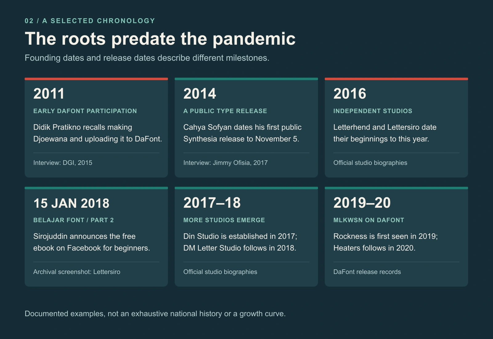
For the names in this article, 2016–2019 is a useful window for the formation and growing visibility of the independent-studio wave. Its roots are earlier, and new entrants continued afterward. Allouse, for example, described a move toward forming its own foundry in 2020 in a MyFonts interview. That is evidence of continued entry, rather than evidence that the whole Indonesian movement started during COVID-19.
The “Kitab Merah” catalyst: knowledge shared through Facebook
An archival Facebook screenshot supplied by Lettersiro gives this story a precise milestone: January 15, 2018. The post by Muhammad Sirojuddin announces “Ebook Belajar Font part 2,” invites people to share and download it for free, and explicitly addresses beginners. The red cover reads Belajar Font Dari 0 Sampe Bisa Jualan and credits Lettersiro. This is the guide Lettersiro recalls as “Kitab Merah”—the Red Book.
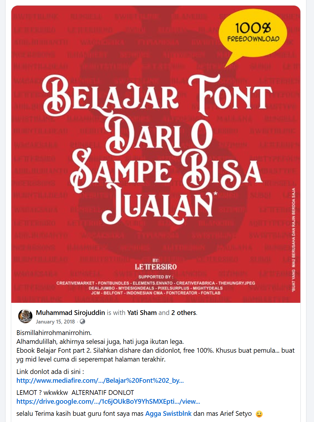
The caption also thanks Agga Swistblnk and Arief Setyo as Sirojuddin’s font teachers—a small but telling record of knowledge being learned from others and then passed onward.
Lettersiro reports that the guide was downloaded tens of thousands of times, and remembers its circulation through Sirojuddin’s Facebook account as a major catalyst that encouraged newcomers to try font design. That download figure is attributed to Lettersiro’s account, rather than presented as an independently audited total.
A contemporary reader’s story provides concrete evidence of the ebook’s influence. In a post published on April 5, 2018, Rian Rahardi recalled reading Sirojuddin’s first ebook in 2017, then encountering its second version on Facebook in early 2018. It motivated him to study font making seriously. He described learning with Priyo Bagus Panji Waluyo of Micromove and in BELFONT, associated in his account with Aryo Pamungkas, as he entered font publishing through Creatype Studio.
That route from shared instruction to practice makes community education visible alongside the stories of individual studio founders.
Kitab Merah therefore deserves a prominent place in the history of this wave. Lettersiro remembers it as an important catalyst for new entrants, and a reader’s published experience supports that educational role. Earlier Indonesian designers were already active, so the distinction is between the origins of the profession and the spread of an accessible route into it. Establishing how many later designers entered through the guide would require a broader study.
The studios behind the names
Letterhend: lettering becomes a foundry
Letterhend Studio identifies Aryo Pamungkas and Hendry Juanda as its founders, Yogyakarta as its base, and 2016 as its establishment year. Hendry’s MyFonts designer biography describes working as a lettering artist before turning that work into fonts with a team. It is a direct example of a skill transition that appears repeatedly in this scene: drawing letters becomes designing a reusable typeface.
Lettersiro: learning online, then selling internationally
Lettersiro’s biography places the studio in Sleman, Yogyakarta, founded by Muhammad Sirojuddin in 2016. His MyFonts foundry profile makes a more specific distinction: he began learning font design through the internet in 2016 and says he began selling fonts in 2018. Those milestones should not be flattened into a single date. The profile identifies Amsterdam Signature as a particularly significant bestseller in his own experience.
Because this article appears on Lettersiro’s website, this is also a disclosure: Lettersiro is one participant in the scene being discussed. Its studio history and recollections about Kitab Merah are identified as its own account, alongside separately published reader testimony and other sources.
MLKWSN: a recognizable brush-led catalogue
MLKWSN’s Creative Market shop identifies its designer as Malik Wisnu and lists Merauke, Papua, as the location. Its official website features Heaters, Rockness, and LOVES, spanning expressive brush work and sans serif design. DaFont records Rockness as first seen on February 27, 2019, and Heaters on May 11, 2020. These are verifiable distribution milestones; they should not be presented as the studio’s founding date.
Din Studio: production becomes a team activity
Din Studio dates its establishment to 2017 in Yogyakarta, founded by Donis Miftahudin. Its biography describes a catalogue covering script, sans serif, serif, and display work. The team page also lists work beyond drawing letters, including previews, marketing, translation, customer service, and web development. This is a useful reminder that a productive foundry needs a business and presentation workflow around the type itself.
DM Letter Studio: a Bandung example
DM Letter Studio identifies Dimas and Yuniar as its founders, Bandung in West Java as its base, and 2018 as its starting year. The studio describes an emphasis on handwritten fonts alongside seasonal, Halloween, monogram, and display work. It illustrates another part of the market: typefaces built around specific creative occasions and applications, rather than a single universal text family.
Blackmetalfont: specialist branding and shared founders
Blackmetalfont presents a specialist catalogue around metal and horror lettering. Muhammad Sirojuddin’s public professional profile identifies him as the founder of both Lettersiro and Blackmetalfont.com. There is also a direct product-level connection: Heartless on DaFont credits Lettersiro Studio and points users to Blackmetalfont for a commercial licence.
The distinction is useful when discussing scale. Several shop names can reflect different audiences served by the same founder. Counting websites, brands, DaFont author accounts, and individual people will produce different totals. Blackmetalfont’s specialist positioning helps explain the breadth of the scene without inventing another independent founder.
Why have so many Indonesian designers entered type design?
The following explanation is an editorial synthesis of the studio histories and interviews, rather than a national survey of every designer’s motivations. Several mechanisms fit the evidence particularly well.
1. Lettering provided a practical starting skill
Someone already drawing logos, brush lettering, invitations, or apparel graphics has useful experience with rhythm, contrast, and expressive letterforms. Building a font adds another layer: a consistent alphabet, spacing, kerning, character coverage, and software testing. The move is substantial, but the starting material is familiar.
In its 2025 interview with Aditya Wiraatmaja, justfont describes lettering’s growing popularity around 2010 as a gateway for many Indonesian type designers, alongside limited access to formal type education. Letterhend’s own account makes that transition concrete. This combination helps explain why expressive display and script work is so visible, while leaving room for designers with quite different backgrounds.
2. Internet learning made specialist knowledge reachable
The pattern is supported by individual accounts. Lettersiro names internet learning and its own sharing of Kitab Merah; Allouse describes searching for instruction on anatomy, kerning, font production, previews, and marketing. In his MyFonts interview, Fitriyawan Runsell describes learning through friends, books, and web resources after working as a computer teacher.
Access to instruction does not make the craft effortless. It changes who can begin. A designer can start investigating a niche discipline without first gaining admission to a specialist overseas course. The recurring combination of self-study and peer feedback offers a more grounded explanation than assuming one school trained the entire generation.
3. A font can be a reusable product
The economics are attractive in principle. A commissioned logo normally answers one client brief. A typeface can be licensed repeatedly to unrelated customers, provided the designer has rights to the work and offers suitable terms. Production remains time-consuming, and support, promotion, updates, and competition continue after release.
Allouse’s account of moving from freelance work toward a foundry shows that this alternative appealed to at least some designers. It does not establish typical earnings or guarantee passive income. The better description is a product business with repeat licensing potential, whose success depends on usefulness, visibility, and sustained care.
4. DaFont connects discovery with commercial shops
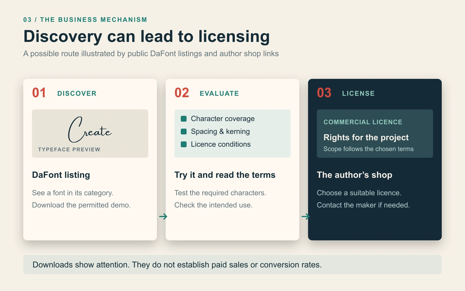
The distribution path is visible on individual listings. MLKWSN’s Rockness page offers a personal-use demo and links to its commercial product page. Heartless similarly routes commercial enquiries toward Blackmetalfont. A visitor can discover a typeface in a familiar directory, test an allowed version, and then approach its maker for the appropriate licence.
That is a plausible explanation for the apparent paradox of commercial foundries being so active on a free-download website. The download serves discovery; a separate licensing transaction may support the business. The listings demonstrate the mechanism, but public download counts do not reveal how often it converts into sales.
5. Designers can serve markets beyond their own city
A buyer may need a warm café wordmark, wedding script, playful package headline, or sharp metal title. None of those briefs requires the designer and customer to live nearby. An international catalogue allows a foundry to compete through a recognizable style and useful application, rather than local proximity alone.
Runsell’s interview describes the opportunities and competition involved in shifting toward English-language offerings. MLKWSN’s location and Khurasan’s Aceh base make the geographic point tangible. Online distribution allows participation beyond Indonesia’s best-known design centres, although language, customer support, payment access, and marketing still require work.
A shared opportunity does not produce one Indonesian style
Indonesian designers are not a single aesthetic school. Brush lettering, restrained sans serif families, ornate scripts, monograms, retro display, and extreme metal alphabets solve different problems. A country label explains where a designer or studio identifies its base; it does not predict how every letter will look.
Within Lettersiro’s own catalogue, for example, Amsterdam and Spirit Stone explore very different directions. Heartless’s horror treatment is another distinct application. These examples illustrate one studio’s range and its related specialist shop, rather than representing the whole country.
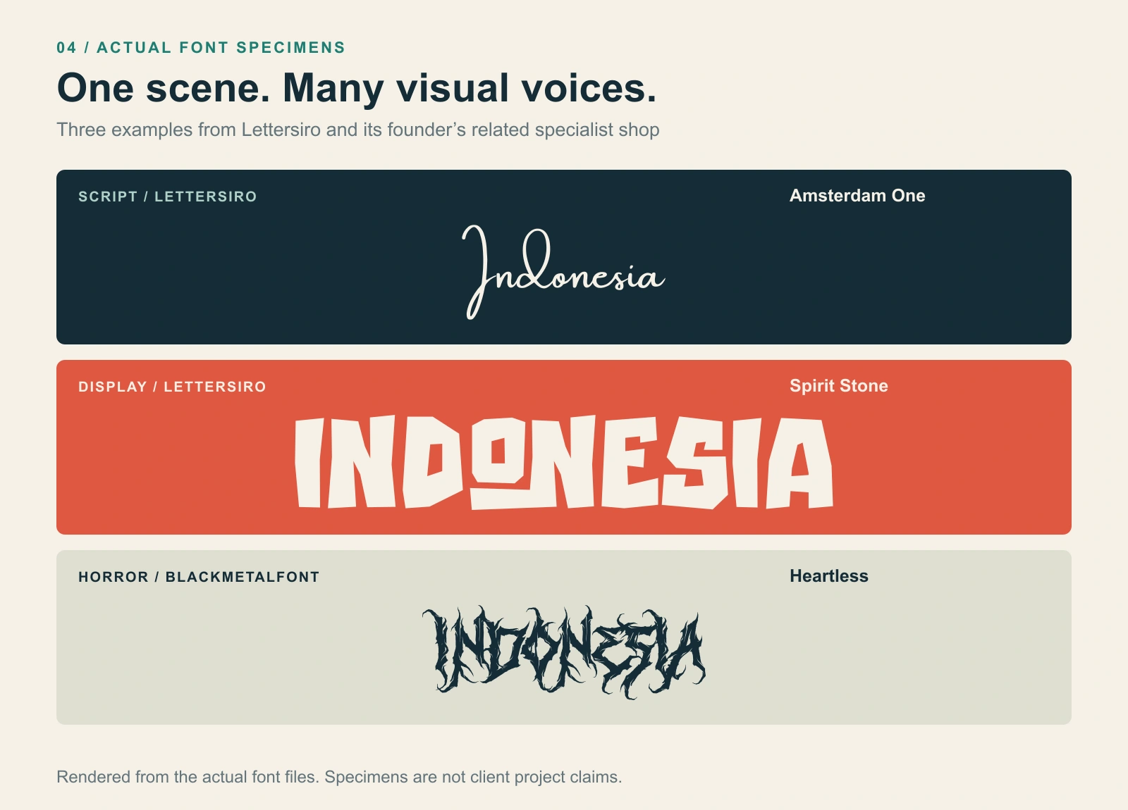
The wider scene has also developed professional connections. Letterhend and PutraCetol Studio identify membership in Perkumpulan Desainer Huruf Indonesia, or PDHI, and cite a 2020 ministerial recognition number. These statements document an association structure around the profession; they do not tell us how many Indonesian designers belong to it.
What this means for designers choosing fonts
The practical benefit is a large pool of independent work to explore. Judge each font in the intended setting: check the required characters, punctuation, language support, spacing, and behaviour in the application you will use. An attractive sample word is only the beginning of that assessment.
Licensing deserves the same attention. DaFont’s FAQ explains that the site includes several licence categories and directs users to the included documentation or author when terms are uncertain. A download button is not blanket permission for a commercial logo, advertisement, website, app, or merchandise. Follow the licence for the particular font and usage, and contact its maker where needed.
Indonesia’s prominence on DaFont is therefore both measurable and explainable. The country leads the directory count checked for this article; documented participation reaches back at least to the early 2010s; and several of the studios now familiar to designers began taking shape in 2016–2018. Kitab Merah adds an important grassroots dimension: established makers sharing knowledge that helped newcomers see a path into the field. Lettering skills, accessible learning, peer networks, reusable products, and international distribution worked together over time. The next chapter will depend on how well that large creative community turns visibility into distinctive, dependable type.
Research checked November 11, 2026. Updated the same day to include Kitab Merah, the supplied archival screenshot dated January 15, 2018, Lettersiro’s account of its circulation, and Rian Rahardi’s published reader testimony. Directory counts and download totals are dated snapshots; ebook downloads reported by Lettersiro have not been independently audited. The selected chronology is not an exhaustive history or a measurement of national sales.