Tactile typography gives a flat composition a sense of material. Ink looks absorbed by paper, a printed edge feels slightly irregular, or a shadow suggests that a letter has physical depth. The appeal comes from those believable relationships. Applying a noisy texture to every surface usually produces clutter rather than character.
For a brand, the question is not how much texture can be added. It is what the material language should communicate. A handmade bakery, a music festival, and a contemporary furniture studio might all use tactile details, but each needs a different degree of roughness, density, and control.
Begin with the material, not the effect menu
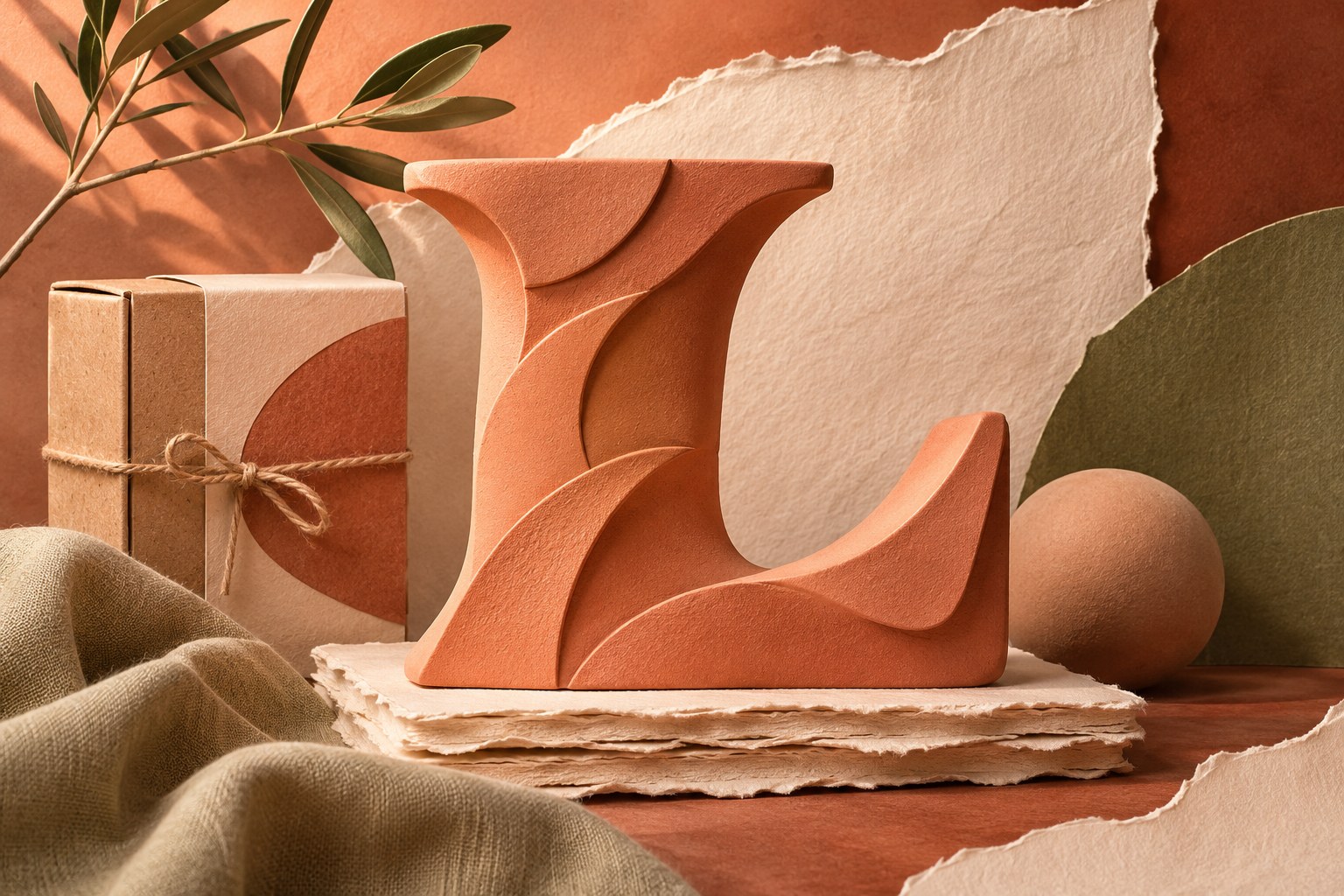
Look closely at a real printed object. Ink may collect along an edge, paper fibers can interrupt a broad stroke, and an impression can create a shadow even without visible color. These are different phenomena. A convincing digital treatment chooses one or two of them and applies them consistently with the imagined process.
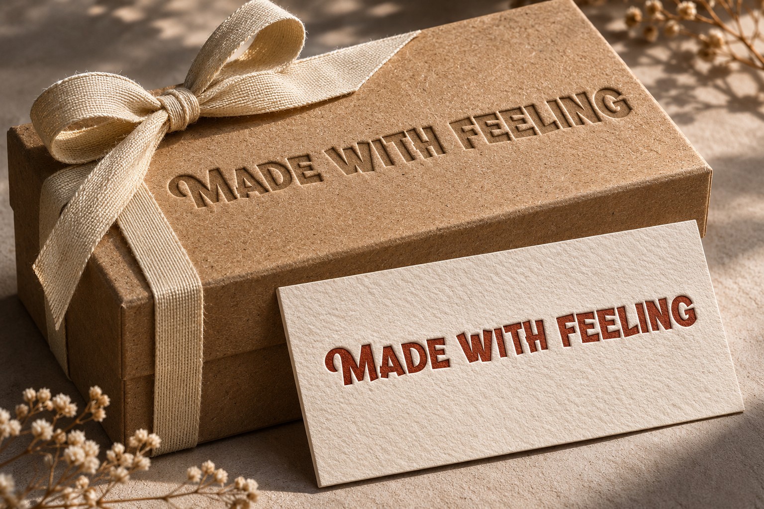
Build a small reference set from materials appropriate to the project. For an informal food identity, that could include kraft bags, stamped labels, and thick printed cards. For an editorial campaign, it might be cut paper, photocopies, or folded posters. Use your own photographs or properly licensed references, and note what you want to learn from each one.
Separate physical texture from typographic structure. A naturally lively typeface can already carry substantial character. It may need very little additional distress. A quieter face may accept a stronger material treatment, but it still needs intact counters, clear spacing, and a recognizable silhouette.
Choose the lettering before weathering it
Banthink offers a useful starting point for retro display typography. Its style variations let a designer explore differences in weight and dimensional treatment before introducing a separate texture layer. Compare the clean lettering first so you understand which qualities belong to the font itself.

Set a short, realistic headline and reduce it to its intended viewing size. Look at the gaps between letters and the interiors of rounded forms. Texture will take away some visual information, so the untreated typography needs enough clarity to accommodate that loss. If the clean version is already congested, roughening the edges will rarely solve the problem.
Think about the amount of language the design must carry. A two-word poster headline can tolerate a different treatment from a paragraph, ingredients panel, or event timetable. Restrict the strongest material effects to the message that can support them, and let the remaining information use simpler forms.
A fictional bakery identity, developed in layers
Imagine a neighborhood bakery called Early Oven. The brief asks for warmth, freshness, and a slightly nostalgic character. Start with a clean wordmark in a single dark color on cream. Establish the proportions and spacing before introducing paper, ink variation, or dimensional effects.
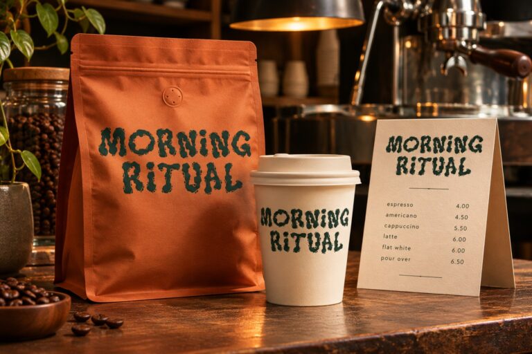
Next, try a light stamped texture only inside the large strokes. Keep narrow joins intact. Print the design at label size, then inspect it from an ordinary reading distance. If the effect disappears completely, decide whether it was necessary. If it makes the name look broken, reduce the intensity or reserve it for larger applications.

Finally, place the identity on a paper bag and a simple promotional poster. The bag's own material may already provide the texture the design needs. In that case, the digital artwork can remain relatively clean. Avoid simulating a paper grain so strongly that it competes with the actual substrate during printing.
This sequence also makes revisions easier. If the bakery later needs an embroidered apron or a small delivery sticker, the clean identity remains available. A textured marketing treatment becomes one expression of the brand rather than the only usable version of its name.
Make light and depth agree
Dimensional lettering becomes confusing when its shadows imply several conflicting light sources. Pick a direction and preserve it across the composition. A raised edge, cast shadow, and background object should all feel as though they occupy the same scene, even in a deliberately stylized design.
Keep the hierarchy visible in silhouette. Temporarily remove color and texture, or view the design as a small grayscale image. The headline should still stand apart from its surroundings. If depth effects create a dark mass that merges with the background, simplify them before adding more highlights.

For screen work, inspect the smallest exported version. Fine grain can turn into unpleasant speckling after reduction or compression. For print, ask the production partner what level of detail the chosen process can hold. A desktop proof is a useful check, but it cannot predict every interaction among ink, pressure, paper, and finishing.
Use nostalgia with a reason
A vintage reference can help a design feel rooted in a particular visual culture, but mixing unrelated eras without intention can make the result vague. Identify the qualities that matter: broad lettering, illustrated storytelling, warm paper, or a dense poster composition. You do not need to borrow every convention at once.
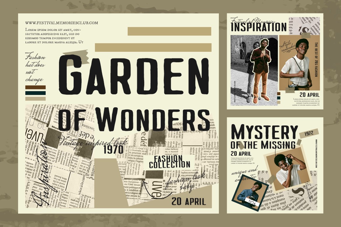
Describe the intended feeling in a sentence before choosing effects. For Early Oven, “a cheerful neighborhood bakery with hands-on craft” supports a lightly stamped name and warm photography. It may not support heavy cracks, metallic bevels, or distressed warnings. That sentence helps the team reject attractive effects that tell the wrong story.
Decide where the texture stops
Create a clean master, a textured display version, and examples showing the smallest permitted use of each. Keep contact information and other practical copy clear. Store editable texture layers separately so the intensity can change for different media without rebuilding the typography.
The final review should ask whether the material treatment adds meaning. Does it suggest a relevant process, strengthen the brand's tone, or help the composition feel more tangible? When the answer is visible, tactile typography can be rich and expressive. When the answer is simply that the page looked empty, the design probably needs a stronger composition before it needs another texture.