Coffee packaging has to perform two jobs at once. From across the counter, it should make a brand recognizable. In a customer's hand, it should explain what is inside: origin, roast, flavor description, quantity, and any other required product information. Typography connects those two viewing distances.
A successful coffee identity therefore needs a hierarchy rather than one dramatic font applied everywhere. A lively display face can make a bag memorable, while a quieter companion helps shoppers compare products. The challenge is deciding where the personality belongs and how it will behave on cups, bags, menus, and delivery materials.
Three coffee businesses, three different voices
Imagine three fictional briefs. A neighborhood espresso bar wants to feel cheerful and easy to approach. A small specialty roaster wants buyers to notice origin and processing details. A hotel coffee lounge wants a restrained identity that sits comfortably beside its interiors. Each sells coffee, but their typography should not begin from the same mood-board adjective.
For the neighborhood bar, chunky lettering and warm color may support a sociable tone. The specialty roaster might use a compact identity above a well-organized information panel. The hotel lounge could choose a more delicate heading, provided it remains visible on cups and small printed menus. Start with the business's character and practical needs before searching for a fashionable typeface.
Give the brief a sentence that can guide decisions: “Friendly everyday coffee with clear choices” is more useful than “cool and premium.” When two layouts compete, return to that sentence and ask which one helps the intended customer understand the offer.
Put a display face in the right role
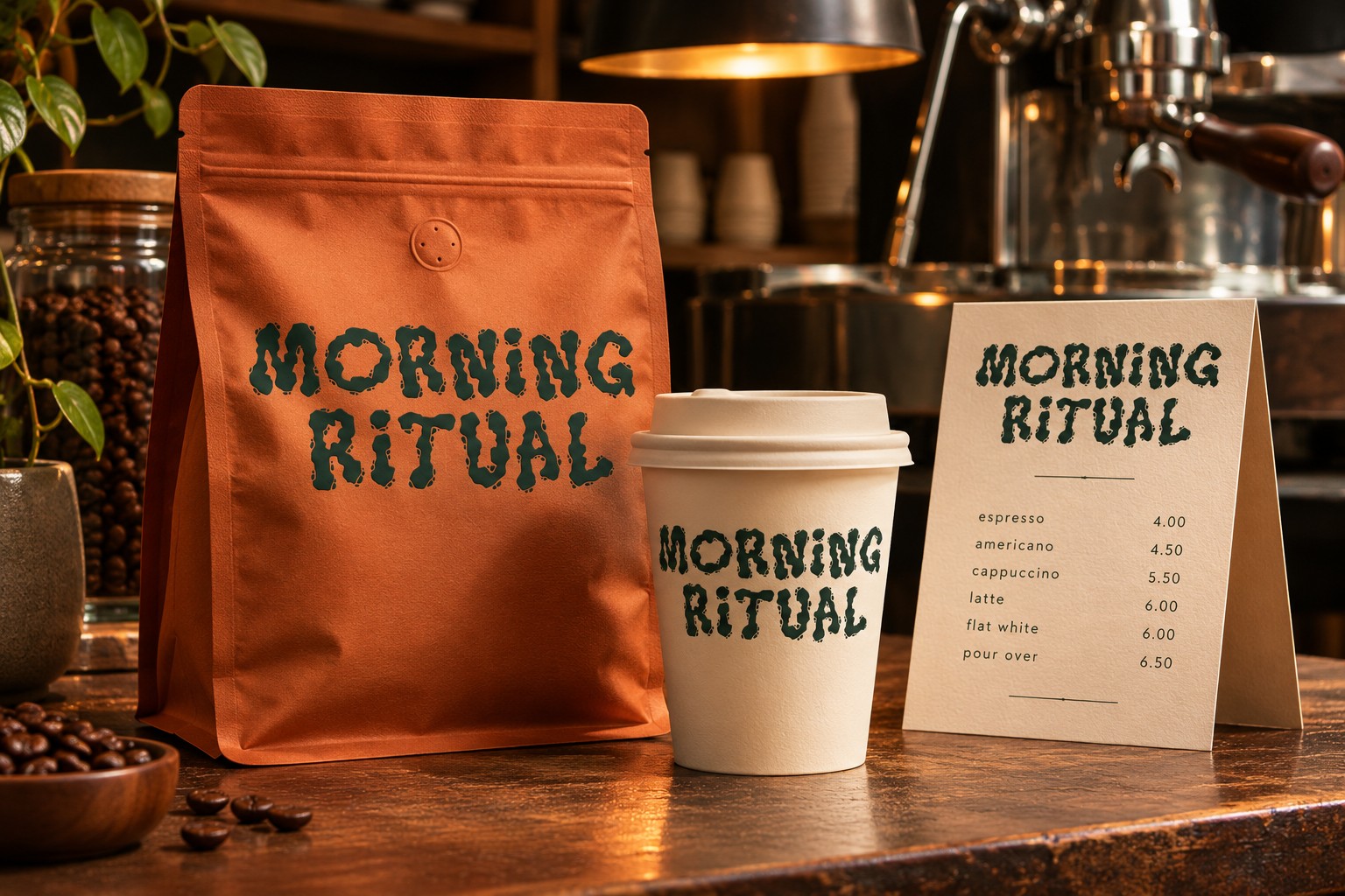
Crispy Snack offers a bold, playful reference for an informal food identity. Its substantial shapes can suggest energy in a short brand name, seasonal promotion, or headline. That personality should be tested with the actual coffee name and on the intended material; it does not automatically make the face suitable for every café.

Try the brand name in one line, then in a compact stack. Compare the amount of open space around it and check whether letters remain distinct when the design is reduced to a small cup print. Avoid tightening a naturally substantial font until the counters and word spaces become congested.
Keep the display role limited. A roast description, brewing instruction, or address should not have to fight the same heavy shapes as the identity. A straightforward supporting face gives the customer an easier route through the information and makes the expressive lettering feel more deliberate.
Design the label around how people choose
For an illustrative brand called Morning Yard, divide a coffee bag into three zones. The top introduces the brand. The middle identifies the specific coffee. The lower area carries practical details. This is a starting layout, not a universal packaging formula; the physical bag, required copy, and printing method will influence the final structure.
| Information role | Example content | Typographic treatment to explore |
|---|---|---|
| Recognition | Morning Yard | Distinctive display lettering with a clear silhouette |
| Product choice | House Blend, medium roast | Readable heading with enough contrast from the brand |
| Supporting detail | Tasting notes, origin, net quantity | Quiet text with consistent alignment and spacing |
Use final copy early. “Chocolate, toasted almond, orange” has a different visual rhythm from a one-word placeholder. A long regional name may need an extra line. A good template anticipates this variation instead of shrinking each new product until it fits the first label.

Color can help distinguish products, but it should not carry the entire system. A customer should still identify the coffee name and roast information in a grayscale proof. Keep the hierarchy understandable even when two bags share similar colors or appear under unfamiliar shop lighting.
Let the typography travel across the café
A coffee identity often appears in places that were not considered during the logo presentation. The loyalty card is small. The takeaway cup is curved. The menu changes prices. The delivery sticker may be printed on a different device. Build a small family of applications before declaring the identity finished.
On the cup, test a compact brand mark with generous surrounding space. On the menu, allow more structure and a calmer reading face. On a social promotion, the display font can become larger and more energetic because the message is short. These are related expressions of the same system rather than identical artwork resized for every surface.
For a quieter contrast, study Spirit Stone in its packaging application. Its presentation suggests a different visual pace from Crispy Snack. Comparing those approaches can clarify whether Morning Yard should feel playful, established, restrained, or bold.

Proof the least glamorous pieces
Print a label at actual size and wrap it around a sample bag. Check the seam, folds, valve position, and areas likely to crease. A carefully centered brand name can become awkward when the bag is filled. Keep important information away from surfaces that routinely disappear or distort.
Read the menu from the distance at which customers will stand. Check numerals, currency symbols, decimal marks, and the relationship between item names and prices. A customer should not have to guess which price belongs to which drink. If a menu contains multiple sizes, align the information consistently and explain the structure clearly.
Ask someone unfamiliar with the design to find the house blend, identify a tasting note, and locate the quantity. Observe where they hesitate. Those moments reveal hierarchy problems more reliably than asking whether they like the font. Adjust the layout, then repeat the task with a different product name to check that the solution is reusable.
The final handoff should include a label example with the longest expected copy, a cup application, a menu page, and guidance on the display font's role. Coffee brand typography becomes durable when it can express a clear personality while continuing to help people choose their next cup.