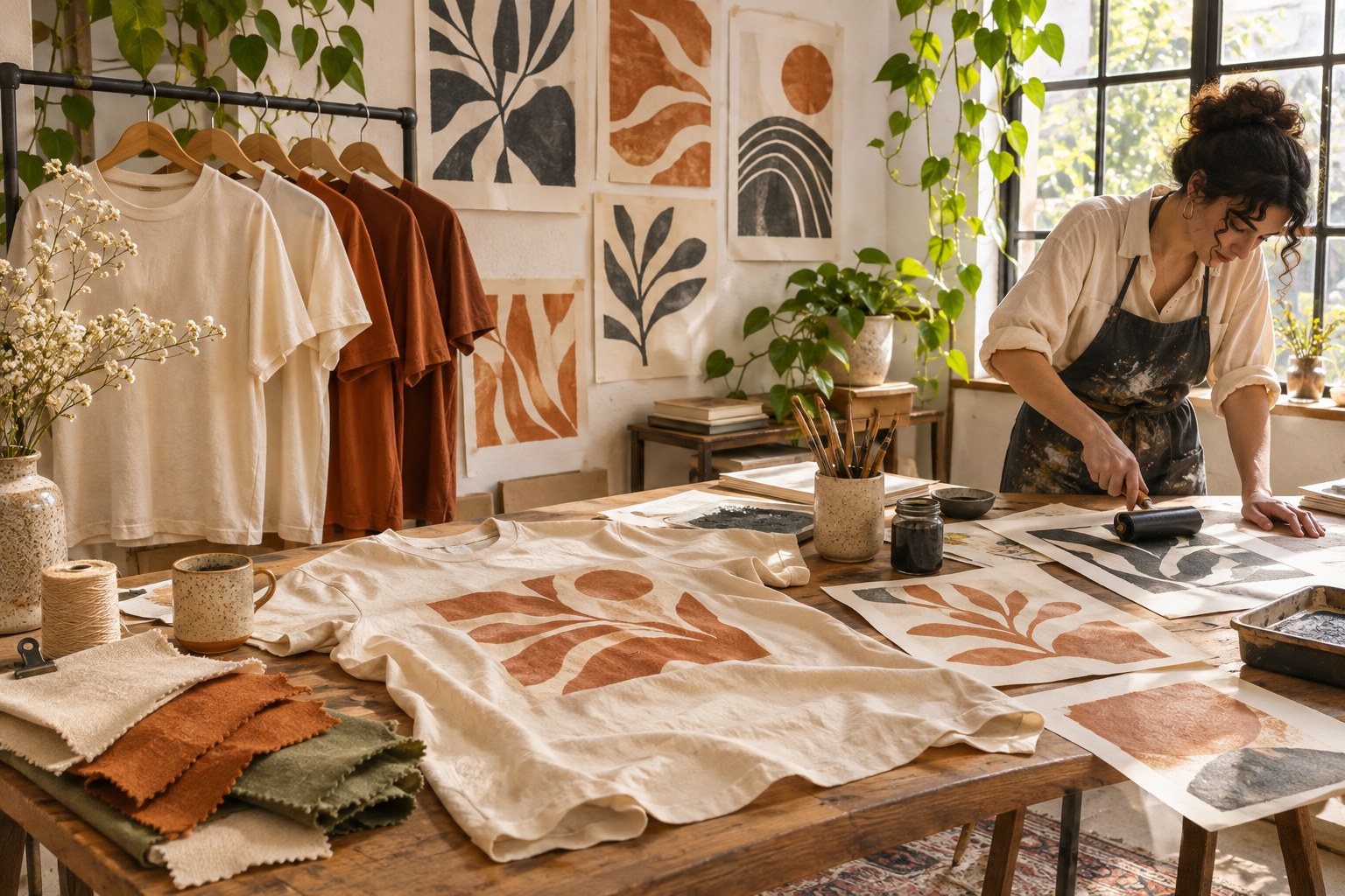
A good T-shirt mockup answers a design question. It can show how a graphic feels on a person, make two color directions easy to compare, or give a client an uncluttered view of the artwork. Those are different jobs, and one attractive image will not always perform all three.
Lettersiro offers three free T-shirt mockups that provide useful starting points for an apparel presentation. This comparison looks at their published previews and advertised editing approach. It does not claim that the PSD files have been opened or that a particular print process has been tested. Use the actual download and your production provider's requirements when preparing a real garment.
1. Use the lifestyle view to establish context
The Man T-Shirt mockup presents a person wearing a light front-facing shirt outdoors. A worn garment gives viewers useful context: the graphic will share space with the body, folds, and an environment rather than living on a flat white canvas.

Use this kind of view when the conversation concerns mood or audience. An informal outdoor setting can help someone imagine the shirt as clothing rather than just a print file. At the same time, the scenery should not make every decision. A beautifully lit photograph can flatter a graphic whose spacing or small lettering still needs work.
Include a separate flat artwork proof beside the lifestyle image in a client presentation. That gives the reviewer a way to inspect the actual design without fabric shadows and perspective. The two views complement each other: one explains the intended experience, while the other makes the graphic easier to assess.
2. Compare two color directions together
The Two Front T-Shirt mockup presents red and black shirts in its published cover. A paired view is helpful when the decision involves color or a coordinated mini collection. It lets you compare two versions within one consistent presentation.

Change one major variable at a time. If the red shirt has a larger graphic, a different headline, and another print position, the comparison no longer isolates color. Start with the same artwork and approximate placement, then discuss the effect of the shirt color before introducing other changes.
Reversed artwork often needs its own review. A dark graphic that reads clearly on a pale garment may need a separate light version for a dark shirt. Check the small interior spaces and any fine lines in both versions. Simply changing every dark element to white may alter the visual balance.
3. Choose a clear single-front presentation
The Front T-Shirt mockup offers a single red-shirt presentation in its preview. A focused front view can be useful when the reviewer needs to judge the print's scale and relationship to the garment without comparing several products at once.

Keep the background and caption restrained. If the main question is whether the design feels too large, the presentation should make that question easy to answer. A dense collage of accessories, large decorative headlines, and unrelated lifestyle photographs can distract from the garment.
| Mockup direction | Strongest presentation job | Supporting proof to include |
|---|---|---|
| Worn lifestyle view | Mood and human context | Flat artwork at readable scale |
| Two-front view | Coordinated colors or alternatives | A consistent artwork comparison |
| Single-front view | Focused scale and placement discussion | Production dimensions in a separate note |
The dimensions in the final column belong to the production brief. A mockup photograph is not a measuring instrument. Do not derive exact print specifications from the apparent size of a graphic on a perspective garment.
Prepare the artwork before opening the mockup
Start with a clean graphic file and a plain background. Confirm the spelling, line breaks, and relationship between illustration and lettering. A strong mockup should present a considered design rather than conceal unfinished typography.
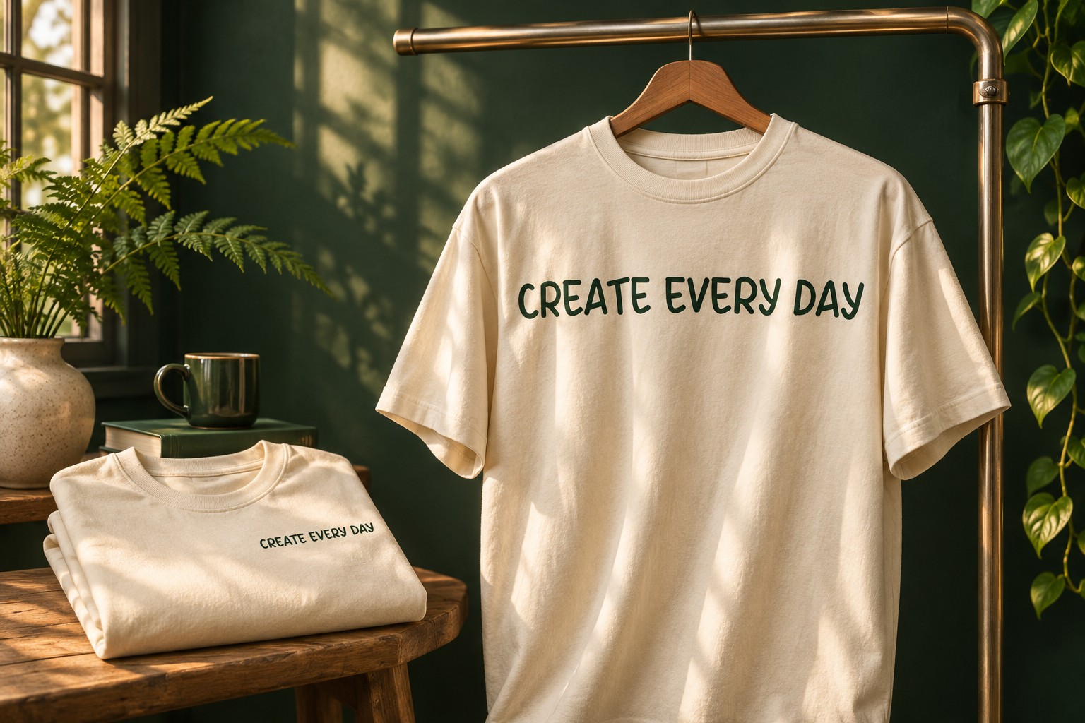
For an outdoor concept, Campnation's free logo badges offer an illustration direction worth reviewing. Select one emblem that fits the project, then decide what the typography needs to contribute. Avoid treating a collection of unrelated badges as a complete apparel identity.

If the concept needs a separate display voice, explore the Lettersiro font collection. Keep the font's permissions separate from the mockup's permissions. A license for a presentation template does not automatically cover the font or illustration placed inside it.
Follow the Smart Object structure
The mockup listings advertise Photoshop Smart Objects and shirt-color customization. After downloading, inspect the actual layer structure and any supplied instructions. Save an untouched original before experimenting. Layer names and controls can differ between files, so a generic tutorial should not be treated as a map of every PSD.
Adobe explains the general process in its guide to replacing the contents of a Smart Object. The important habit is to update the intended artwork container while preserving the presentation's supporting effects. Check the result in the main document after each change.
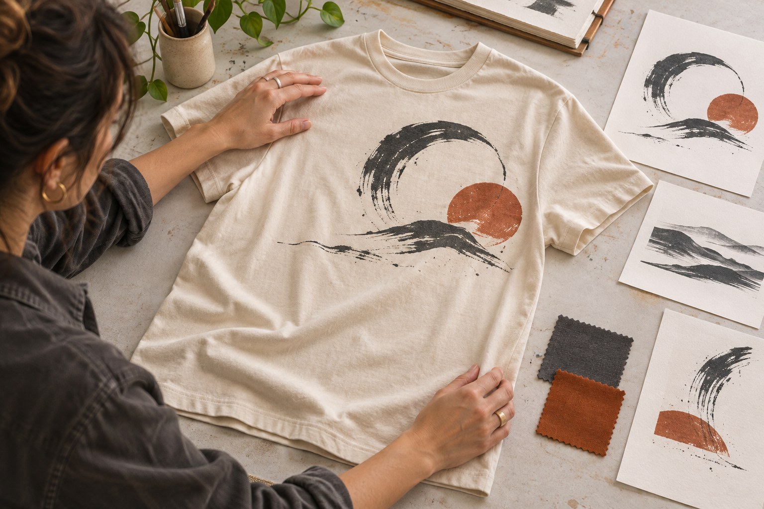
Compare the mockup with your original graphic. Look for clipped edges, unexpected proportions, stray backgrounds, and text that has become difficult to read. A realistic fold may be useful in the presentation, but it should not hide an essential part of the message in every view.
Ask for a specific decision
Give the reviewer a short question with each view: which shirt color suits the collection, whether the graphic should feel quieter, or which presentation best communicates the concept. Avoid asking for a general reaction to several unrelated alternatives at once. Record the chosen direction separately from production specifications. This keeps a preference about the mockup photograph from being mistaken for approval of the exact garment, print method, or finished color.
Present the concept honestly
Use captions that identify the images as mockups. A visualization can communicate direction, but it cannot establish the exact color, ink feel, durability, or print quality of a manufactured garment. If those qualities matter to the decision, request a physical sample from the chosen provider.
Export a small, purposeful presentation: an opening context image, a focused garment view, and the flat graphic. Add a paired color comparison only if it resolves an actual choice. Review the exported pages at a comfortable reading size rather than only as thumbnails in a folder.
Before sharing, check the current download terms on each Lettersiro freebies page and retain the source links with your project. A free mockup is most useful when it makes the design easier to understand, keeps alternatives comparable, and leaves production questions clearly documented.