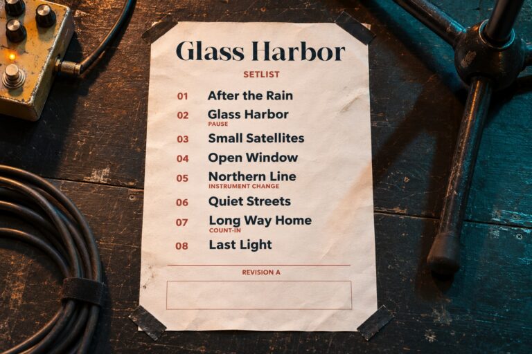
A packaging system often begins with the most flattering size: a roomy carton with plenty of space for a name, a flavor, and a decorative graphic. The difficulty appears later, when the same design must fit a compact pouch. Shrinking the entire front panel preserves proportions, but it also shrinks the information people need to read.
Build the system around roles that survive a change in size. The brand name, product description, variant, and other required content do not all need to scale at the same rate. The original studies below use Cedar Vale, a fictional pantry brand, and real Master Modern lettering for its name. The packages are shown in applied concept mockups. They are not physical print proofs or examples of a compliant food label.
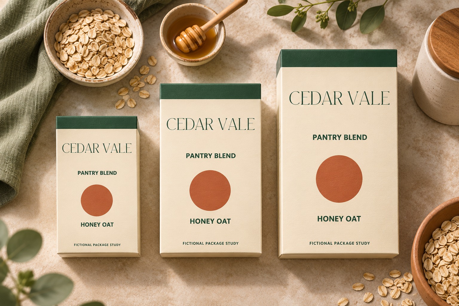
Collect the copy before drawing the largest label
Get the confirmed brand spelling, product names, variant names, quantities, and all other copy the project requires. Ask the responsible team which information belongs on the front, which can move to another panel, and what must remain together. Requirements depend on the product and market; a decorative example cannot determine them.
Use real content lengths in the working file. HONEY OAT is a different layout problem from TOASTED COCONUT AND ALMOND. Keep both in the system while designing, even if the first launch uses only the shorter phrase. A compact panel should be a design input from the beginning, not an inconvenient export request at the end.
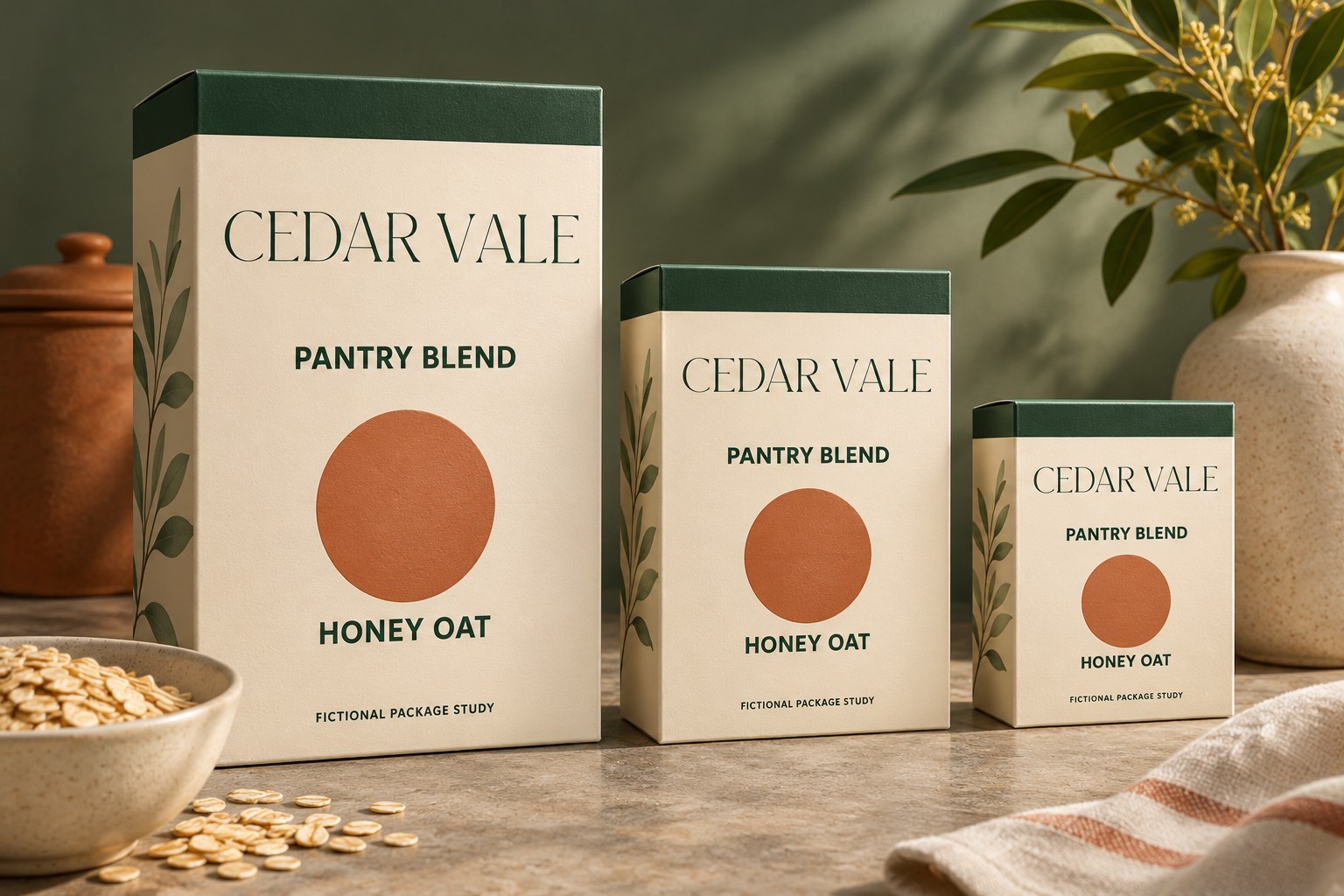
Set stable roles instead of one universal scale
Choose which relationships need to stay consistent. The name can occupy the upper area across the range, while the product description sits below it in a quieter style. Variant information can use a repeatable position and a distinguishable accent. That consistency can remain even when margins, line breaks, and the size of the name change.
Do not assume the smallest pack needs the smallest text everywhere. It may need a shorter front message, a simpler graphic, and a different arrangement. The goal is a recognizable family with usable information, rather than three miniature copies of one master image.
| Role | Keep consistent | Adapt when space changes |
|---|---|---|
| Brand name | Approved lettering and spelling | Size and surrounding space |
| Product description | Meaning and relationship to brand | Line breaks and text area |
| Variant | Naming convention and position | Accent area and wrapping |
| Supporting information | Confirmed content | Panel allocation after review |
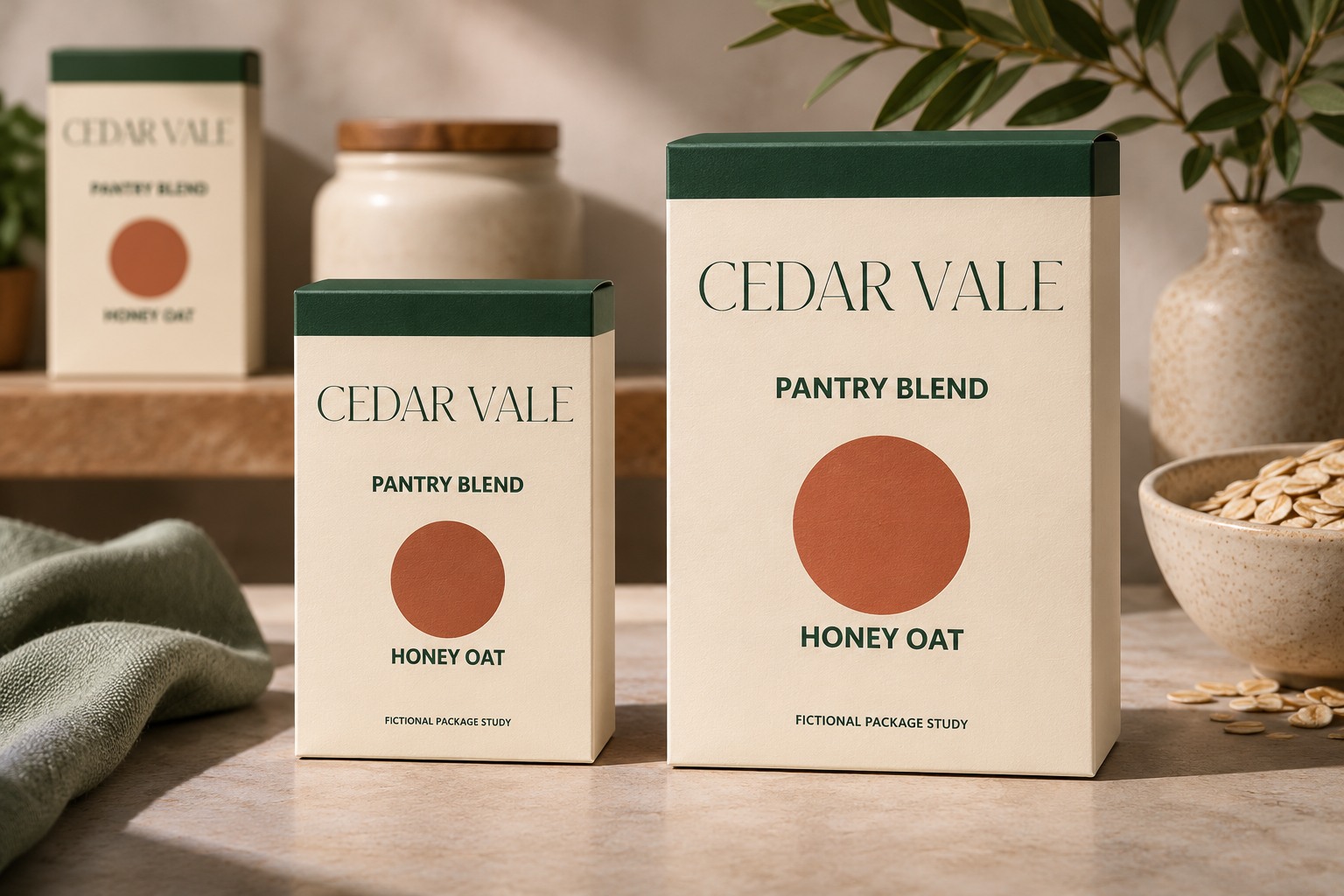
Start with the most demanding size
Build a rough version of the smallest front panel first. Place every confirmed element, then inspect what is being squeezed. If the brand graphic consumes most of the usable area, reduce its role or move a supporting element. If the variant becomes a narrow stack of isolated words, give it a wider measure or revise the arrangement.
Keep the larger pack nearby while working. It can have more space and a broader graphic without looking like a different brand. The useful question is whether someone can recognize the family and distinguish its products, not whether every edge aligns in an overlay of all three sizes.
Stress the system with longer names
Create at least one deliberately demanding variant proof. Use the actual longest confirmed phrase where available. Otherwise label a placeholder clearly and replace it before approval. Check whether the extra line pushes the quantity or other information into a crowded corner.
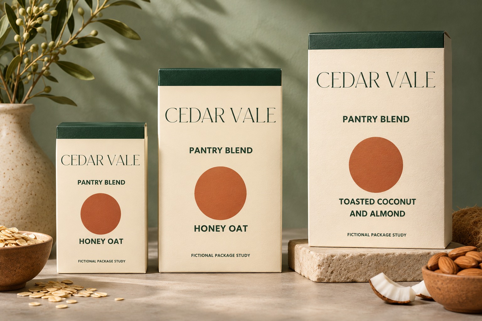
Avoid solving every exception with a smaller size. Record an alternate two-line arrangement, a wider variant zone, or a controlled reduction within the system. A consistent exception rule is easier to maintain than a collection of unexplained local adjustments.
Review artwork at its intended dimensions
Large on-screen mockups can hide weak information hierarchy. Print a draft at the intended dimensions, trim or fold a non-production sample if appropriate, and inspect the relevant panels together. Check seams, curves, folds, and the usable area supplied by the packaging vendor. A front-facing rectangle does not show what happens around a pouch edge.
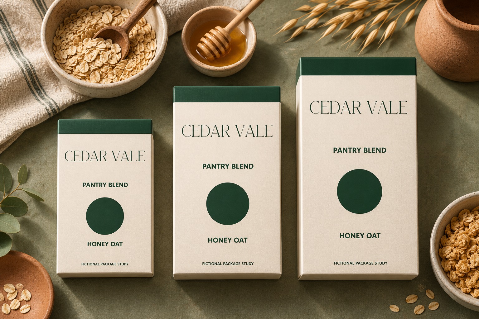
The one-color illustration below helps inspect relationships without relying on the full palette. It cannot predict ink behavior, substrate color, finishing, or production tolerances. Those questions need the supplier's specifications and an appropriate proof.
Hand off a system the next designer can use
Keep separate editable files or clearly labeled artboards for the three sizes. Name the approved dieline version, the copy revision, and the export purpose. Store the original text alongside any outlined production artwork so future changes do not require reconstructing the type.
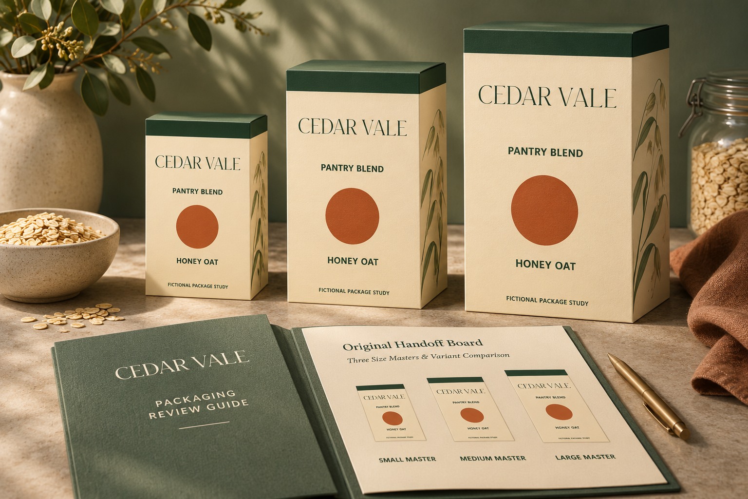
Use Adobe's Illustrator export guide when preparing the requested file formats, and follow the actual supplier's instructions for the job. Explore Master Modern for the brand role and confirm the appropriate font license. A well-adapted family gives each package enough room to communicate while keeping the range recognizably connected.