A client team rarely needs to memorize a type specimen. It needs to know which style to use for a headline, how to handle a longer title, and where to find the approved files. A one-page typography guide works when it answers those recurring decisions with examples the team can recognize.
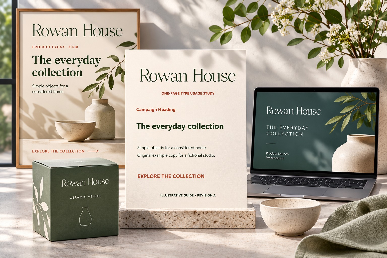
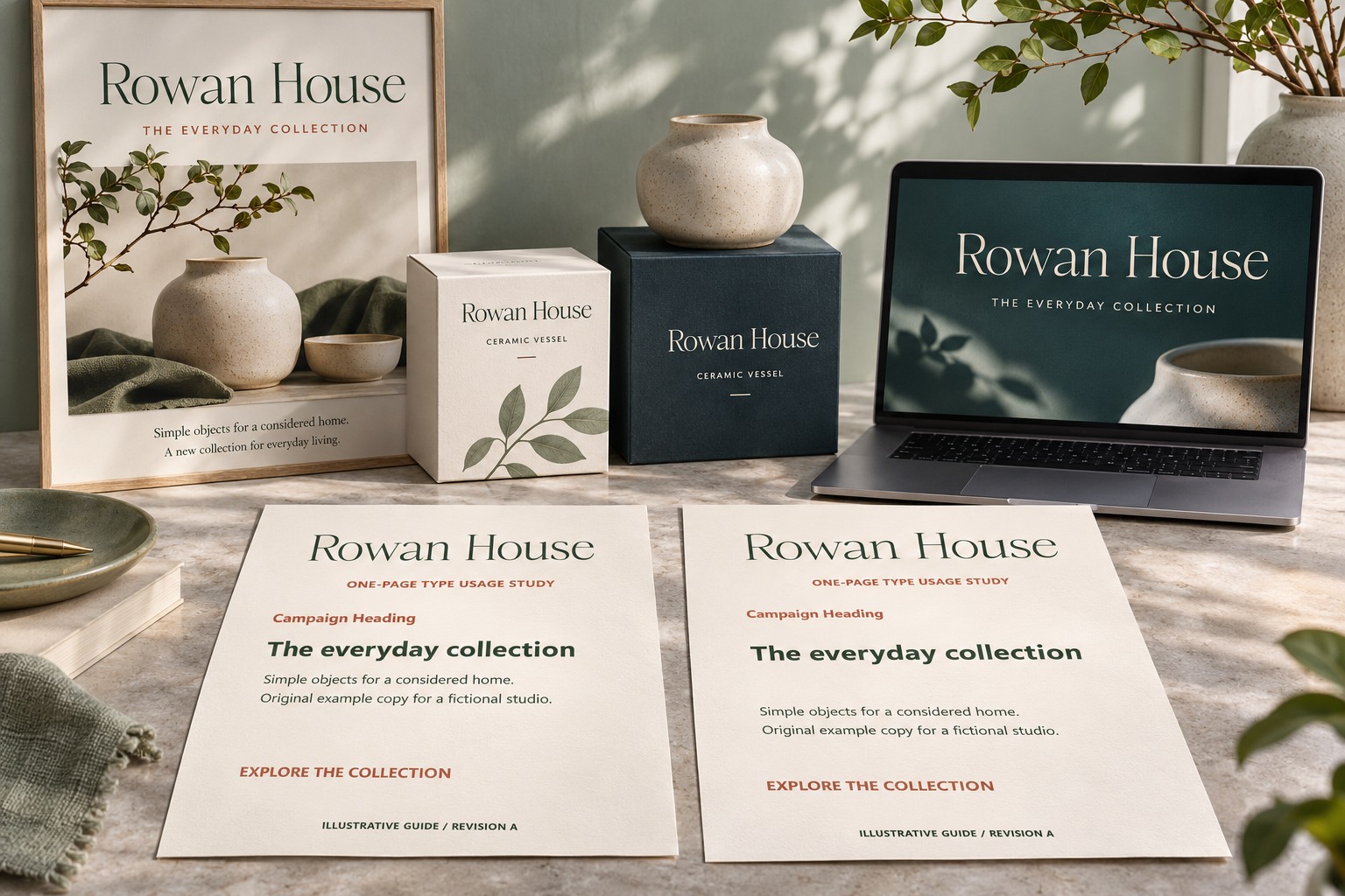
Keep the guide narrow enough to use while making something. It should show the normal case, one demanding case, and the route to more detailed instructions. This article builds an original guide for Rowan House, a fictional homeware studio. Its expressive name uses actual Romans Branding lettering. The illustrations show a proposed design system, not a guide delivered to a real client.
Begin with the team's recurring outputs
Ask what the team actually produces: product announcements, social posts, price lists, event notices, or presentations. Choose examples from those jobs. A guide filled with fashion headlines may be attractive but unhelpful to a team that spends its week updating workshop schedules.
For Rowan House, the recurring output is a small product announcement. The guide therefore includes a product name, a short explanation, and a practical action line. The brand name has a distinctive role, while the rest of the content follows a quieter hierarchy. That relationship is more useful than a list of unrelated font sizes.
Give styles names that describe their purpose
Use names such as Brand Name, Campaign Heading, Supporting Copy, and Details. If a software library also has technical style names, show the mapping clearly. A person choosing a style should understand what it does without interpreting a designer's private abbreviation.
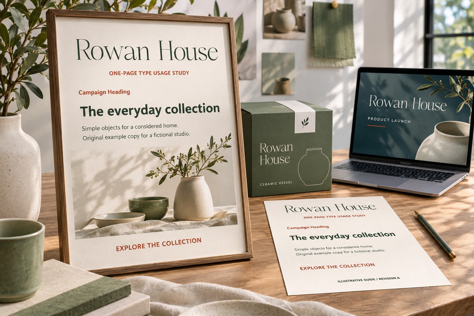
Include the actual family and style names from the supplied files. A marketing product name and an application's family menu can differ. If a file needs a specific style or feature, explain that requirement and provide an approved example. Do not ask a client to reproduce an effect by guessing which font looks closest.
Show complete text instead of isolated numbers
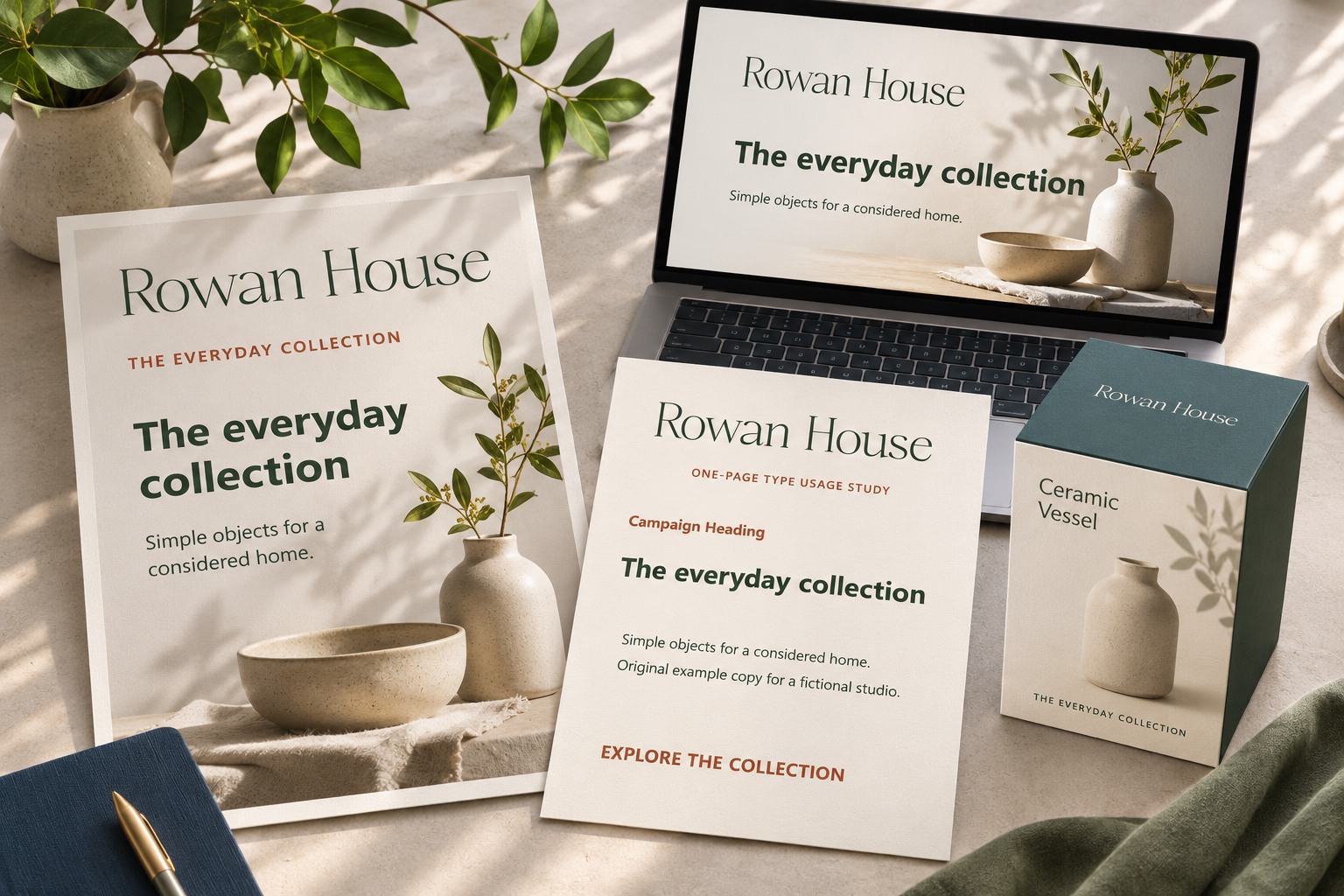
A size value alone does not explain hierarchy. Place the headline above a realistic supporting paragraph and a details line. Show the available width and the intended line breaks. Include enough content to reveal the difference between a spacious example and an ordinary working announcement.
If the team uses a design application, save styles there as well as documenting them. Figma's text-style guide explains how to create and apply reusable text styles. The one-page guide should explain the communication role of each style; the application library should carry the precise settings needed for that workflow.
Include a useful long-title exception
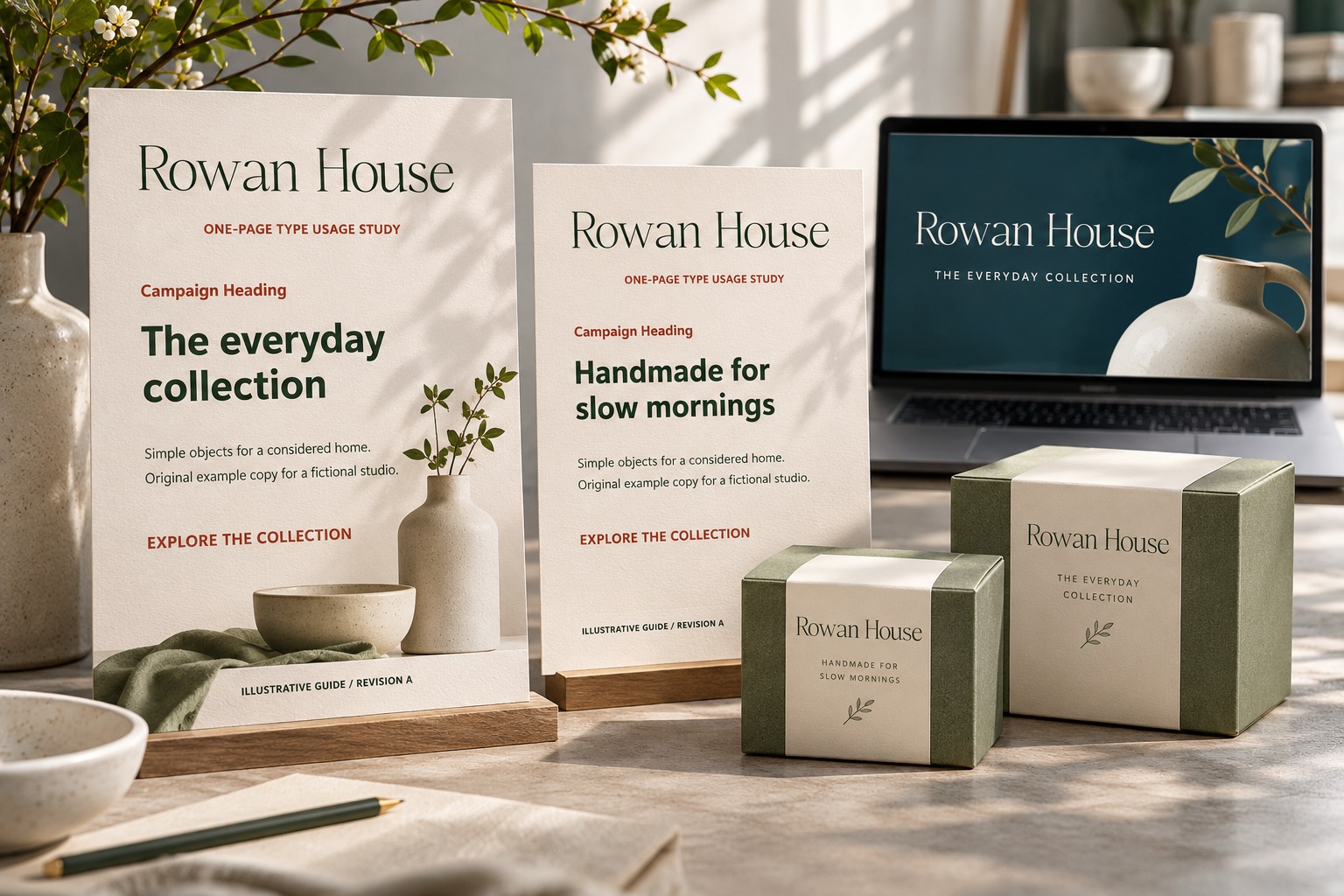
Write one longer title that could plausibly occur in the team's work. Show how it wraps and which relationships remain stable. The answer might be a two-line heading, a slightly wider text area, or a documented alternate arrangement. It should not be an instruction to keep shrinking until the title fits.
Keep the rule specific. “Use the two-line arrangement for a longer product name” is easier to apply than “make it look balanced.” If the team must seek review beyond a certain case, identify the person or role responsible. A simple escalation route is more useful than pretending one page can cover every future campaign.
Explain spacing through relationships
Show space around the name, space between the heading and body, and the margin between the content and the edge. Mark the relationships that should feel consistent. If exact measurements are part of the template, store them there and explain when the template changes for a different format.
Avoid filling the guide with arbitrary prohibition symbols. Show one crowded example beside the preferred arrangement and explain the consequence: the details become difficult to separate from the headline, or the brand name loses its surrounding space. A reason helps the team adapt when a new format appears.
Add the file and approval information
Reserve a small footer for the guide version, the location of editable templates, approved exports, and the review contact. State which files are for editing and which are for placement. Keep font licensing and asset access connected to the actual team workflow rather than assuming everyone can share an installed font file freely.
| Include | Why it helps |
|---|---|
| Role examples | Shows what to choose for a real task |
| Family and style names | Helps locate the correct installed font |
| Long-title arrangement | Prevents improvised shrinking |
| Template location | Connects the guide to editable work |
| Version and review contact | Makes later changes traceable |
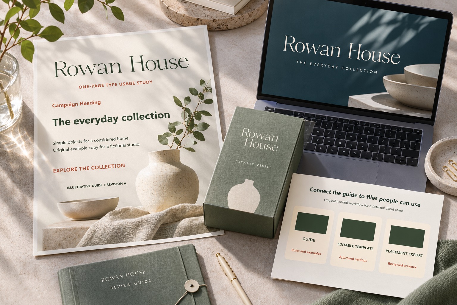
Try the brand wording in the Lettersiro Logo Tester, inspect Romans Branding, and confirm the license for the people and uses involved. Before handing over the guide, ask someone unfamiliar with the design to make one ordinary announcement from it. Record the questions they ask and revise the page around those gaps. A compact guide earns its space by helping the next person make a consistent decision.