The difference between a font and typeface is that the two terms are often tossed around interchangeably. While most people use them as synonyms, especially in casual conversations, they actually refer to two different, yet closely related concepts. Let’s break this down further!
Key Takeaway
- Complete information concerning the differences of a typeface and a font.
- A typeface is essentially a family of fonts with its particular artistic design.
- A font is the scalable variation of a typeface
A History Behind the Difference Between A Font and Typeface
The distinction between font and typeface originates from the history of printing and typography, dating back to the invention of the printing press in the 15th century. Then, the confusion gets worse in the modern era.
The history of fonts and typefaces is deeply intertwined with the evolution of writing systems, printing technologies, and cultural shifts. To answer what’s the difference between font and typeface, here is a bit summary of the typography history.
Also Read: What Does the Future of Typography Look Like? Here Are the Predictions
Eras of the Firsts
Long story short, text has been around even from ancient civilizations. The Phaistos Disc (1800 BC) and Phoenician Alphabet (1200 BC) lay the foundation of modern written communication. Until the first standard, thanks to Medieval innovation, the Caroline Minuscule (732) that introduced lowercase and uppercase letters.
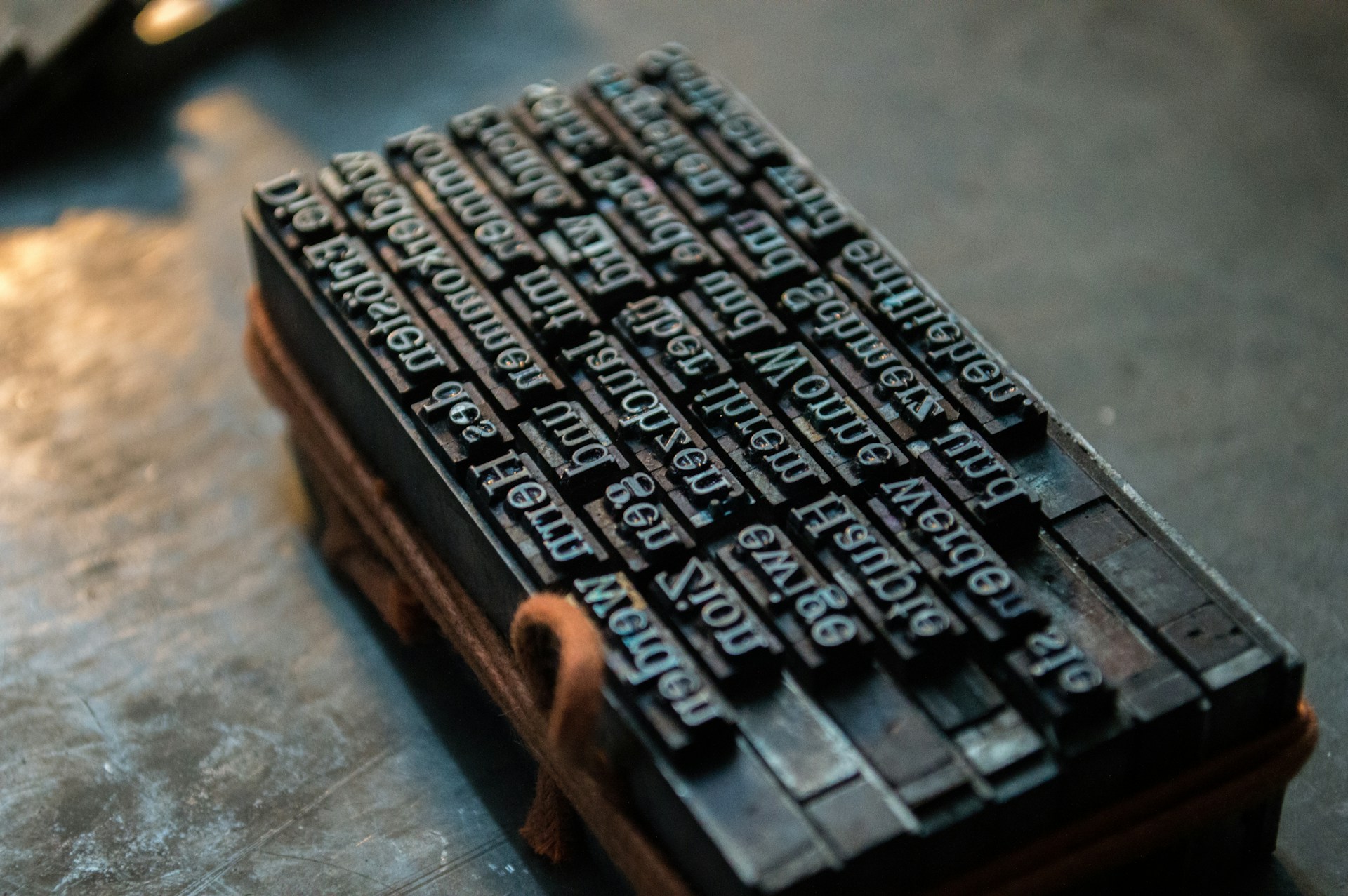
Gutenberg’s Printing Press (1440) enabled mass text production, replacing the labor-intensive handwritten manuscripts with metal type molds. Each mold represents a specific letter or symbol, forming what was historically referred to as a font (from the Old French word “fondre”, meaning melt). So, font is just one specific letter or symbol.
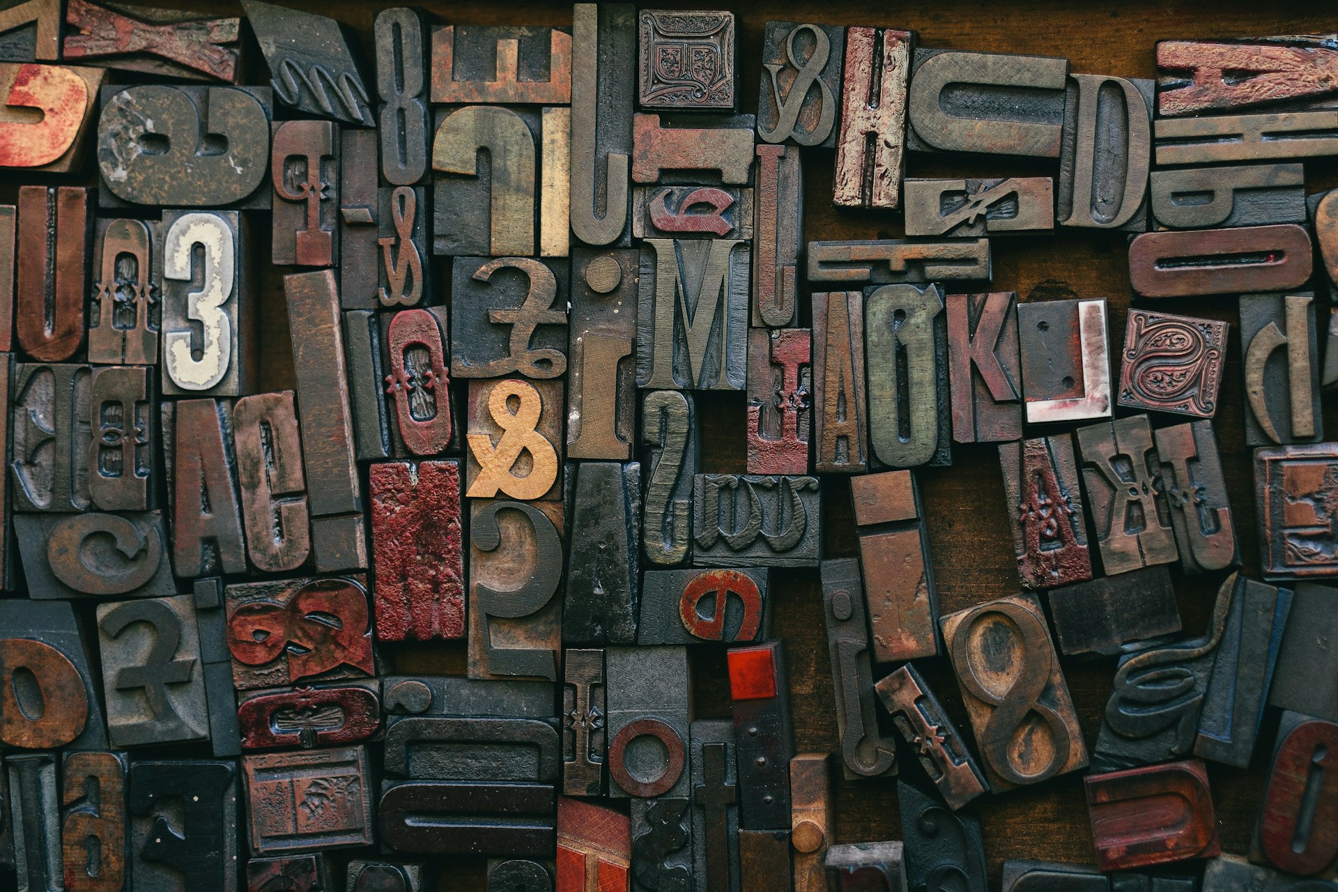
Around the year 1455, printers began to spread, and Europeans started developing new typefaces, namely the Gothic and transitional Roman styles. In 1490, Claude Garamond designed the first printing typeface that did not imitate handwriting but used geometric principles. So, a typeface is a collection of fonts.
As time passed, Aldus Manutius introduced the Italic typefaces (1500). In the 18th and 19th centuries, John Baskerville introduced high-contrast strokes with sharper serifs, while ultra-thin strokes known as the hairlines by Firmin Didot and Gianbattista Bodoni also gained popularity around the time.
The Digital Age that Blurred the Difference Between A Font and Typeface
The advent of digital typesetting and computer software in the 1980s blurred the lines between typefaces and fonts. Programs like Microsoft Word introduced “Font Menus,” where users actually select typefaces. With the lack of understanding of their historical distinction, this shift contributes to widespread confusion between the two terms.
Although the digital age created a fundamental misconception, the 20th century also brought profound changes with digital technology. Adobe developed PostScript Fonts in 1985, enabling scalable mathematical representations of typefaces rather than pixel-based definitions, which single-handedly revolutionized “font” design and usage.
TrueType Fonts (1989) from Apple and Microsoft democratized font creation and accessibility. Jointly developed by Adobe and Microsoft, the OpenType Format is a cross-platform font.
Also Read: Accessible Fonts for Dyslexia: How Typography Can Alter Reading
The Difference Between Typefaces and Fonts Now
With the continued development of typeface styles, usage, and technologies, we’ve arrived at a slight shift in discerning font and typeface. Here is the correct understanding now.
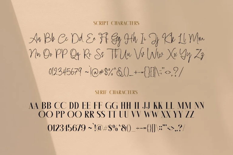
Typeface

A typeface refers to the design of a set of characters, including letters, numbers, and symbols that share a consistent visual style, pretty much still the same throughout history. It’s the aesthetic personality that gives words their unique look and feel. Essentially, the family name of a particular style of lettering.
Font
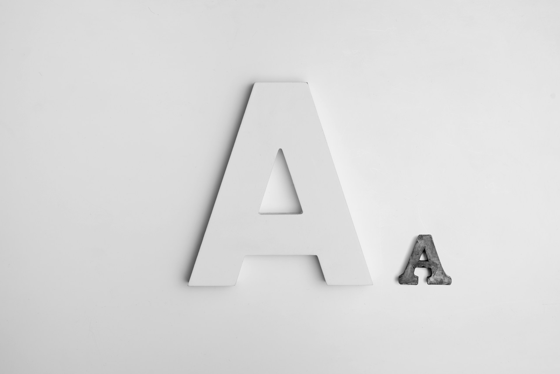
A font, on the other hand, refers to a specific instance or variation within a typeface. It includes details like size, weight, style, and other attributes. Each size and style variation of a typeface was a separate font. For example:
- Typeface: Helvetica.
- Font: Helvetica Regular 12 pt italic, or Helvetica Bold 14 pt.
There is a notable shift from traditional printing and digital typography, where in traditional printing, fonts were physical metal blocks representing specific characters at a particular size and style. Whereas in digital typography, fonts are scalable files that allow users to manipulate typefaces into various forms.
Also Read: 10 Common Typography Mistakes Every Designer Should Know
Glyph
Another layer of terminology emerges because of this shift. An individual character, symbol, or letter within a font is called a Glyph now. The block of metal in the past that represents a letter or symbol is now (digitally) called a glyph.
Common Misconceptions
Within the digital age today, most people use font to mean typeface, especially in casual settings. Most popular software like Word, Docs, and Canva also label their typeface selection as “font”, which further amplifies the arbitrary meaning.
While there is a distinct difference between a font and typeface, this usage is so widespread that it’s accepted in everyday conversation. However, if you’re delving deep into professional design and typography, it’s still the best practice to understand and use the correct terminology.
Also Read: Hierarchy of Typography: How to Make Fonts Speak
Understanding the Difference Between a Font and Typeface Matters
Grasping this distinction is about understanding how design works at a fundamental level. Fonts and typefaces shape everything from brand identity to readability and user experience. When you can confidently distinguish the two, you can communicate more clearly, choose more effectively, and design more intentionally.
It’s a small detail, but with our high-quality typeface, that smallest detail often makes the biggest impact on your projects. Here at LetterSiro, you can choose from our vast typeface collection that’ll fit your artistic design.