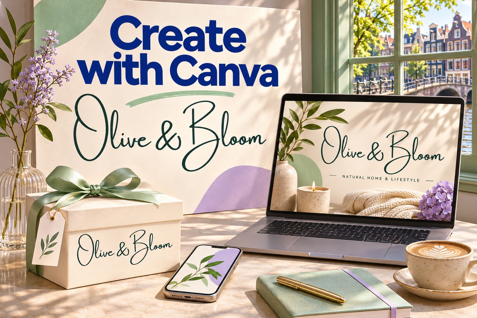
Canva makes a good idea feel possible. A small business can introduce a new collection, a teacher can turn a lesson into a visual story, and a creator can give a campaign a recognizable style. The appeal is easy to understand: you can start with something tangible, make decisions on the page, and see the design take shape.
Typography gives that convenience its personality. The Amsterdam font family by Lettersiro is a popular script choice among Canva creators, bringing a handwritten signature character to names, invitations, brand graphics, and social content. Its expressive lines offer a useful example of how an accessible design tool and a distinctive typeface can work together.
Here is why Canva deserves the enthusiasm—and how to give your next design a more personal voice with Amsterdam. The product and screen scenes below are original illustrative concept mockups; the separate Amsterdam One specimen uses the actual Lettersiro font file.
Why Canva is such a compelling creative tool
A starting point that helps ideas move
The hardest part of a project is often turning a vague intention into a first composition. Canva gives you layouts to react to. You can change the wording, replace an image, try a different color, and quickly see whether the direction fits your message. That visible feedback makes experimenting feel approachable.
Its design creation library spans presentations, social graphics, business cards, posters, and other formats. For a small brand, that breadth is useful: a launch can have several connected pieces rather than a single isolated post. A template becomes more valuable when you bring your own message, photographs, and typographic decisions to it.
A place to develop ideas together
Canva also supports the conversation around a design. Its sharing controls let you give people viewing, commenting, or editing access. A clear review question—such as whether the offer is obvious—can turn a vague round of feedback into a useful next revision.
Early ideas have a home too. Canva Whiteboards provide space for brainstorming and planning. A team can explore the mood, audience, and message before committing to a polished page. That link between thinking and making is part of what makes the platform appealing.
Consistency that can grow with a brand
A strong identity gains recognition through repetition. Canva’s Brand Kits organize brand assets such as logos, colors, and fonts. Availability and controls depend on the account and plan, but the design principle is useful to everyone: decide which elements stay consistent before producing more content.
For example, a signature name, an earthy green, a warm paper color, and a quiet supporting typeface can become a small visual vocabulary. Reusing those decisions gives a product card, an invitation, and a campaign graphic a shared character. Canva is especially enjoyable when each new piece feels like part of a growing collection.
Amsterdam in Canva: a popular script with a recognizable character
Amsterdam’s visibility in the Canva community has a clear editorial trail. Creator guide Market With Miranda describes Amsterdam as a widely used Canva script and discusses its One, Two, Three, and Four variations. Canva’s own handwriting font guide features Amsterdam Four and highlights its signature-like character.
These recommendations support describing Amsterdam as a popular choice among Canva creators. They do not establish a platform-wide usage ranking. Its real appeal is visible in the design: an expressive name can give a simple composition warmth, movement, and a sense of authorship.
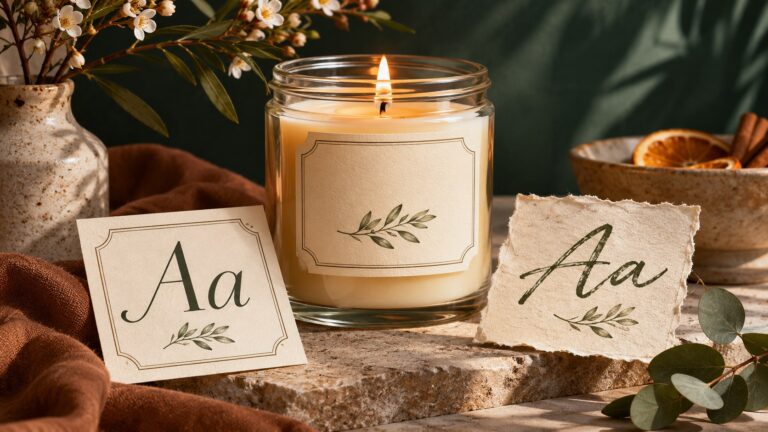
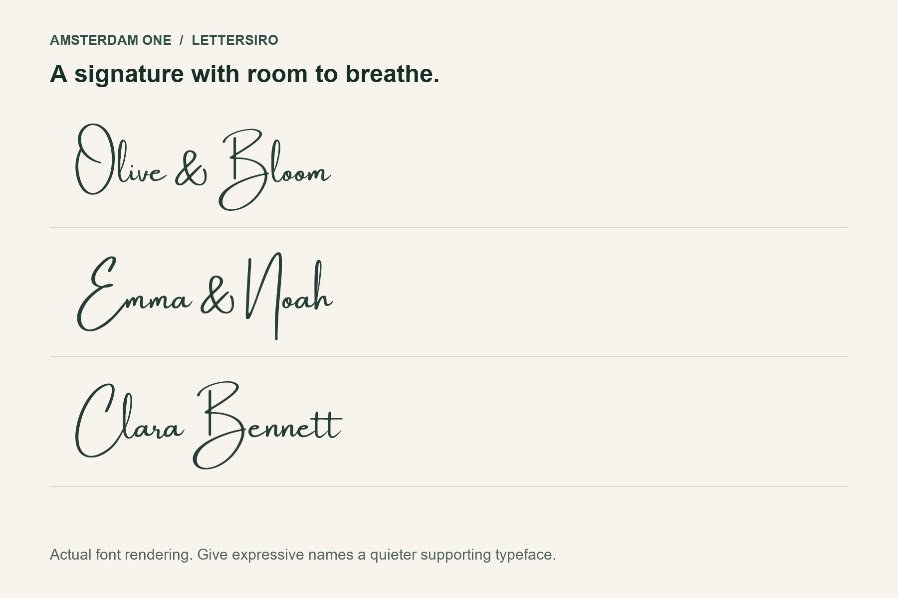
The Amsterdam collection from Lettersiro offers eight signature styles. In the Amsterdam One examples here, large initials, long strokes, and flowing connections give short names a distinctive silhouette. Compare the actual words you need, because the balance of one name can differ substantially from another.
Five ways to turn Amsterdam lettering into a finished design
1. Give a product brand a personal signature
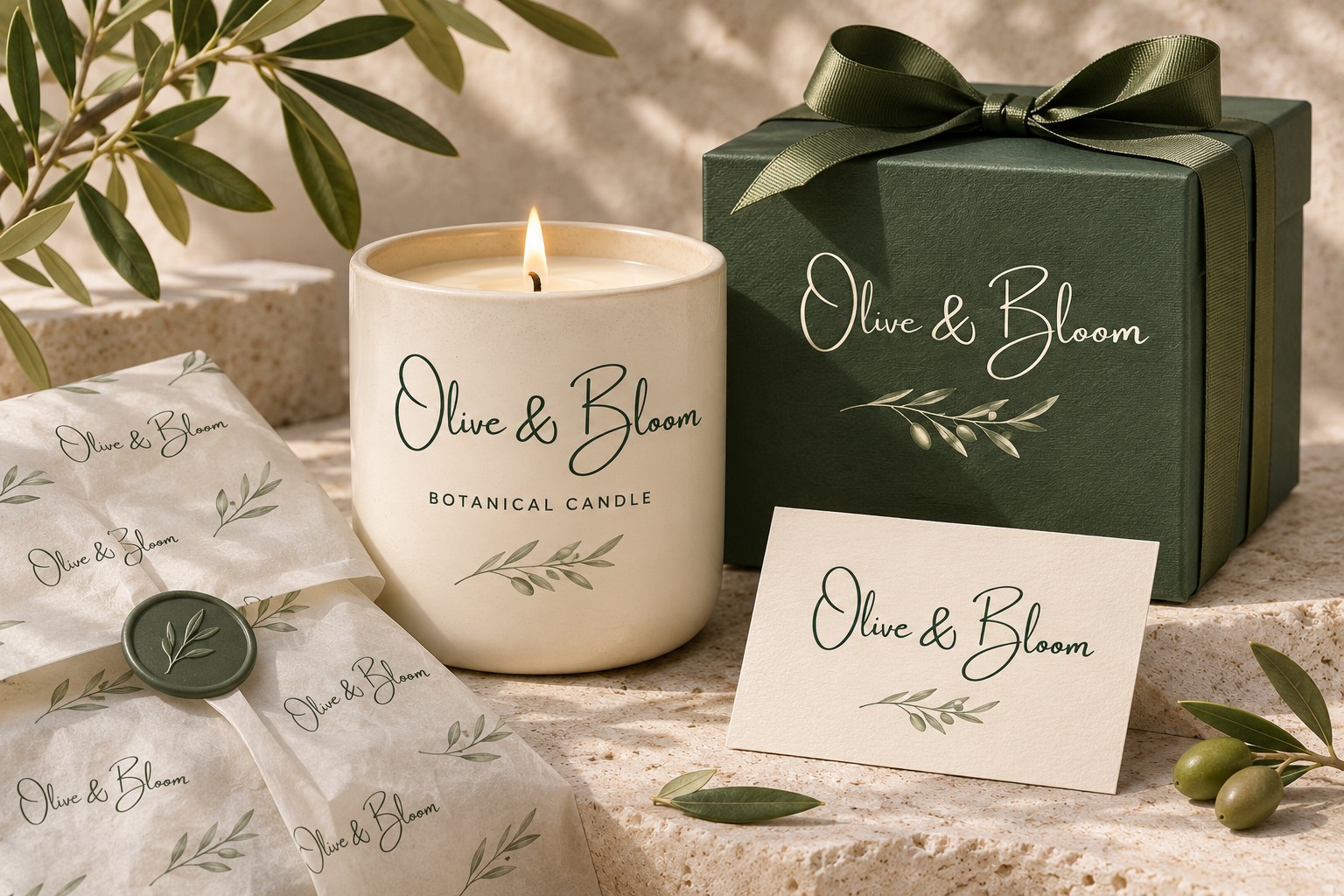
In the Olive & Bloom concept, the name carries the personality while the product descriptor stays clear and restrained. The same lettering moves from a candle to a gift box and a small card. The arrangement changes with the surface; the identity remains familiar.
Try this approach in Canva by giving your name its own text box and keeping product information separate. A short signature works best when it has enough room around the tallest and longest strokes. Add decoration only where it supports the reading order.
2. Make wedding stationery feel connected
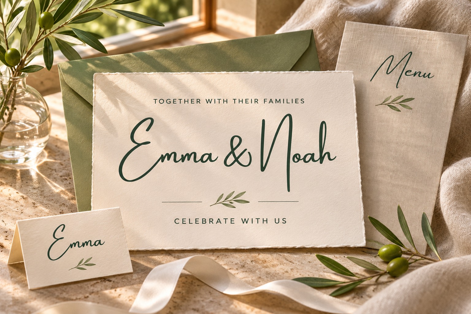
Wedding names invite expressive lettering. Amsterdam can provide the emotional center of an invitation, with a simpler face handling practical details. The Emma & Noah concept extends that feeling to a place card and coordinating stationery.
Start with the longest names in the event, then review the invitation at its intended size. Leave room for dates, venue details, and response information in your real version. A beautiful heading becomes more effective when guests can also find what they need quickly.
3. Create a social campaign with a consistent voice
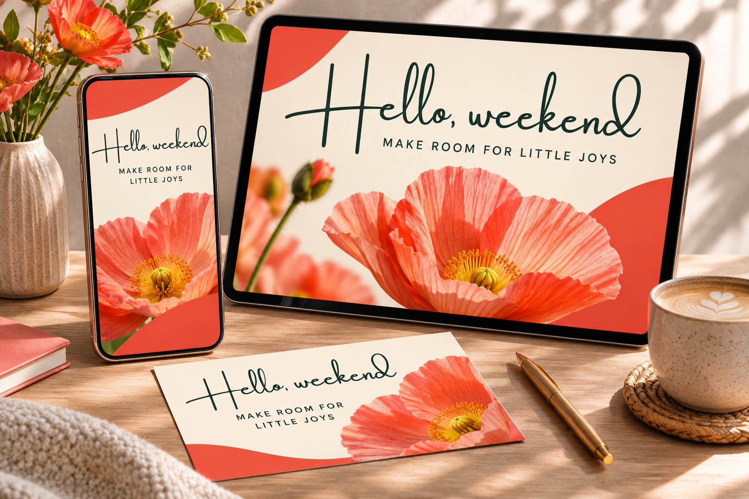
A phrase such as “Hello, weekend” can become the recognizable thread through a campaign. The mockup below pairs expressive lettering with a flower photograph, a coral accent, and a clean supporting line. The portrait and landscape versions keep the same personality while using the available space differently.
When adapting your Canva design, review each format as a composition of its own. Adjust the crop, line breaks, and spacing together. Open the result on a phone and check the smallest important words before publishing.
4. Build warmth into a café identity
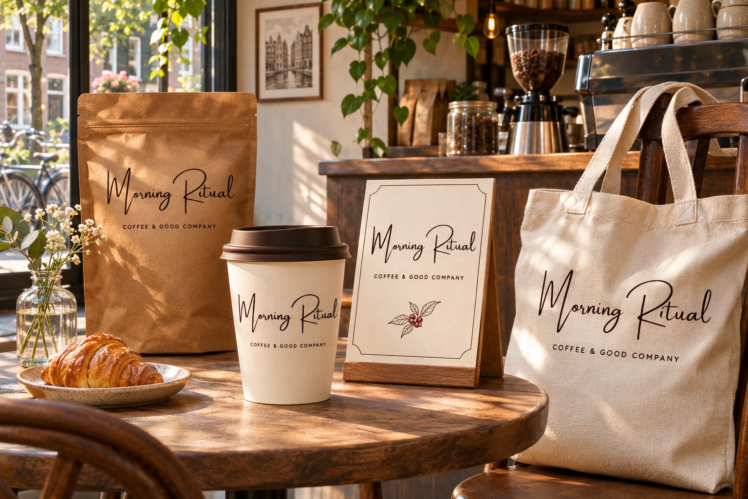
A café brand appears in people’s daily routines: the cup they carry, the pouch they take home, the sign on the counter. In the Morning Ritual concept, one signature connects those touchpoints and a quiet descriptor explains the offer.
Use Canva to explore the visual relationship between these pieces, then check the production artwork against your supplier’s actual dimensions. The curve of a cup, the fold of a bag, and the texture of fabric each introduce a different constraint. The mockup helps you imagine the identity; a physical proof helps you approve it.
5. Bring personality to a business presentation
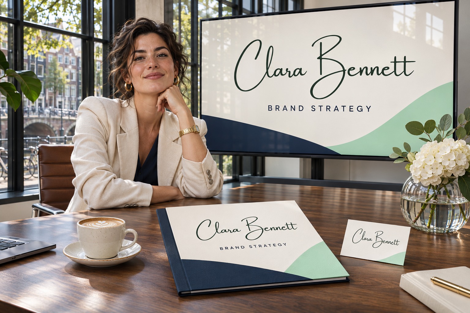
A personal brand can use Amsterdam for the name on a presentation cover, proposal folder, and business card. The Clara Bennett concept pairs that signature with a structured layout and a clear service description. It feels expressive while giving the business information a stable place.
Keep the script for moments where personality matters most. Use a comfortable text face for proposals, slide explanations, contact details, and other longer reading. For a stronger and heavier lettering direction, explore our guide to bold script fonts for corporate branding.
A practical workflow for using Amsterdam in Canva
- Define the message. Write the one thing the reader should remember before choosing a template.
- Choose a suitable format. Consider where the design will appear and how much text it needs to carry.
- Search the font menu for Amsterdam. Compare the styles available in your current Canva account using your real wording.
- Assign clear type roles. Let the script introduce the name or short phrase; give supporting information a simpler treatment.
- Protect the letterforms. Check joins, long strokes, punctuation, and the gap between words. Review any spacing change on the complete phrase.
- Make a small family of designs. Build a main composition and a compact version, then compare them side by side.
- Review the exported result. Check image quality, spelling, crop, and readability at the size your audience will actually see.
You can also compare a name in the Lettersiro Logo Tester before developing the full composition. That first focused check can reveal whether an elegant initial or long finishing stroke needs more room than your chosen layout provides.
Small decisions that make a Canva design feel more polished
Give the eye a clear first stop. A name, offer, photograph, and call to action should have a deliberate order. If every element competes at the same volume, simplify the hierarchy before adding another effect.
Use a calm surface behind fine lettering. A detailed photograph can obscure delicate strokes. Try a quieter crop, a solid panel, or more separation between image and text. Judge contrast on the actual exported design.
Let the words guide the layout. A short brand name and a long wedding name have different needs. Test the complete phrase early, including ampersands and accented characters. Keeping a consistent style becomes easier when the layout has room for real content.
Save the decisions you want to repeat. Record your chosen colors, font roles, and spacing approach. A small, understandable system is easier to maintain as your content grows.
Common questions about Canva and Amsterdam fonts
Is Amsterdam one of the most-used fonts on Canva?
Amsterdam is a widely recommended script choice in the Canva community, and Amsterdam Four appears in Canva’s own handwriting guide. The sources reviewed for this article do not provide platform-wide font usage totals, so a numerical “most-used” ranking cannot be confirmed.
Which Amsterdam style should I choose?
Start with your actual name or headline and compare the available styles. Look at the initials, word spacing, long strokes, and overall shape. This article’s native specimen uses Amsterdam One; Canva’s cited handwriting guide features Amsterdam Four.
Can I use the same look outside Canva?
Explore the Amsterdam family on Lettersiro for work in other design applications. Check Canva’s current content licensing guidance for designs made with its library, and the Lettersiro license information for separately licensed font files and your intended use. Editable templates and delivered font files deserve particular attention.
Does using a popular font make my design distinctive?
The font is one ingredient. Your wording, original imagery, color choices, spacing, and composition shape the result. A familiar script can still support an individual identity when those decisions reflect the project.
Make your next idea feel like your own
Canva’s appeal comes from how readily it invites you to begin. Amsterdam adds a personal gesture that can carry through the work, from a first social graphic to a carefully considered brand presentation.
Choose one real project, write its actual name, and try a few compositions. Give the lettering room, make the supporting information clear, and look for the version that feels right for the people you want to reach. Explore Amsterdam by Lettersiro and turn that first promising idea into a recognizable design.