
A setlist is a working document used during a performance. Its design should help musicians find the next song, notice an important cue, and recover their place quickly. A dramatic band heading can establish identity, but it should not compete with the sequence of songs beneath it. The most useful revision is often a clearer sequence or a better position for a cue, rather than an additional decorative effect.
The examples use Glass Harbor, a fictional band, and an invented song list. The mockups use supplied heading artwork rendered from Brienny, while the songs use a quieter information style. The AI-generated scenes illustrate applications on stage, in rehearsal, and on devices; they do not document a real performance test.
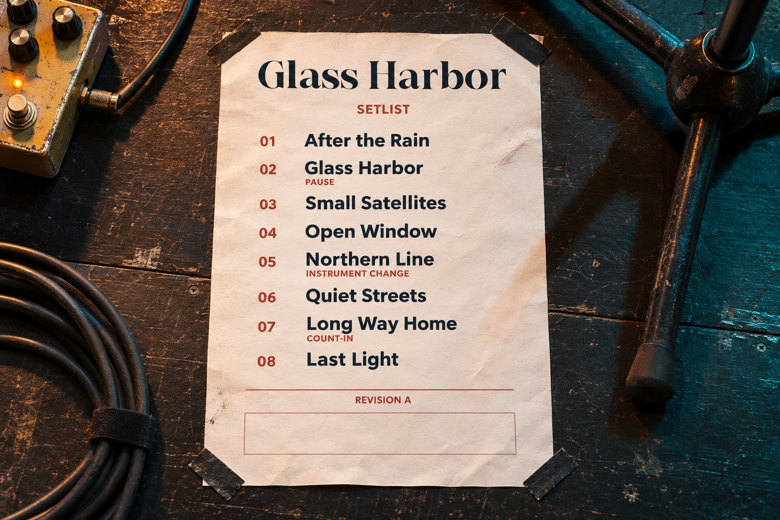
Start with the performance sequence
Get the running order from the musicians before polishing the document. Confirm which songs need a count-in, an instrument change, a transition, or another cue. Determine whether an encore belongs on the same sheet or in its own clearly separated area. A layout cannot compensate for an unconfirmed sequence.
Keep the main column predictable. Numbering can help the band discuss a change, but the number should not become more prominent than the song title. If the performer recognizes the sequence by titles, those titles should be the easiest elements to locate.
For the example, each song occupies its own row. Notes stay near the song they describe, but their placement and tone distinguish them from the title. A musician scanning the page should not need to read a paragraph to identify the next entry.
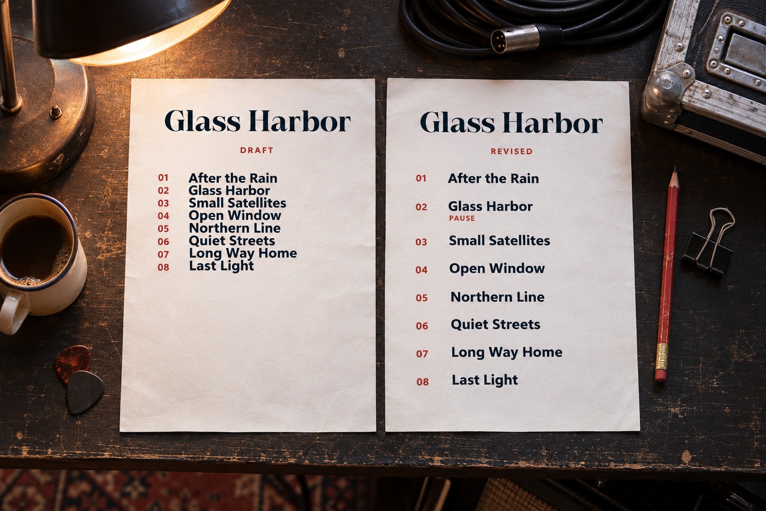
Separate identity, song titles, and cues
Concentrate the band's expressive font in the heading. A distinctive header can connect the setlist to the artist's other materials without turning every song name into display lettering. Choose a simpler treatment for the repeated information that the performers will scan throughout the show.
Give cues a stable visual role. A short instruction such as a count-in or a pause can sit in a secondary position beside its song. Use text or a clear symbol as well as color when a cue matters. Lighting, printing, and a monochrome copy can change the usefulness of a color distinction.
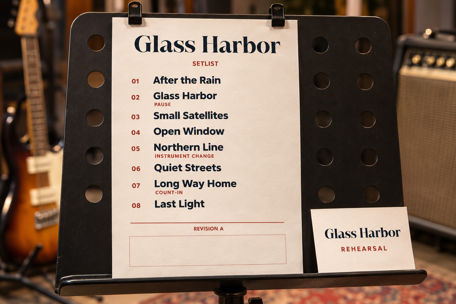
Do not fill every available gap with a note. Ask whether the information belongs on the performance sheet or in a separate rehearsal document. The version needed for detailed practice can be more extensive than the version someone uses to find the next song on stage.
Proof the page where it will be used
Choose the physical page size and placement with the band. A sheet taped to the floor, a music stand, and a tablet create different viewing relationships. Export a sample and evaluate it at the intended size rather than relying on a large editor preview.
Check the layout under the relevant lighting conditions. The light and dark examples here are visual alternatives, not a measurement of stage visibility. A real rehearsal can reveal glare, shadows, or contrast problems that an illustration cannot reproduce. Have the people using the document assess that proof.
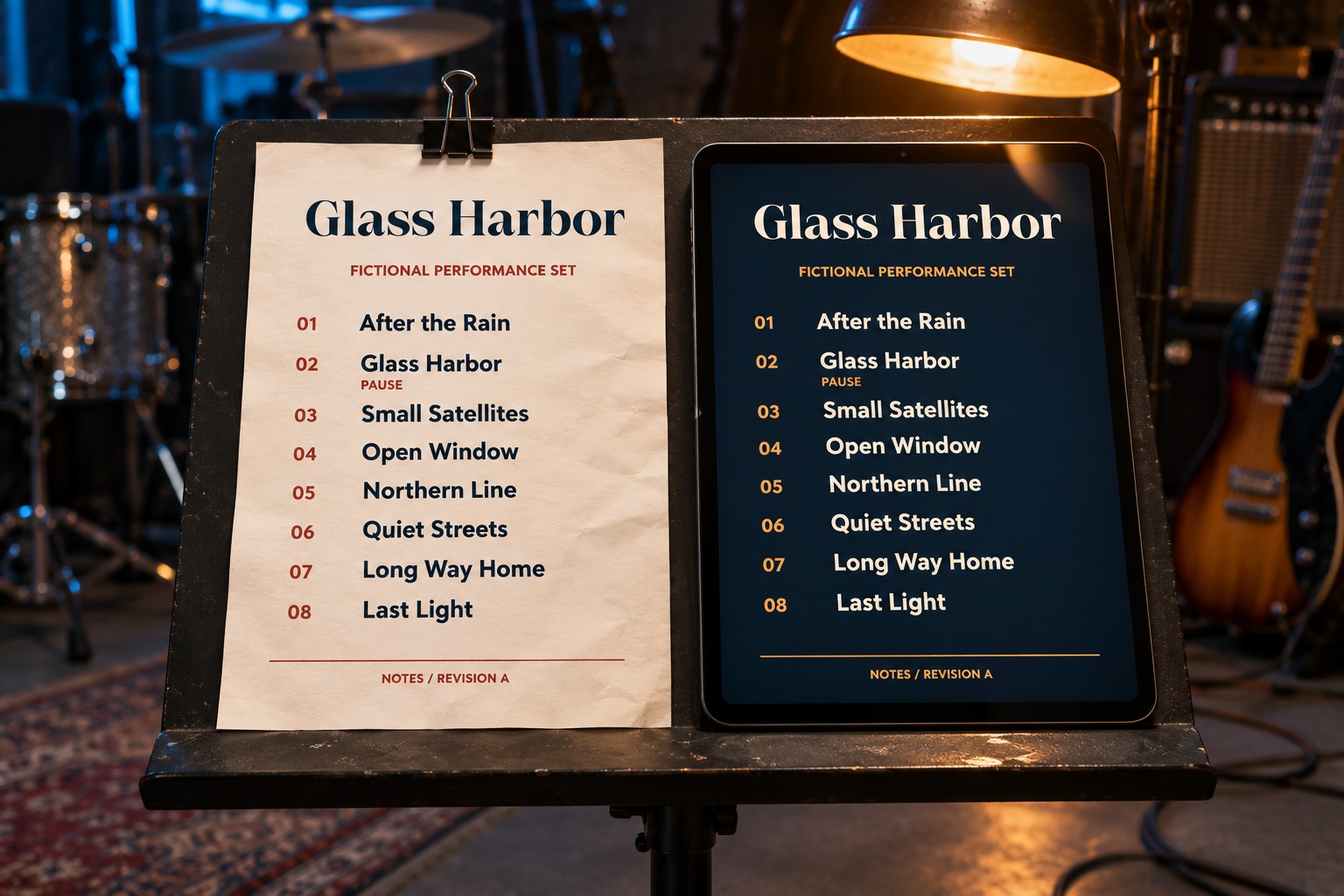
Leave a useful place for last-minute changes
Build enough room for a longer song title and an extra instruction. If the band frequently changes the order, keep a clear revision label on the working copy. Circulate one approved running order so different musicians do not arrive with conflicting versions.
Decide how additions will be marked. A handwritten insertion needs space between the existing rows. A digitally revised copy needs a recognizable date or version. These decisions should be made before the sheet is printed in quantity.
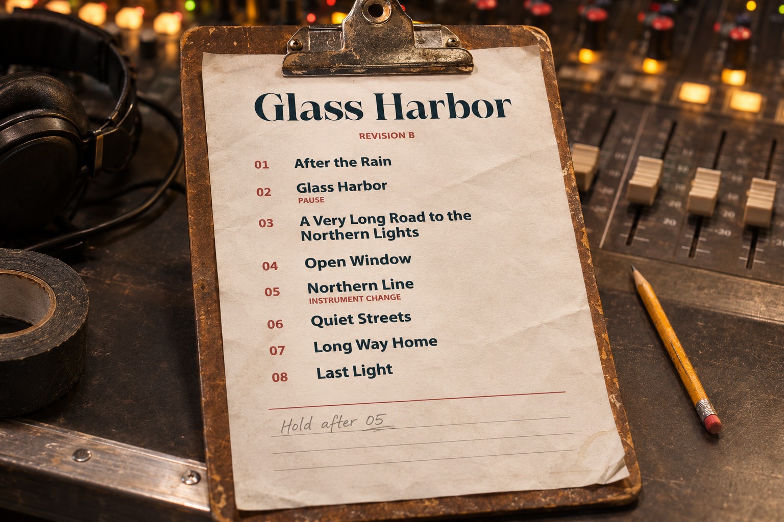
Prepare the print and compact versions separately
A phone preview can be useful when sharing the sequence, but it does not replace the print proof. Adapt the hierarchy to the smaller screen. A single-column list often remains more predictable than shrinking a complex two-column page until everything fits.
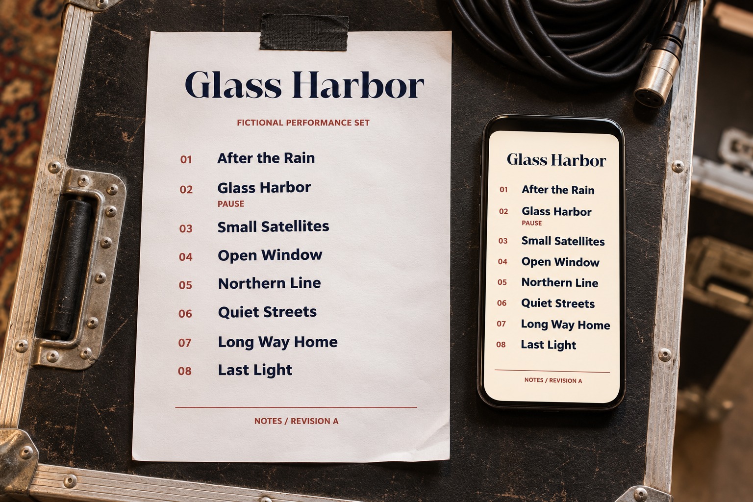
Compare the exported versions with the confirmed running order. Check song spelling, cue placement, version labels, and the treatment of any encore. Keep an editable source so the band can change the sequence without rebuilding the entire design.
Explore Brienny if its character fits the artist's heading, or compare other options in the Lettersiro catalog. The Logo Tester can help examine the band's actual name. Match the font's role to the job, review the license terms, and let the musicians' reading needs determine the final page.