A game logo invites someone into a world. A menu label helps them do something inside it. Giving those two elements the same typographic treatment can make a striking title screen feel awkward as soon as the player needs to choose an option, read a name, or understand a changing value.
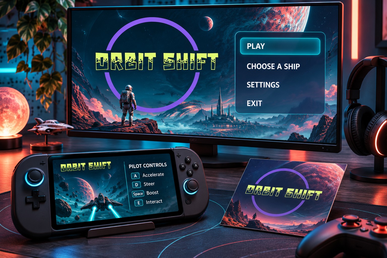
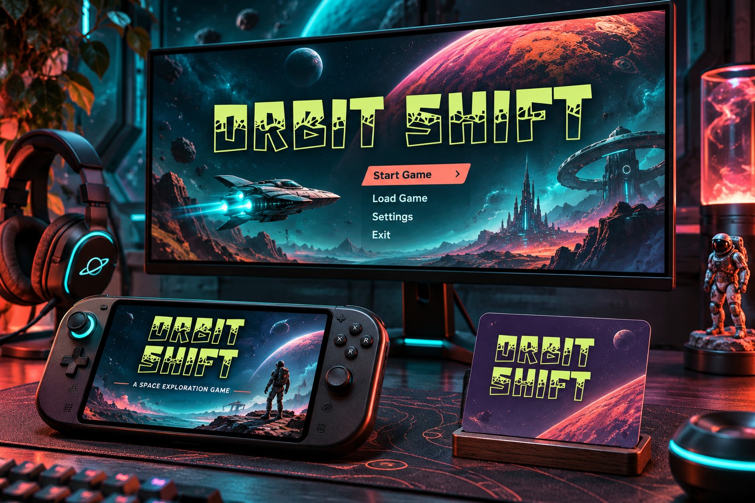
The useful distinction is between identity and repeated reading. Identity lettering can carry a distinctive silhouette. Working interface text needs dependable spacing, a clear hierarchy, and room for changing content. This article uses Orbit Shift, a fictional space-racing game, to show how those roles can coexist. The title uses real Hyper Block lettering; the interface studies use a quieter information style. All screens are original layout illustrations, not screenshots of a released game.
Decide what the player needs to read repeatedly
List the text that appears throughout play before choosing effects for it. A main menu, inventory description, lap counter, subtitle, and player name create different reading tasks. Some remain on screen long enough for inspection; others change while attention is focused elsewhere. A title treatment that works during a deliberate pause may be unsuitable for a short notification.
For Orbit Shift, the expressive face belongs to the name and a few large promotional headings. Menu options, times, player names, and supporting instructions share a restrained family. This makes the contrast deliberate. The game still feels connected through color, panel shapes, and the arrangement of information, without requiring every label to imitate the logo.
Build the title as an identity asset
Start with the exact game name. Inspect repeated letters, the outline of the whole phrase, and the space between words. Keep an editable version before making any final vector treatment. If the lettering needs an outline, shadow, or emblem, add one element at a time and return to a plain version for comparison.
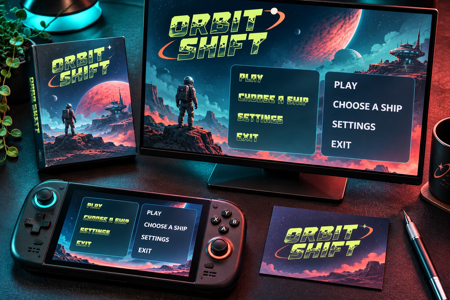
Keep a compact title arrangement available. A wide logo may work on a store banner but become cramped in a square announcement. Reflowing the name into two deliberate lines is usually a more useful option to inspect than squeezing the lettering horizontally. The smallest usage may need a separate symbol or simplified lockup, developed as part of the identity rather than improvised during export.
Design interface styles around real strings
Use the actual words the team expects to ship. Include the longest plausible option, a short label, mixed numerals, and punctuation. A row that comfortably holds PLAY can still fail with ACCESSIBILITY SETTINGS. Do not solve the longer string by silently reducing only that row until the hierarchy becomes inconsistent.
Decide how content is allowed to wrap, shorten, or move. A multiplayer name may need a reserved column, while a description can occupy more than one line. Those are content and layout decisions, not simply font-size decisions. Record them so the next screen does not invent a conflicting behavior.
| Text role | Question to resolve | Useful proof |
|---|---|---|
| Main title | Does the name remain recognizable? | Wide and stacked lockups |
| Menu option | Can the longest label fit naturally? | Complete option list |
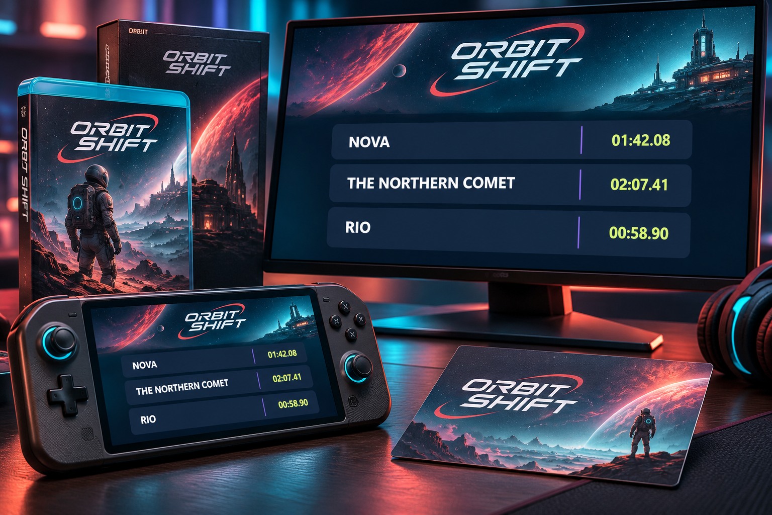
| Player name | What happens when a name grows? | Short and long names together |
| Changing value | Do digits stay easy to compare? | Several representative values |
Review the hierarchy on a busy scene
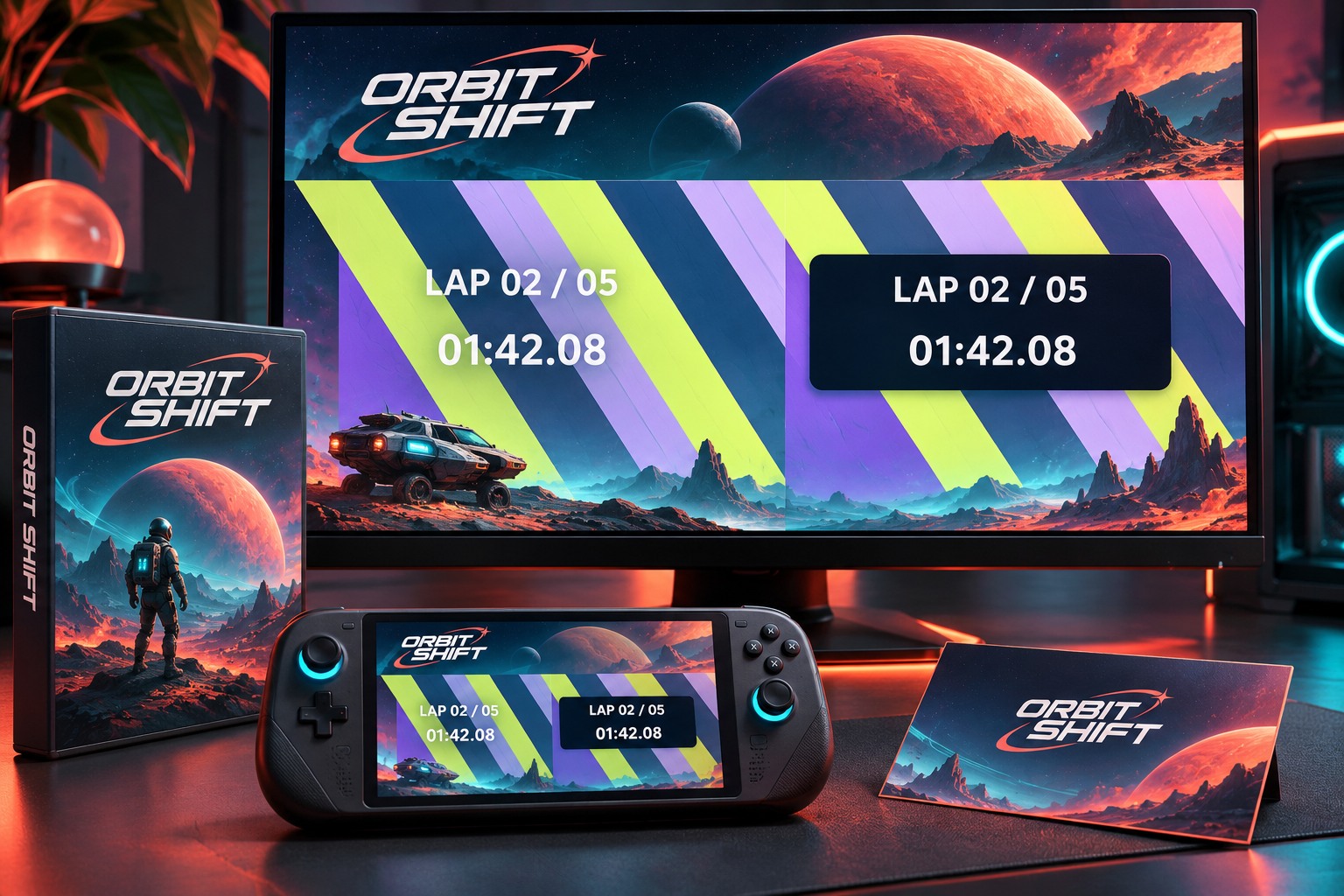
A clean dark panel can make almost any text look orderly. Place the interface over a representative background as well. Look for changes in brightness, shapes crossing behind letters, and movement near the reading area. If the information becomes unreliable, a quieter panel or a different location may help more than another outline around every character.
The illustrated background here is an original geometric scene. It demonstrates a composition problem; it does not establish performance in a game engine. Test the implemented interface on the intended devices and offer the relevant user controls. A static article image cannot stand in for a player's experience during motion.
Keep promotion and play connected
Reuse recognizable parts of the identity in promotional art: the title, a key shape, a palette, and the overall tone. Allow the information typography to do its own work. A release announcement, patch note, and settings screen should feel related, but their reading priorities differ.
Create a small handoff sheet that names the approved logo files, interface styles, fallback behavior, and the person responsible for reviewing new screens. Include examples of actual strings rather than a page containing only the alphabet. That record helps future contributors preserve the distinction between an expressive title and functional text.
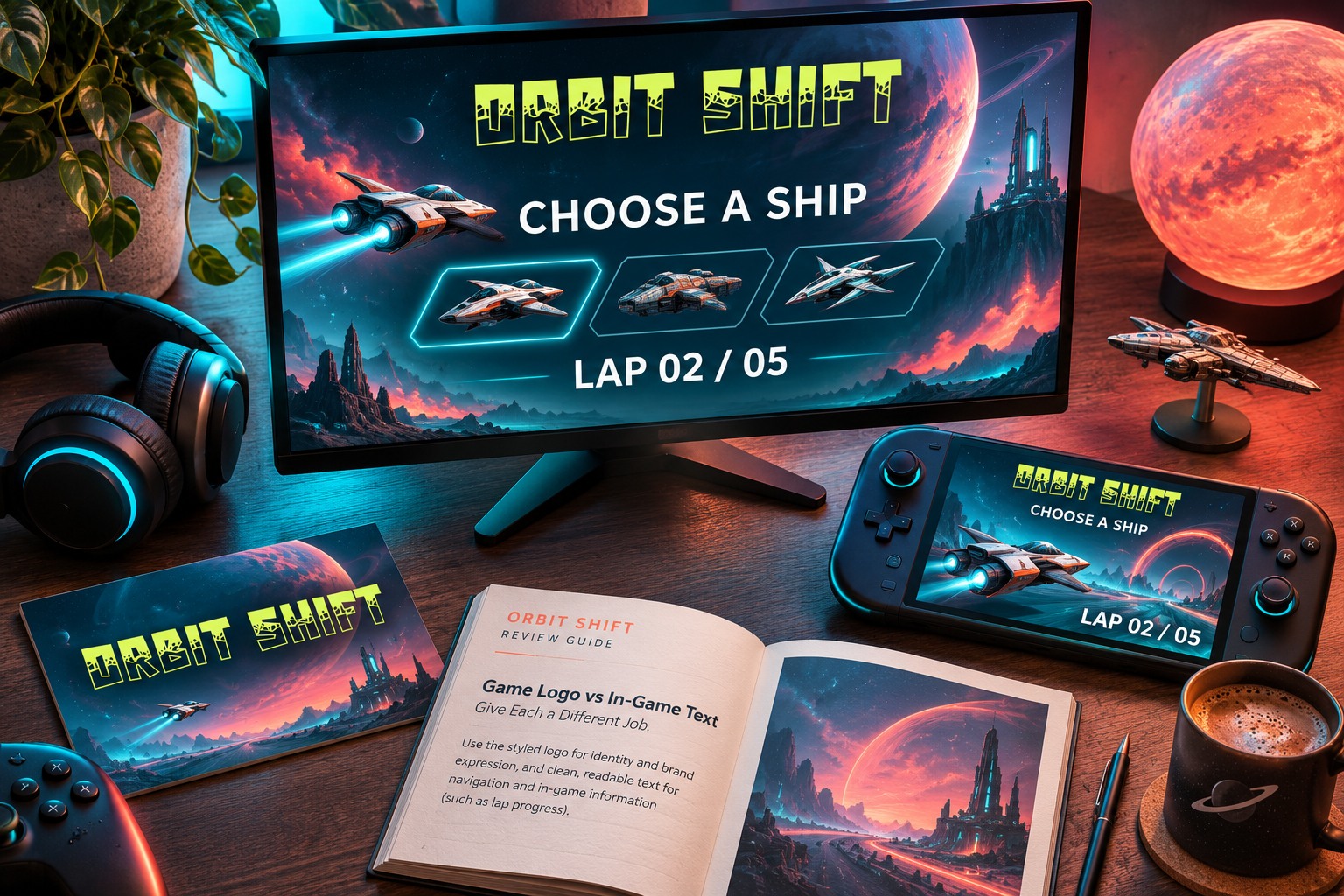
Try the name in the Lettersiro Logo Tester, then review the Hyper Block product if its blocky character suits the project. Confirm the intended game, promotional, and distribution uses against the Lettersiro license options. Approve the complete reading system alongside the logo: the player's next action deserves as much design attention as the opening title.