A camping poster has several jobs at once: establish an outdoor mood, name the activity, and make practical information easy to find. A collection of attractive illustrations can help with the first job, but the poster still needs an order of reading. Choosing fewer images and giving each a clear role is often the most useful design decision.
Lettersiro's free outdoor vectors provide several directions for this exercise. We will compare object illustrations and badge collections, then plan a fictional camping gathering around one main image, one title, and a compact information block. The composition studies are original examples rather than claims about a real event.
Start with the object that tells the story
The Camping Adventure vector set presents eight outdoor illustrations in EPS format. The published preview includes a tent, fire, backpack, lantern, sleeping bag, mug, mountain, and axe. Each object suggests a slightly different emphasis within the same outdoor world.

For a relaxed overnight gathering, a tent or lantern may provide a useful central image. A walking-focused event may have more reason to emphasize a backpack or mountain. The choice should follow the brief, not simply whichever drawing occupies the most space in the preview.
Write a one-sentence description of the fictional event before editing. For example: an evening camp gathering with a shared meal and a guided morning walk. Then list the information a participant needs. This keeps the illustration connected to a real communication problem.
Sketch three visual arrangements
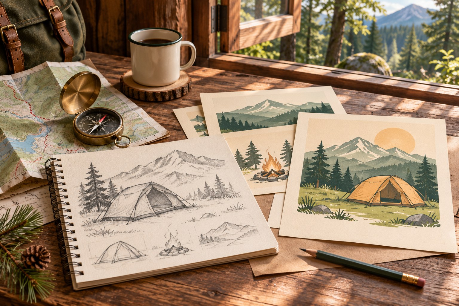
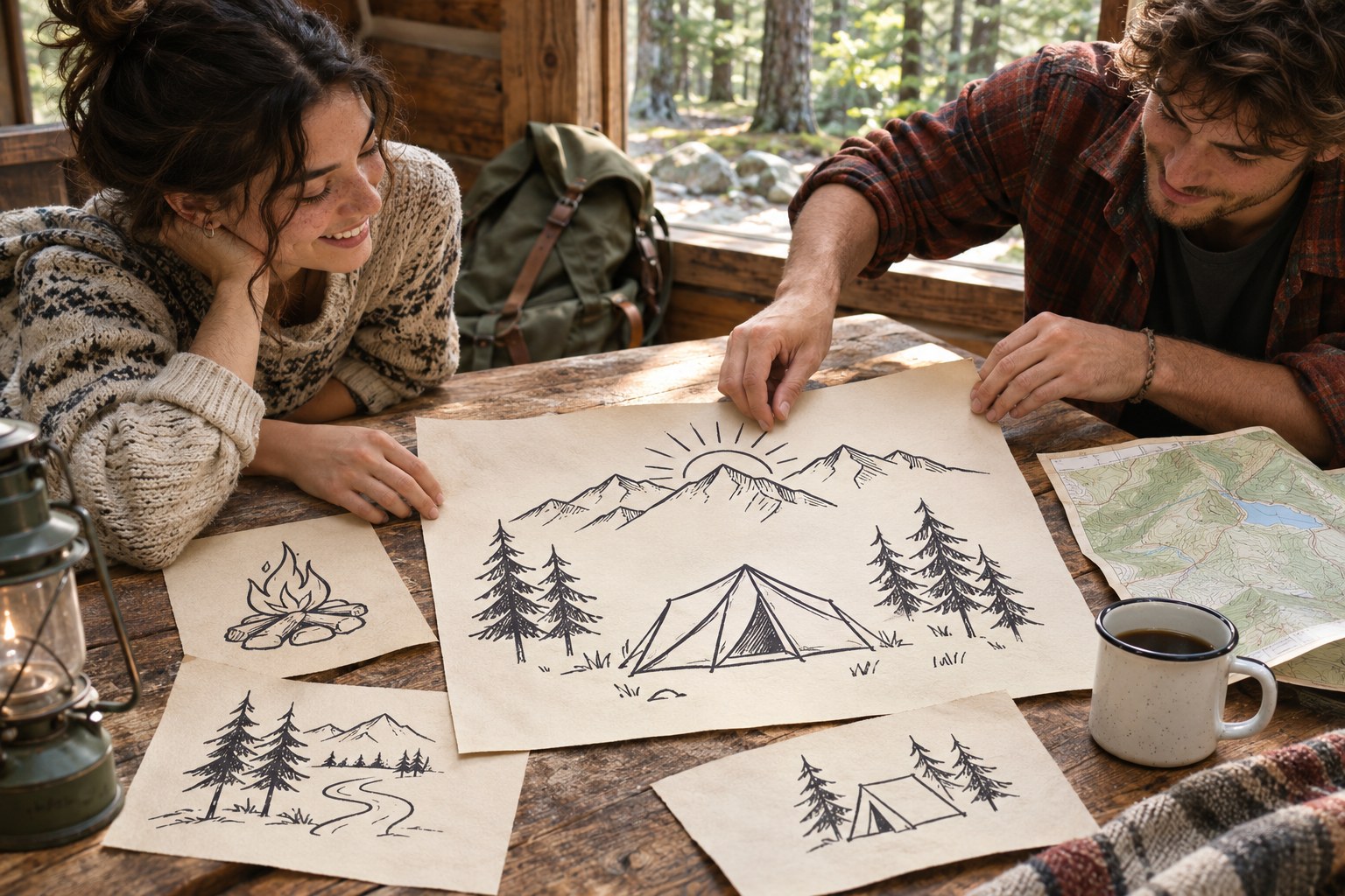
Make small rough sketches before moving vector objects around. Try an image above the title, an image beside the title, and a large illustration occupying one side of the poster. Keep the same words in all three so that the composition is the variable being tested.
The rough studies do not need realistic paper shadows or elaborate color. Their job is to reveal whether the title and image can share the space comfortably. If one arrangement only works after shrinking the date to an unreadable size, reject that structure early.
Leave a generous boundary around essential content. A border can frame the outdoor illustration, but a heavy decorative frame should not consume the only room available for the activity name. Review the poster without the frame before deciding whether it contributes anything necessary.
Decide whether a badge is the better main image
Sometimes a self-contained emblem fits the project more naturally than a freestanding object. The Wilderness Camping Badge set presents eight outdoor emblems, offering a different balance between illustration, shape, and lettering.

A complete badge already contains several visual relationships. Adding a second large illustration and another decorative title can duplicate those roles. Choose whether the badge or the poster title leads, then reduce the competing element accordingly.
The Adventure Logo Badge Collection offers a smaller group of four related options. Its mountain, lantern, mug, and tent directions are worth comparing when you want a simpler starting point.

Keep the illustration language coherent. Two packs may share an outdoor theme while using different line weights, levels of detail, or shape conventions. If those differences remain visible after recoloring, one carefully chosen source may produce a clearer result than a collage of several collections.
Give typography a distinct responsibility
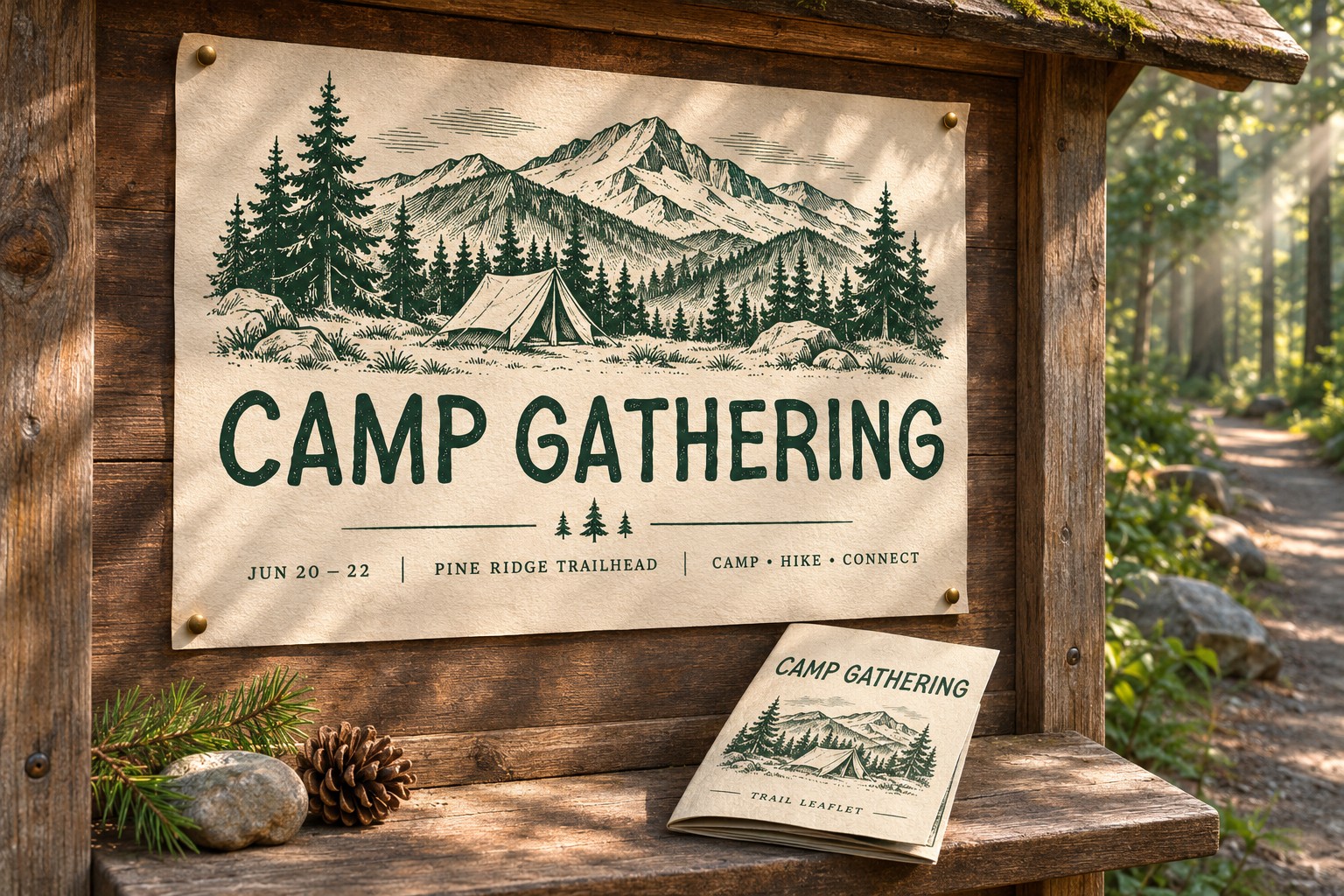
The title should name the experience, while supporting text handles the logistics. Use a short title with enough presence to establish the poster's first reading point. Then group the date, meeting place, and action in a quieter block. Readers should not have to search through decorative words to find the information that lets them participate.
Ancient Museum is a separate Lettersiro display-font direction to consider for a vintage outdoor voice. Its gallery provides a reference for expressive title lettering, not a claim that the font is included with any vector download.

Use the actual event name in the proof. Long place names and unfamiliar words can create a different silhouette from a short promotional sample. Change line breaks and scale before compressing the letters to fit an arbitrary width.
Build color around the reading order
Begin with a light ground, one dark color for essential content, and an optional accent for the primary image or action. A restrained green-and-cream palette is one outdoor direction, but it is not a requirement. The image and typography should remain understandable even before color creates atmosphere.
Avoid assigning a new color to every object. That can turn the poster into a catalog of illustrations. If the accent appears on the tent, title, date, and every small divider, it stops distinguishing any one element. Review where the eye travels and use color to support that sequence.
For a dark version, inspect the illustration's interior spaces and the smallest text. A simple color reversal may change the apparent weight of the drawing. Compare both versions at the actual intended size before choosing the final treatment.
Separate the invitation from the checklist
If the gathering needs a packing list, give that content its own companion page or message in a real project. The main poster can establish the experience and point readers toward the details. Trying to place equipment guidance, a complete itinerary, safety instructions, and a decorative illustration in one small composition creates competing reading tasks. Decide what belongs at the first encounter and what people need after they choose to participate.
Prepare separate print and digital proofs
A portrait poster and a phone-sized announcement share content but not necessarily the same arrangement. For the smaller digital version, simplify the composition around the title, primary image, and most important details. Reposition supporting information rather than reducing the entire poster until every line becomes tiny.
When working with EPS artwork, Adobe's Illustrator import guide explains the available handling of EPS content. Inspect the actual objects and any text in the downloaded file before editing, and preserve an original copy.
Read the current listing and included terms for each resource. Free commercial artwork still has conditions, and the rights for fonts and images should be checked separately. Save the source URLs with the editable document rather than relying on a folder of unnamed downloads.
Finish by asking someone to identify the activity, date, and location from the proof without explanation. If they hesitate, revise the hierarchy before adding another illustration. The Lettersiro freebies collection can supply the visual starting point; a useful poster emerges from selection, order, and a clear message.