Adding a second language changes more than the word count on a package. It affects the hierarchy, the available line length, the handling of accents, and the relationship between the front and the other panels. Shrinking every line until both languages fit usually postpones the real design decision.
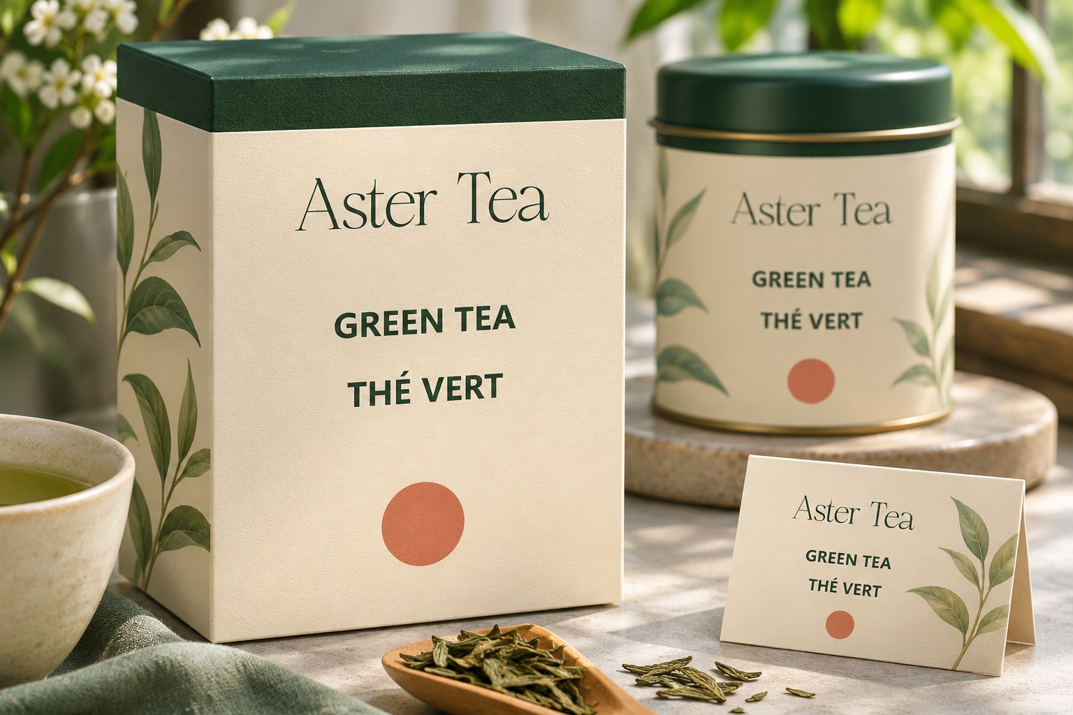
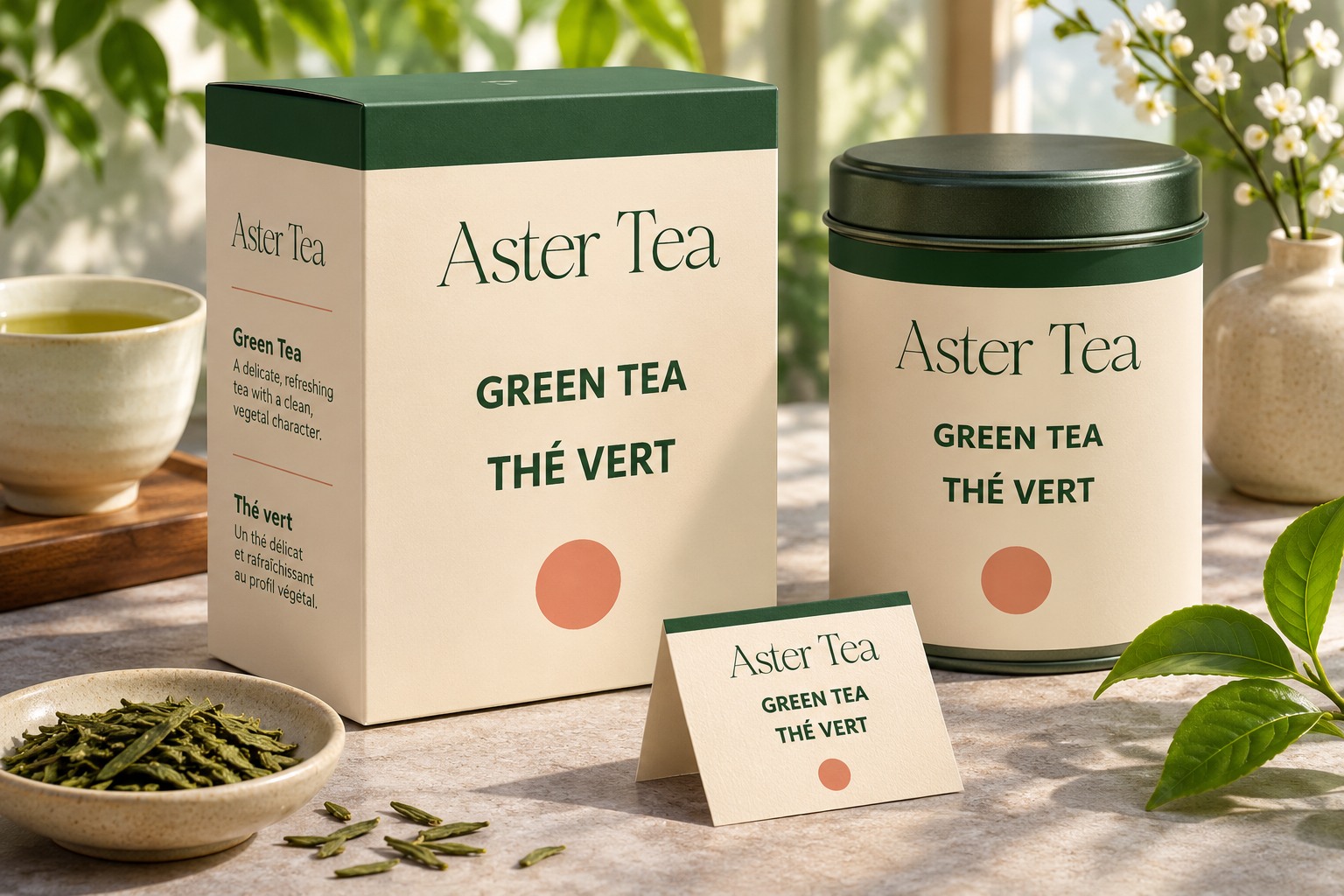
Plan the language roles before polishing the front. Confirm which content is required, which language relationships the project needs, and where longer information can live. The examples use Aster Tea, a fictional brand, with the short English and French product descriptions GREEN TEA and THÉ VERT. The brand treatment uses real Romans Branding lettering. These are layout studies, not approved packaging translations or regulatory label templates.
Confirm the content and market requirements first
Get the approved copy from the team responsible for the product. Identify which language versions must appear, which statements must remain together, and whether particular prominence or placement is required. Those requirements depend on the product and destination. A designer should not infer them from another attractive package.
Ask a qualified reviewer to confirm translations and terminology. Two phrases that appear equally short may not carry the same meaning or tone. Keep a copy record with the language, revision, reviewer, and intended panel. That record prevents a polished draft from becoming the accidental source of truth for later products.
Choose a visible language relationship
Some projects call for equivalent visual treatment. Others have a defined primary language and a supporting version. Follow the actual brief and requirements rather than inventing a hierarchy based on which phrase fits most neatly.
Use position, spacing, and a consistent style to make the relationship clear. A paired stack can work when the two phrases belong together. Separate areas can work when the content has a different role. Avoid a composition in which a second language looks like an unrelated flavor name or a smaller footnote without an intentional reason.
Test longer approved copy early
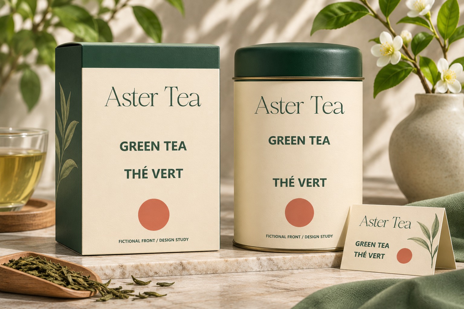
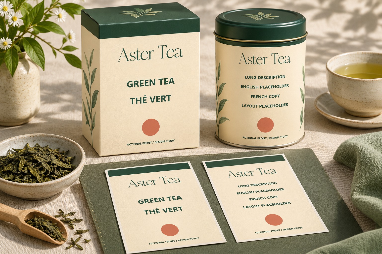
The short GREEN TEA and THÉ VERT examples make the hierarchy easy to see, but they do not prove the system can handle the full range. Place the longest confirmed product description and a demanding variant into the working layout before choosing the final text area.
If only placeholder copy is available, label it and replace it before approval. Do not use machine-generated language as final packaging copy without appropriate review. The shape of a sentence can help stress a layout, but its presence in a design file does not establish accuracy.
Inspect accents and the required characters
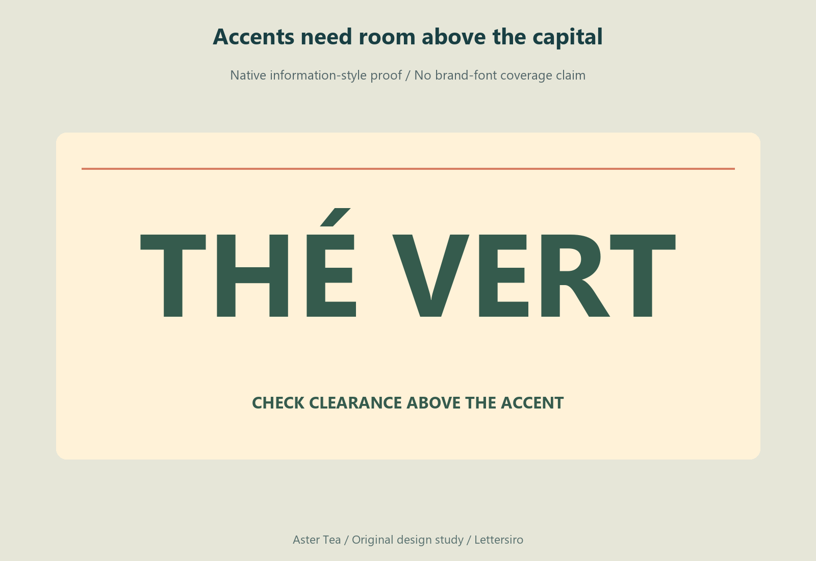
Check every character in the actual words, including accents, punctuation, and any special symbols the project needs. Look for clipping above capitals and collisions near neighboring lines. A text box that accommodates GREEN TEA may still need more vertical room for THÉ VERT.
Inspect the actual font files in the target application. A display font can provide the brand voice while a separate information family handles multilingual descriptions. The combination should be deliberate. Avoid replacing a missing accented character with an unaccented one merely to preserve the appearance of a headline.
Give the other panels a planned role
The front does not need to carry every paragraph unless the actual requirements say otherwise. Map the content across the available panels and review the complete package. A quiet front can become misleading if important information is moved to an inaccessible or impractical location.
Use the vendor's actual dieline and usable-area guidance when preparing production artwork. Check folds, seams, curves, and panels that will be covered in use. The flat rectangles in this article explain information architecture; they are not production dielines.
Review the languages together at delivery size
Print or otherwise proof the complete artwork at the intended dimensions. Have the appropriate language reviewers inspect the copy in context, including line breaks and any abbreviations. A correct phrase can become awkward when divided in the wrong place.
Ask the team to review the smallest product in the range as well as the spacious master. If the compact version needs a different arrangement, document it as part of the system. A multilingual range is easier to maintain when the exception is deliberate rather than a last-minute reduction applied to one product.
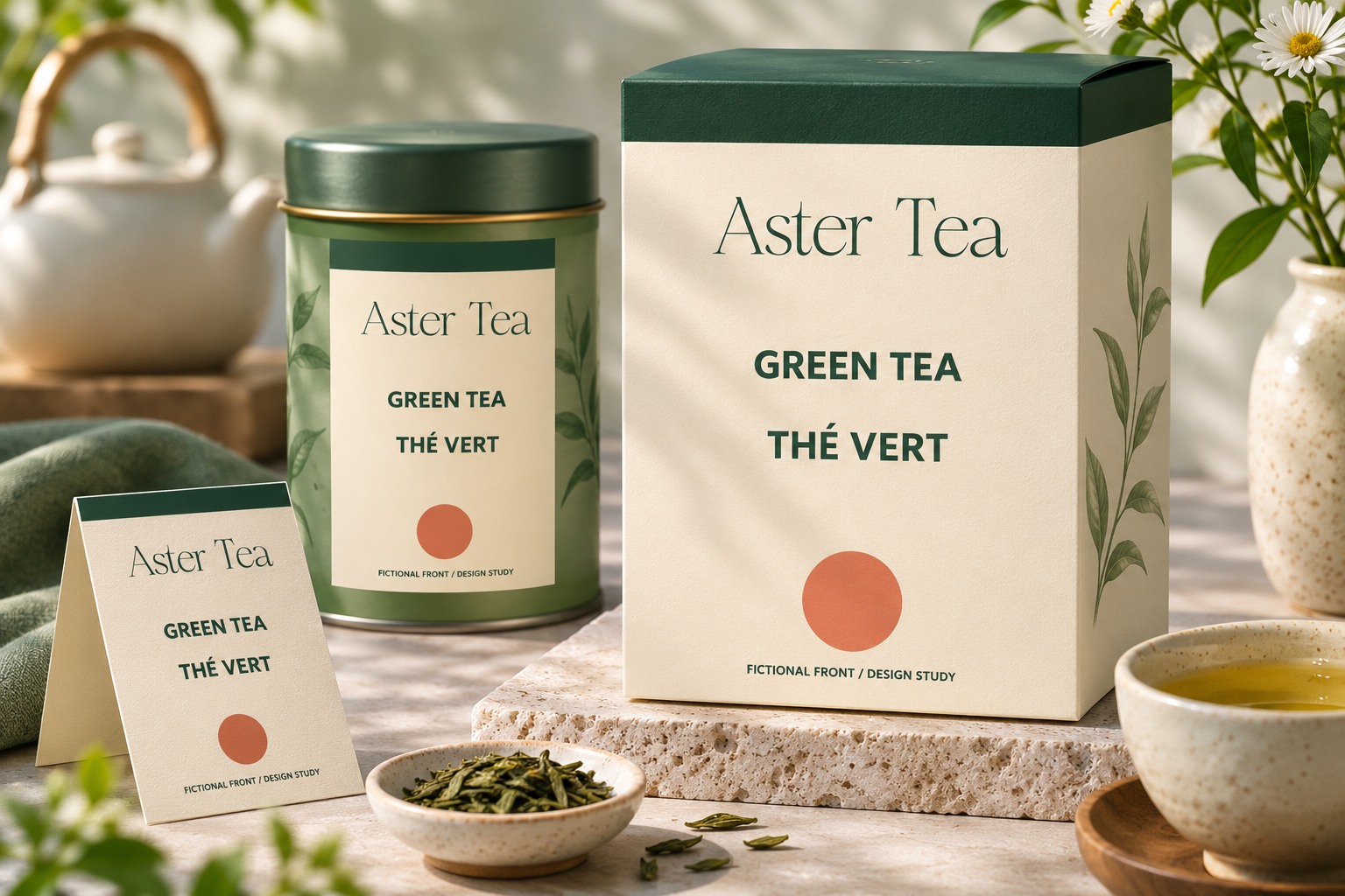
Keep the approved copy record, editable source, font versions, and reviewed export together. Explore Romans Branding for an expressive brand role and check the Lettersiro license for the planned uses. The strongest multilingual layout gives each required message a clear place, while leaving enough room for the actual words the product needs.