A concert lineup is not simply a collection of names arranged until the poster feels full. The type hierarchy communicates billing, relationships, and the event's identity. A small size difference or an isolated position can imply a priority the organizer did not intend.
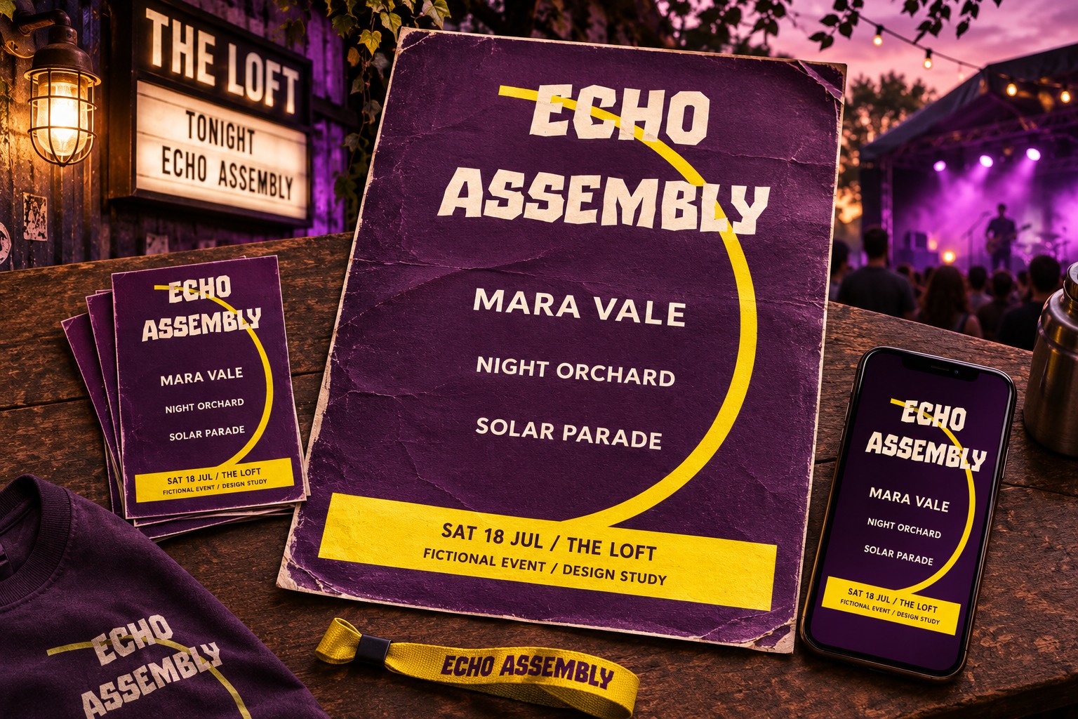
Confirm the billing before choosing the composition. Then make the visual hierarchy match that agreement and leave a dependable area for date, venue, and ticket information. The original examples use Echo Assembly, a fictional event, and invented performer names. The expressive event heading uses actual Spirit Stone lettering. None of the examples represents a real artist contract or event announcement.
Confirm what the hierarchy is allowed to say
Ask which performers share a tier, which name leads, and whether any order is required. Get the approved spelling and capitalization for each act. If logos are supplied, clarify whether they must be used and what variations are approved. Do not infer those decisions from a rough email list or from the order in which files arrived.
Keep a simple billing list beside the working artwork. It should explain the intended relationships in plain language. A graphic arrangement can then be reviewed against that list, which is more reliable than asking whether the poster merely feels balanced.
Separate event identity from performer billing
The event name can have a strong voice without becoming confused with the headliner. Use position, spacing, a container, or a different typographic role to distinguish them. If the event title and the leading act look like a single phrase, a new reader may misunderstand what is being announced.
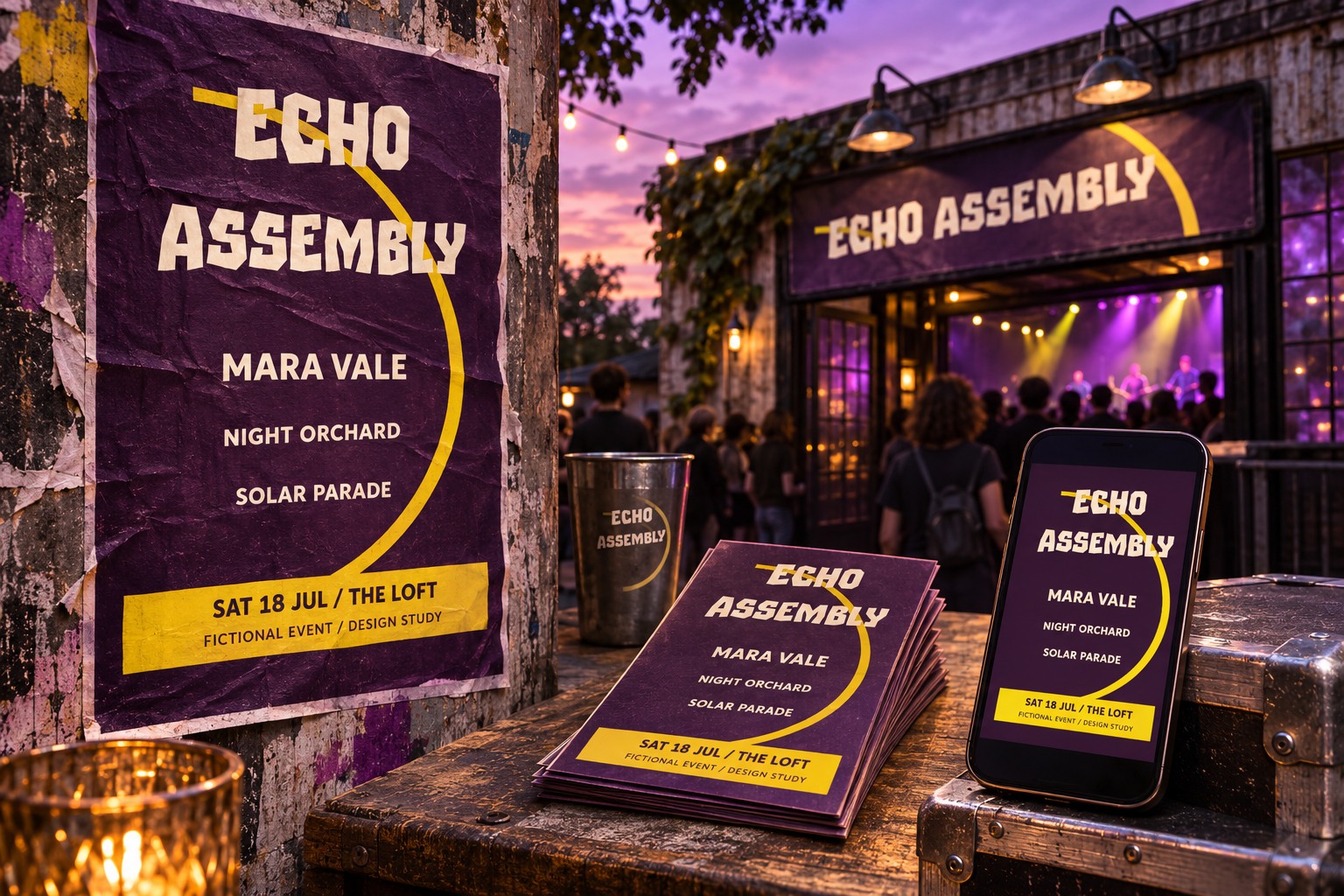
For Echo Assembly, Spirit Stone establishes the event identity near the top. Performer names use a quieter bold style in a separate area. The connection comes from the palette and composition, while the role distinction remains visible.
Design equal billing as a visible relationship
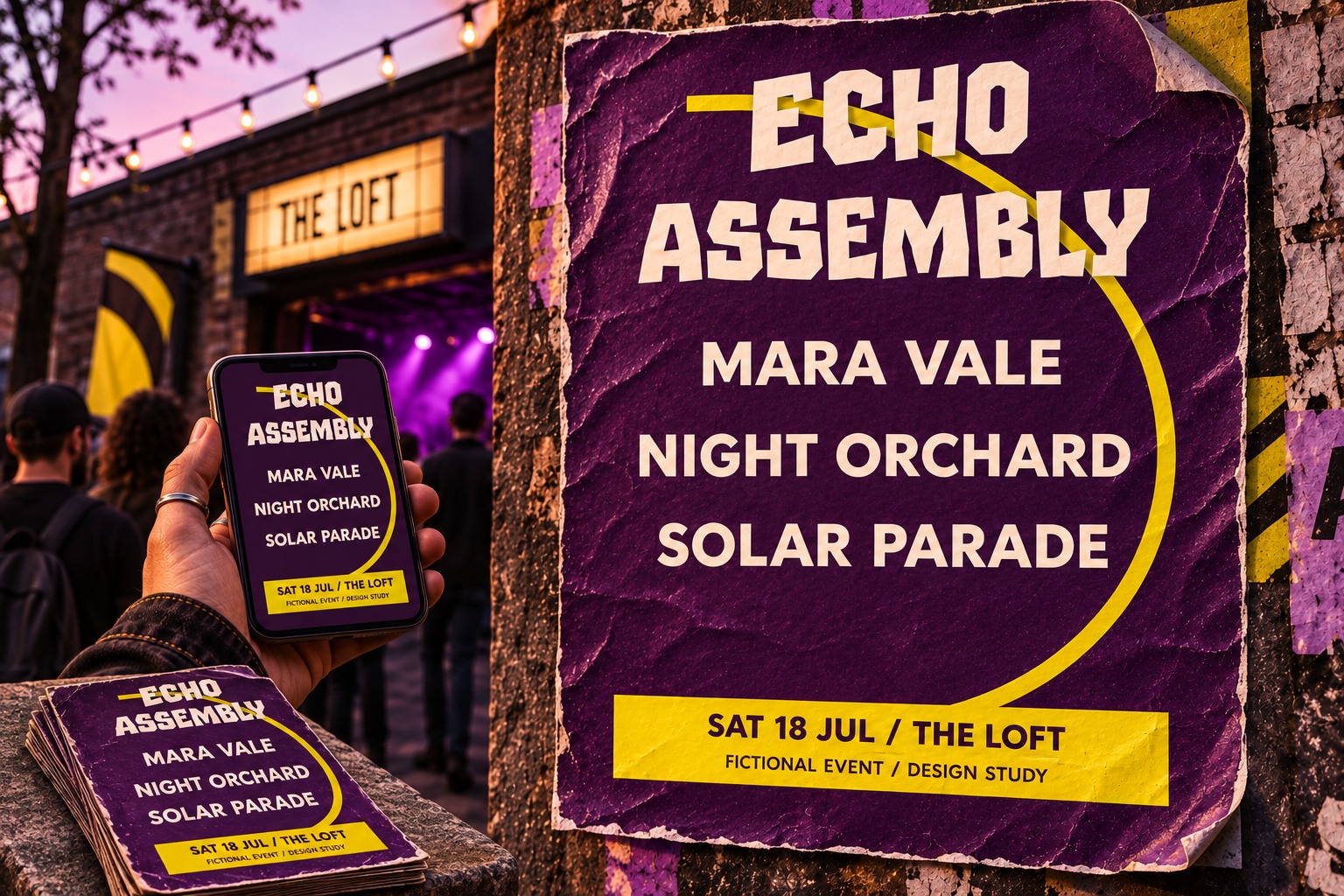
Equal billing needs more than the same nominal type size. A long name can occupy much more space than a short one, and different letter shapes can have different visual weight. Compare the complete names together. Use a consistent treatment and enough room that one does not appear accidentally subordinate because it wraps into a crowded corner.
If the event requires a particular order, retain it. If an equal-billing arrangement is unclear, show an alternative structure to the organizer rather than silently changing the relationship. A centered stack, a consistent grid, or clearly separated rows can each work when their rules are deliberate.
Test a longer name before approving the grid
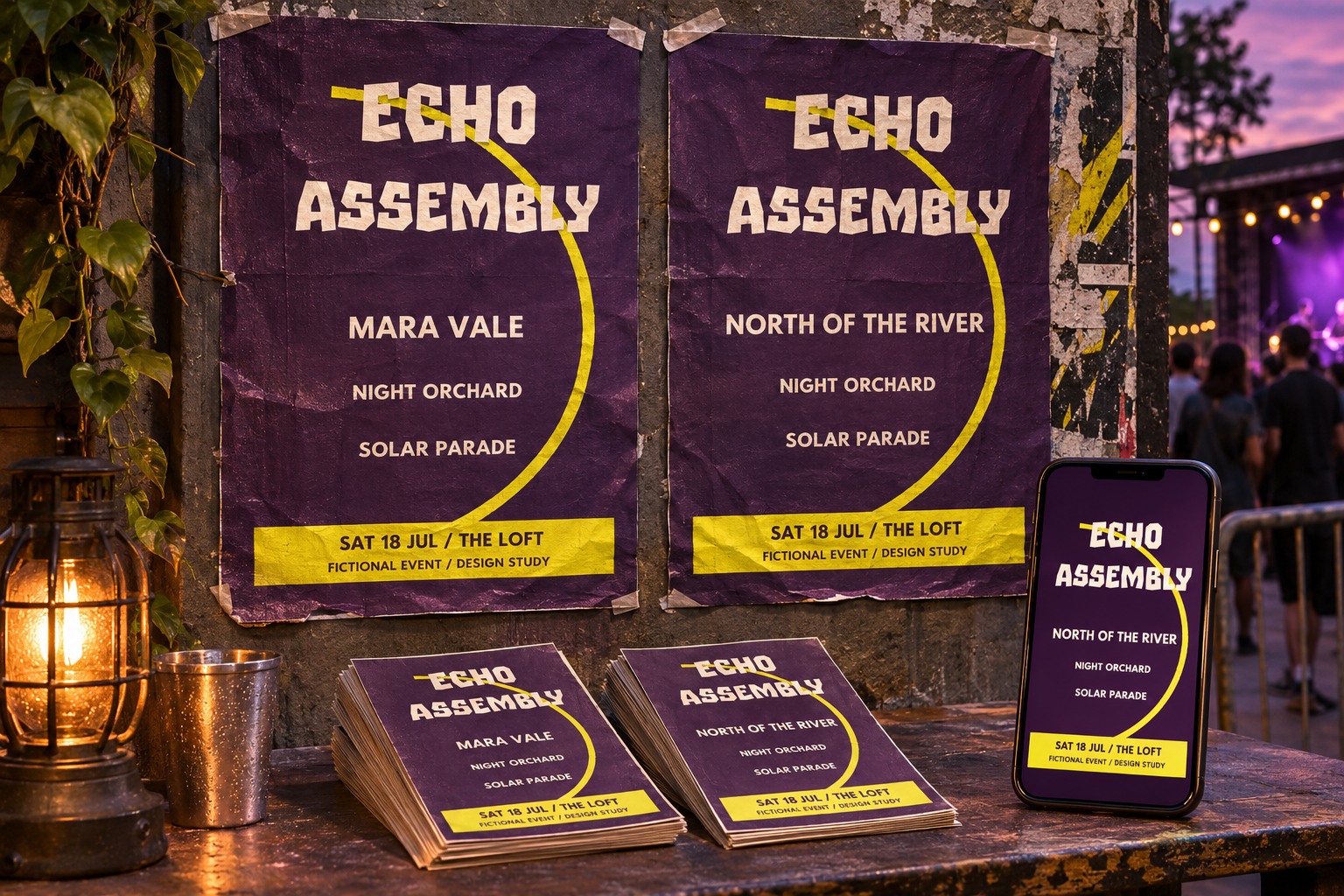
Place the longest confirmed act name into the demanding position. Check whether it wraps, approaches a neighboring name, or forces the type size downward. A layout that works with a short placeholder can fail as soon as the final lineup arrives.
Avoid squeezing a long name horizontally. Give it a suitable line break or a wider measure when that is permitted. Compare the revised arrangement with every other act in its tier. The goal is to preserve the intended relationship across the full list, not simply make one troublesome name fit.
Keep practical information outside the competition
Date, venue, doors time, age information, and the ticket route should be easy to locate. Confirm the actual requirements with the event team. These details do not need the same expressive treatment as a title, but they need enough room and contrast to remain usable.
Review the poster without the surrounding social caption. Can someone still identify the event and find the practical details? If the image will circulate independently, relying on a caption for essential context can leave a weak announcement. Keep the information architecture complete in the formats where it needs to stand alone.
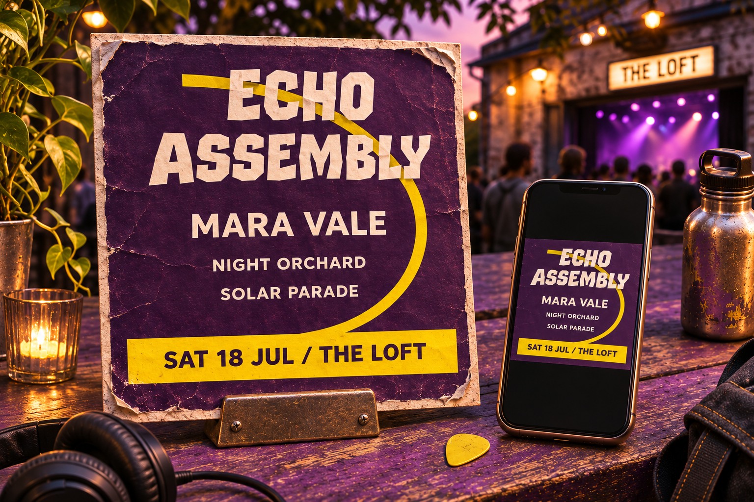
Review the export with a name-by-name checklist
Check each act's spelling against the approved list, then inspect the tier relationships and required order. Confirm that supplied logos have not been stretched or altered unexpectedly. Read the practical information separately so a visually striking title does not distract from a wrong date or venue.
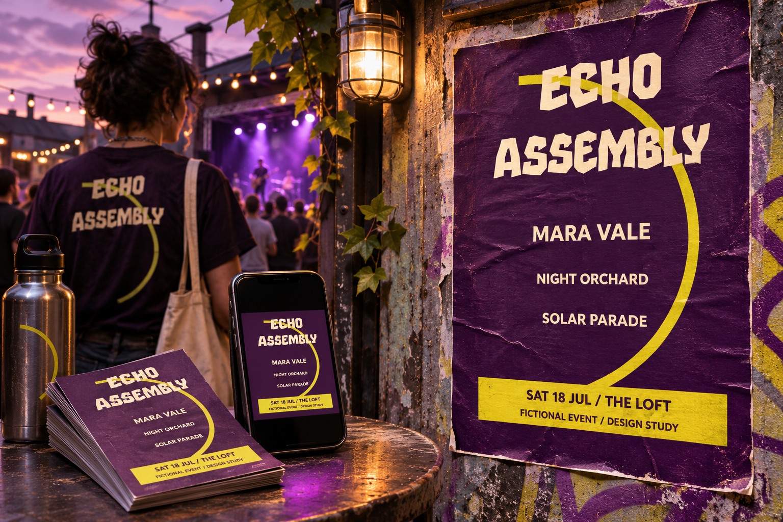
Save the approved lineup record with the editable source and final export. Explore Spirit Stone for an expressive event identity and review the Lettersiro license for the planned uses. A strong lineup design communicates the organizer's intended relationships clearly while giving the audience a practical route from interest to attendance.