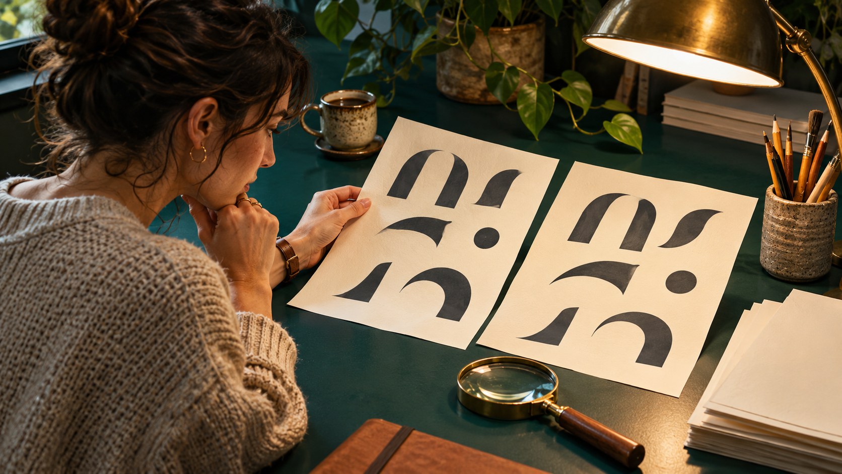
A PDF can look different from the editable design for several reasons. A font may have been substituted, a particular character may be missing, or the same outlines may simply look heavier in one viewer. Changing the typeface immediately can hide the symptom without identifying the cause.
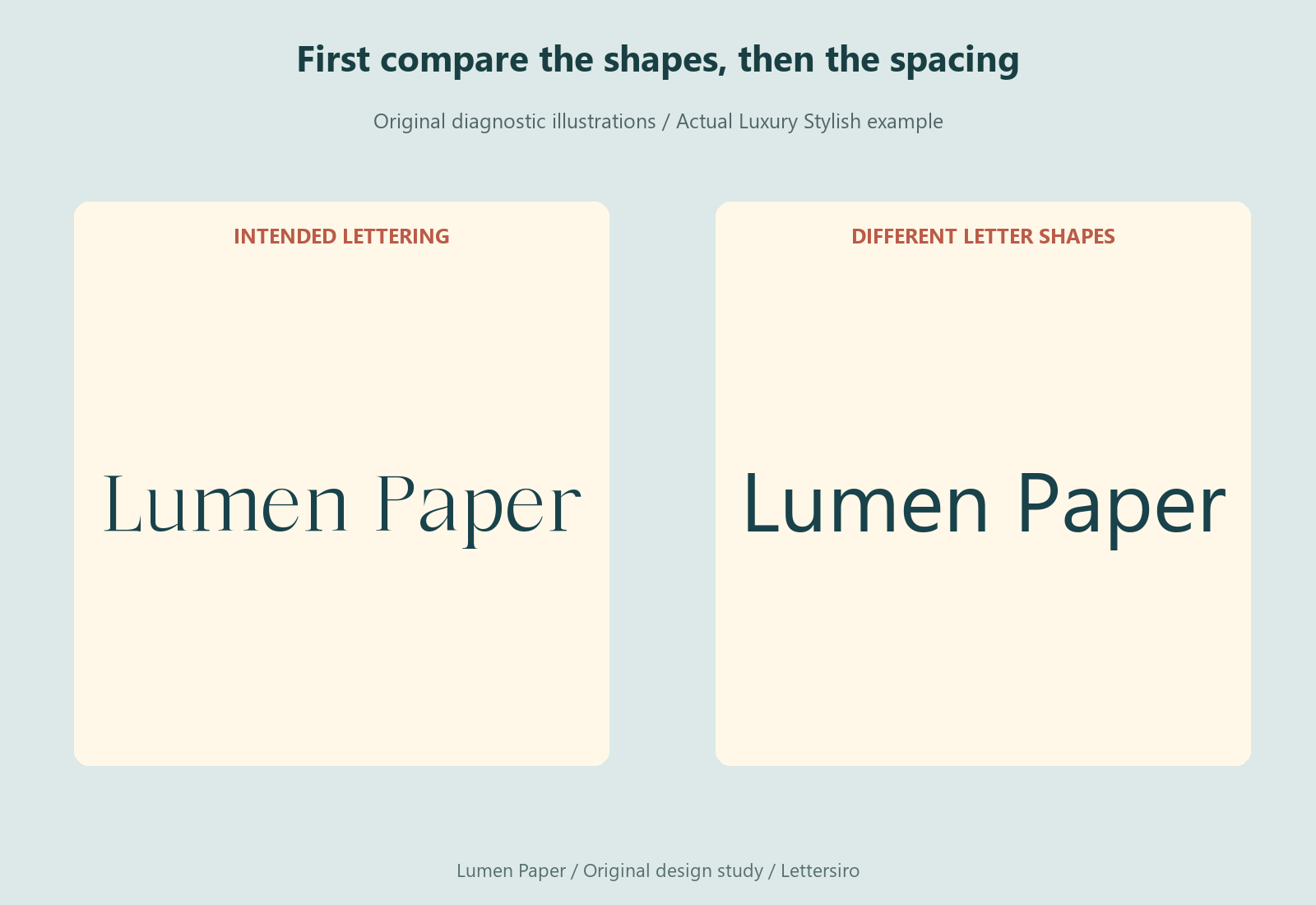
Begin with one affected word and compare its shapes, spacing, and position. Then inspect the document's font information and export settings. The original illustrations use the fictional name Lumen Paper in actual Luxury Stylish lettering. They demonstrate diagnostic differences; they are not screenshots of a PDF failure reproduced in Acrobat.
Ask whether the letter shapes changed
Look at distinctive features: the capital's construction, a terminal, a counter, or the shape of a lowercase letter. If those features are different, investigate the active font in the source document and the fonts carried by the PDF. Do not rely on the overall width alone; a spacing change can alter width while leaving the letter shapes intact.
Adobe's PDF creation documentation explains that embedding includes font information in the PDF so it can be rendered without depending on an installed copy. It also explains that a subset contains the glyph information needed for the characters used. A subset label therefore does not, by itself, mean the export is broken.
Check the source before adjusting the export
Reopen the editable file and confirm the intended family and style are active. Look for missing-font warnings and check the affected text directly. If a collaborator's computer already displays a replacement in the source, exporting that document again will not restore the intended design automatically.
Keep a record of the exact font file and version used for the approved artwork. A public product name is not always the same as the internal family name shown in an application. If two versions are installed, resolve that ambiguity before producing another proof.

Inspect the PDF's font information
Use the font information available in a suitable PDF inspector to see which fonts are present and whether they are embedded or subset. Compare those names with the source. The exact interface depends on the application and version, so use the tool's current documentation for the location of those details.
If a font is absent, investigate the source and export process. If embedding was restricted or failed, address the actual cause within the permitted workflow. Do not try to override a font's permissions. Adobe's font-handling guide describes embedding and substitution in Distiller; the settings relevant to another exporter may differ.
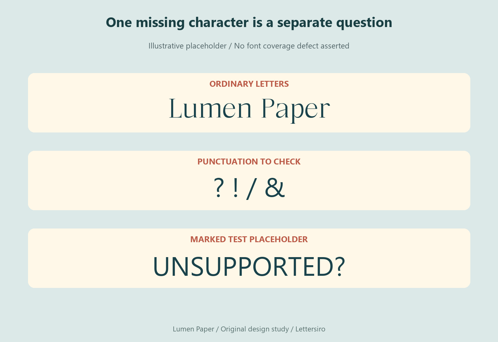
Separate a missing character from a missing font
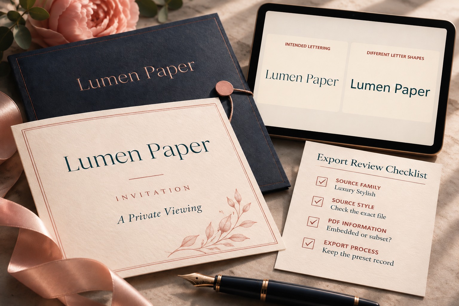
One empty box or unexpected symbol can indicate a narrower issue than full substitution. Compare the affected character with the font's actual coverage and the original text. Check punctuation, accents, and pasted symbols as well as ordinary letters. A visually similar character can have a different underlying code point.
Replace the test text deliberately and repeat the export. Keep the original alongside it so you can identify which change resolved the problem. If the project needs characters the selected font does not provide, choose a suitable supported style for that content rather than assuming embedding will create missing glyphs.
Compare spacing and rendering independently
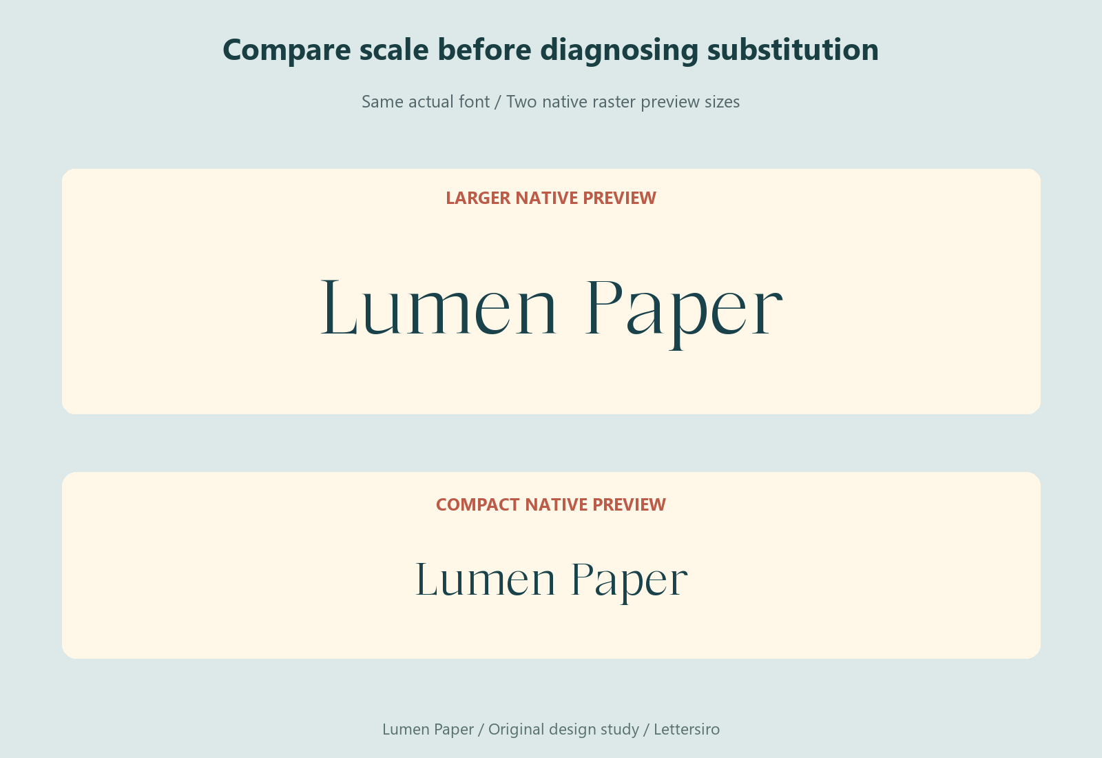
If the shapes remain the same but the line wraps differently, inspect the text area, tracking, kerning, line breaks, and the export path. Keep the page dimensions and comparison scale consistent. A smaller preview of one file can make a difference appear larger than it is.
If the layout and shapes match but edges look heavier, compare another zoom level and another suitable viewer. Screen rendering can change how fine edges appear. A rasterized image also has a different inspection limit from vector text. Do not diagnose substitution solely from the apparent darkness of a tiny browser preview.
Keep an editable source and a reviewed delivery proof
For a specific production handoff, follow the recipient's file requirements. Outlined artwork may be appropriate for some fixed graphic uses, but it changes editability and the nature of the text. It is not a universal repair for every PDF, especially a document that needs searchable, selectable content.

Record the source file, export preset, font version, and the PDF that was approved. Recheck the affected wording after any copy change. Inspect the Luxury Stylish product for its actual files and the Lettersiro license for intended use. A useful diagnosis ends with a repeatable export and a clear explanation of what changed, rather than a new font chosen to conceal an unresolved problem.