
A two-color gig flyer needs a clear division of labor. One color can establish the large title and strongest shapes; the other can provide contrast, emphasis, or a supporting graphic. When every element fights for attention, a limited palette does not automatically create a simple design.
This construction guide uses Late Signal, a fictional live-music event, and real Grand Retro lettering. The examples are original layout studies. They show the decisions to reproduce in Illustrator rather than screenshots of an Illustrator session. The aim is a flyer that explains the event at a glance and still rewards a closer look.
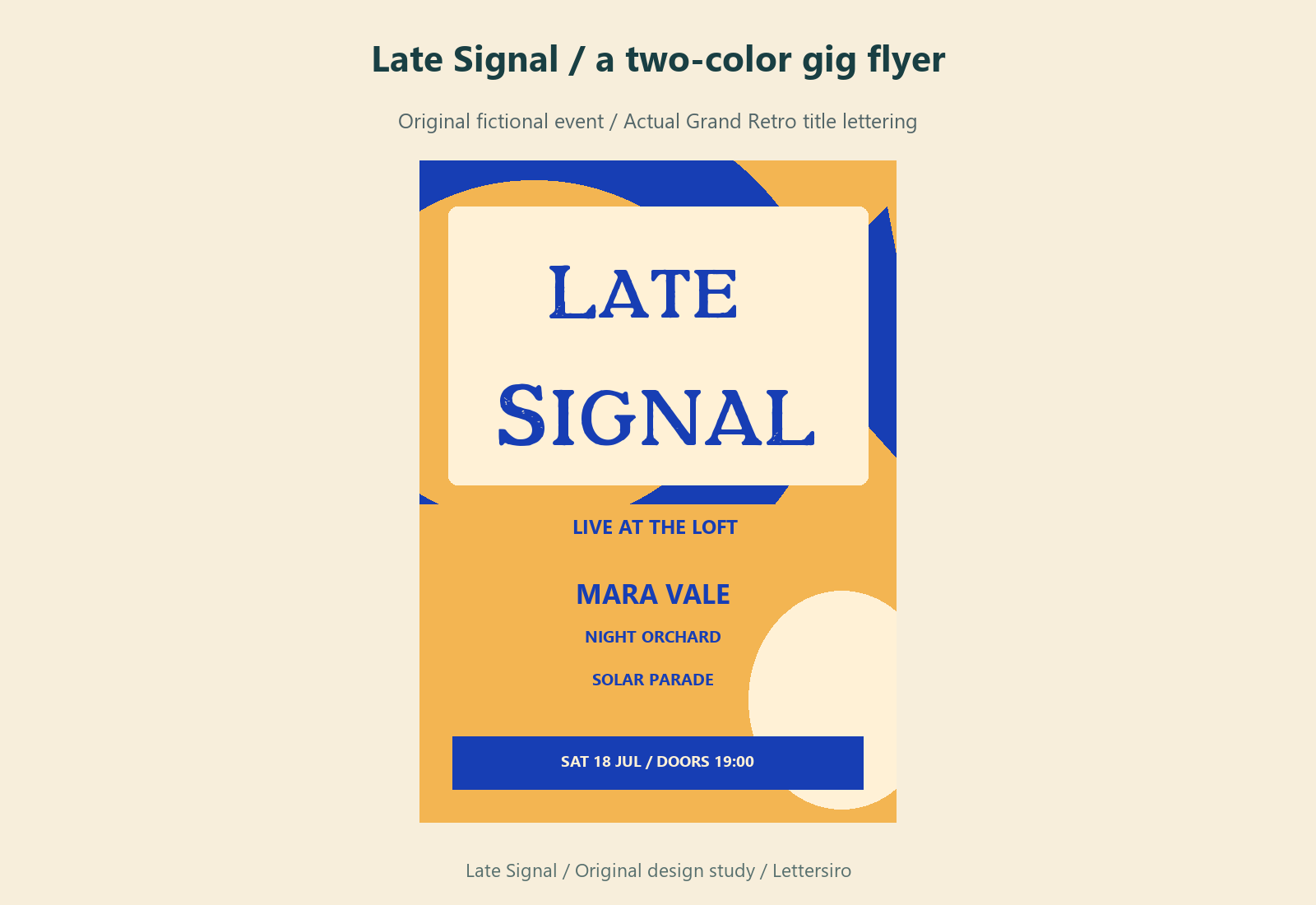
Write the event information before drawing the poster
Prepare a short content list: event name, headline performer, supporting acts, date, doors or start time, venue, and the action the viewer should take. Confirm actual event details with the organizer before publication. For a practice project, use clearly fictional information so a convincing design cannot be mistaken for a real announcement.
Rank the items by the viewer's immediate questions. What is this? Who is appearing? When and where does it happen? How do I attend? The event name does not always deserve the largest treatment if the artist is the reason people will care. Decide that relationship deliberately instead of letting the longest line determine the hierarchy.
For Late Signal, the event title provides the expressive voice, while the lineup and practical information sit in a quieter reading area. The display font is concentrated in the title. Repeating it across every small detail would reduce the contrast between roles.
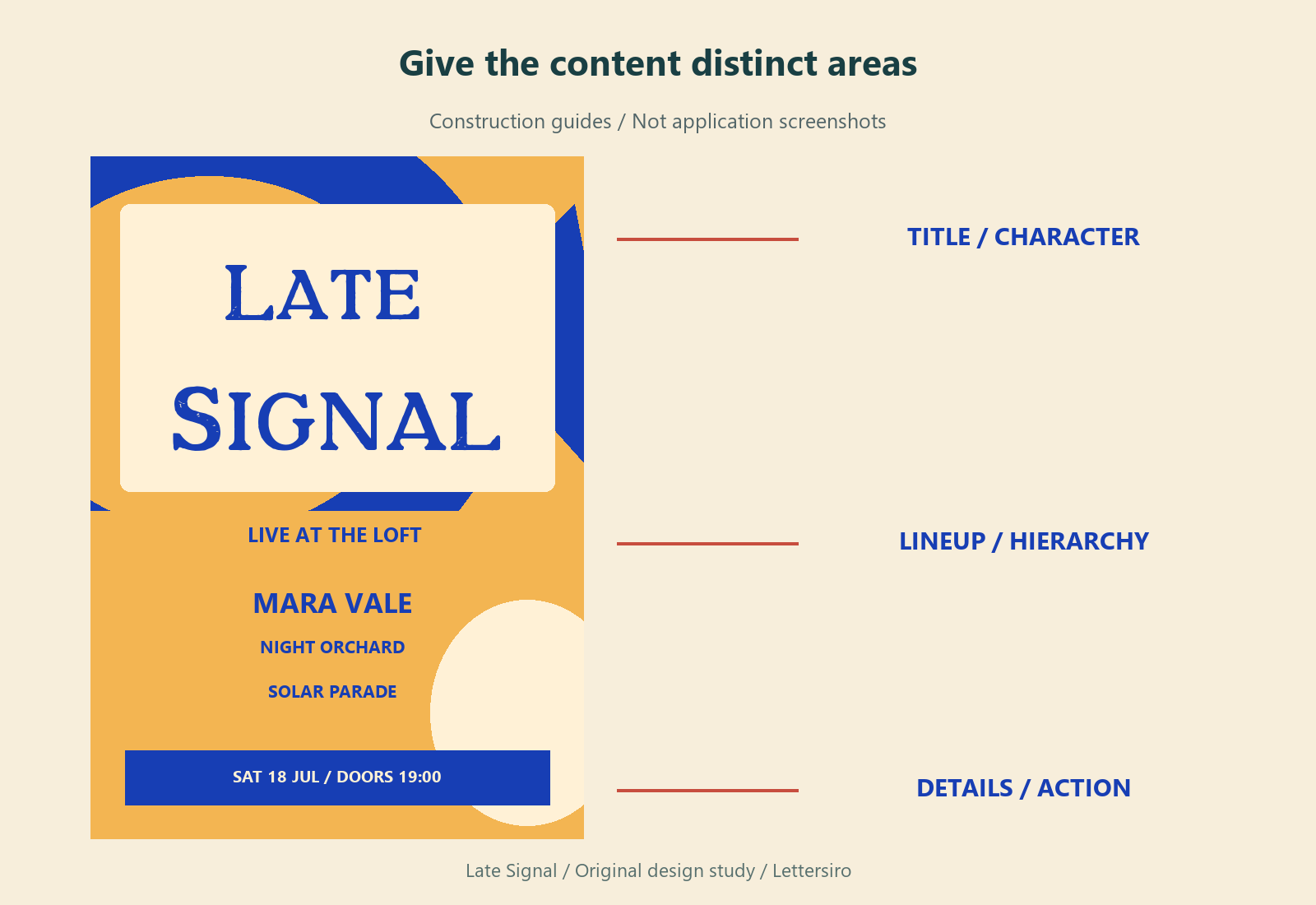
Build the composition with a small set of shapes
Start an Illustrator document at the format requested by the organizer or printer. Agree on physical dimensions and bleed with the supplier if the flyer will be printed. Create a working artboard and keep a separate copy for experiments. Avoid treating a social-media crop as a substitute for the print specification.
Set the title, then place the complete lineup and event details before adding decorative elements. Use a few large geometric forms to connect the empty areas. In this study, broad curves and a circular accent support the title's rhythm. Small decorative marks are added only where they improve the balance.
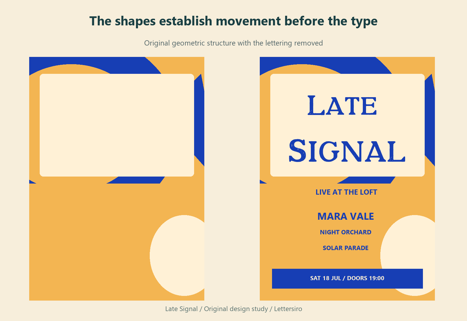
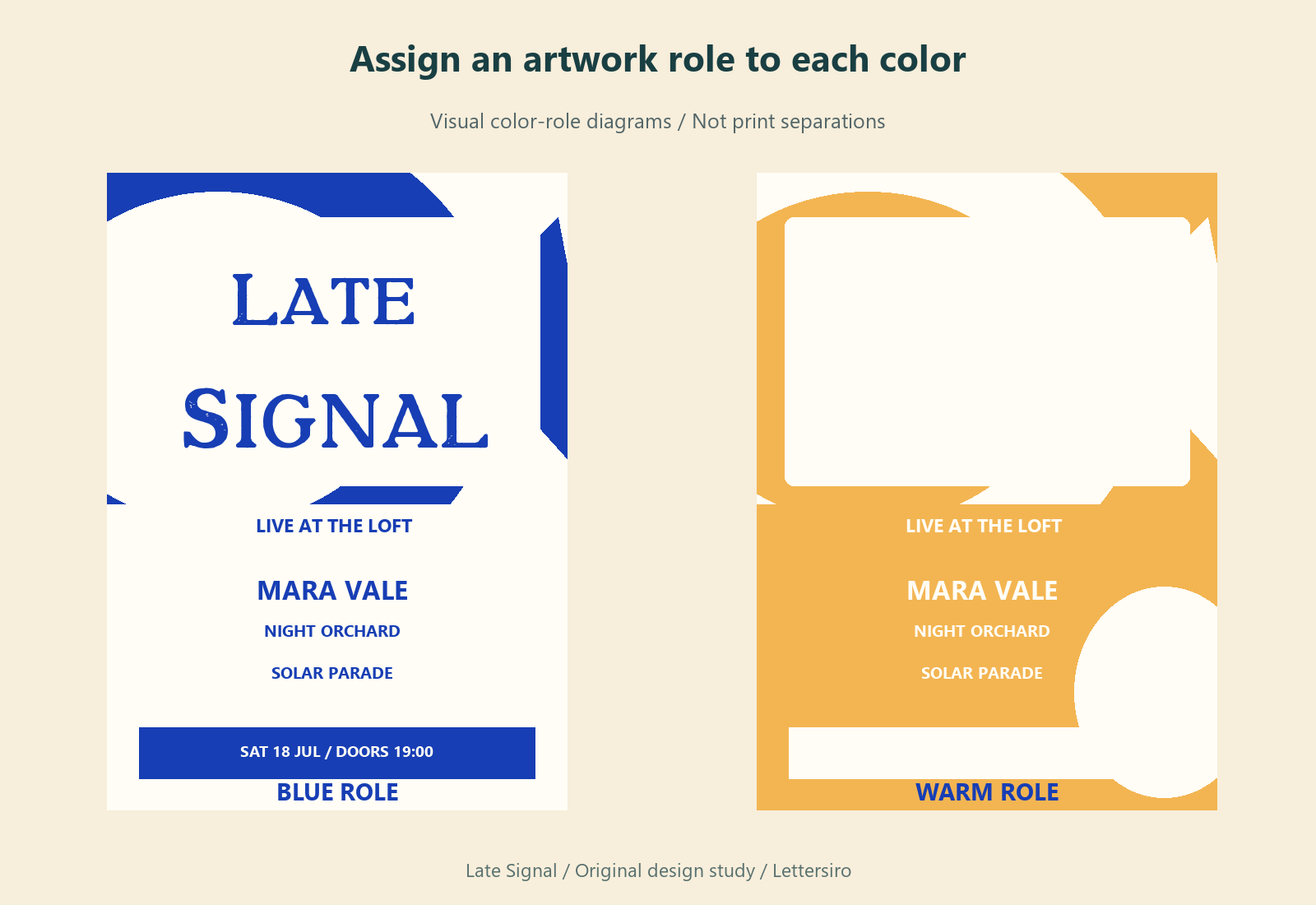
Assign the two colors by function
Define the palette as two intentional artwork colors, plus the paper or background where appropriate. If the job requires exactly two printing inks, confirm the production setup with the printer. A screen preview that looks like two colors is not proof that the file contains two correctly prepared print separations.
Choose one color for the main title and dominant graphic areas. Use the second to distinguish a particular information zone or supporting shape. Check whether text remains readable where the colors meet. Reversing a line out of a colored panel can be effective, but a fine stroke may require a larger or simpler treatment.
Adobe documents palette editing in its Recolor Artwork guide. Use such controls to inspect and organize a palette; review the actual fills, strokes, images, and effects before sending the file for production.
Make the lineup survive a smaller view
Reduce the complete flyer until it occupies roughly the space of a phone preview. Read the event name, headline act, and date without zooming. If the title survives but the date disappears, the hierarchy is incomplete. Enlarge or reorganize the practical information before adding more visual effects.
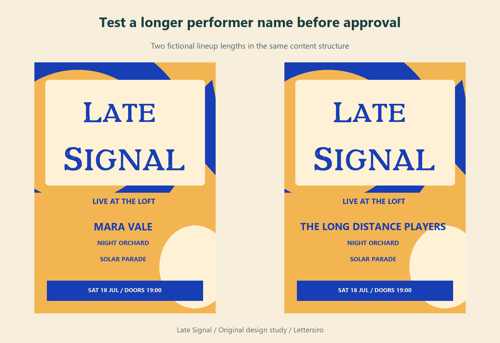
Test a longer artist name as well as a short one. Leave a repeatable rule for how supporting acts wrap onto another line. A composition that works only with convenient placeholder text is difficult to maintain when an organizer adds a real performer.
Export versions for their actual destination
Keep the editable Illustrator source. For a digital announcement, export an image at the dimensions requested by its destination and inspect the actual downloaded file. For print, use the printer's requested PDF settings and proof the final dimensions, bleed, colors, and text. Adobe's export guidance explains the Export As workflow and artboard selection.
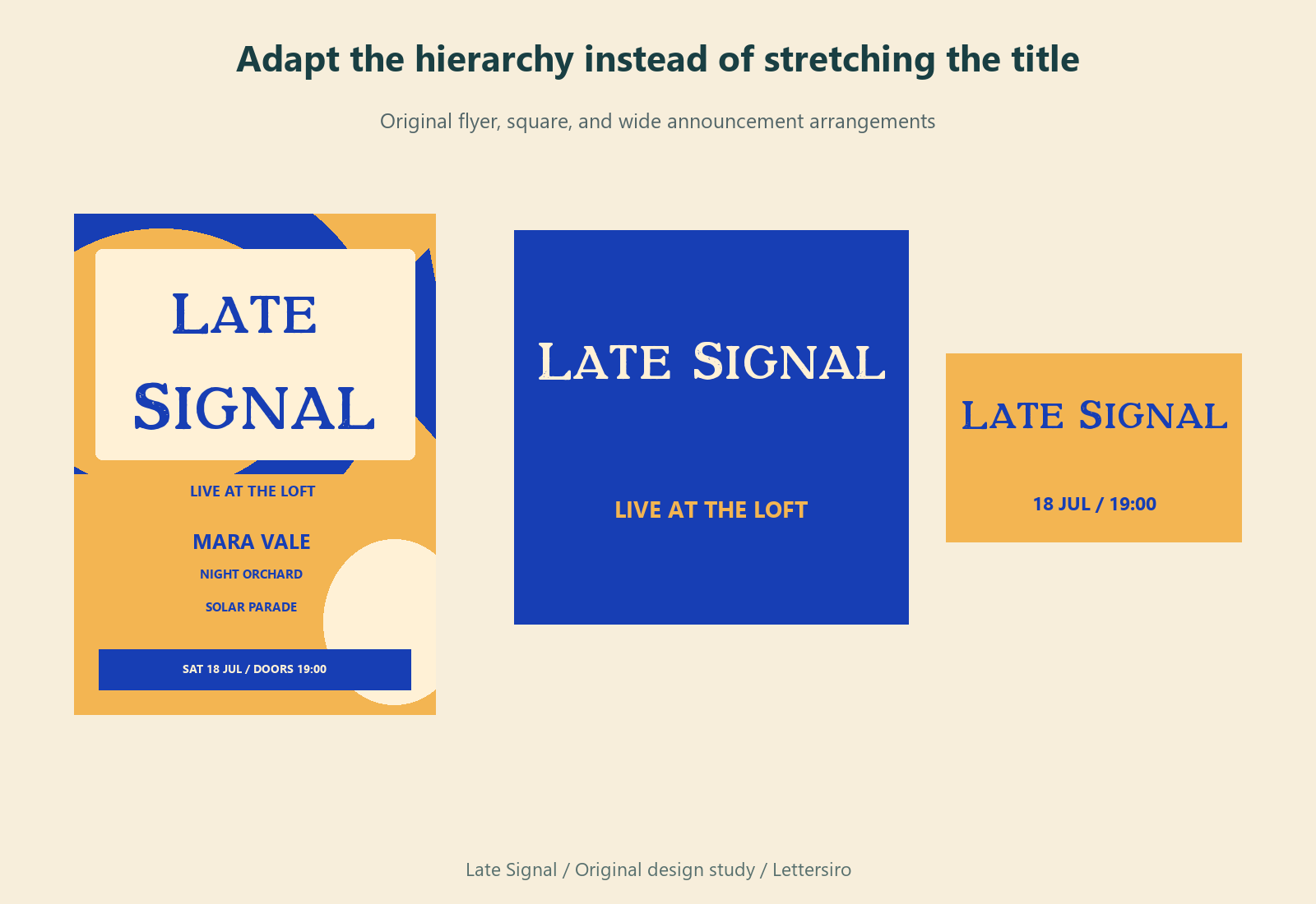
Before approval, compare the exported file with the confirmed event information line by line. An attractive poster with an incorrect date is still an unsuccessful event asset. Save the approved version with a recognizable filename so the organizer can distinguish it from earlier drafts.
Explore Grand Retro if its letterforms fit your event's tone, or try your own title in the Lettersiro Logo Tester. Choose the font after considering the name, lineup, and intended formats, and review the license information for the planned use.