A useful way to explore a free display font is to give it a small, specific job. For an outdoor event, that might be a title on a welcome card, a short route identifier, and a number on a participant card. The same typeface can connect those pieces without being responsible for every instruction.
This project uses the actual Wild Sight font from the Lettersiro resource page. Ridgeway Trail Day is a fictional event created for the design examples. The illustrations demonstrate visual organization; they are not a real event announcement or a navigational map.
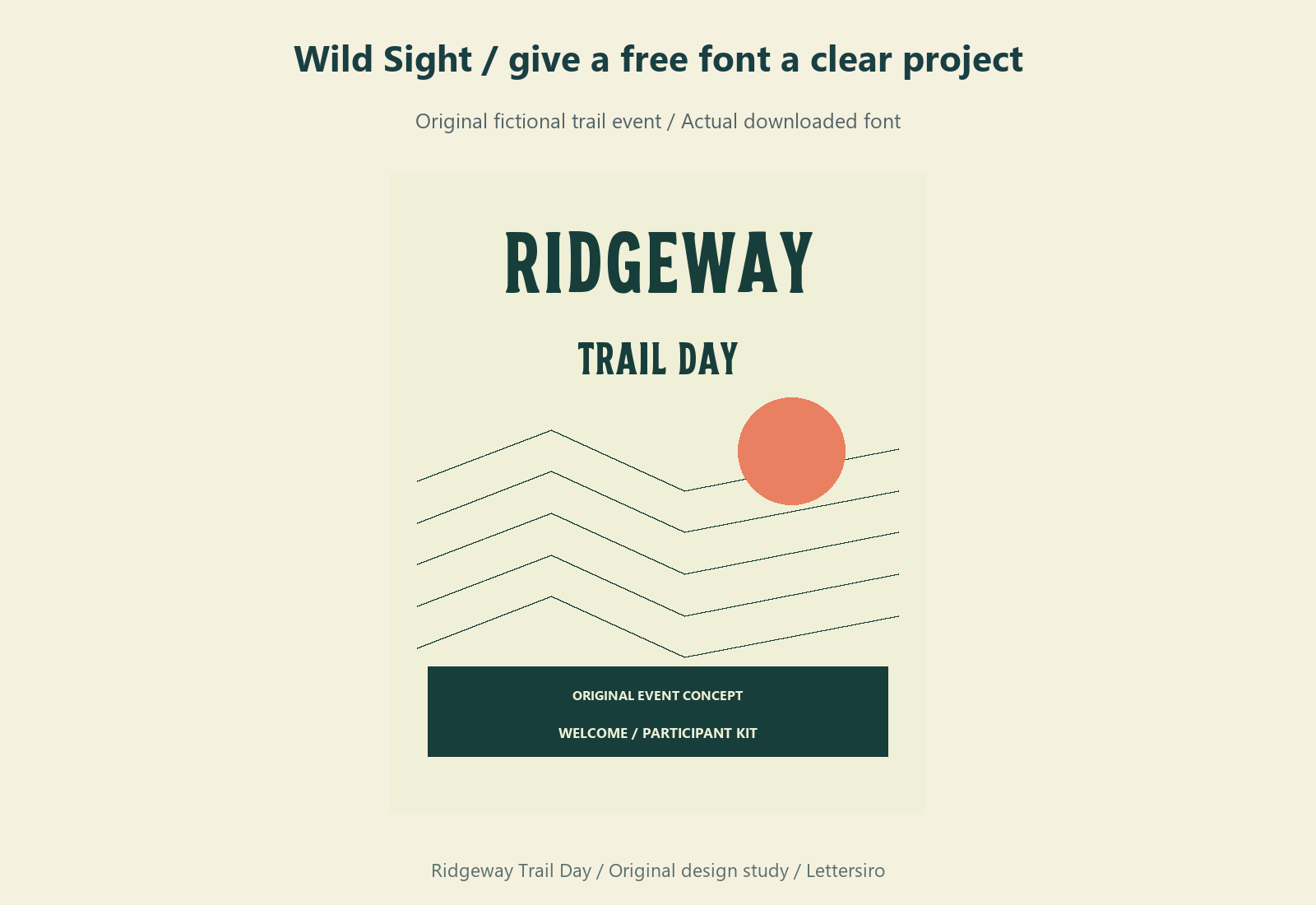
Inspect the download before choosing a layout
Open the resource's own page and check its current access and license information. A font's free-use label and the website's download-access requirements are separate questions. Keep the original source link with the downloaded package so you can return to the item information when the project changes.
Inspect the files included in your copy instead of assuming that every format or style is present. The package examined for this project contains Wild Sight font files in several formats. A desktop layout and a website do not necessarily use the same file or permissions. Choose the appropriate file for the actual destination, then test the wording you need.
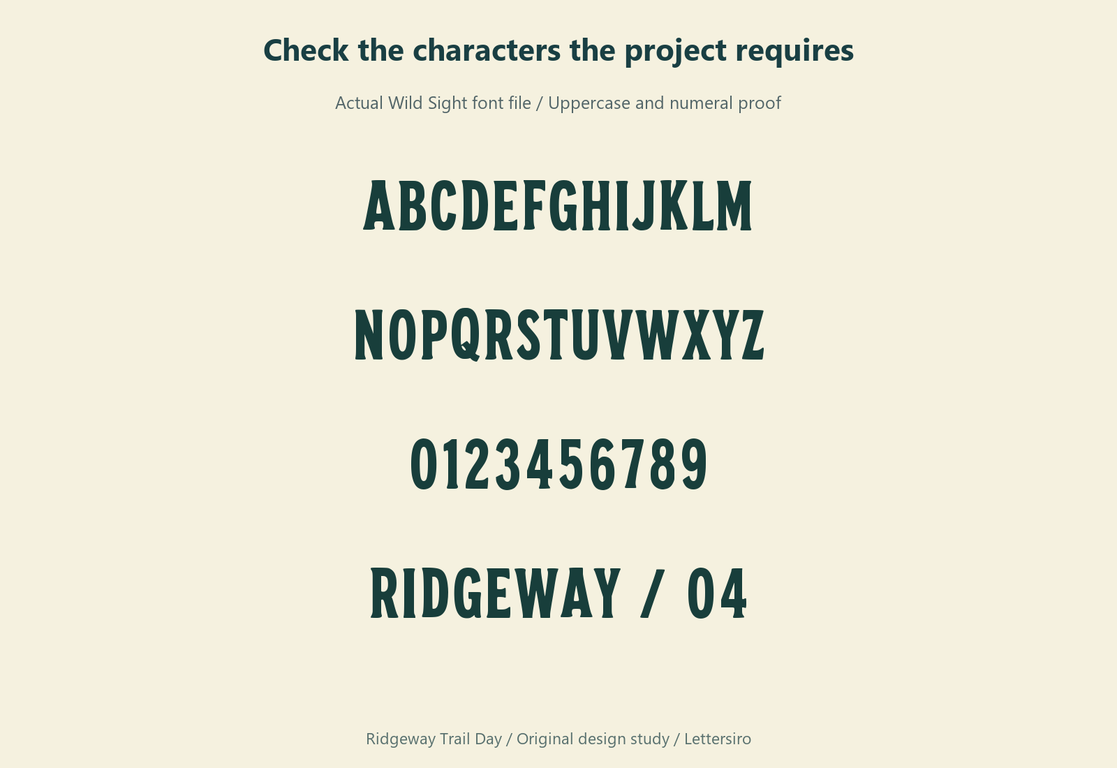
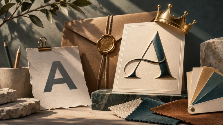
The character proof is a practical starting point. Check the letters in the event name, the digits in the participant numbers, and any punctuation in the details. A visually appealing headline does not establish complete language coverage. Test accented names and other required characters in your own application before committing to the full event kit.
Assign Wild Sight to short, recognizable information
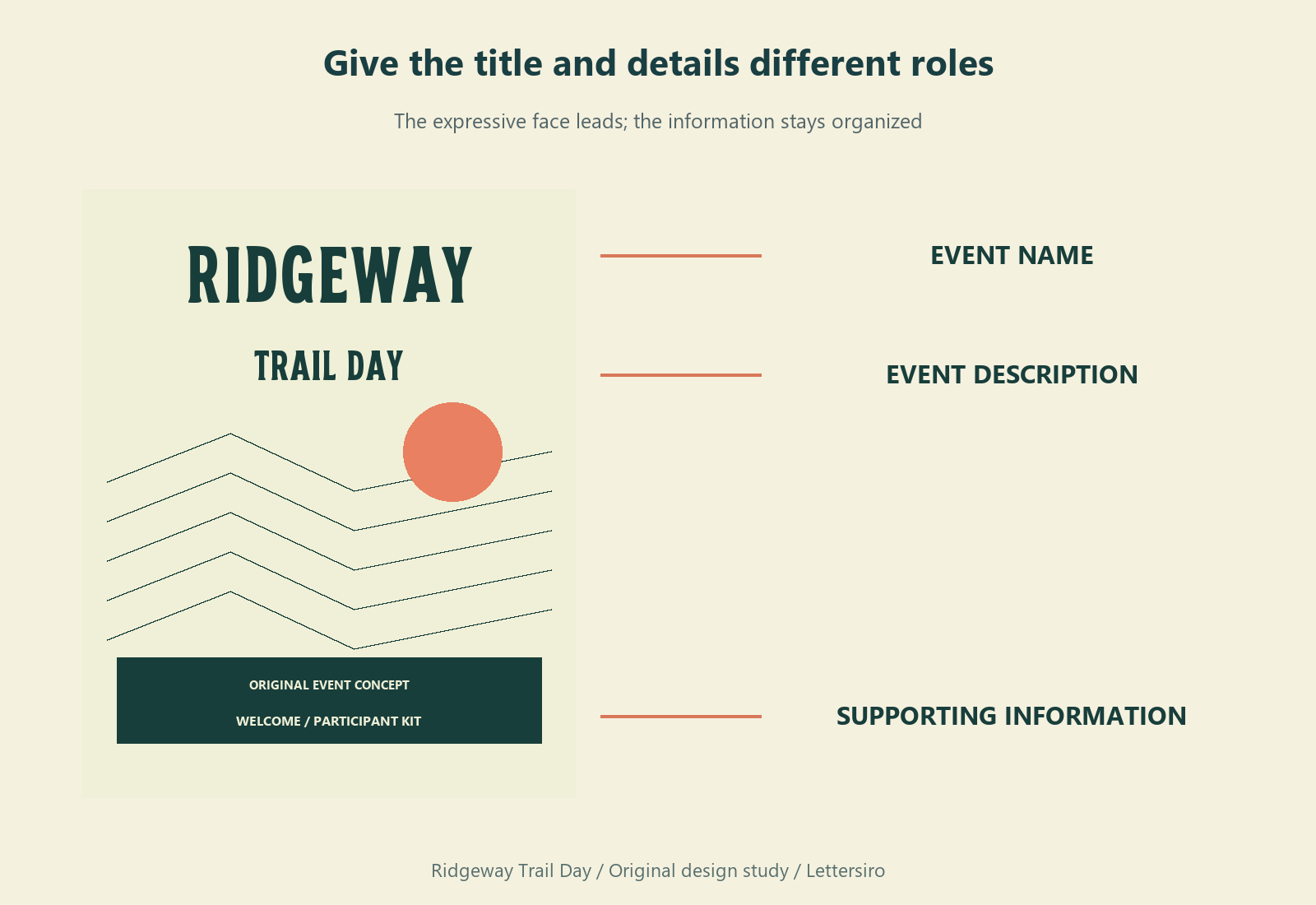
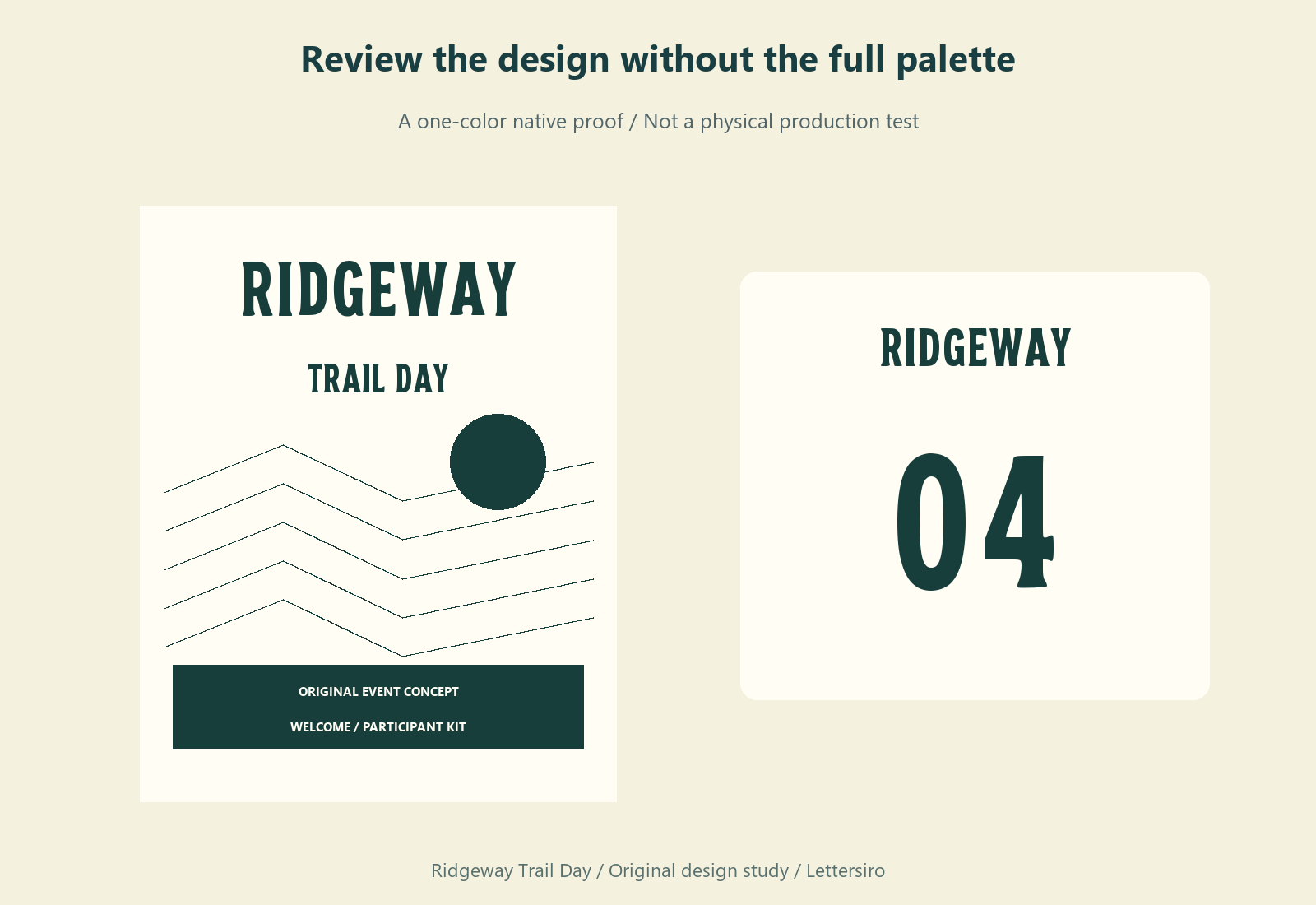
Use the display face where the shape of a short phrase can establish character. In this study, Ridgeway leads the welcome design, Trail Day explains the event, and a quieter information style handles the supporting details. This division keeps the expressive title from competing with every line beneath it.
Avoid shrinking the display lettering merely to fit a paragraph of instructions. A map legend, a long meeting-point description, and an accessibility note have different reading demands from an event title. Give those elements an appropriate information style and enough space in the composition.
Build a compact set of related pieces
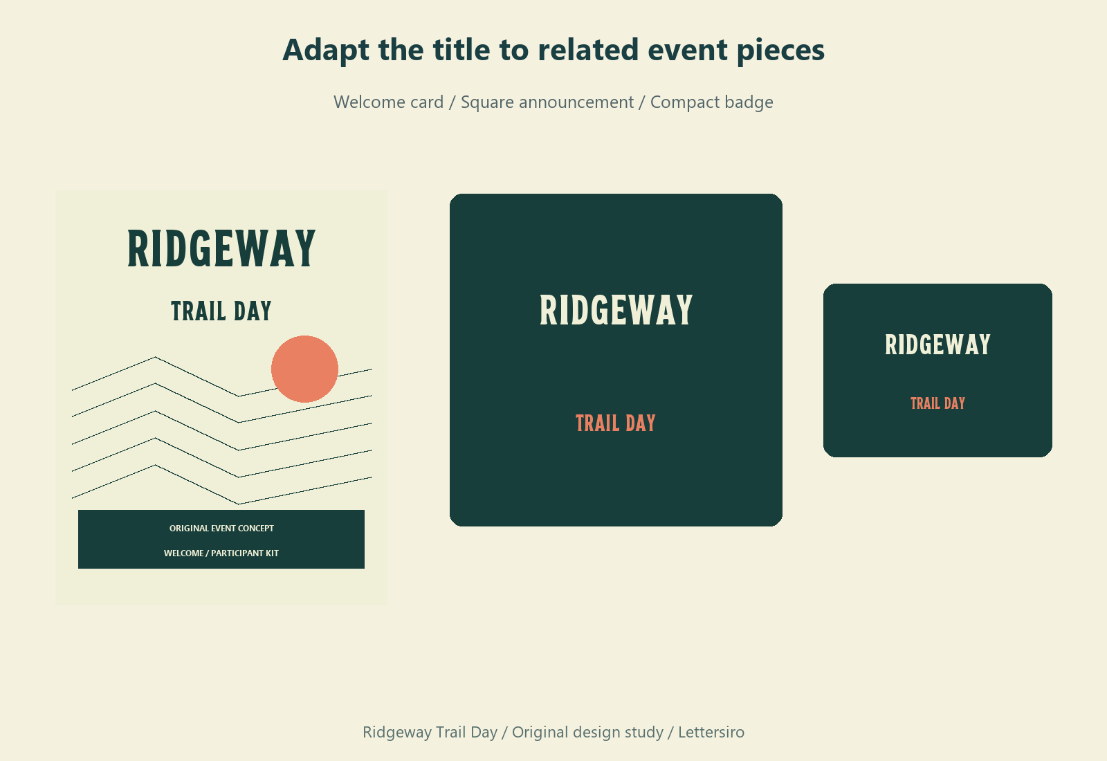
Start with one welcome card and establish a consistent placement for the title. Then adapt that relationship to a square announcement and a small participant card. Change the arrangement to fit the area, while preserving the basic letterforms. Stretching a word horizontally to match every format produces inconsistent shapes across the kit.
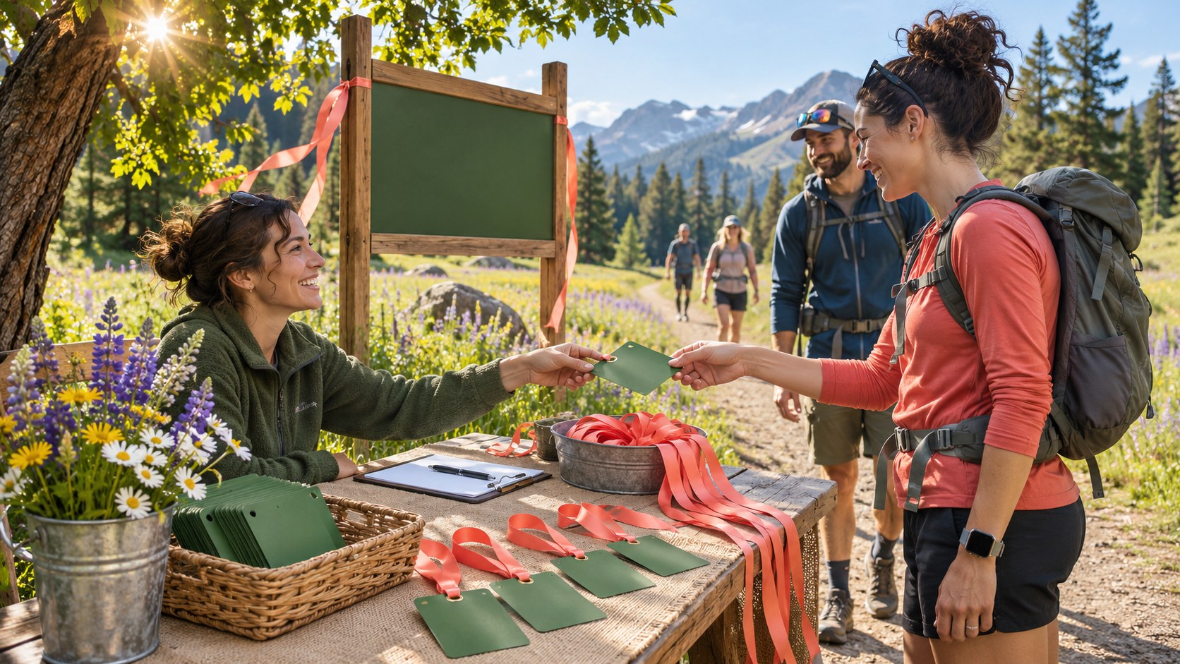
Use a small palette that can work both with and without the landscape illustration. Forest green and coral provide the example's recognizable accents. The geometry is original artwork, separate from the font. For your own project, choose imagery that represents the event accurately and that you have permission to use.
Test the numbers as their own design task
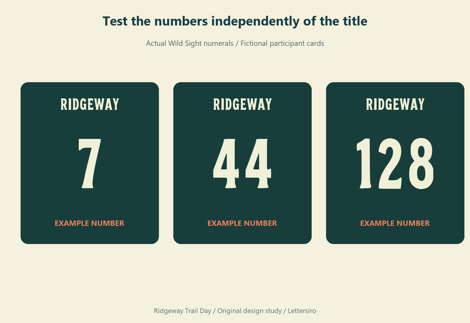
Participant numbers deserve a separate proof. Check a single digit, a number with repeated digits, and a longer identifier. These combinations occupy different amounts of space. Keep a predictable position for the number so the card does not change its overall reading order with every participant.
Do not assume that a bold-looking number in an enlarged image will be easy to identify at the real viewing distance. Print a sample at the intended size if the card is physical. Review its contrast, position, and surrounding marks. When numbers serve an operational purpose, have the event team assess the proof in the conditions where it will be used.
Keep the download and final artwork connected
Save the editable source, a clear export, and the source record together. Name each output by its purpose, such as welcome card, square announcement, or participant number. This is more useful than keeping a folder of indistinguishable final versions when a date or venue detail changes.
Visit the Wild Sight resource page for the current download details. You can explore additional lettering directions through the Lettersiro font catalog or try an actual project name in the Logo Tester. Choose a premium font when its particular shapes, files, or features fit the job, and consult the license information for the intended use.
The finished kit should make the title, practical details, and participant identifier feel related while allowing each to do its own job. That is a more useful evaluation of a free font than judging a single decorative word in isolation.