Lorem ipsum can reveal the shape of a paragraph, but it rarely reveals the full difficulty of a real layout. Product names vary. Headings arrive with awkward lengths. A short action label becomes a sentence. AI can help draft a more demanding set of fictional content before the final copy is ready.
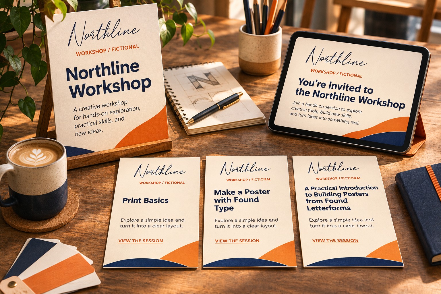
Use it as a source of layout test cases, then keep those cases visibly separate from approved copy. This guide uses Northline Workshop, a fictional creative business, to compare short, ordinary, and longer content. The original layout illustrations use actual Hamilton lettering in the brand role. They are not screenshots of a particular AI product or evidence that one model performs better than another.
Tell the model which layout problem to stress
Begin with the content role rather than asking for attractive marketing copy in general. Name the field: product title, event description, speaker biography, action label, or another specific piece of the layout. State the audience and tone, then ask for several realistic lengths.
For a workshop card, a useful prompt can request a concise session title, a longer session title, a two-sentence description, and a practical action label. Ask it to use invented details and avoid claims about a real company. The goal is a set of plausible shapes and meanings that expose the layout's limits.
Request awkward cases as well as easy ones
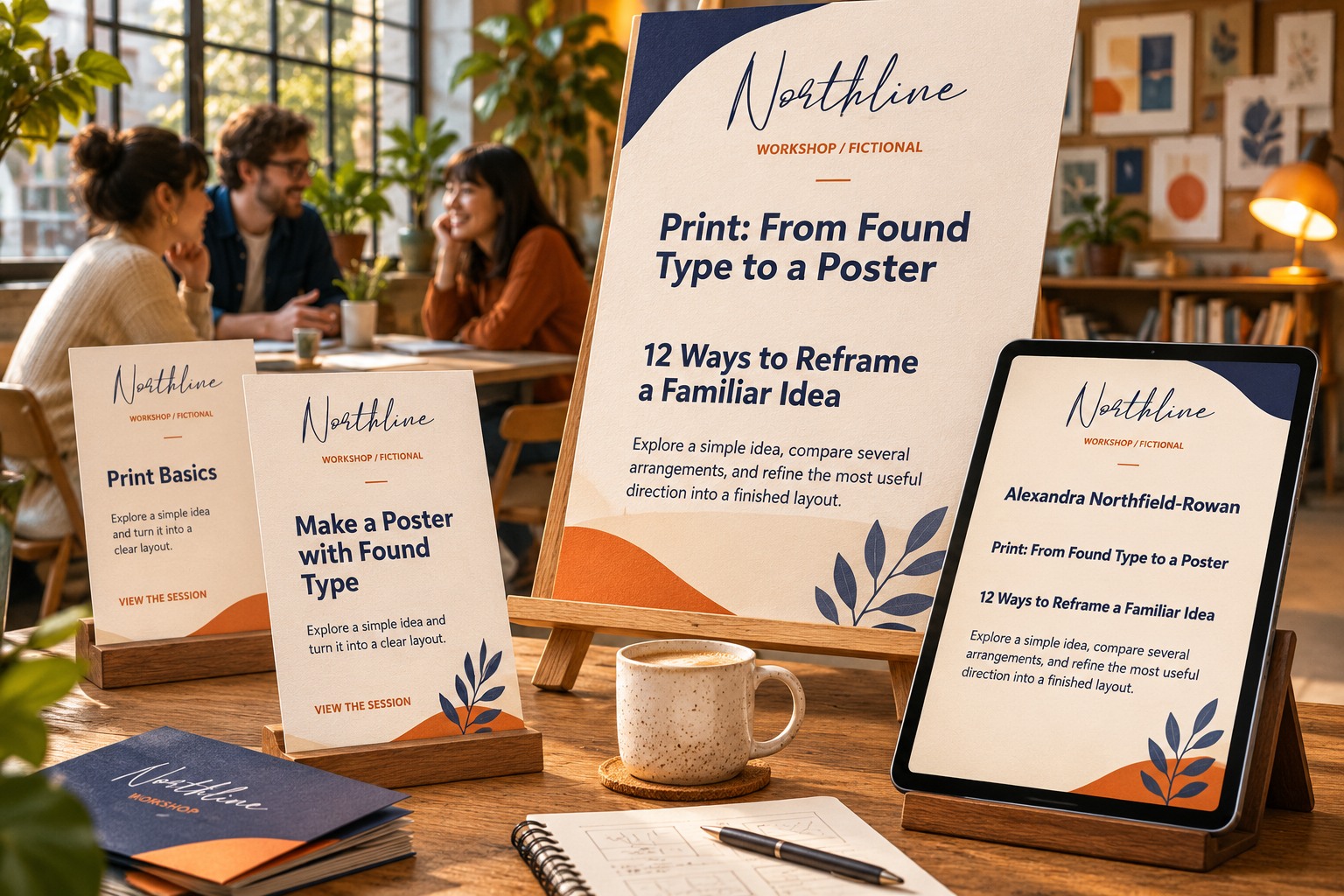
A model may produce several similarly neat headings unless you ask for variation. Request one long proper name, a title containing a colon, a phrase with a numeral, and a description that needs an additional line. Keep those cases tied to the project's likely content rather than adding random difficulty.
Use character or word limits as guidance, then count the output yourself when the limit matters. A generated response is not a substitute for checking the actual text. The final line count also depends on the font, text area, and rendering environment, so a character count alone cannot predict the layout.
Put the copy into the real text styles
Paste the candidates into the actual working file. Use the intended family, style, size, and text area. A sentence that looks short in a chat window can wrap into several lines in a narrow card. Avoid adjusting the font for every candidate before you have inspected the problem.
For Northline Workshop, Hamilton identifies the brand while session names and descriptions use an information style. Keeping those roles separate allows the test to focus on the content area. If a heading collides with the brand, revise the hierarchy or available space before assuming the entire font pairing must change.
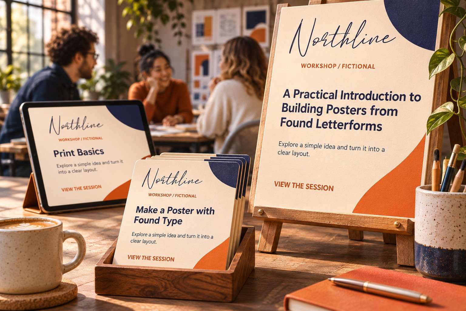
Record the failure instead of quietly fixing it
Note exactly what happens when a candidate becomes difficult. Does the title add a line? Does it push the action below the visible area? Does a long name collide with a badge? A specific observation leads to a useful rule.
Keep one ordinary case beside each demanding case. That comparison helps you decide whether a revision improves the system or merely favors one unusual sentence. A layout with more room may solve the long title while making the short title look disconnected; inspect both before approving the change.
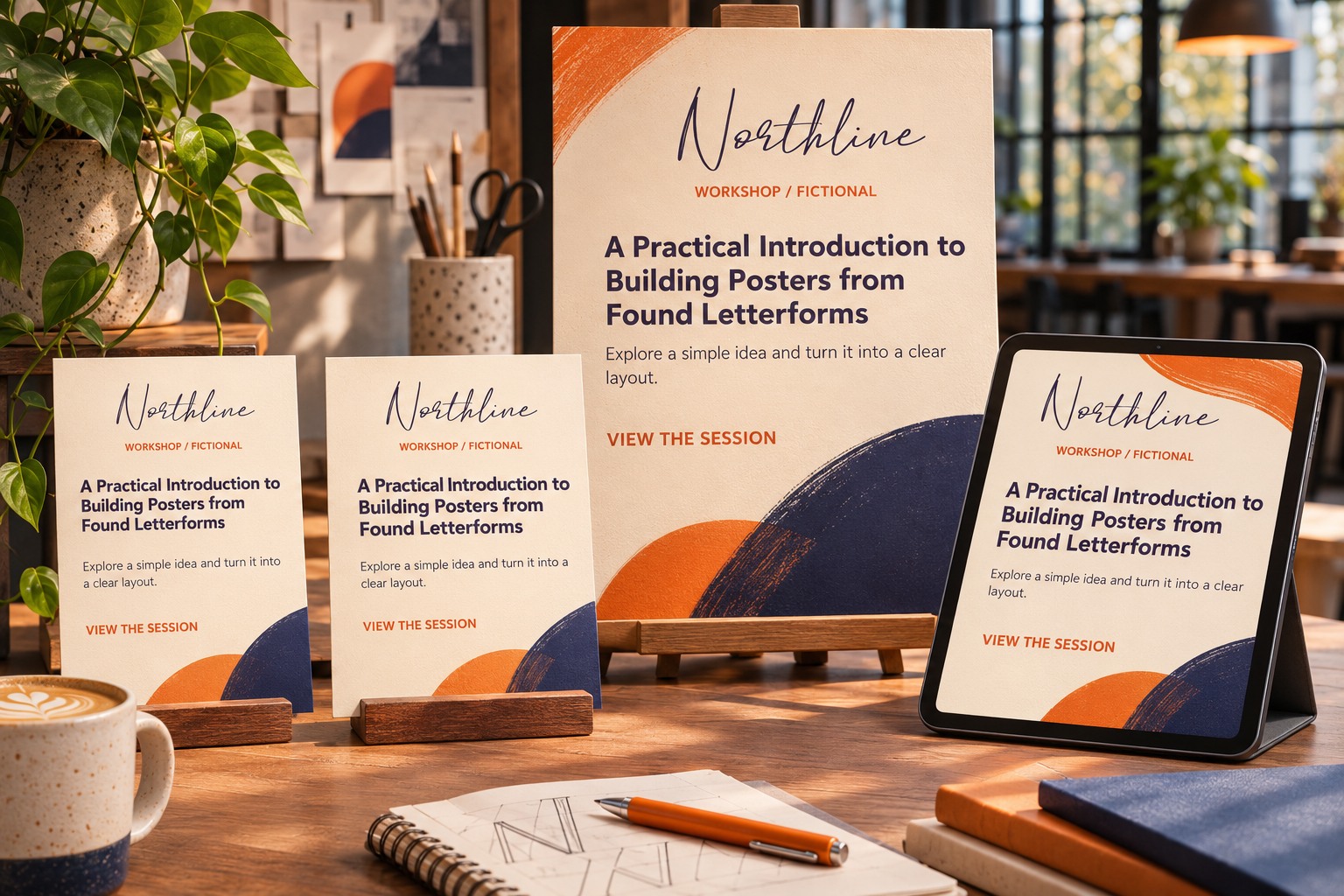
Decide which content is allowed to change
Some problems should be solved through editing. Others require a different layout. Identify the difference with the team. A campaign slogan may be negotiable; a person's name should not be shortened casually to make a card more convenient. A required product statement may need its own area rather than a smaller font.
Write a short rule for each important exception. For example, a longer title can use the two-line arrangement, while a longer description can move to a detailed view. Keep the rule tied to the actual content and platform. Do not present an arbitrary number of characters as a universal design standard.
| Case | What to observe | Possible response |
|---|---|---|
| Long title | Extra line and displaced content | Alternate heading arrangement |
| Long name | Collision or unintended truncation | More reserved name space |
| Longer description | Action becomes crowded | Larger content area or detailed view |
| Longer action | Button or label no longer fits | Review wording and component width |
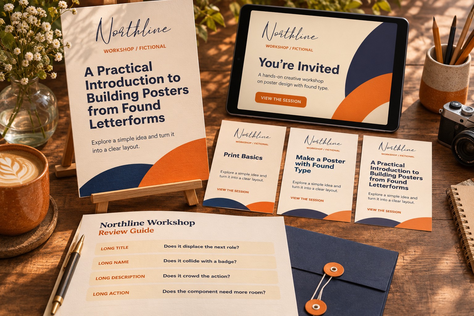
Replace every placeholder before publication
Mark the working file clearly and keep a list of fields that still contain invented content. Before export, compare the final copy with the approved source, including names, dates, prices, and claims. A realistic placeholder is useful precisely because it looks plausible; that also makes it easy to overlook during a rushed handoff.
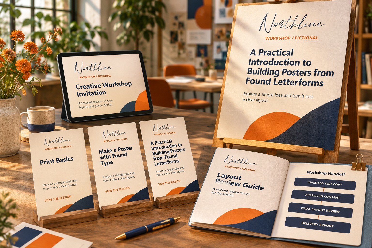
Save the demanding examples with the template so future editors can repeat the check after a design change. For related spacing decisions, see Lettersiro's kerning, tracking, and leading guide. Explore Hamilton when its character fits the brand role. AI-assisted placeholder copy has served its purpose when it reveals a concrete layout weakness early enough to fix it with the real project still in view.