A packaging image can look convincing while leaving no useful place for the actual brand name. Ember Study is a fictional home-goods concept used to plan an AI-created atmosphere around a separate editable label. The generated scene provides materials, lighting, and context; the native typography proof uses real font lettering.
The visual examples use Ember Study, an original fictional project. The native font proofs use actual Lettersiro files. The thumbnail is AI-created editorial illustration; any lettering within that illustration is separate from the real font specimens below.
Give the name a practical reading role
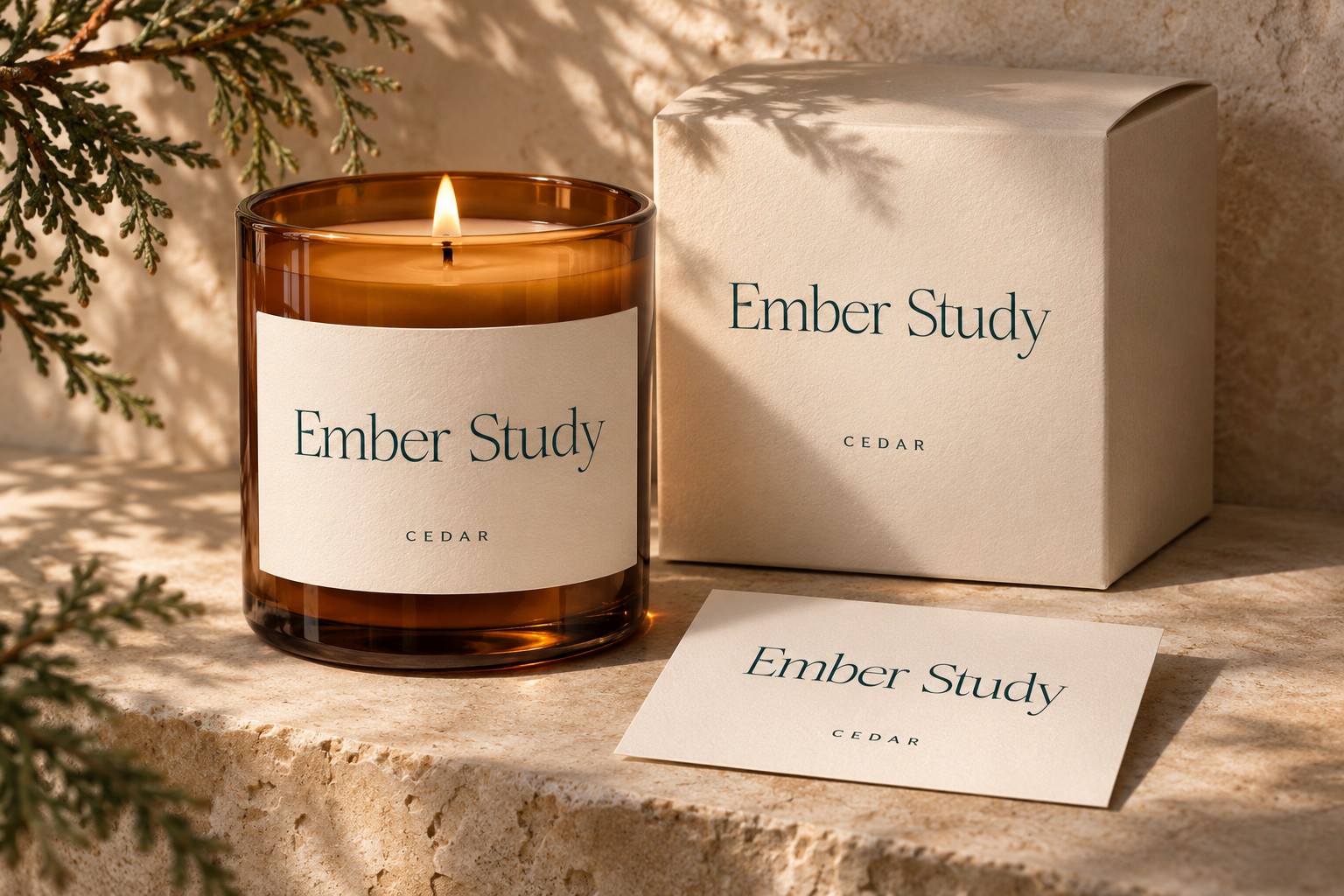
Use the flat front panel to establish the brand, the product descriptor, and their relationship. The product application adds context, while the separate native specimens keep the lettering inspectable. A curved surface can change how much of a label is encountered at once, so the final artwork needs to be considered with the actual container. Keep the name stable across variants and give changing descriptors a consistent area. Test a longer realistic descriptor before approving the family. The mockup makes the composition tangible; actual dimensions and material choices belong to the real production discussion.
The article's AI image is an original illustrative concept, not a production mockup benchmark. The native studies demonstrate the typography decision independently. Preserve the prompt, source image, editable wording, and approved export so a corrected product name does not require regenerating every part of the design.
Three real font routes for the brief
Write the visual brief around the object, camera relationship, surface, and intended reading area. Ask for a quiet label surface without generated branding when the wording must remain exact. Then build the real name and product hierarchy separately. A generated blank area still needs inspection for curvature, perspective, and available space before the layout can be applied convincingly.
Romans Branding
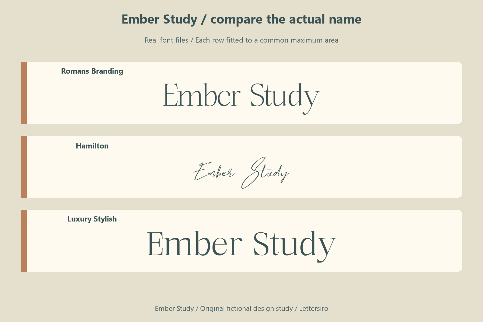
Romans Branding gives the name a refined serif rhythm with a visible contrast between stronger and finer strokes. Inspect how its capitals establish the line and how the smaller forms connect the words. The more delicate details deserve attention in the compact proof. Its role here is a considered name treatment; the practical supporting information has a separate reading job. Explore the current Romans Branding information alongside the actual project requirements.
Hamilton
Hamilton introduces a light signature gesture with clear movement through the name. Its extending strokes can give a personal character to a wide layout, while a smaller application may need more room or a quieter surrounding composition. Compare the actual capitals and repeated letters. A signature treatment works best when the project also has a clear, ordinary reading style for practical information. Explore the current Hamilton information alongside the actual project requirements.
Luxury Stylish
Luxury Stylish provides a structured serif direction with a pronounced relationship between thick and fine strokes. The name can feel deliberate without depending on an enclosing emblem. Inspect the repeated upright forms and the available space around the capitals. A generous large presentation should be paired with a compact proof so the finer details are considered in a realistic context. Explore the current Luxury Stylish information alongside the actual project requirements.
Review a compact proof
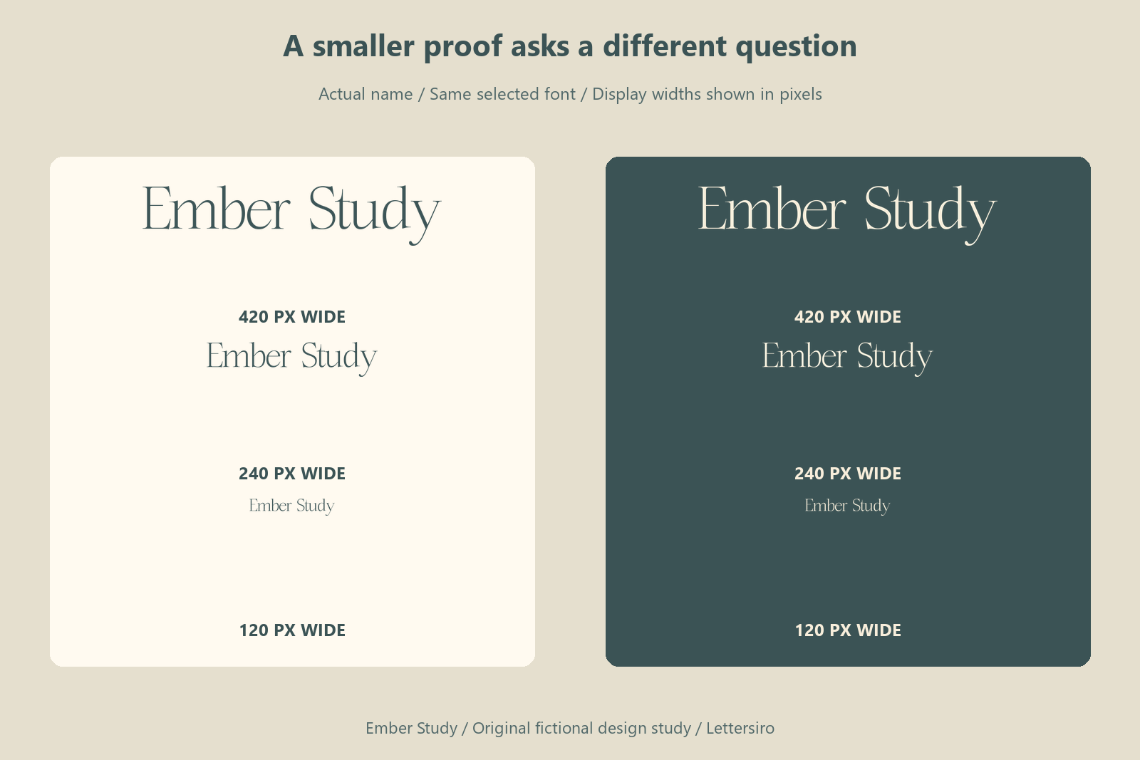
Review the name both alone and within the full composition. The isolated proof exposes letter relationships; the application reveals competition from images and other text. If the name works in only one of those views, identify the actual source of the difficulty before replacing the font. Space, contrast, and the supporting hierarchy may need attention. Record the chosen application and a compact proof together so the identity is understood as a working relationship rather than one enlarged specimen.
The wording contains 10 non-space characters. The repeated letters include e, which makes their spacing and surrounding rhythm worth inspecting in the actual name. Keep the whole word shape visible while reviewing those details. A correctly spelled, clearly organized name is the practical goal; the measurement table and reduction figure simply make parts of that decision easier to examine.
Check the space the complete name needs
The following measurements come from drawing Ember Study at a nominal 64-pixel font size in the local Pillow renderer. They record the visible ink bounds for this exact string, using the ordinary setting. They are a controlled project reference rather than a browser-layout benchmark or a score for font quality. The fitted name illustration above answers a different question: how the choices look within a shared maximum area.
| Actual font file | Ink width at 64 px | Ink height at 64 px |
|---|---|---|
| Romans Branding | 322 px | 67 px |
| Hamilton | 292 px | 96 px |
| Luxury Stylish | 377 px | 63 px |
In this particular rendering, Luxury Stylish occupies the greatest width and Hamilton the least; the widest result is about 1.29 times the narrowest. This difference can affect the line break or available room for a descriptor. It does not establish which version reads best. Compare the actual word rhythm and application before deciding whether width is the constraint that matters most.
The character maps of the three local font files were also checked for the 10 distinct non-space characters required by Ember Study. Each contains those characters. This confirms the wording used in these proofs, rather than complete support for every language or future phrase. For your own project, repeat the check with the actual names, punctuation, numbers, and any accented letters you need before building the final layout.
Keep the image and the real type connected
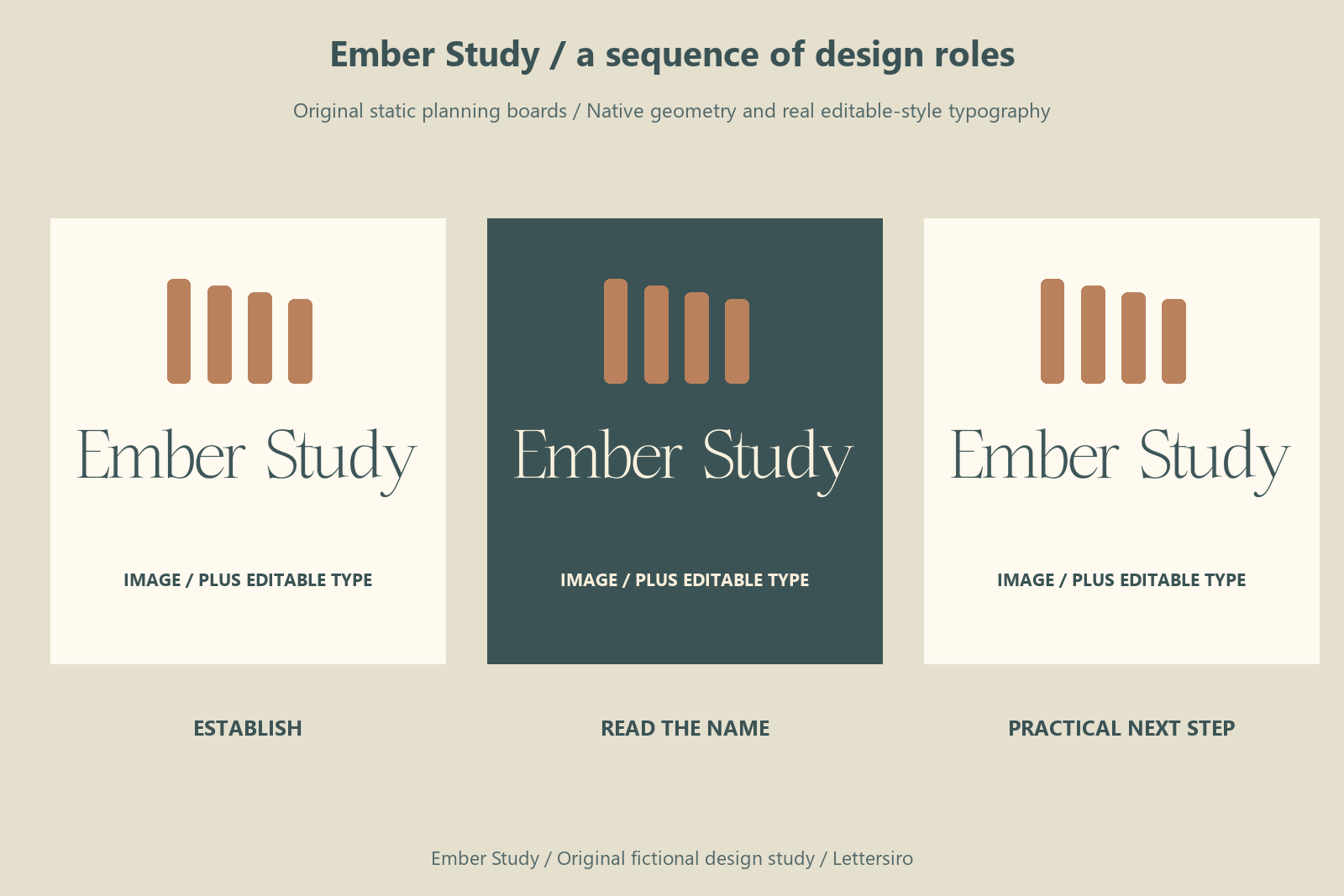
Keep the stable identity and exploratory imagery in separate, clearly named roles. Preserve the real name as editable text and record which image is a concept, source, or selected final asset. A generated scene can support atmosphere while the native type layout provides exact wording and a reviewable hierarchy. Check the actual result against the brief rather than assuming the prompt guarantees it. Store the chosen image, prompt, type source, and final export together so a correction can be made to the appropriate component.

Try the wording for your own project
Use the Lettersiro Logo Tester to compare your actual name, then inspect the current product page for the chosen style, files, features, and license options. For this brief, Romans Branding is the primary native application direction; the other two candidates show how a different letterform voice can change the decision. Your own wording may produce a different result.
Keep an editable text source and a clearly named approved export. Where a recipient needs outlined lettering, Adobe's type-to-outlines guidance explains the operation and the value of preserving an editable copy. Check the actual Lettersiro license information for the intended project and delivery.
Before approving your version, record the actual name, the smallest important application, the longest supporting line, and the reason behind the selected font. That short record gives the next design revision a useful starting point.