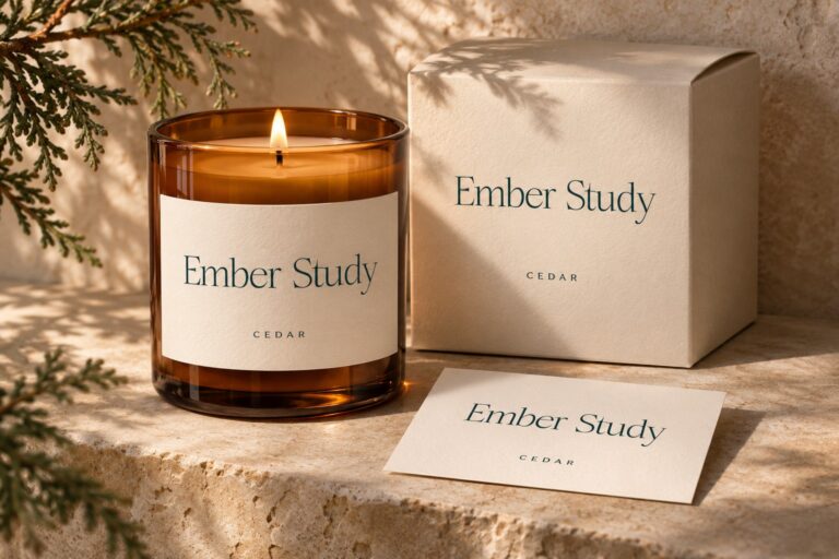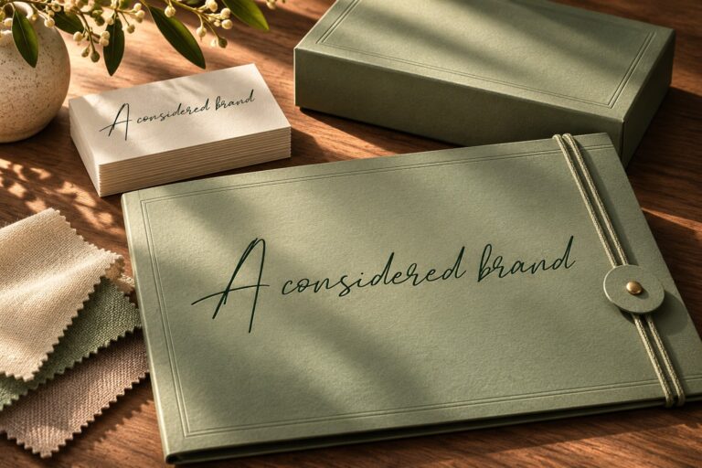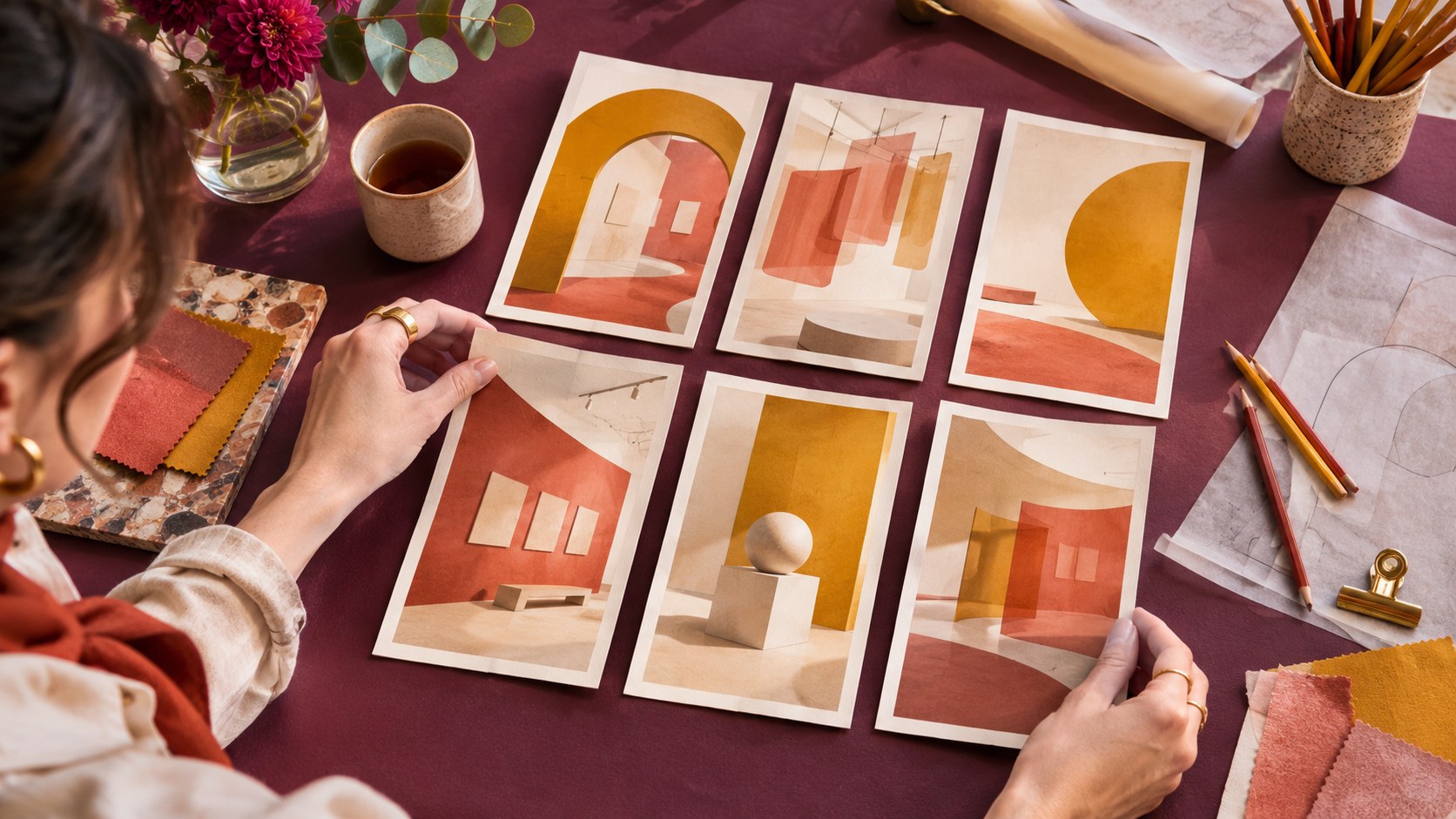
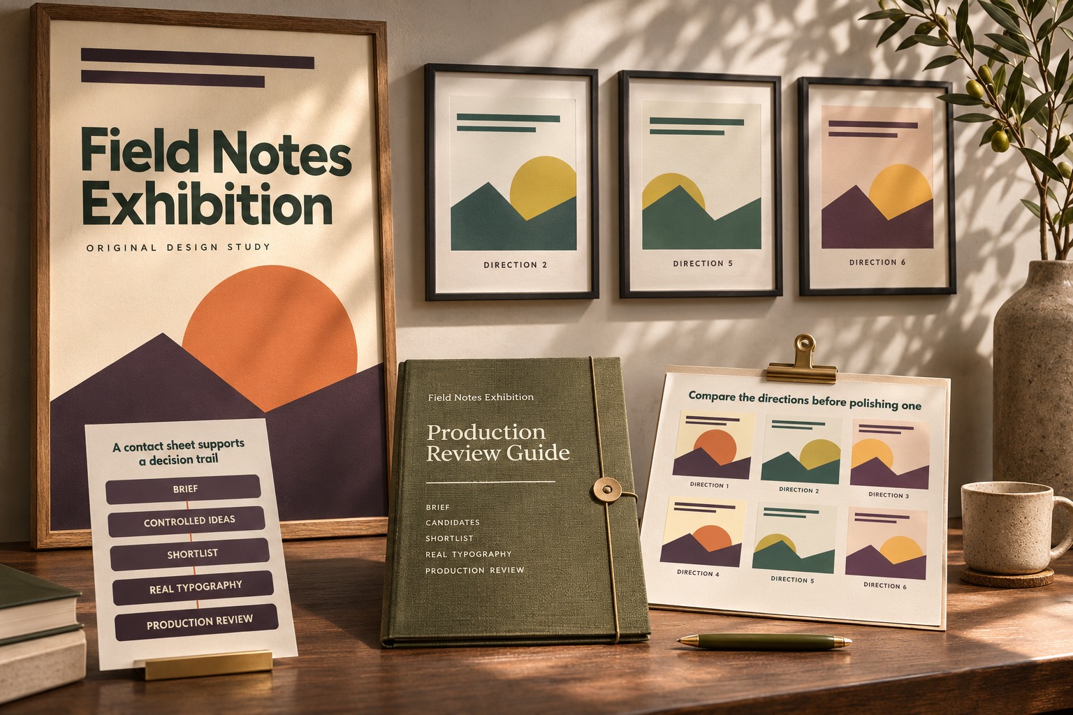
A polished image can win a presentation before anyone asks whether it solves the brief. A contact sheet changes the order of that conversation. It places several small directions together so you can compare composition, tone, and information space before spending time refining one attractive result.
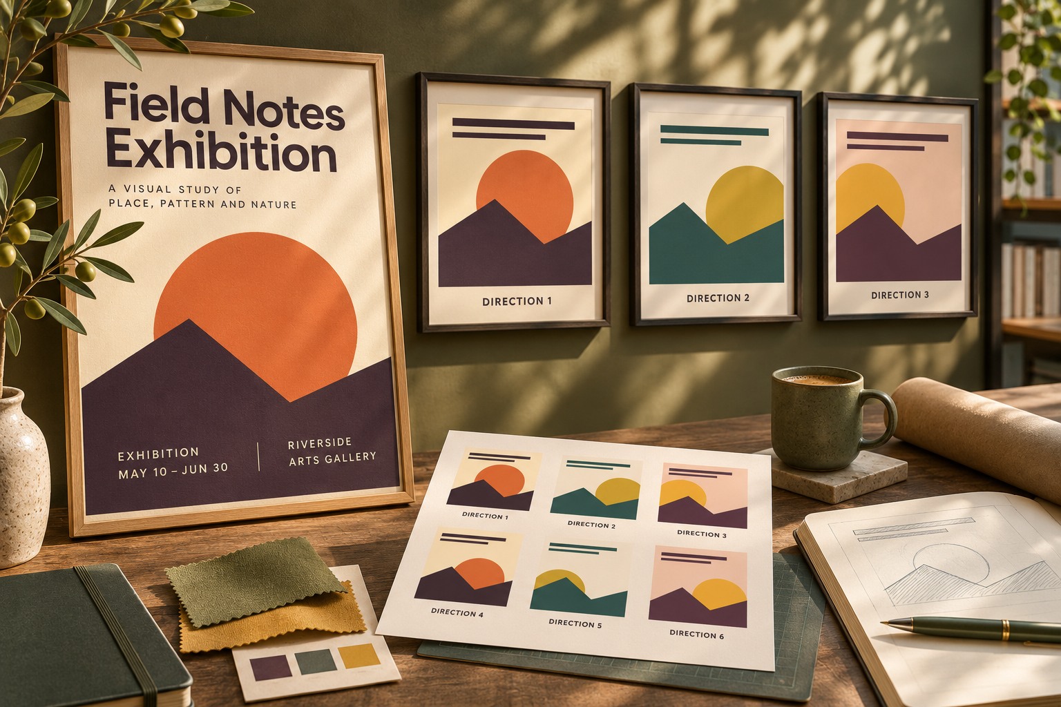
AI can help generate visual starting points, but the sheet still needs a deliberate question. Six unrelated images are a gallery. Six directions responding to the same brief can support a design decision. This guide uses Field Notes Exhibition, a fictional event, to explain the method. Its examples combine original layout references with AI-generated application mockups; they illustrate a review method rather than a model benchmark. The source header artwork uses the actual Ancient Museum font.
Write a brief that survives a change of image
State the audience, communication goal, required content, and intended placements before generating anything. For the fictional exhibition, the design needs to announce a small collection of landscape observations. It must leave room for the event name, a short description, and practical details. Those requirements remain stable whether the image is quiet, energetic, photographic, or abstract.
Decide what the sheet is meant to resolve. You might compare a central image with an edge composition, or a restrained palette with a stronger accent. Avoid asking it to settle composition, copy, font choice, and campaign strategy simultaneously. A narrower decision makes the differences easier to discuss.
Vary one useful axis at a time
Create a small set of related prompt directions. Hold the subject and delivery purpose steady while changing the property you want to inspect. Keep the requested empty information area explicit. If an image looks wonderful but fills every corner with detail, record that as a layout constraint rather than assuming the typography will somehow fit later.
For example, ask for the same abstract landscape idea with a central focal point, a focal point toward one side, and a lower visual horizon. Request no lettering when you intend to add actual fonts afterward. This separates image exploration from typographic production and avoids treating generated letter-like shapes as usable font specimens.
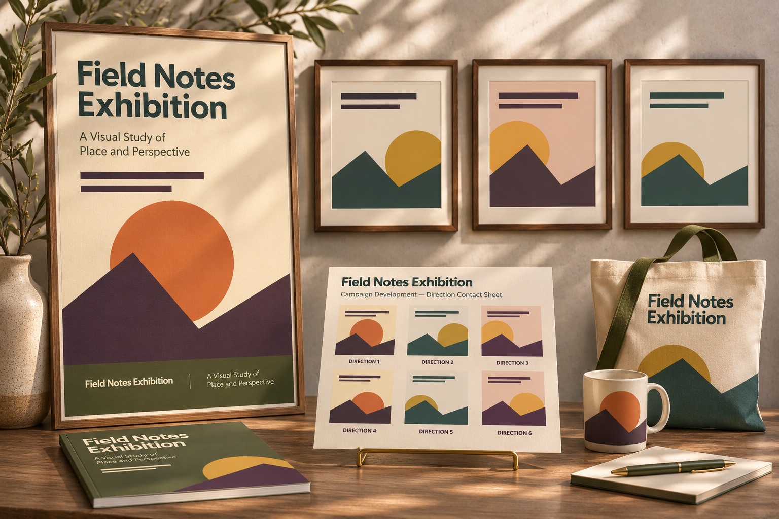
Normalize the sheet before judging it
Give each candidate the same display size and a simple identifier. Use a consistent crop or clearly note when one candidate requires a different crop to work. Place comparable text areas over the images so an unusually empty composition does not receive an unnoticed advantage.
Keep the first pass small enough that you see the whole set together. Large individual previews encourage attention to attractive texture before the structure has been compared. A second pass can inspect image defects, edges, and detail in shortlisted candidates.
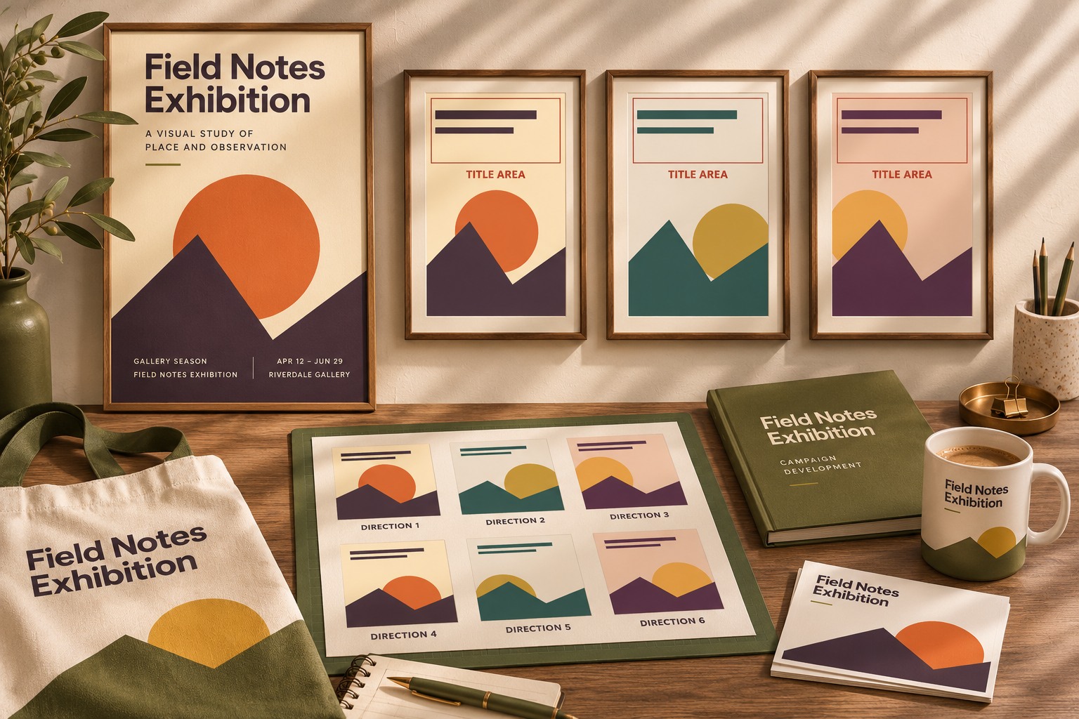
Use criteria that describe the job
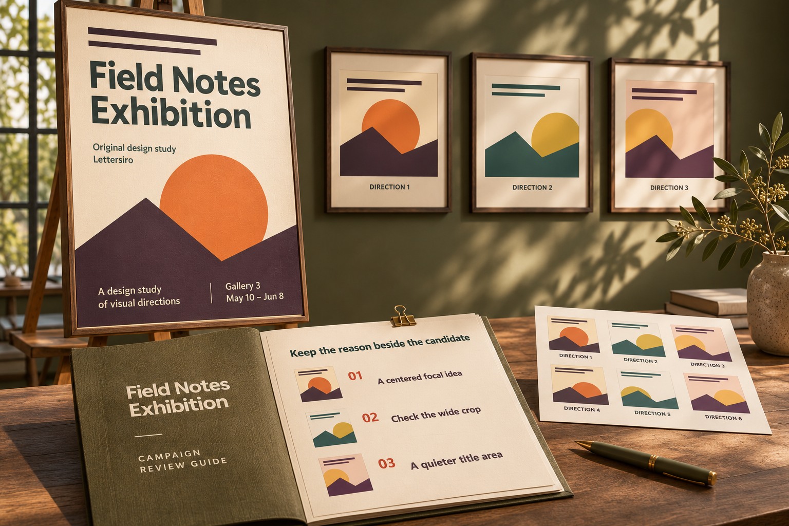
Write a few observable questions beside the sheet. Does the focal point support the intended reading order? Is there enough quiet space for the longest title? Does the visual tone match the event? Can the concept adapt to a square and a wide banner without losing its main idea?
Do not replace those questions with unexplained numerical scores. A note such as “the image crosses the title area” is actionable. A score of seven without a reason is harder to use. If the team wants a ranking, keep the reason beside each choice and distinguish preferences from production constraints.
| Review question | Useful note | Next action |
|---|---|---|
| Is there room for the title? | Focal detail overlaps the name | Revise composition or placement |
| Can it adapt to another ratio? | Subject is lost in a narrow crop | Request a related wider direction |
| Does it fit the brief? | Tone feels too dramatic | Adjust the art direction |
| Is it ready for production? | Detail needs close inspection | Review the shortlisted image |
Put real typography on the shortlist
Once two or three compositions remain, add the actual name and practical content in an editable design file. A blank rectangle can reserve space, but real words reveal line breaks and collisions. Try the complete phrase in the selected font, then keep an information style for smaller details.
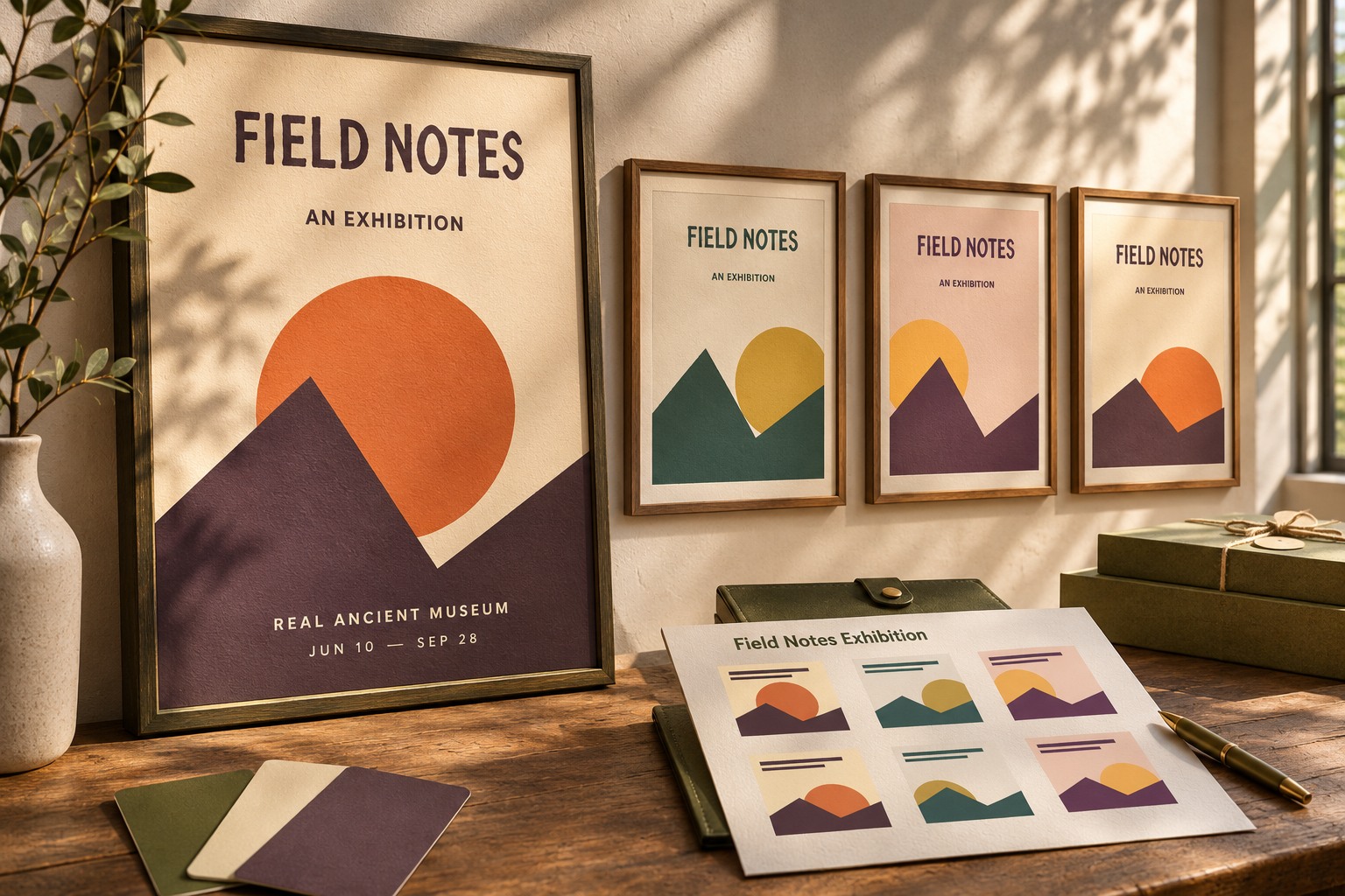
The fictional exhibition uses Ancient Museum as a title voice. The original comparisons show how the same lettering relates to different image areas. They do not imply that the typeface was generated by AI or that an image model can reproduce its precise letterforms.
Preserve a decision trail
Save the brief, prompt versions, candidate identifiers, and the reason for the chosen direction. Keep original outputs separate from later crops and retouching. Review permissions and usage conditions for every asset and tool involved in the final work; a contact sheet itself does not resolve those questions.
Use the Lettersiro Logo Tester for an early wording check and the Ancient Museum product page for the actual font. The contact sheet has done its job when it helps explain a choice: which direction serves the brief, what needs revision, and why that candidate deserves the next round of work.