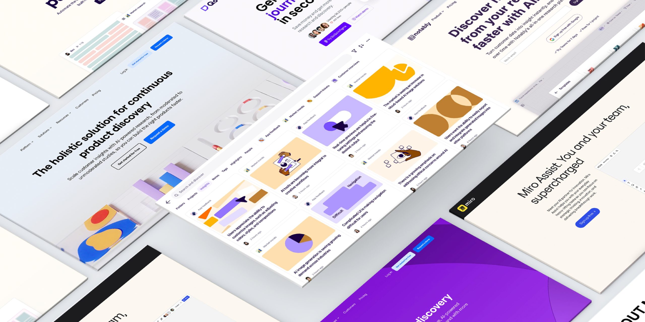
An AI mood board can produce an attractive atmosphere in minutes. The harder task is turning that atmosphere into decisions a designer can defend: which typeface fits the brand, how much contrast the layout needs, and which details should remain consistent across a website, package, and social post.
Treat the board as a set of visual hypotheses. A soft photograph might suggest calm, but it does not tell you whether a thin signature will survive a small label. A dramatic architectural image might communicate confidence, yet contribute little to an approachable service business. The board becomes useful when each reference answers a question about the work ahead.
Start with a fictional brand that has a real problem
Consider an illustrative brief for a coastal guesthouse called Stillwater House. It wants to feel personal and considered, with booking information that visitors can understand quickly. Its audience includes couples planning short stays and guests checking practical details on their phones. The project needs more than an attractive beach image: it needs warmth without losing clarity.
Write three working statements before generating anything: personal welcome, quiet surroundings, uncomplicated information. Add three exclusions, such as nightclub glamour, ornate wedding styling, and sterile corporate imagery. Those boundaries help the image tool explore a direction without confusing every attractive reference with a suitable one.
Gather a few non-generated references too: materials the business actually uses, existing photography, and examples of its printed communication. AI imagery can help explore a feeling, while genuine references keep the proposal connected to the place and its constraints. Keep source notes so the team knows which images are concepts and which represent the real business.
Build contrasting directions, not thirty similar pictures
Create two or three directions with meaningful differences. For Stillwater House, one might use airy handwritten accents, another a structured editorial serif, and a third simple lettering with stronger documentary photography. Hold the brief constant while changing the visual interpretation. Otherwise, the team may compare unrelated brands rather than alternatives for the same brand.
An initial image prompt could read: “Editorial photograph for a quiet coastal guesthouse, pale stone, weathered oak, linen, gentle morning light, intimate human scale, restrained warm palette, no visible branding or readable text.” This describes a scene and mood without asking the generator to imitate a font or deliver finished brand lettering.
Generate a small selection, then remove weak references. Ten nearly identical beige interiors do not provide ten useful decisions. Select one image for lighting, one for material, one for composition, and perhaps one for a different emotional register. Annotate the role each reference plays so the board remains a design tool rather than a collection of preferences.
Translate the board into a type shortlist
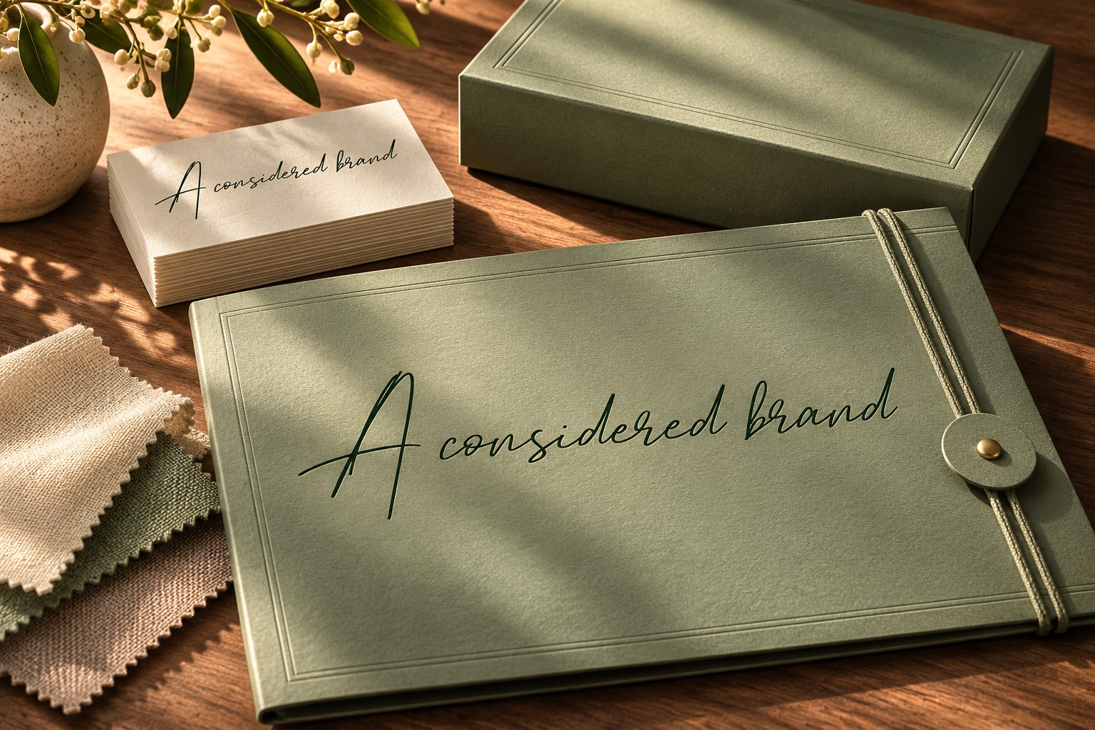
For the personal direction, test Hamilton Modern Signature in the actual guesthouse name. Its signature style offers a potential accent for a welcome line or identity. It should earn that role through readability and proportion, not simply because handwriting seems warm.

Compare a short greeting with the full business name. Check whether distinctive capitals dominate the composition, whether joins remain clear, and whether the signature appears balanced beside practical booking information. A beautiful sample word can hide problems in the actual wording.
For a more structured alternative, look at Master Modern. Its editorial applications suggest a different balance between personality and order. This is a change in design language, not a claim that one font is universally more premium than another.

Place both options into the same simple layout using identical copy, photograph, and dimensions. That controlled comparison makes the effect of the font easier to see. If you change the photograph, color, and headline at the same time, the strongest image may win the review while the typography goes unevaluated.
Annotate what each reference means
Use notes that can guide production. “Elegant” is a starting adjective; “short expressive heading, generous margins, dark text on a pale ground” is an actionable interpretation. “Natural” might translate into documentary photography and uncoated paper rather than a distressed texture on every letter.
| Mood-board observation | Possible design decision | Question to test |
|---|---|---|
| Quiet interiors with generous space | Fewer elements per page | Can guests still find prices and booking details? |
| Personal handwritten marks | Signature accent in limited roles | Is the full name readable at small sizes? |
| Strong light and dark areas | Clear text zones in photography | Does contrast survive different crops? |
Keep the notes provisional. A mood board describes a direction; the prototype reveals whether that direction works. The purpose of annotation is to make the next experiment clear, not to freeze an untested idea into a rule.
Test one complete moment in the customer journey
Design a booking-page opening section, a welcome card, and one social announcement. These three applications expose different demands: a screen needs navigation, a card needs a comfortable physical scale, and a social post needs a clear focal point at reduced size. A consistent brand does not require identical compositions across all three.

For Stillwater House, a signature might work beautifully on the welcome card while the booking button needs simpler type. That is a useful finding, not a failure of consistency. Give each font a clear role and preserve the recurring relationships: palette, spacing, heading treatment, and image tone.
Ask reviewers to describe the direction before showing the intended adjectives. If they independently mention calm, personal service, and easy navigation, the proposal is communicating. If they only mention luxury or wedding stationery, investigate which reference or type treatment caused the shift.
Keep generated images identified as concept material, and keep final brand text editable in the design file. Do not upload licensed font files to train an image model or ask it to reproduce a proprietary typeface. The strongest AI mood board workflow ends with a human decision supported by real typography, clear reasoning, and a prototype that answers the original brief.