
The same logo can look crisp on a large sign and disappointingly soft in an email signature. Often the problem is the exported file rather than the design. SVG and PNG describe artwork differently, and each has a useful place in a practical logo delivery package.
SVG stores a vector description of shapes, while PNG stores a grid of pixels. A vector logo can scale without gaining the blocky edges associated with enlarging a small raster image. A PNG can be convenient in software that expects a conventional image file. The right choice depends on the destination, the artwork, and the way the logo's typography has been prepared.
Start with a clean source
Before comparing extensions, inspect the logo itself. Remove accidental points, check alignment, and confirm that the intended font and character features are present. A poor curve remains a poor curve in SVG. An unintended font substitution remains a design error even when the export is technically valid.
A signature style such as Silver Black makes this especially visible. Its connected strokes depend on clear edges and appropriate space. Look at the narrow joins and interior shapes before deciding how small the logo can reasonably become.

Keep an editable master that preserves the original text. For a fixed logo delivery, a separate copy with text converted to vector outlines can help preserve the intended shapes without relying on the recipient having the font installed. That copy is no longer ordinary editable text, so it should supplement the master rather than replace it.
What happens when you enlarge the artwork?
A PNG has a defined pixel width and height. If the destination displays it much larger, the software must interpolate the existing pixels. Edges can become soft or visibly stepped. An SVG made from vector paths is rendered at the size requested by the destination, so the outline can remain clean across a much wider range of scales.
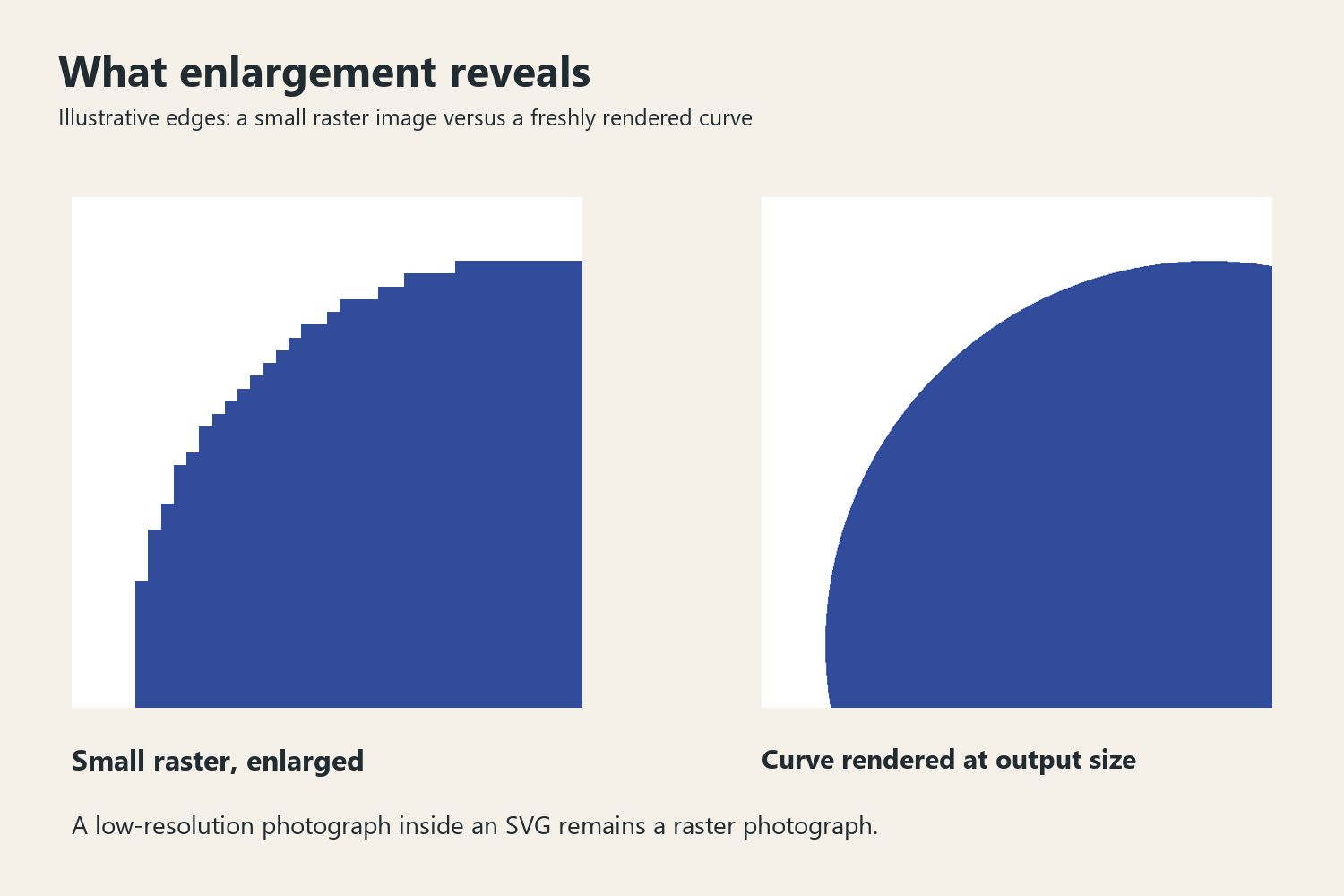
This distinction does not mean every SVG is resolution independent in every respect. An SVG can include embedded raster images, filters, or other effects. If the file contains a low-resolution photograph, the photograph does not gain unlimited detail because the container ends in .svg. Inspect the contents and test the file in its actual destination.
For a simple one-color wordmark, a clean path-based SVG is often a useful website asset. For a richly textured treatment, a raster export may reproduce the intended appearance more predictably. Keep the clean identity available so the brand is not dependent on a single complex effect.
A delivery decision by destination
| Destination | File to consider | What to verify |
|---|---|---|
| Website identity | SVG where supported | Rendering, accessible naming, dimensions, and contrast |
| Office document or presentation | PNG if the application workflow prefers it | Pixel dimensions, transparency, and placement size |
| Email signature | A suitably sized raster asset for the target system | Actual client rendering and display scale |
| Print production | The vector format requested by the printer | Color settings, outlines, size, and production requirements |
SVG is not a universal print handoff standard, and a transparent PNG is not automatically a print-ready logo. Ask the production partner what they need. For a website, the MDN SVG documentation provides a technical starting point for how the format is used in browsers.

Transparency is only the beginning
Both SVG and PNG can support transparent areas. Transparency helps a logo sit on different backgrounds, but it does not guarantee contrast. A black logo can disappear on a dark photograph, and a white version can vanish on a pale interface. Prepare deliberate light and dark variants rather than expecting the background to solve itself.
Check the exported boundary too. Excessive transparent padding can make the logo look unexpectedly small when placed in a template. An overly tight crop can clip strokes or effects. Use consistent, intentional space around each delivered version, and explain whether that space is included in the file or should be supplied by the layout.

Do not add a white rectangle simply to hide an export issue unless that rectangle belongs in the identity. Test the logo over a checkerboard and over realistic light and dark backgrounds. Inspect fine edges for halos introduced during raster export or resizing.
Text, outlines, and accessibility
For a fixed wordmark, outlining text can preserve its appearance. For navigation, articles, and other ordinary website copy, live text usually offers important flexibility. Do not turn every heading into an image merely because outlining solved the logo handoff.
Give a logo image an appropriate accessible name according to its context. A linked site identity might need to communicate the brand and destination; a purely decorative repeated mark may need different handling. Follow the W3C image accessibility tutorial rather than repeating a long visual description indiscriminately.
Build a delivery package people can understand
Use clear filenames that identify the brand, color variant, and format. Include a short usage note with the intended background and minimum-size guidance established by your tests. Avoid names such as final-final-new, which leave the recipient guessing which file to use.
Open every delivered export in an appropriate viewer and place it into at least one representative destination. Check the smallest intended use, not just the largest. A successful logo package makes the correct choice easy: the recipient can find a suitable file, place it at a sensible size, and preserve the typography that made the identity work in the first place.