

A website can display the right typeface and still feel unfinished. Its headline might arrive late, a fallback font might push a button onto another line, or a mobile visitor might download weights the page never uses. Choosing between WOFF and WOFF2 is one part of that wider web typography problem.
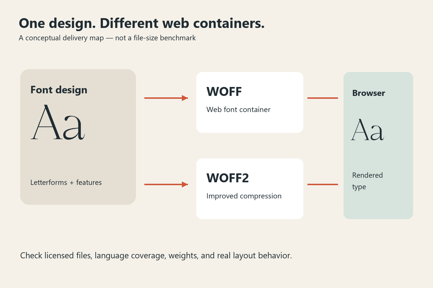
Both formats package fonts for delivery on the web. WOFF2 uses a different compression approach from WOFF and is generally the first format to consider for a current website. Neither format improves a weak font choice, supplies missing language characters, or automatically grants permission to embed a typeface. The useful question is which licensed files your audience needs and how those files behave in the actual layout.
Separate the visual decision from the delivery decision
Imagine a small interior studio preparing a portfolio website. Its designer chooses an expressive serif for project titles and a restrained text face for descriptions. The visual review happens first: can visitors distinguish project names, read captions, and navigate comfortably? Only then does the implementation team decide how to deliver those fonts.
Romans Branding is a useful visual reference for that first discussion. Its branding examples show how a distinctive serif can establish a tone. They do not demonstrate a particular browser file format, download size, or loading speed. Those are separate properties that must be checked in the licensed web files and the finished site.

Keep a specimen page containing the site's real project titles, navigation labels, prices, punctuation, and a representative paragraph. This page gives the designer and developer a shared reference. Testing a beautiful two-word heading alone can conceal awkward numerals, an unsupported accent, or a paragraph that becomes tiring to read.
What changes between WOFF and WOFF2?
WOFF stands for Web Open Font Format. WOFF2 is its later version, with improved compression. The outline and typographic behavior available to the visitor still depend on the source font and the way it has been prepared. A WOFF2 filename does not mean the font is variable, and a WOFF filename does not mean it lacks ligatures.
| Decision | WOFF | WOFF2 |
|---|---|---|
| General role | Web font delivery format | Web font delivery format with improved compression |
| Starting point for a new site | Consider when the support requirements call for it | Usually the first format to assess for modern browsers |
| What still needs checking | License, glyph coverage, weights, rendering | License, glyph coverage, weights, rendering |
| What the extension cannot promise | Good typography or fast overall pages | Good typography or fast overall pages |
Consult the compatibility information in the MDN reference for @font-face against the browsers your project actually supports. An internal application with a prescribed browser environment and a public consumer site may have different requirements. Avoid adding legacy files simply because an old tutorial lists them.
A small, understandable CSS declaration
The following example assumes you have obtained the appropriate licensed WOFF2 file. The filename and family name are illustrative; they are not a statement about what a particular Lettersiro product download contains.
@font-face {
  font-family: "Studio Headline";
  src: url("/fonts/studio-headline-regular.woff2") format("woff2");
  font-style: normal;
  font-weight: 400;
  font-display: swap;
}
.project-title {
  font-family: "Studio Headline", Georgia, serif;
}
Describe the actual file honestly. A regular static face should not be declared as if it contains every weight from thin to black. If the design needs a real bold or italic, identify the corresponding files and declarations. Browser-synthesized styles can look different from the type designer's intended drawings.
The fallback stack matters because it may be visible while the web font loads or when loading fails. Choose it by comparing letter width, apparent size, and line wrapping, not merely by choosing another serif. A similar fallback can reduce disruptive movement, but the real page still needs testing.
Look beyond the headline
Brand mockups make a display face feel convincing because the design controls the surrounding space. Websites are less predictable: readers resize windows, increase text size, translate copy, and browse on slow connections. Preserve enough flexibility for those conditions rather than locking a headline into one perfect screenshot.

For the interior studio, use the expressive face on project titles and short statements. Keep long descriptions in a comfortable reading face. Check a short title beside a much longer one, and view both on a narrow screen. If one title wraps into four lines, decide whether that is acceptable before shrinking all headings to accommodate it.
Also test language coverage deliberately. Use the names of actual people, places, and products the site needs. A missing glyph may appear in a fallback face while the rest of a word uses the brand font, producing a mismatch that is easy to overlook in a generic alphabet specimen.
Review the page under imperfect conditions
Open the browser's network tools and inspect the font requests. Look for duplicate downloads, unused weights, failed paths, and unexpectedly large files. The goal is a small set of necessary resources, not the smallest possible number at the expense of the site's content or language support.

Repeat the review with a cold cache and a slower connection. Watch the page before the final font appears: does the menu remain usable, does a call to action move, and does the opening paragraph stay visible? Then inspect the loaded result at enlarged text sizes. A fast request is not enough if the final design becomes difficult to read.
Keep a short handoff note recording the chosen family, permitted web use, file locations, declared weights, fallback stack, and test pages. Consult the current Lettersiro licensing options when embedding a Lettersiro font; using a font in a static image and serving a font file to a browser are different uses. Once the files, layout, and permission agree, WOFF versus WOFF2 becomes a manageable implementation choice instead of a distraction from the reading experience.


