A personal note card is a small design with a specific purpose: make a short message feel considered. It does not need to resemble a business card or carry a miniature brand system. A distinctive title, a clear place for the message, and enough open paper can be sufficient.
This project uses the downloaded Reileigh font for a short expressive phrase. The example is a fictional note for Maya, with original sample wording. The card concepts are based on artwork from the actual font file. The applied stationery scenes are AI-generated concepts rather than a record of cards that have been printed or mailed.
Choose the message before adding the flourishes
Decide why the card exists. A thank-you note, a welcome message, and a simple greeting invite different wording. Write the intended sentence in ordinary language first. The font should support the feeling of that sentence rather than encourage an elaborate phrase that says less.
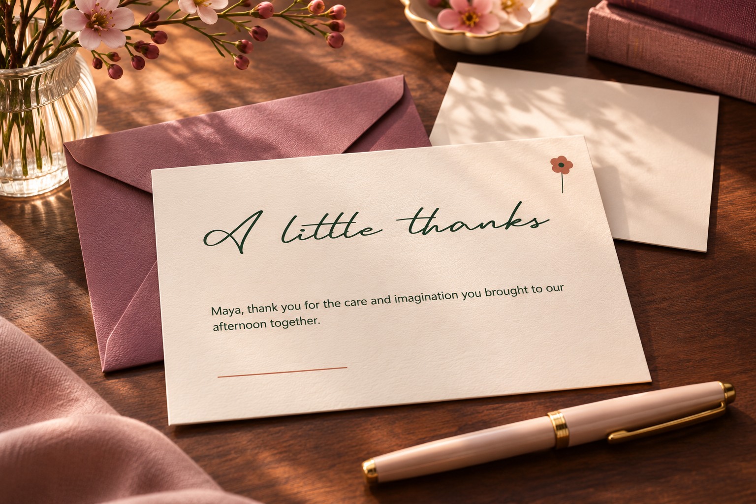
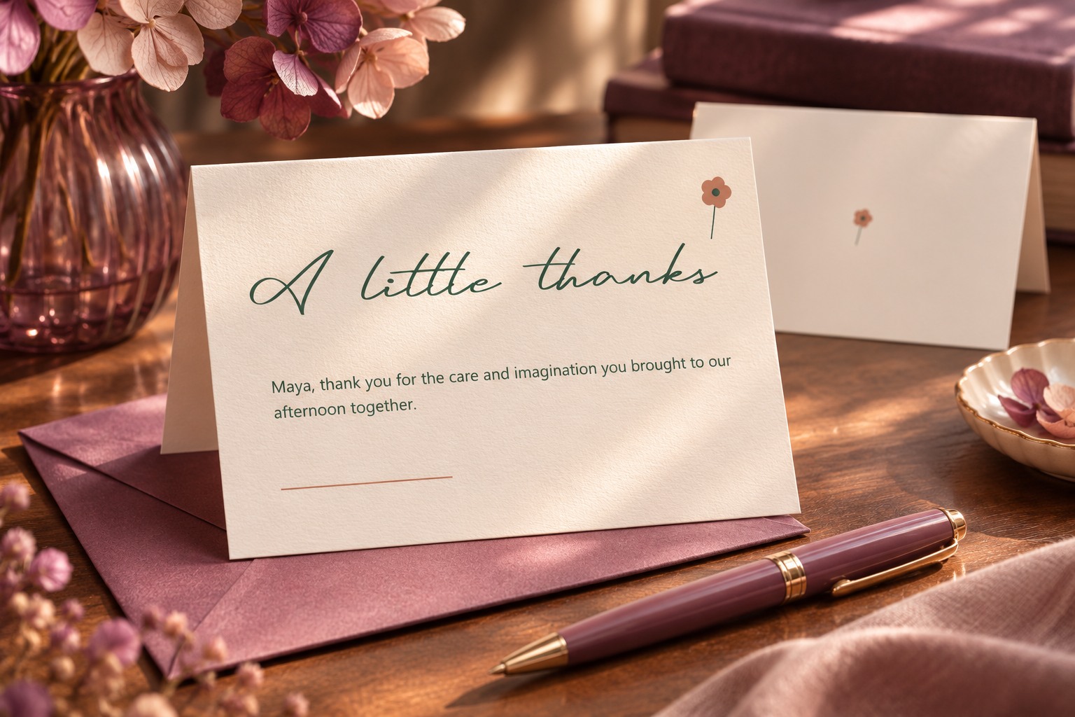
For this study, the front says “A little thanks.” The inside message thanks Maya for the care she brought to a shared creative afternoon. It is deliberately specific enough to feel like a note, while remaining fictional. Your own card can use a real memory or a simple direct sentence that belongs to the recipient.
Keep the expressive phrase short. If the whole message needs several lines, use a quieter text style for that part or leave room for handwriting. A decorative title does not have to carry every word to make the card feel personal.
Inspect the actual resource and characters
Begin with the Reileigh resource page and review the current download and usage details. The resource used here provided an actual TTF font file. Keep the source record alongside the design so you can identify the file later instead of relying only on a folder name.
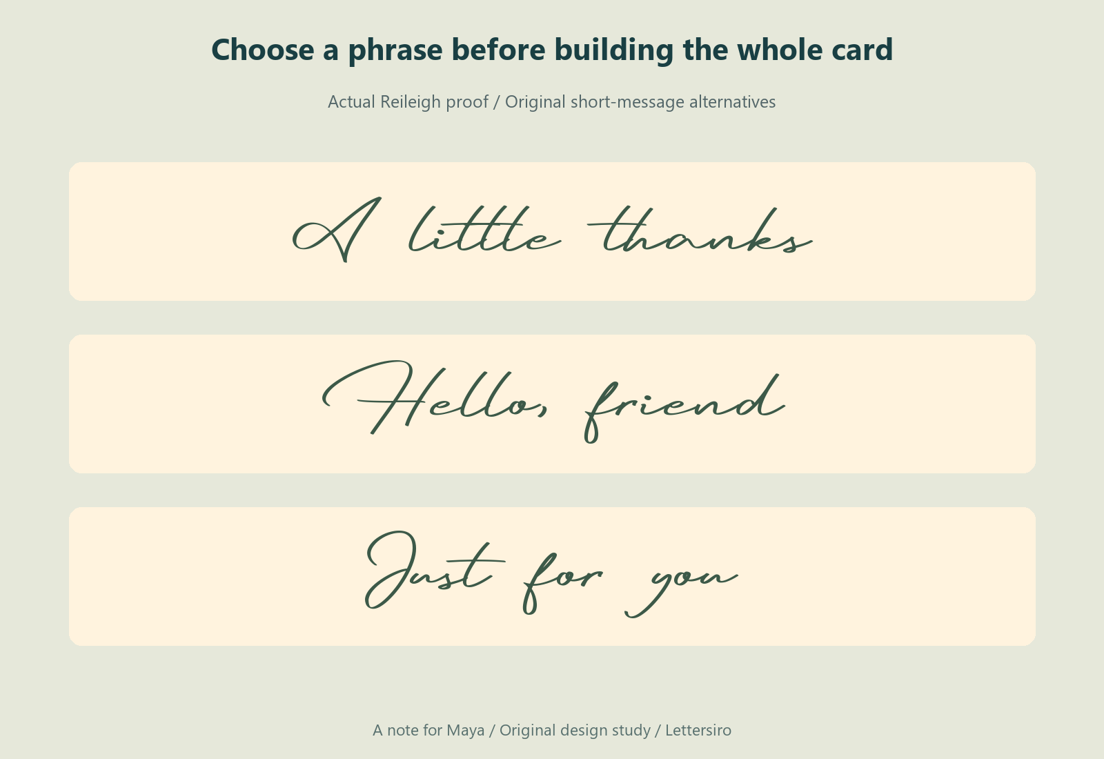
Set the exact phrase and inspect every letter. Look at the first capital, repeated shapes, the word gap, and the ending. Include the punctuation you intend to use. A font can look appealing in a specimen while a particular combination needs a different arrangement in your card.
Do not add spacing across a connected script simply because the card has room. First inspect how the ordinary setting reads. If the phrase feels crowded, try changing its overall size or the surrounding space. Keep an unmodified copy nearby while you compare revisions.
Give the card a simple reading order
Place the expressive phrase where it can lead, then keep the message in a separate area. Let the open paper connect them. A small decorative mark can support the composition, but it should not force the reader to decide whether the mark is part of a letter or part of the message.
The example uses warm cream, dark olive, and a restrained terracotta accent. Its flower-like geometry is original artwork, separate from Reileigh. The palette is an editorial choice for this fictional card, not a requirement attached to the font.
Keep the main phrase away from the trim edge. If a letter extends farther than the compact body of the word, include that extension in the visual margin. Centering a text box is a useful starting point, but inspect the complete visible shape before deciding that the phrase feels centered.
Leave a place for a human message
If the card will be written by hand, leave a genuinely useful blank area. Do not fill it with sample lines or decoration merely to make the preview look complete. Consider how much the sender is likely to write and whether the card opens or remains flat.
If the message is printed, set it at a comfortable size for the actual card and keep its measure modest. A quiet information style can make the sentence easier to follow while the title supplies the expressive character. Compare the printed wording with the approved source before export.
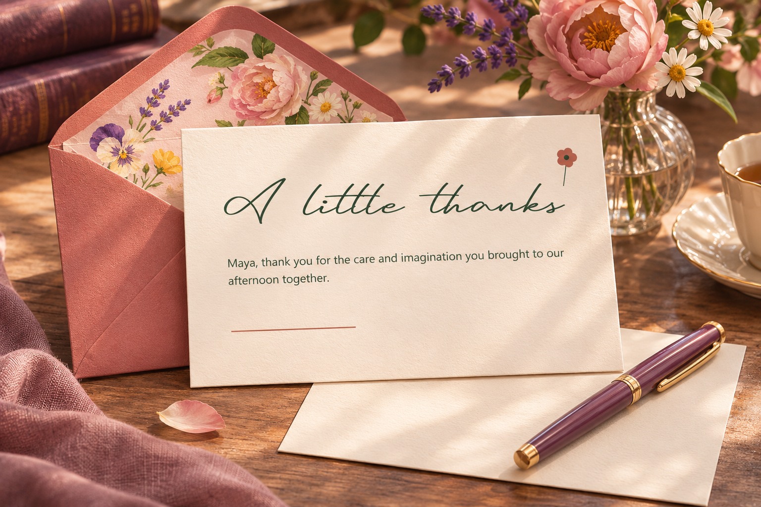
The fictional message in this project is short: “Maya, thank you for the care and imagination you brought to our afternoon together.” It is followed by a signature area. The exact sentence is less important than its role: a readable thought addressed to one person, with enough room to feel deliberate.
Compare two title arrangements
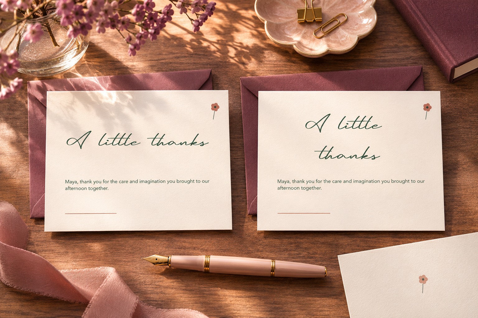
Try the phrase on one line, then compare a deliberate two-line arrangement if the proportions call for it. Keep the letters' shapes intact. Stretching the phrase horizontally to fill the card changes its character and can make the result feel less considered.
Look at the arrangement together with the message. A title that sits beautifully by itself may leave too little usable paper beneath it. A smaller title can sometimes make the note feel more generous because the personal sentence receives more attention.
Plan the back and the envelope as related pieces
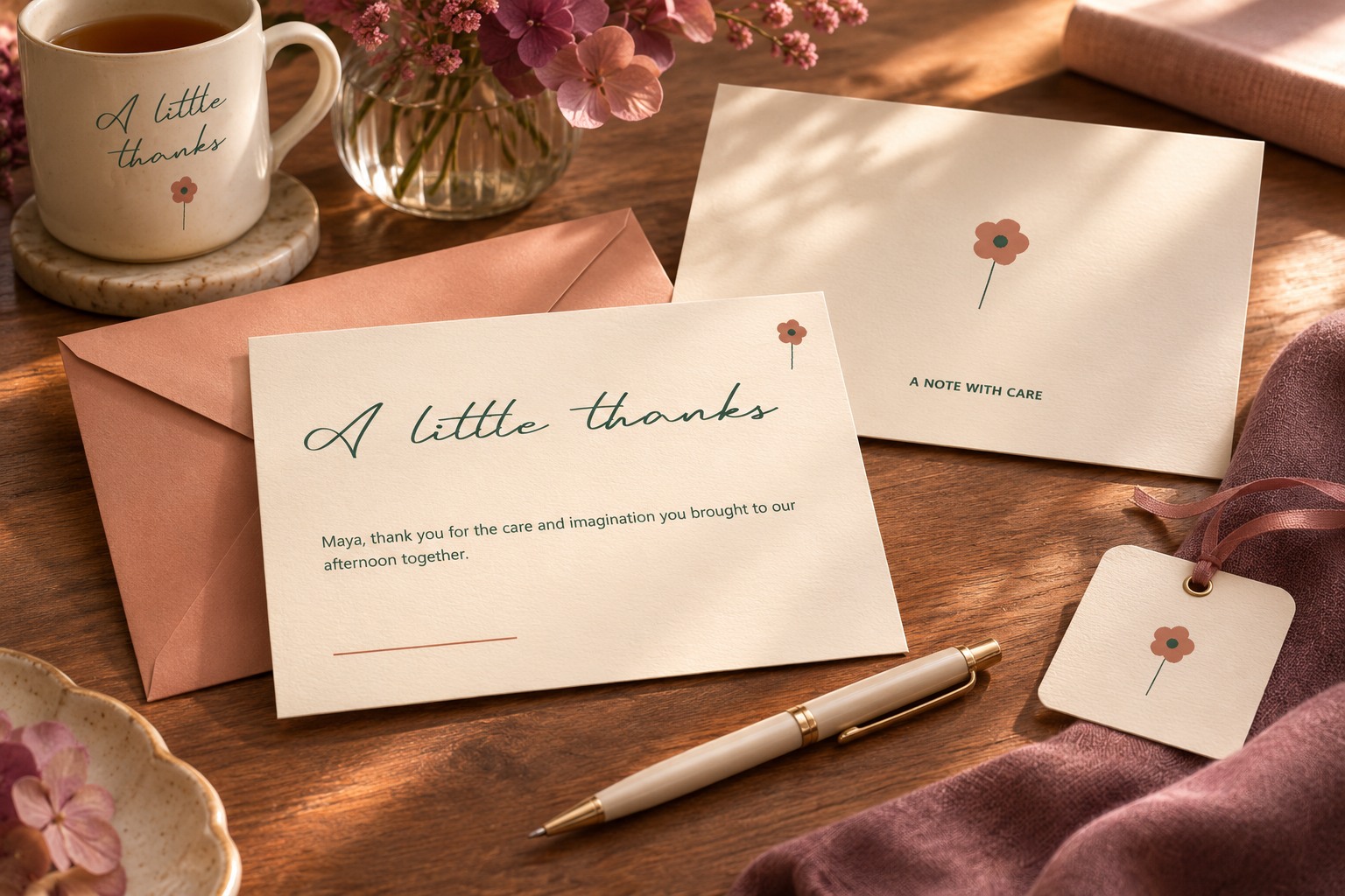
The back can remain mostly quiet. If you need a sender's name or a small credit, give it a clear, modest role. Avoid turning a personal note into a promotional panel unless that is the intended purpose of the project.
An envelope can repeat the palette or a small motif without repeating the whole front design. Keep any actual addressing requirements separate from decorative decisions. The example below is a flat design study of related pieces, not a mailing template or a specification for postal use.
Review a one-color version before production
Remove the accent color and inspect the hierarchy. The phrase and message should still have distinct roles. If the design depends entirely on a pale accent to explain where reading begins, revise the structure before choosing a production method.
Print a draft at the intended dimensions when preparing a physical card. Check the title, message, folds, trim, and the area reserved for handwriting. The one-color concept here supports a visual review, but it does not predict ink, paper, or finishing behavior. Follow the printer's actual specifications for the final file.
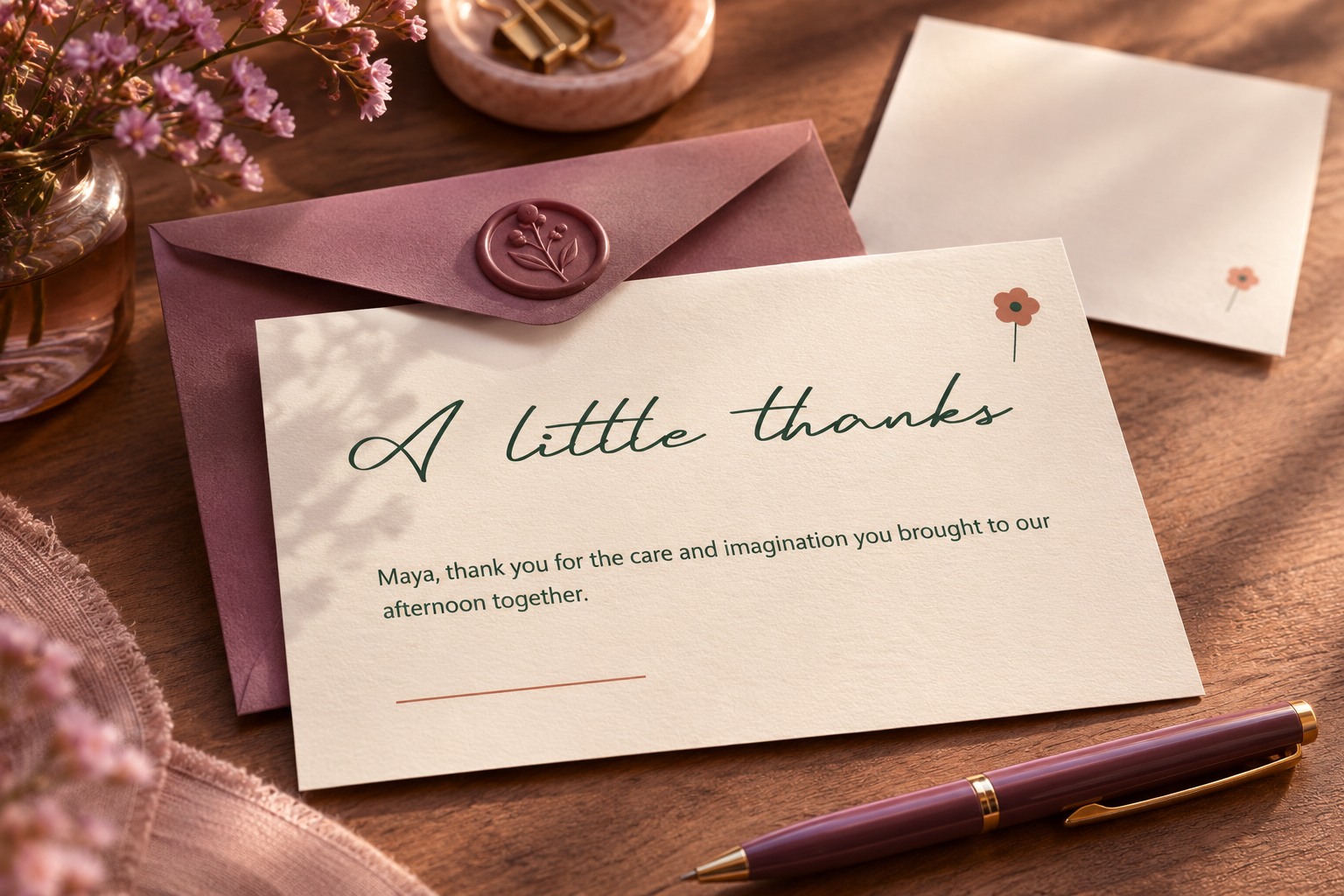
Keep the editable source, the font resource record, and the reviewed export together. Explore more Lettersiro freebies when another project needs a different voice. The finished card should feel personal because of the message and its care, with the font giving that thought an expressive opening.