A type scale is useful when it helps someone design an actual page. A column of sizes can look beautifully ordered while the first long heading, product description, or compact card exposes a problem. Build the scale around real reading roles, then save the settings that survive those examples.
This walkthrough develops a proposed system for Evoke Ceramics, a fictional studio. Actual Master Modern lettering supplies the expressive display voice, while a quieter information style handles descriptions and details. The examples combine original layout references with AI-generated application mockups. They explain the decisions to make in Figma and are not screenshots of a completed Figma file.

1. Collect the content before choosing the sizes
Write one page's worth of realistic material. Include the brand name, a short heading, a longer heading, a paragraph, a card title, a description, and the practical details the page requires. If final content is unavailable, mark the examples as placeholders and include plausible variation rather than repeating one short phrase.
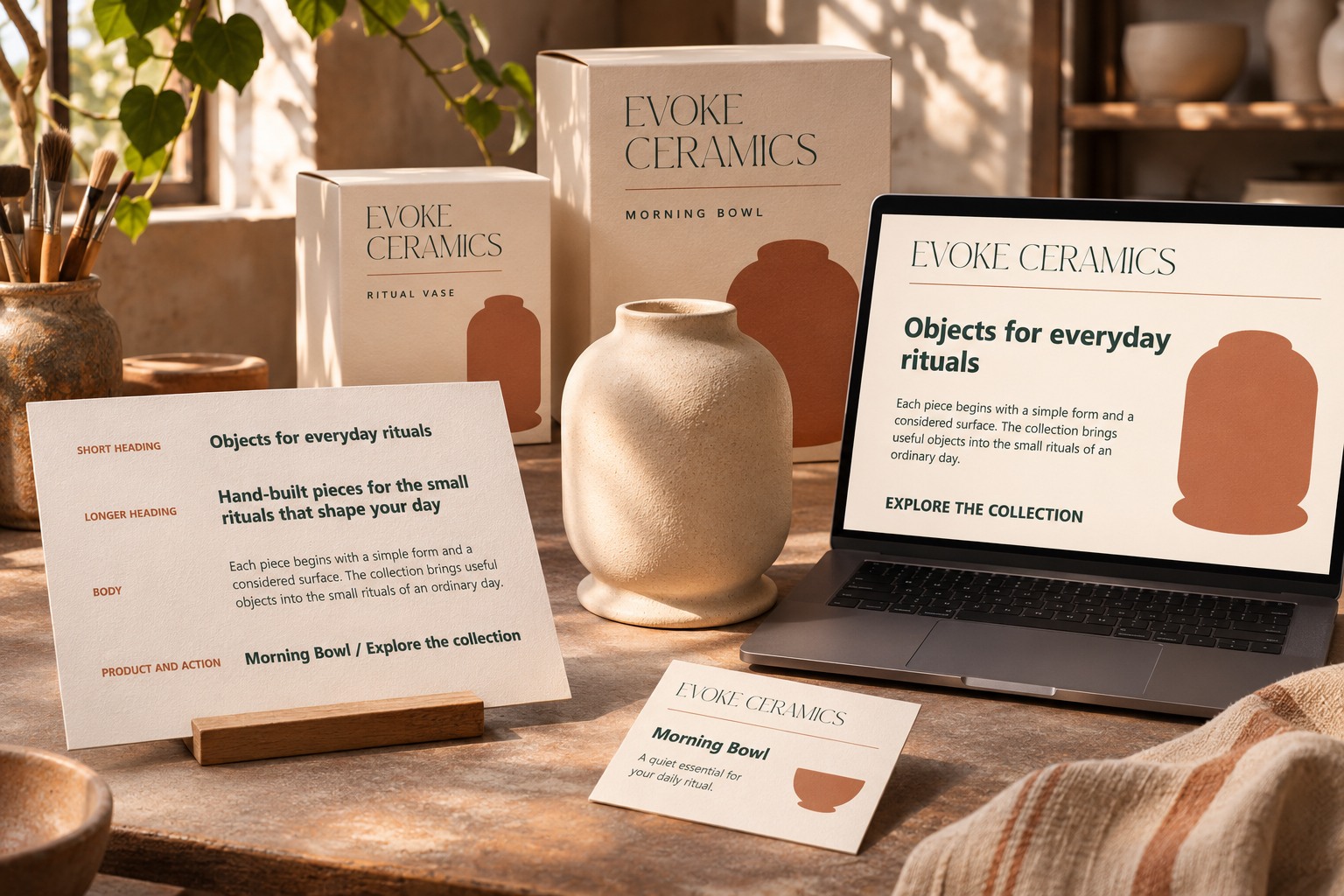
For Evoke Ceramics, the sample heading is “Objects for everyday rituals.” A longer alternative is “Hand-built pieces for the small rituals that shape your day.” A product card includes a name, a short description, and an action. These strings give the scale something meaningful to handle. They are more revealing than a specimen containing only Heading 1 and Body Copy.
Place the examples in a working frame with the intended content width. Keep a second, narrower frame nearby. The purpose is not to solve every responsive behavior immediately; it is to stop the scale from being approved solely in a spacious desktop composition.
2. Give each reading role a plain name
Begin with the jobs the page needs: Brand Display, Page Heading, Section Heading, Body, and Details. Add a role only when the content requires it. Several nearly identical heading styles can create more choices without creating a clearer hierarchy.
Keep the identity role separate from the page's working text. Master Modern can carry character at a generous size, while the information style supports repeated reading. You do not need to use the display face for every label to make the page feel connected. Color, spacing, and the arrangement of content can establish the family relationship.

In Figma, create text layers for the roles and apply the actual family and style you intend to use. Confirm that the font is available in your working environment. A similar-looking substitute can change line breaks and invalidate a comparison made with the intended file.
3. Choose a starting scale, then test it
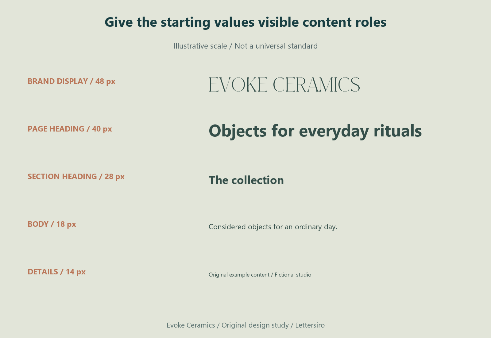
Use a small set of starting values rather than chasing a mathematically perfect ratio. The table below is one illustrative wide-frame starting point. These values are not an accessibility standard, a universal website scale, or a rule that every brand should adopt.
| Role | Example starting size | What to inspect |
|---|---|---|
| Brand Display | 48 px | Character and surrounding space |
| Page Heading | 40 px | Long title and page hierarchy |
| Section Heading | 28 px | Relationship to body content |
| Body | 18 px | Paragraph measure and rhythm |
| Details | 14 px | Practical information at delivery size |
Set the real content in those roles. Inspect the complete composition before revising a number. If the body paragraph is difficult to follow, the issue may involve line length, spacing, or contrast as well as size. If the heading dominates everything, its available area or surrounding space may need attention.
Figma's text-properties guide documents the relevant text controls. Use those controls to make deliberate changes, then return to the full page. A pleasing specimen line is only one part of the decision.
4. Inspect the paragraph as a block
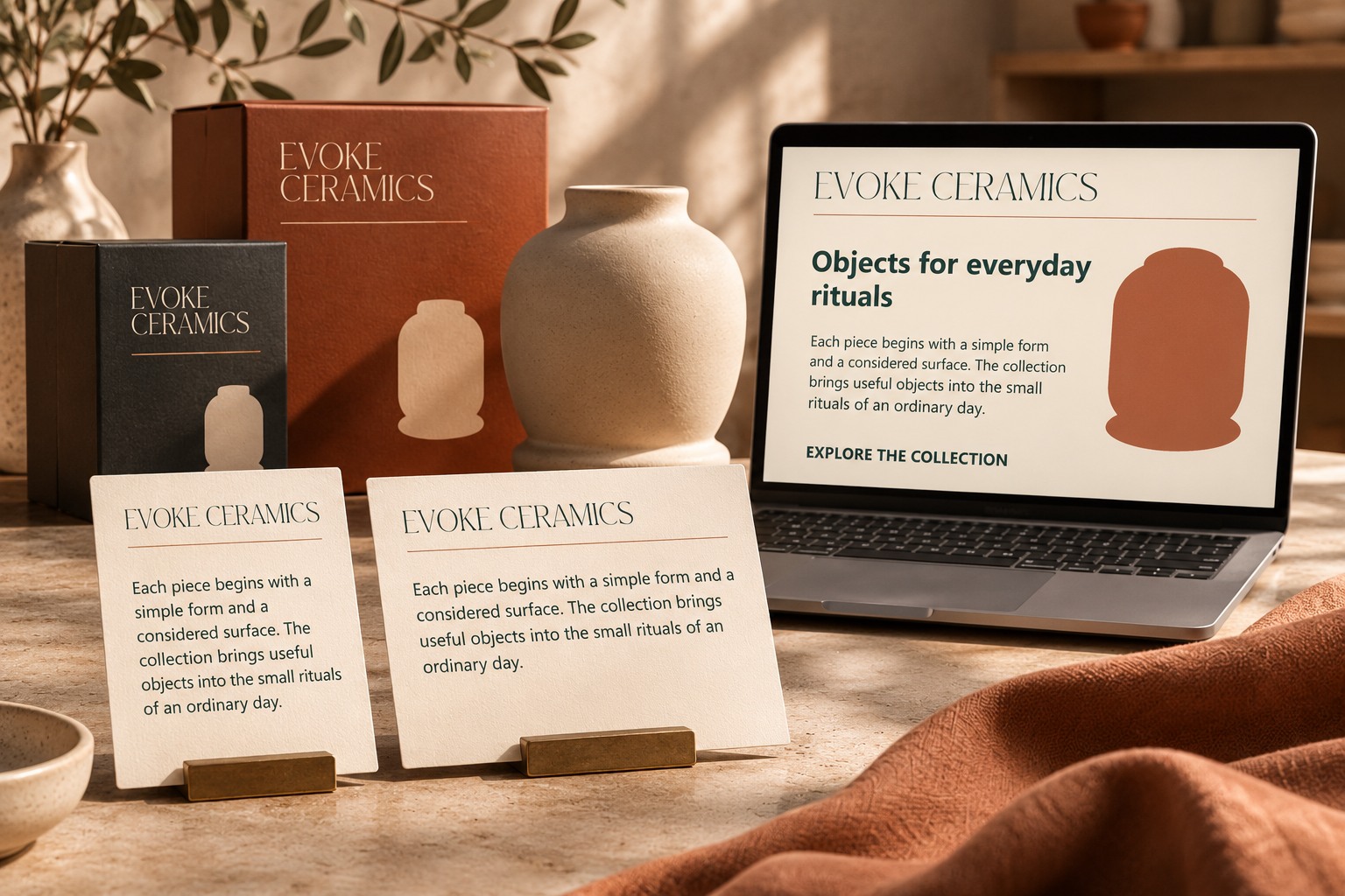
Use a paragraph long enough to form several lines. Read it rather than judging only its gray texture. Look for an uncomfortable line length, uneven spacing, or a line height that makes neighboring lines difficult to separate. Keep the wording constant while comparing alternatives.
Change one useful property at a time. If you change size, width, and line height simultaneously, you may create a better-looking paragraph without understanding which change helped. Keep the earlier version nearby until the new relationship works in the complete page.
Include a second paragraph or a short list if those appear in the real project. A body style should work across ordinary content, not just one carefully chosen block. If a supporting label needs a distinct role, name it clearly rather than hiding a local override in the file.
5. Stress the headings and cards
Replace the short heading with the longer alternative. Inspect the line break, the gap to the paragraph, and the position of the next section. A type scale should allow the page to grow naturally rather than depending on an exact one-line title.
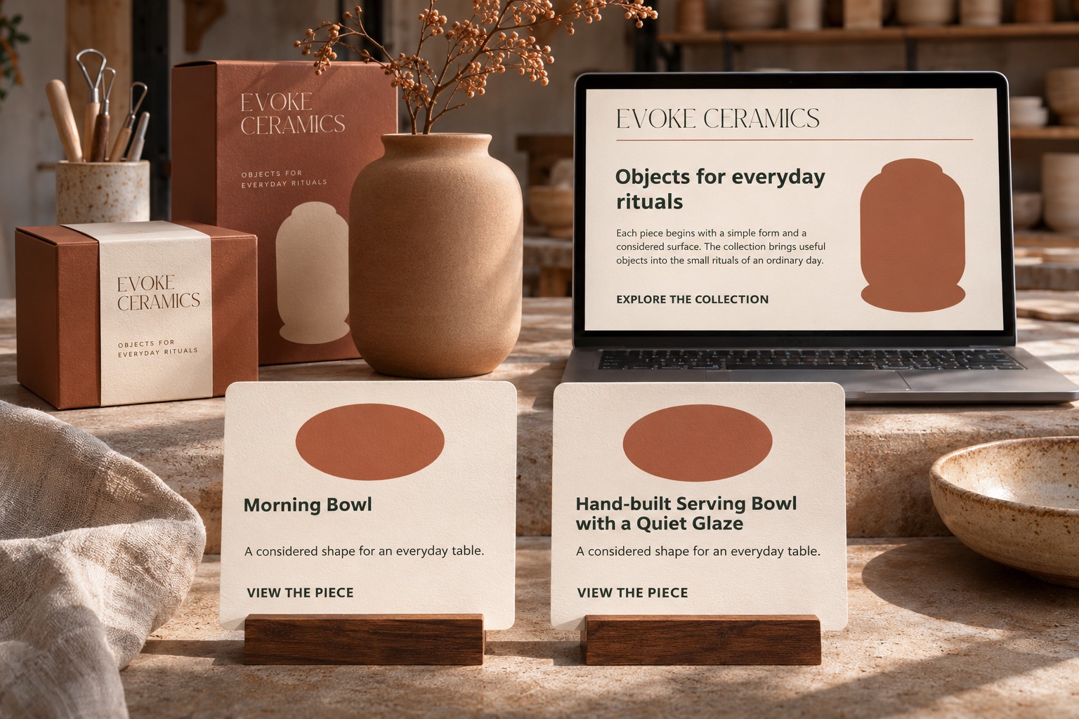
Test a short and a long product name inside the same card structure. Keep the supporting description and action present. The longer title may need a second line, but it should not collide with the image area or silently push the action into a different visual role.
Decide how the component should behave. The card may grow with content, reserve a title area, or use another approved arrangement. Document the choice in the working system. Do not solve each individual card with an unexplained font-size reduction, because that produces a collection of exceptions rather than a reusable scale.
6. Review the narrower frame as its own composition
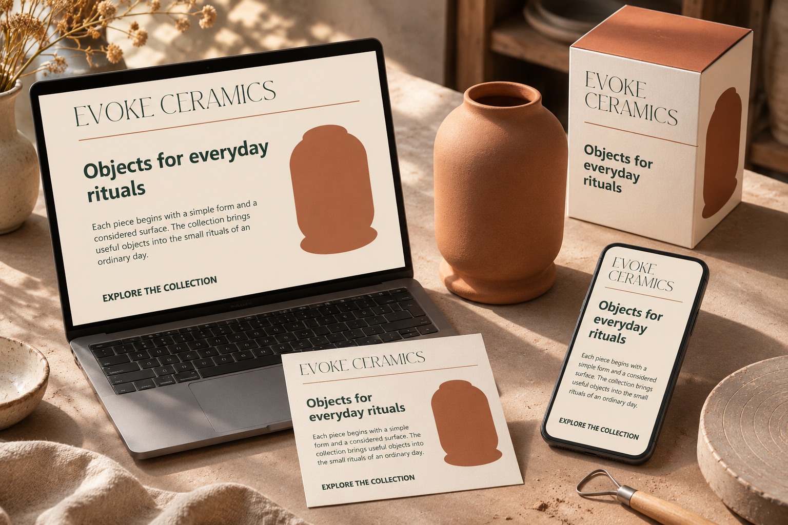
Move the real content into the narrower frame and inspect the reading order. The display heading may need a different arrangement, while the paragraph needs an appropriate measure. Scaling the entire desktop image down would make all text smaller without resolving those relationships.
Keep the role names consistent even when the settings adapt. A Page Heading should still lead the content. A Details line should still be distinguishable from the paragraph. The system becomes easier to use when the communication roles remain recognizable across formats.
Check the actual implementation separately when the design becomes a website or application. Native illustrations and Figma frames can support planning, but they do not prove how a live page behaves with real browser rendering, user settings, or changing content.
7. Save reusable styles after the examples work
Once the roles survive the content checks, save the settings as text styles in the working Figma file. Use names that connect to the role rather than only to a size number. Figma's text-style instructions explain creating and applying those styles.
Apply the saved styles back to the examples and look for accidental local differences. Keep a compact specimen page showing the real heading, paragraph, card, and demanding cases. A future contributor should be able to understand the system without reverse-engineering a polished screenshot.
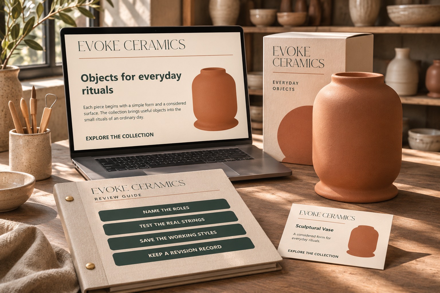
Record the intended font files, the style roles, and the circumstances that call for an alternate arrangement. Include a revision note when the scale changes. That makes later updates a visible design decision instead of a set of unexplained overrides.
The Master Modern product page provides the display-font reference, while Lettersiro's hierarchy guide offers related reading. Keep the final scale tied to the actual words and components. It succeeds when the next heading, paragraph, or product card can enter the system without forcing the team to redesign the hierarchy from scratch.