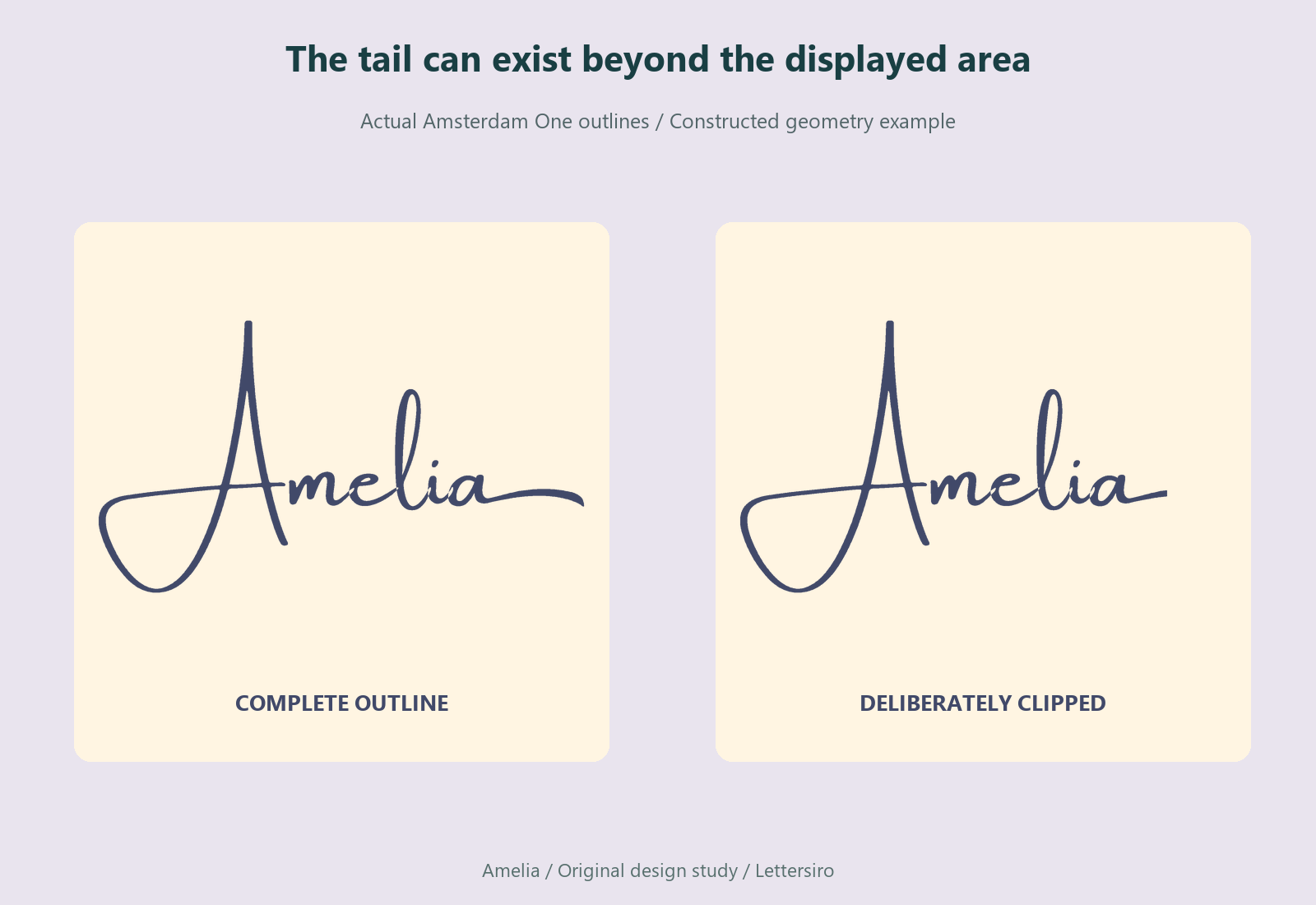
A script name can look complete in the editable file and lose the end of a flourish after export. The missing stroke may still exist in the SVG; it may simply sit beyond the area being displayed or inside an unintended clip. Replacing the font is an expensive first response to a problem that may belong to the export geometry.
Start by finding where the stroke disappears. Does it stop exactly at a rectangular edge? Does the standalone SVG differ from the same file inside a website? Is the artwork clipped in the source as well? Those observations help separate a bounds problem from a missing alternate or a different font.
This guide uses Amelia, an original fictional wordmark study, built from actual Amsterdam One glyph outlines. The controlled example includes a swash alternate stored in that file. It is a constructed geometry demonstration, not a claim that Illustrator or another application's exporter produced a defect.
Locate the first point at which the artwork changes
Keep the editable source, the exported SVG, and a screenshot of the affected placement. Compare the same lettering in all three. If the source is already missing a stroke, investigate the selected glyph or an existing source clipping path. If the source is complete and only the export is cut, inspect the export area. If the SVG is complete on its own but clipped in a website, inspect the destination too.
A straight rectangular cutoff is a useful clue, but it is not a complete diagnosis. Several different clipping mechanisms can produce a similar edge. Record which side is affected and whether the missing area changes when the displayed dimensions change. That gives you a specific problem to reproduce.
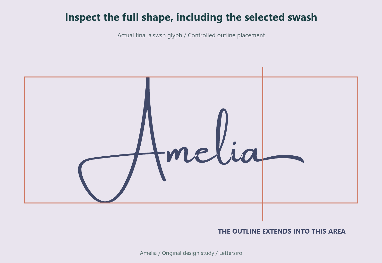
Inspect the complete visible outline
Select or inspect the whole graphic, including the flourish, descenders, and any added stroke or effect. A small text box around the main letters may not represent the full visible shape. The same problem can occur when a decorative alternate extends farther than the ordinary letter that preceded it.
In the controlled study, the final lowercase a uses the actual a.swsh glyph from the font. Its extended shape is part of the artwork being reviewed. The diagram does not assume that every application exposes the same feature controls or chooses that alternate automatically. Select the intended glyph in the target application, then inspect the resulting outline rather than guessing from the product name.
Understand the SVG's display area
The SVG viewBox describes the coordinate area mapped into its viewport. It should be considered alongside the actual artwork bounds and the intended padding. MDN's viewBox reference explains that coordinate mapping. A change to the viewBox can affect the apparent scale as well as which area is being fitted into the viewport.
Clipping also depends on other settings. An SVG can contain a clip path or mask, and its display can be constrained by overflow behavior or an enclosing element. MDN's SVG overflow reference describes how overflow can create a clipping rectangle. Avoid treating one attribute as the answer to every cutoff.
The practical task is to make the intended artwork and its display area agree. A larger display area without moving or scaling the art may solve one geometry case. Removing a deliberate source clip may solve another. A container that hides overflowing content needs its own review. Keep those operations separate so you know which one changed the result.
Correct the source or export area deliberately
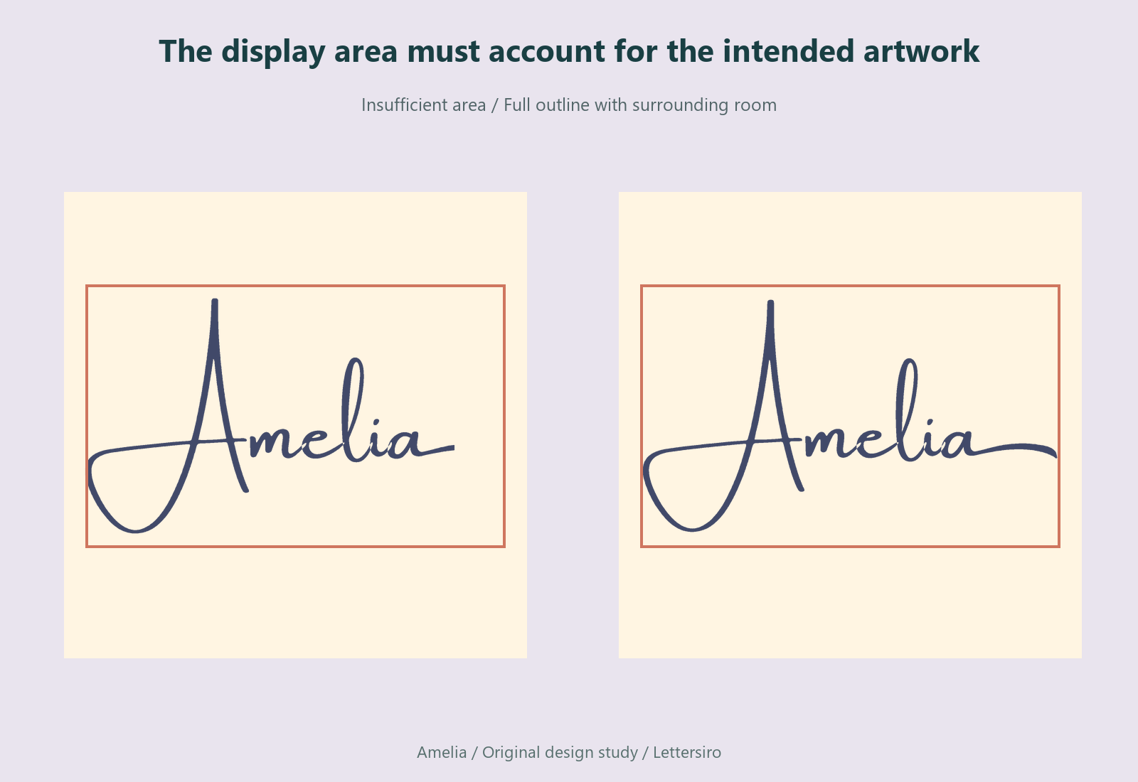
If the source artboard is too tight, expand it to include the full visible artwork and the appropriate surrounding space. Check all four edges. A tail that fits on the right may be accompanied by an overhanging capital on the left or a descender below the baseline.
When exporting from Illustrator, follow Adobe's export guide for selecting the required format and artboards. Keep an editable source. Reopen the exported result and inspect the complete word; the existence of an export file does not show that its boundaries are appropriate.
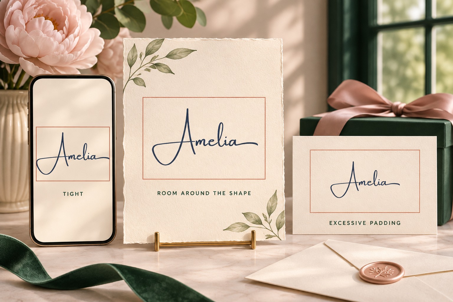
Do not add excessive empty space merely to avoid investigating the bounds. Large padding can make the wordmark appear unexpectedly small when it is placed into a fixed-size slot. Choose enough room for the actual shape and intended clear space, then verify the fit in the destination.
Check the destination container separately
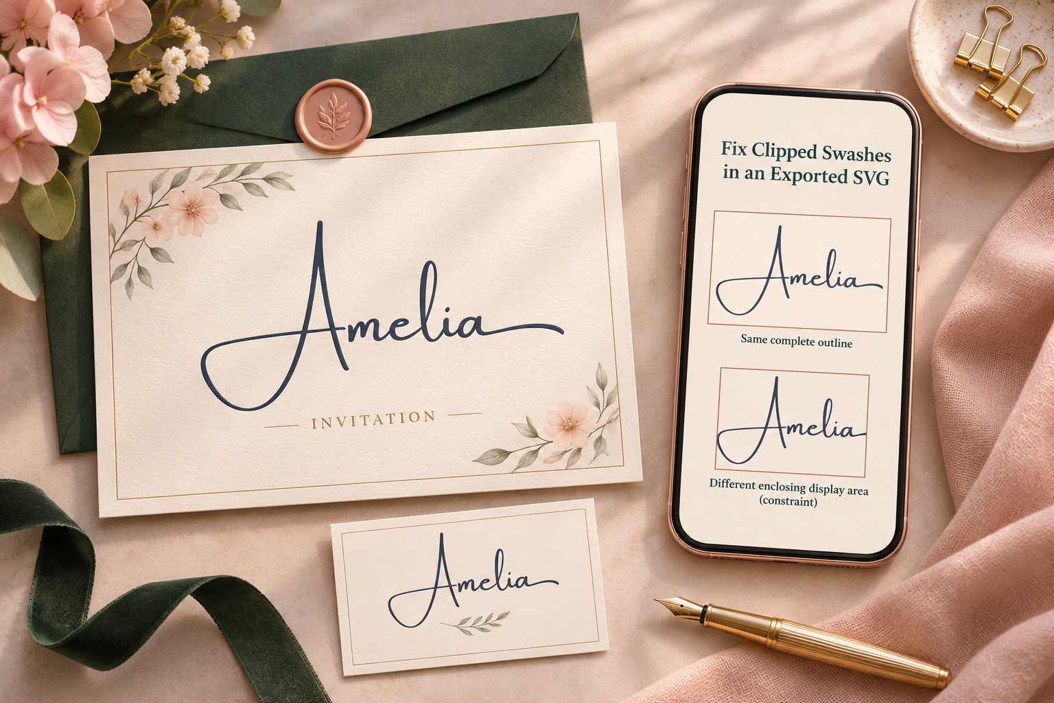
Place the revised SVG where it will be used. If the standalone file is complete but the website still cuts it, inspect the enclosing layout and any clipping applied there. A fixed-height slot, a crop, or an overflow rule can hide artwork even when the SVG itself contains the full shape.
Compare a simple placement with the actual placement. Keep the same file in both. If the simple version works, the difference in the destination is useful evidence. Avoid repeatedly changing the font or exporting another unrelated format before checking the container that is actually hiding the stroke.
Finish with a small delivery proof
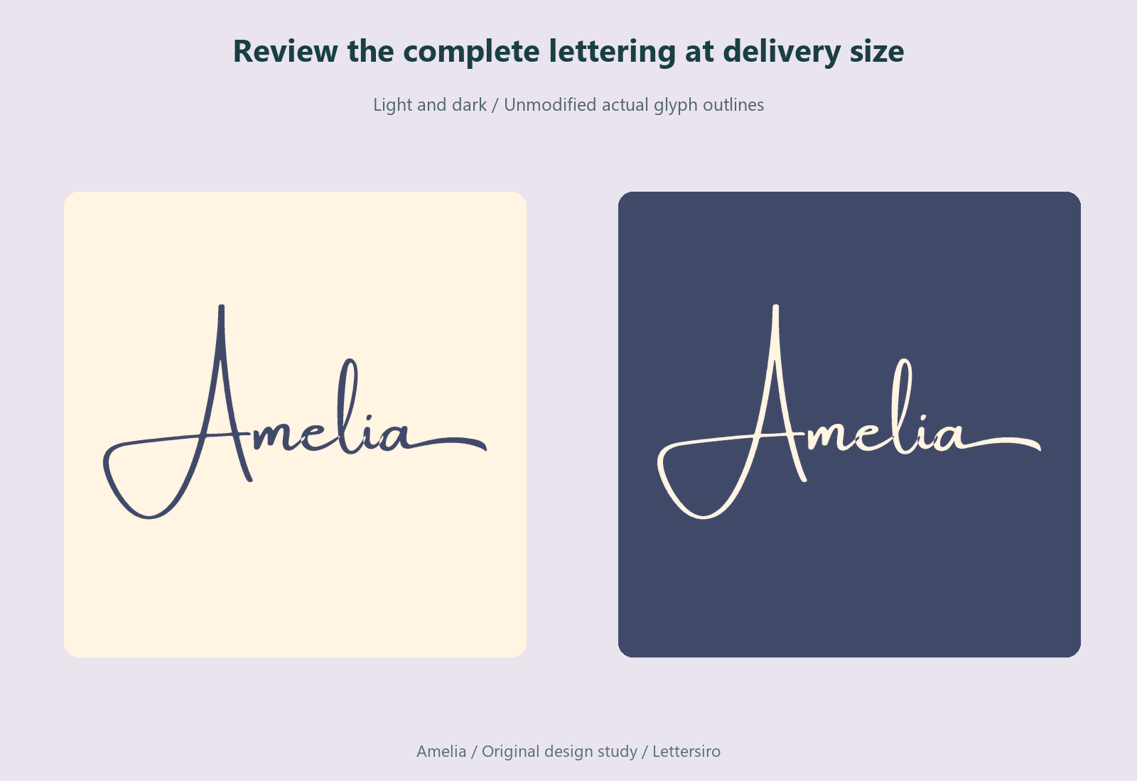
Inspect the revised result at its normal size, on the intended background, and at a compact size if it will be used that way. Check the end of the swash and the spaces around the main letters. A complete flourish can still collide with nearby text if the layout never reserved room for it.
Keep a before-and-after record with the source, export settings, and reviewed file. If you pass the asset to another person, explain the intended clear space and placement proportions. An SVG that is technically complete still needs a sensible area in the final design.
Explore the Amsterdam family for its available styles, and use the Lettersiro Logo Tester for an early wording comparison. When a swash disappears, follow the visible evidence from source to export to destination. The useful repair preserves the intended lettering and gives its complete shape a place to appear.