An informal headline should sound like it belongs to the person or project speaking. It might announce a small event, introduce a creative workshop, or give a short campaign phrase some energy. Brush lettering can help, but the words and the surrounding composition still need to do their jobs.
Hey Brush is a free Lettersiro font presented with natural handwritten strokes. Its published preview suggests a lively alternative to a polished signature script. This article uses authentic resource previews and clearly labeled composition diagrams to explore that direction without pretending that an illustrated mood image is an actual font specimen.
What the Hey Brush preview tells you
The Hey Brush free font is introduced through tall, loosely articulated handwritten letters and visible brush character. Its relaxed rhythm can provide a useful starting point for a concise message that needs personality at a glance.

The preview establishes the broad voice, but it cannot answer every practical question. Your phrase may contain different letter combinations, punctuation, or a longer final word. Download the font through its official page, read the included terms, and test the real wording before committing to a layout.
The resource is presented for free commercial use. Keep the current license information with the download and check how it applies to the intended output. Finished artwork, live website text, an application, and a font uploaded into an online design service are different deployment situations; one should not be assumed to cover all the others.
Write a phrase with a clear speaking voice
Begin with one direct message. “Make something today” gives a workshop poster a recognizable invitation. “Fresh ideas, shared here” suggests a different tone. Neither needs a long introductory clause before the reader understands the point.
Read several options aloud and choose the one that sounds natural. Then remove words that repeat the same idea. Brush character already adds visual movement; the wording does not need to carry a stack of dramatic adjectives to feel expressive.
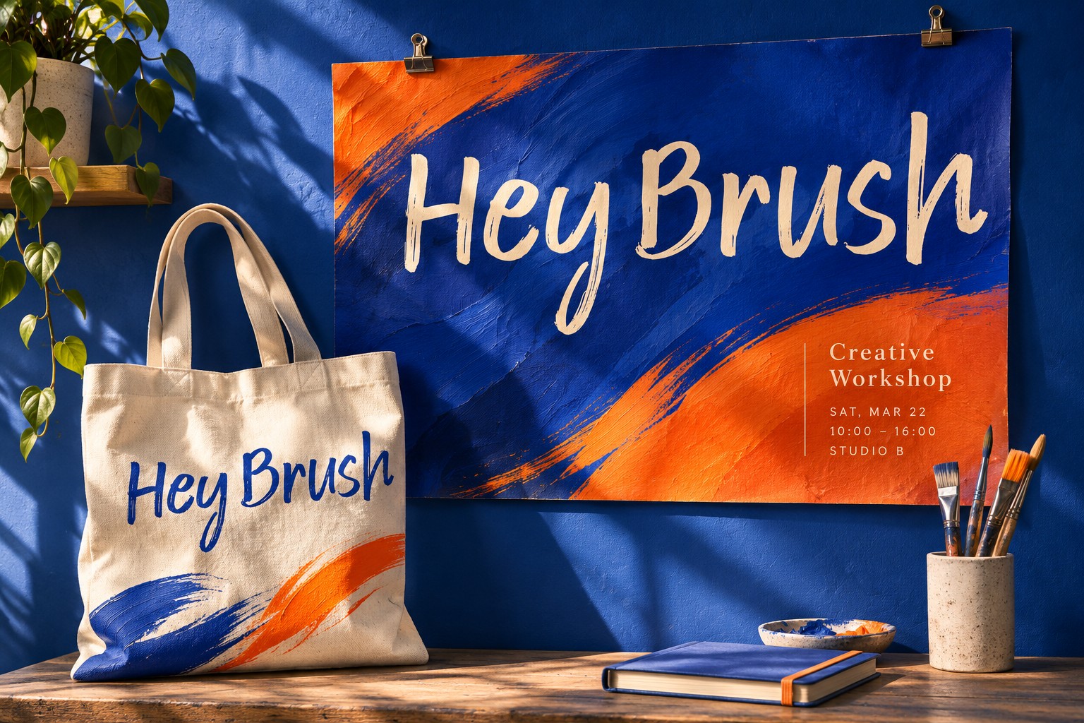
Place the phrase in a plain composition first. Add one sentence explaining the event or offer, then one clear action. If the message cannot be understood without a photograph, texture, and several effects, review the wording and order before adding more decoration.
Compare flow with Mileadilan
Mileadilan provides a useful contrast. Its rounded flowing script creates a different visual rhythm from the more individually articulated strokes in Hey Brush's presentation. A personal greeting may invite one direction, while an informal headline may benefit from the other.
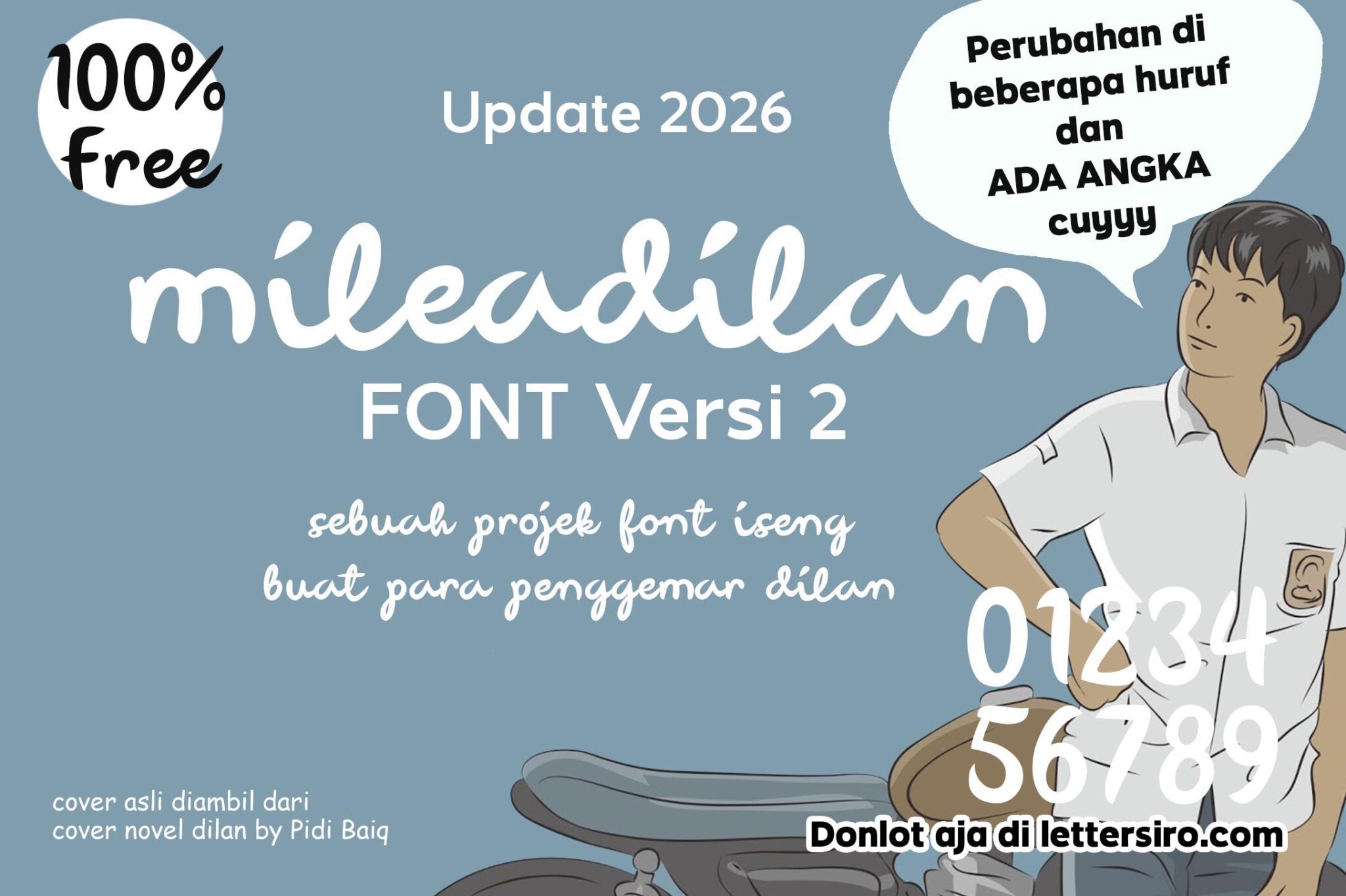
Do not decide by comparing unrelated sample words alone. Once both fonts are available locally, set the same phrase at comparable visual prominence. A font with a narrow overall word shape may need a different nominal point size to appear equally prominent. Judge the composition rather than treating matching point sizes as a complete comparison.
Look at the space around the phrase as well as inside it. The first and last strokes affect how the text relates to the edge of the page. Give the lettering room to form a complete shape before introducing a border or image crop.
Consider a more substantial handwritten alternative
The Petersburgh free font is presented as bold handwritten type with playful curves. It provides another comparison when the brief needs a fuller visual presence. Its description specifies Desktop use, which should be considered before planning any other deployment.

This comparison is about the job of the headline, not a contest between attractive covers. A bold, fuller word can anchor a sparse composition. A lighter or more open rhythm can leave more room for illustration. Choose according to the message, format, and supporting content.
Make a short decision note: what works with the actual words, what becomes difficult at the intended size, and which permission questions remain unresolved. A written reason is more useful later than “this one looks cool,” especially when another person joins the project.
Give the background a supporting role
An expressive brush headline needs a place to sit. On a photograph, look for an area with a reasonably stable tone and fewer competing edges. A crop with empty wall or sky may work better than one filled with branches, texture, or bright reflections.
Keep a clean one-color version while experimenting with imagery. Return to it whenever the headline starts to depend on heavy shadows or outlines for survival. Moving the text, changing the crop, or simplifying the background often gives the lettering a clearer role.
If the campaign already has colorful photography, let the typography provide structure. If the artwork is quiet, the headline can carry more of the visual energy. Giving every element maximum expression at once makes a small poster difficult to scan.
Learn from a separate advertisement type direction
Lettersiro's Letter Heaven offers a separate casual advertisement direction. Its presentation is useful when you want to compare informal handwriting with a more constructed display voice. It is a distinct product with its own terms, not part of the Hey Brush download.

Keep the practical details quiet enough to read. Dates, prices, or location information should not compete with the main phrase through equal size and decorative treatment. Consistent spacing and a clear alignment can connect the elements without asking them to share the same personality.
Run a headline editing exercise
Write three versions of the same invitation: one direct, one playful, and one descriptive. Set them in an otherwise identical proof, then ask which version communicates the purpose fastest. Choose the wording before refining letter spacing. If a phrase is difficult to understand in ordinary text, expressive brush treatment is unlikely to clarify it. Keeping a plain-text copy beside the visual proof also helps collaborators check spelling without being distracted by the design.
Review the actual output
Inspect the headline at the size and distance intended for its audience. Then look at the supporting details without zooming in. For a social image, review the exported file on a phone; for a printed piece, make a physical proof if possible. These checks reveal different weaknesses from an enlarged editable canvas.
If you need to inspect available characters, Adobe's Glyphs panel guide explains the Illustrator controls. Review the font itself rather than assuming language coverage or decorative alternatives from a promotional image.
Keep your shortlist small and purposeful. The Lettersiro freebies library offers more resources to explore, but a successful brush headline depends on a concise message, a suitable type voice, and enough visual space for readers to understand both.