Aureline is a fictional jewelry studio with small boxes and restrained product photography. Its name has a narrow sequence of letters that can look graceful in a large presentation but become less explicit on a small box lid. The aim is to compare three serif directions through the actual name, then decide how much space and contrast each needs.
The visual examples use Aureline, an original fictional project. The native font proofs use actual Lettersiro files. The thumbnail is AI-created editorial illustration; any lettering within that illustration is separate from the real font specimens below.
Compare the three name directions
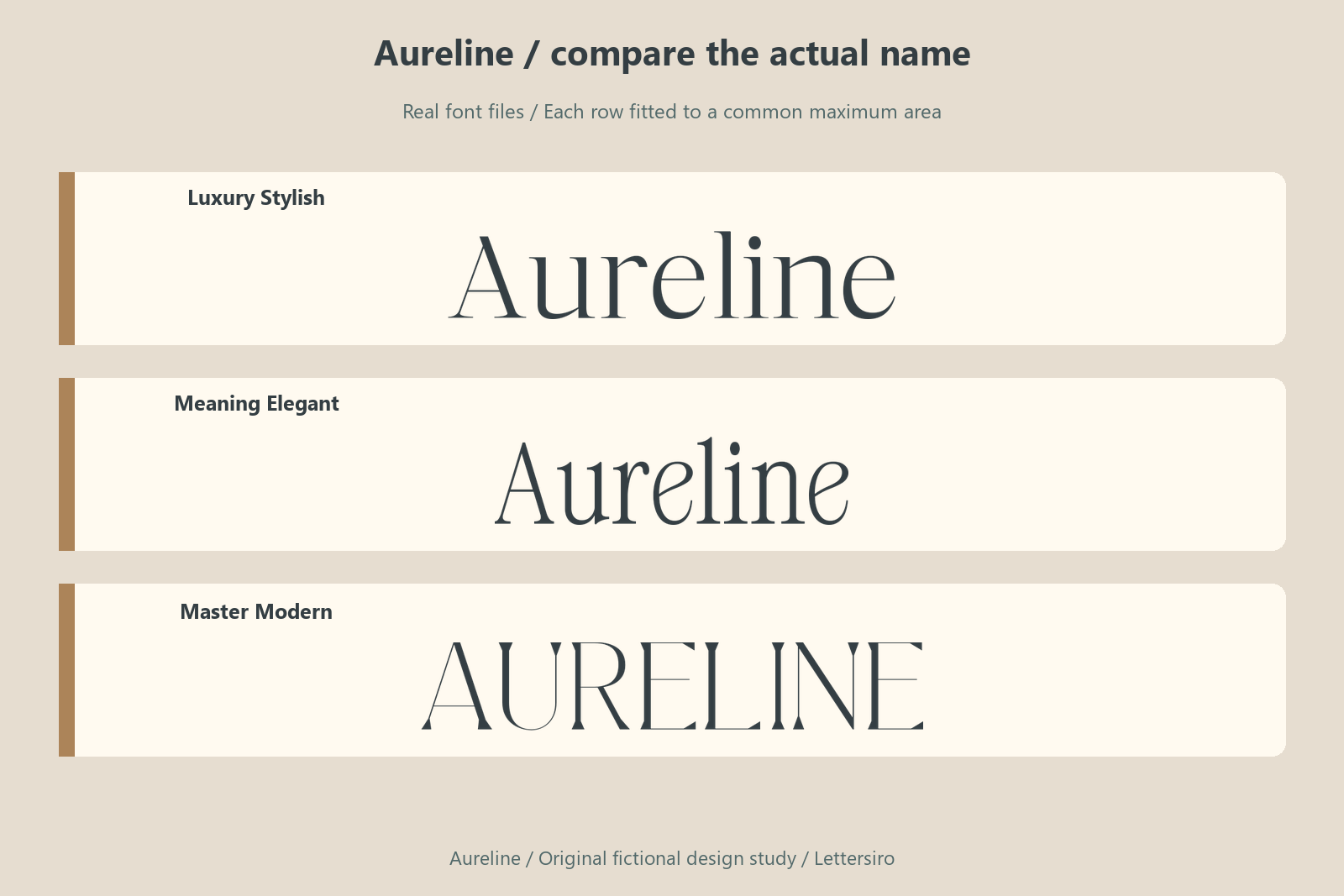
Inspect the capital A, the repeated vertical rhythm, and the ending of the word. Fine strokes are a visible part of the chosen aesthetic, so show a compact proof before approving an elegant enlarged specimen. Avoid assuming that thin lettering will reproduce in a particular foil or engraving process. A digital mockup can demonstrate hierarchy and placement; the manufacturer must review the real artwork against the actual production method.
Luxury Stylish
Luxury Stylish provides a structured serif direction with a pronounced relationship between thick and fine strokes. The name can feel deliberate without depending on an enclosing emblem. Inspect the repeated upright forms and the available space around the capitals. A generous large presentation should be paired with a compact proof so the finer details are considered in a realistic context. Explore the current Luxury Stylish information alongside the actual project requirements.
Meaning Elegant
Meaning Elegant provides a lighter serif direction with a quieter rhythm than the heavier display candidates. Its fine details and open relationships deserve enough space to remain visible. Compare the actual word endings and the smaller proof before deciding how delicate the final treatment should be. The surrounding layout can support this voice through clear contrast and restrained competing elements. Explore the current Meaning Elegant information alongside the actual project requirements.
Master Modern
Master Modern creates a formal, capital-like appearance in the local file used for this study. The vertical rhythm and spacing can become a strong part of the name's voice. Compare the whole phrase rather than judging one impressive initial. Keep a clear supporting hierarchy so the formal treatment introduces the brand without making every practical line equally emphatic. Explore the current Master Modern information alongside the actual project requirements.
Move from the name to the whole composition
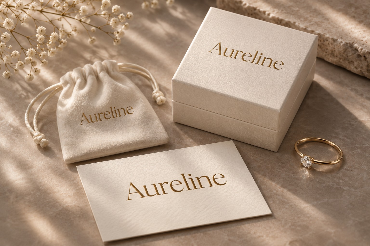
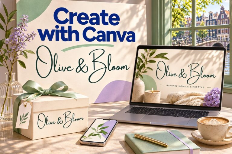
A box can offer a generous front surface while its smaller sides and supporting cards introduce different constraints. Decide which identity elements lead on the front and which take a quieter role elsewhere. Keep a plain artwork proof beside the contextual illustration so the name can be judged without lighting or perspective effects. A finish suggested by an image is not a substitute for the producer's assessment of the actual file. Record the selected arrangement and preserve a clear place for changing product information before expanding the concept into a complete range.
Keep a simple label system beside the expressive name. Product descriptions, sizes, and item references should have their own readable hierarchy. A consistent wordmark can introduce the studio while the information layout does the practical work of identifying each piece.
Record a useful application family
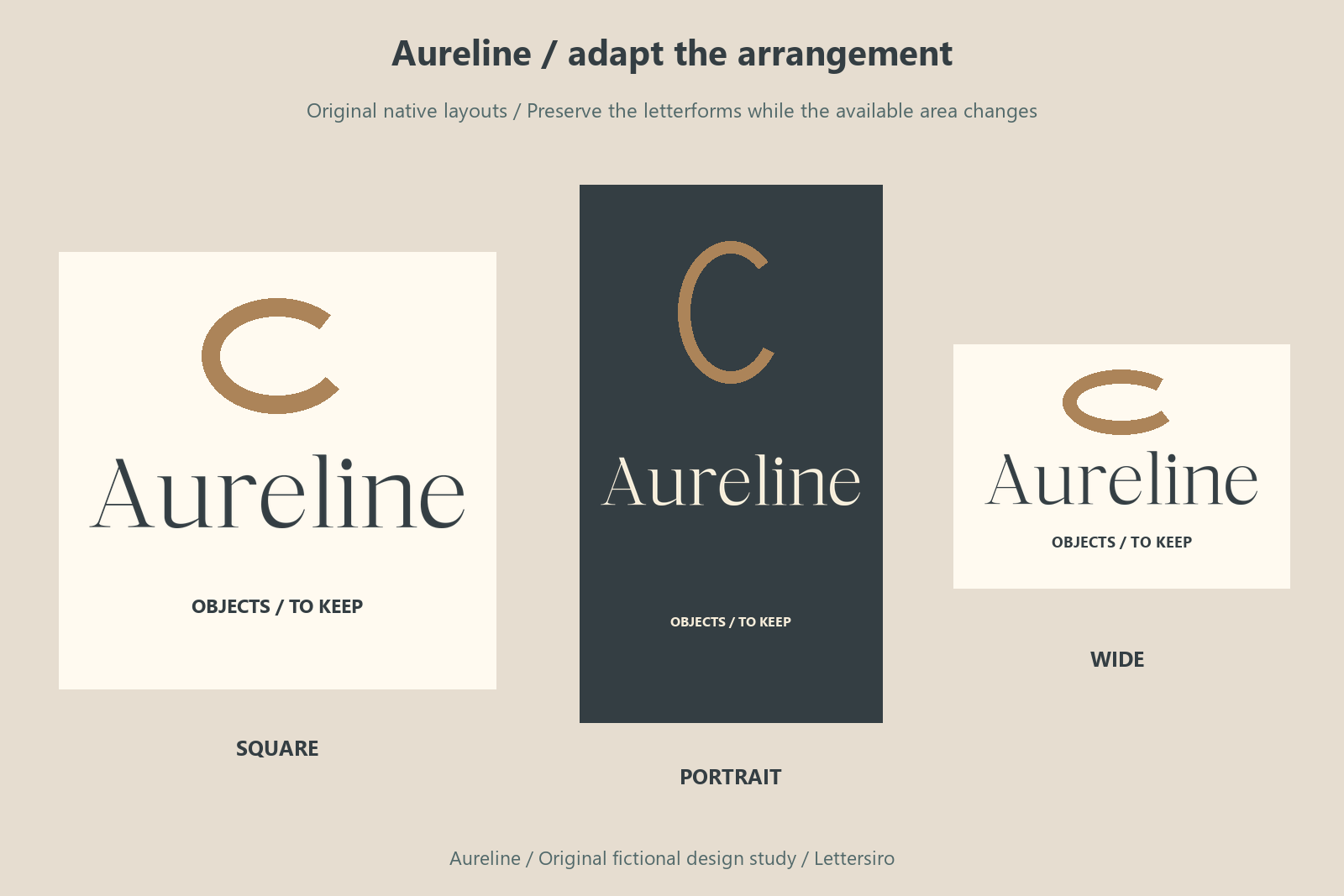
Build the smallest useful application family before expanding the identity. A primary composition, a compact information layout, and a wider introduction are enough to expose several different constraints. Keep the same name and chosen letterforms across the family while allowing the arrangement to respond to the available area. Give changing descriptions a stable role. When a new product or campaign arrives, test its actual wording against this family before introducing a new treatment. That preserves a recognizable core while leaving room for the project to develop.

Check the space the complete name needs
The following measurements come from drawing Aureline at a nominal 64-pixel font size in the local Pillow renderer. They record the visible ink bounds for this exact string, using the ordinary setting. They are a controlled project reference rather than a browser-layout benchmark or a score for font quality. The fitted name illustration above answers a different question: how the choices look within a shared maximum area.
| Actual font file | Ink width at 64 px | Ink height at 64 px |
|---|---|---|
| Luxury Stylish | 253 px | 49 px |
| Meaning Elegant | 197 px | 50 px |
| Master Modern | 271 px | 46 px |
In this particular rendering, Master Modern occupies the greatest width and Meaning Elegant the least; the widest result is about 1.38 times the narrowest. This difference can affect the line break or available room for a descriptor. It does not establish which version reads best. Compare the actual word rhythm and application before deciding whether width is the constraint that matters most.
The character maps of the three local font files were also checked for the 7 distinct non-space characters required by Aureline. Each contains those characters. This confirms the wording used in these proofs, rather than complete support for every language or future phrase. For your own project, repeat the check with the actual names, punctuation, numbers, and any accented letters you need before building the final layout.
Review a compact proof
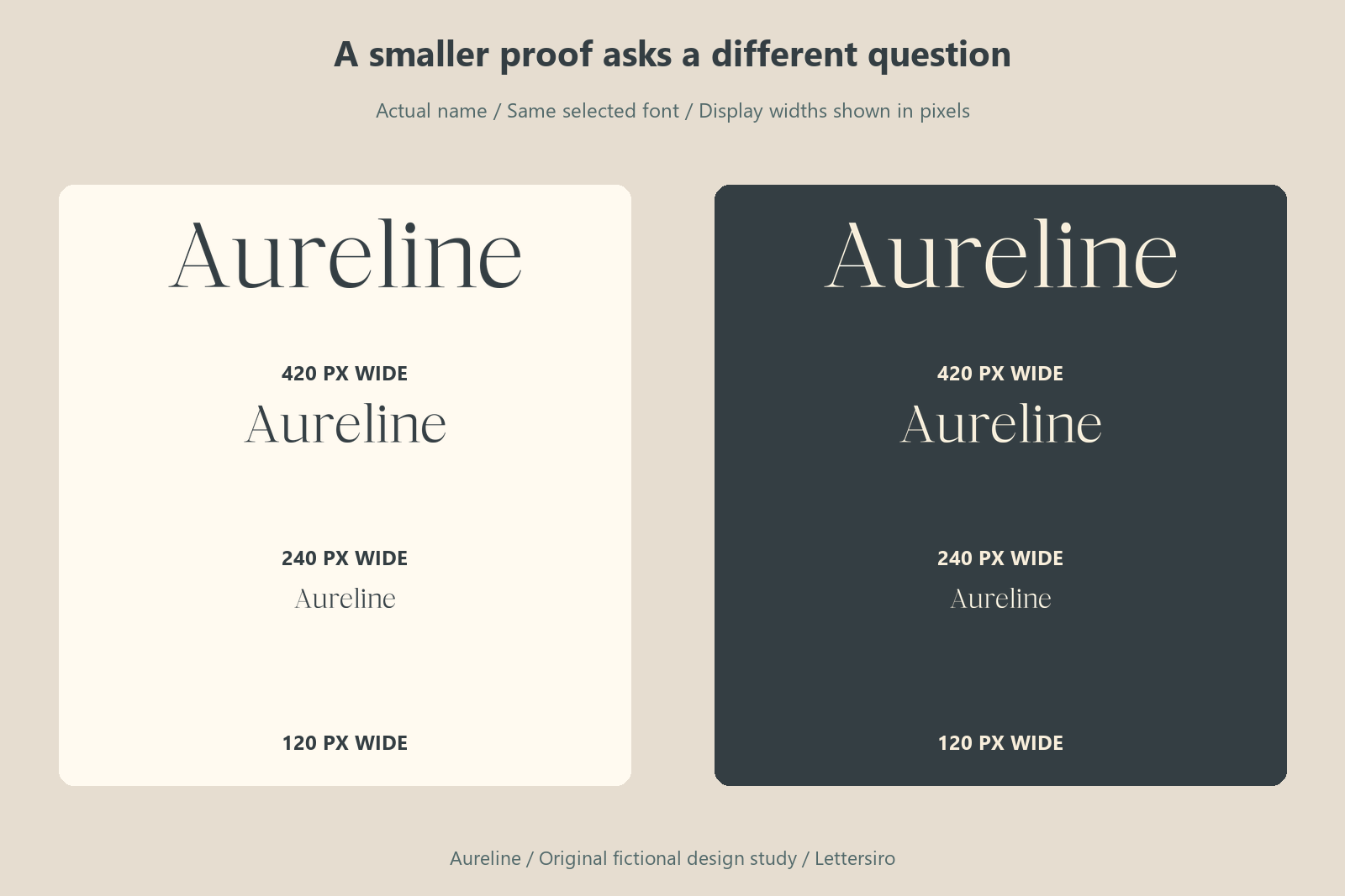
Ask an unfamiliar reader to identify the name from the small proof before explaining the intended spelling. Record where they pause or misread a relationship. That observation is more useful than a general preference for the most elaborate sample. Then show the complete application and ask what information they encounter next. The task connects the identity's personality with its actual reading role. Keep the ordinary setting beside the chosen composition so a later revision can be compared with a clear reference.
The wording contains 8 non-space characters. The repeated letters include e, which makes their spacing and surrounding rhythm worth inspecting in the actual name. Keep the whole word shape visible while reviewing those details. A correctly spelled, clearly organized name is the practical goal; the measurement table and reduction figure simply make parts of that decision easier to examine.
Try the wording for your own project
Use the Lettersiro Logo Tester to compare your actual name, then inspect the current product page for the chosen style, files, features, and license options. For this brief, Luxury Stylish is the primary native application direction; the other two candidates show how a different letterform voice can change the decision. Your own wording may produce a different result.
Keep an editable text source and a clearly named approved export. Where a recipient needs outlined lettering, Adobe's type-to-outlines guidance explains the operation and the value of preserving an editable copy. Check the actual Lettersiro license information for the intended project and delivery.
Before approving your version, record the actual name, the smallest important application, the longest supporting line, and the reason behind the selected font. That short record gives the next design revision a useful starting point.