Some projects need lettering that feels like a person has left a note. A personal card, an informal announcement, or a small name treatment can benefit from that directness. Mileadilan is a free Lettersiro font worth exploring when the brief calls for flowing handwritten character rather than a rigid display title.
The useful question is how that character behaves with your own words. This article combines the official preview with specimens rendered from the actual Mileadilan font file. The examples are original design studies, so you can see which parts of the advice concern the lettering itself and which concern the surrounding layout.
Read the character of Mileadilan
The Mileadilan free font page presents rounded, flowing brush-script lettering. Its rhythm feels informal and personal, with changes in stroke direction that give a word more movement than a neutral text face. The official cover also includes numeral examples, providing a starting point for a closer character review.
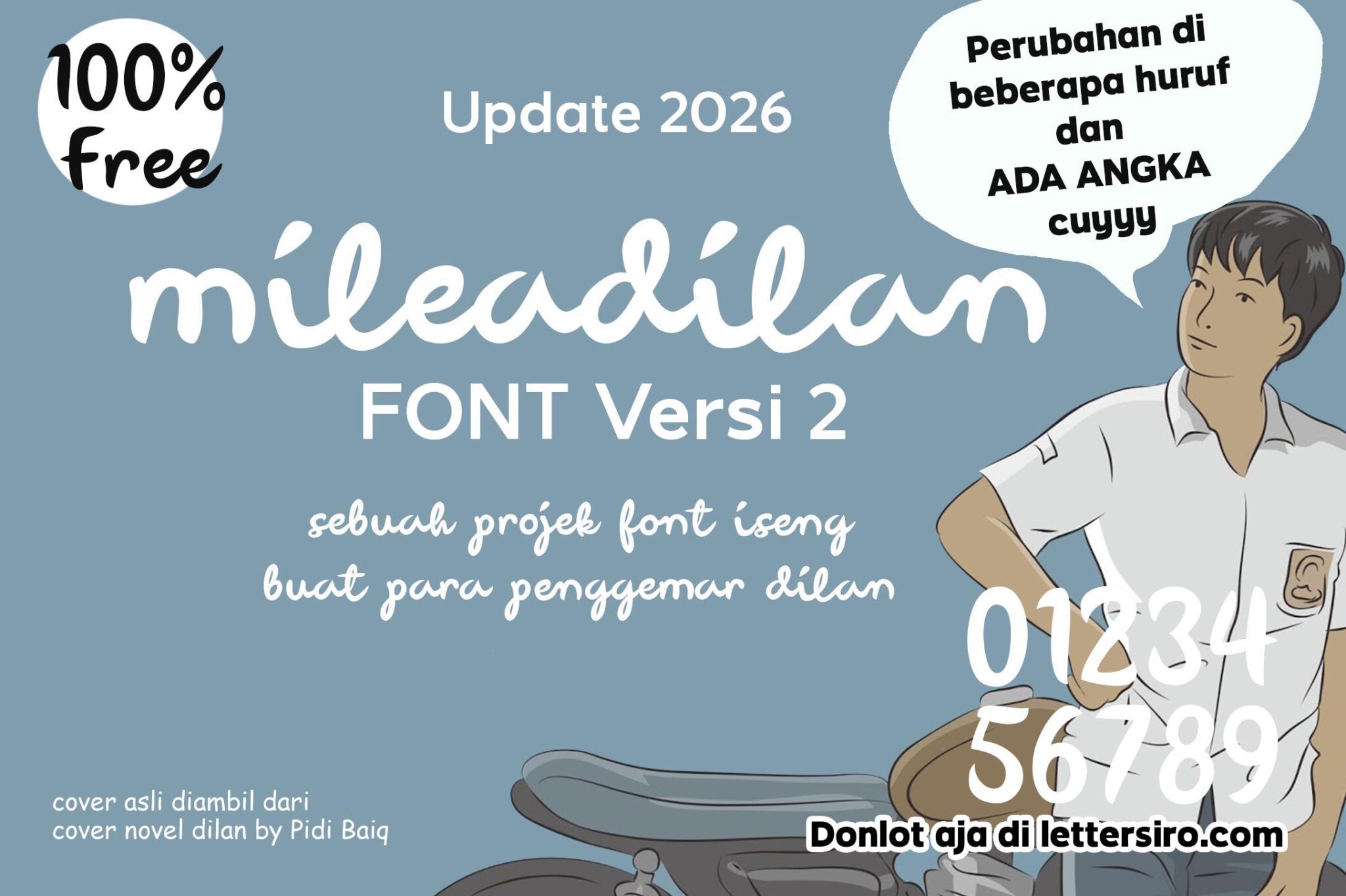
The download is presented for free commercial use. Read the current listing and included terms for the application you intend, and keep that information with the project. A permission statement about finished design work should not be treated as permission to resell or reupload the font software.
If installation is unfamiliar, the Lettersiro guide to installing fonts on PC and Mac provides a useful starting point. After installation, reopen the design application if necessary and verify the selected font before evaluating any sample. An unnoticed fallback face can make an otherwise careful comparison meaningless.
Begin with a short personal message
Try a greeting that belongs to the occasion: “A little hello,” “For someone special,” or another phrase with a natural spoken rhythm. Read it aloud before designing. Expressive lettering is easier to judge when the message already sounds like something a person would say.
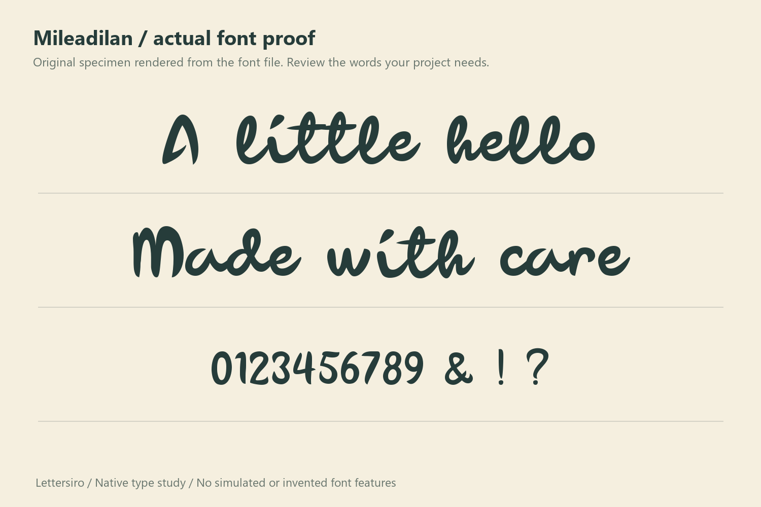
Study the word as a shape. Look at the relationship between the first letter, middle rhythm, and ending stroke. Check that the phrase has room above and below the main line. A text box that technically contains every character may still feel cramped when placed near a border or fold.
Do not begin by forcing the phrase into a narrow rectangle. Set it at a comfortable scale and build the card around its proportions. If the format is fixed, compare a shorter phrase or a different line break before changing the letter shapes through horizontal stretching.
Give the handwriting one clear role
For a personal card, let Mileadilan carry the greeting or the name. A quieter supporting face can handle the date, a longer message, or practical details. The supporting typography does not need to imitate the handwriting to feel connected to it; consistent alignment and spacing can do that work.
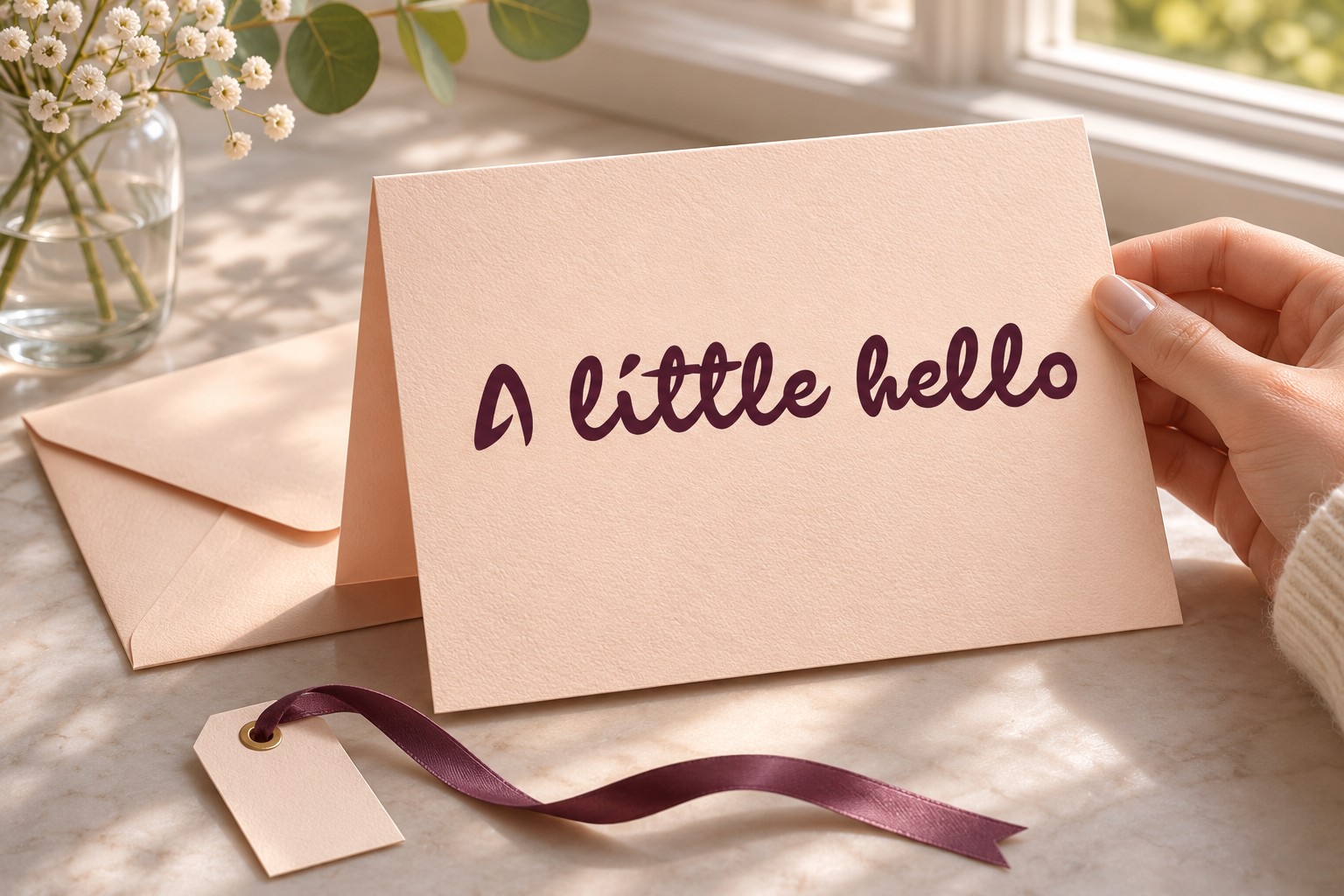
This division helps when wording changes. A long explanatory sentence should not become tiny simply because the display lettering looks attractive at a large size. Keep the expressive phrase concise, then give the longer content a readable measure of its own.
Try two alignments. A centered greeting can suit a simple folded card, while a left-aligned message may connect more easily to a longer text block. Compare the whole composition rather than selecting alignment from habit. The best option depends on the shape of the words and the amount of supporting information.
Test names with different lengths
Names expose practical differences that sample phrases can hide. A short name may produce a compact, confident mark; a longer name may need additional width or a second line. Build the test from actual likely names rather than selecting only combinations that look unusually good.
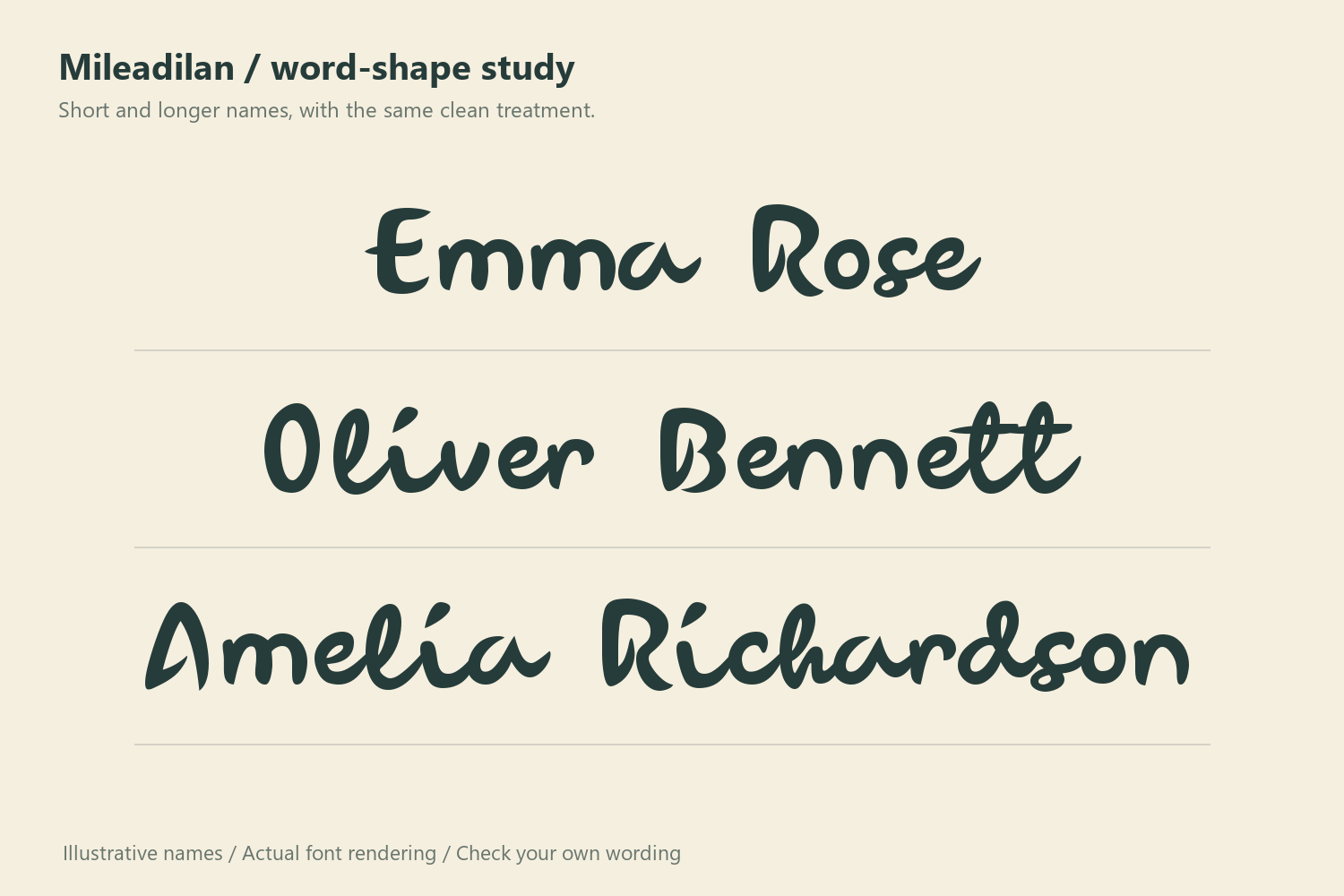
Keep the comparison honest. Use similar visual prominence, a stable background, and the same basic color. If one version has an elaborate border and another sits on an empty page, the decoration will influence the decision as much as the lettering.
Check names that contain repeated letters or unfamiliar combinations. Inspect punctuation and any required accented characters in the installed font. Do not assume language coverage from an English preview. Illustrator's Glyphs panel documentation explains how to browse the characters actually available in a typeface.
Let paper and color support the mood
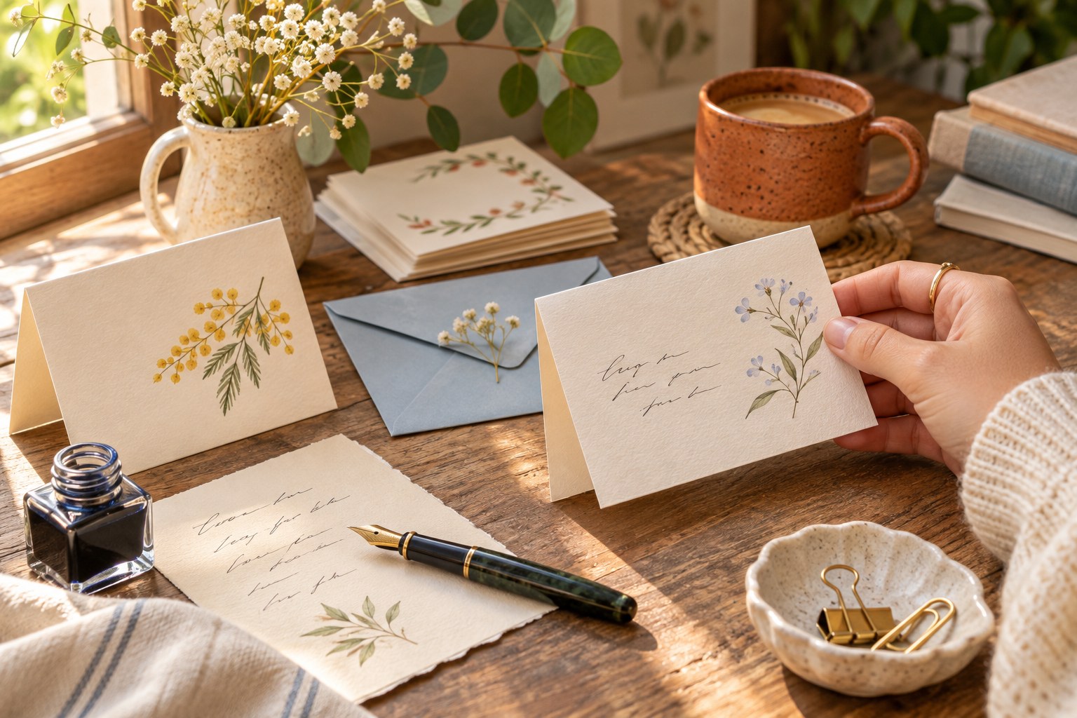
Warm white paper, a soft blue envelope, and one dark ink can create a personal setting without competing with the lettering. These are optional art-direction choices. A bright announcement or a monochrome business note may need a very different palette while using the same font.
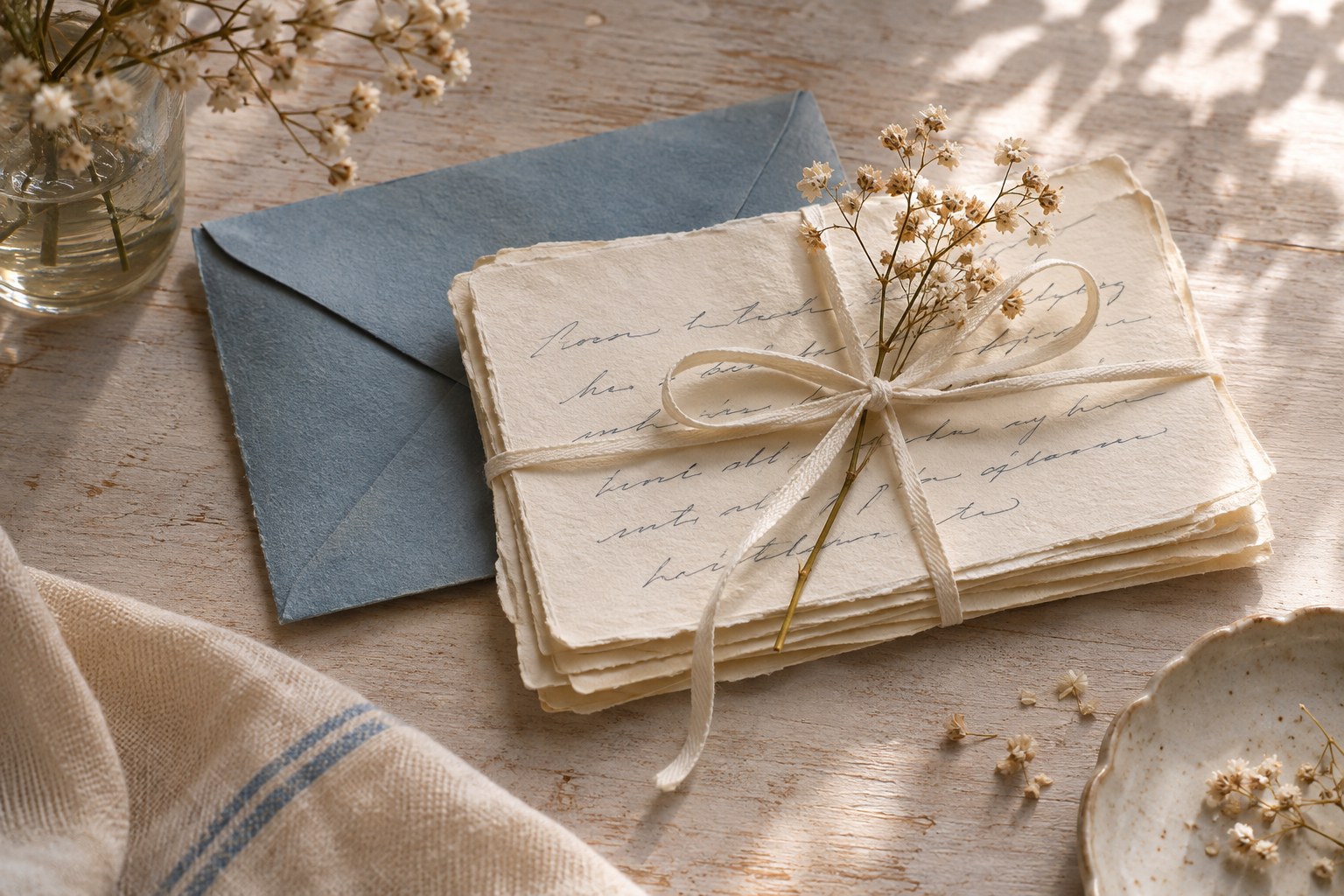
Before adding texture, review the clean version. Fine changes in paper tone can be appealing, but heavy grain across the lettering can reduce clarity. If an image sits behind the phrase, find a quiet region rather than outlining every stroke to compensate for a busy crop.
Print a proof at the intended size. Hold it at the distance at which a recipient will read it. A beautiful close-up on a large screen does not establish that the smaller greeting, date, or message remains comfortable on the finished card.
Compare another handwritten direction
Hey Brush offers a useful comparison because its published presentation has a different brush-led rhythm. Comparing two authentic previews can clarify whether the project wants a flowing script or a more individually articulated handwritten headline.

Use the same words when you move from preview selection to a local type proof. Avoid comparing an emotional greeting in one font with a dramatic all-capital slogan in another. That changes the message as well as the typeface.
For a broader search, explore Lettersiro's modern script font guide and the freebies collection. Keep a compact specimen beside the final layout so that later revisions can be checked against the original intent.
A useful card revision
If the greeting feels unbalanced, duplicate the artboard and change only one relationship. Move the supporting line farther away, shorten the message, or increase the outer margin. Compare the versions at a normal reading size. This makes the reason for the improvement visible and helps you avoid a chain of small adjustments that accidentally changes the entire mood.
Finish with a practical proof
Review the longest phrase, smallest essential text, and the actual output format. Check that the greeting has breathing room, the name is spelled correctly, and the supporting copy remains readable. Reopen the exported file rather than judging only the editable document.
Save the original font download, the included terms, and the editable design together. If someone else will continue the project, explain which elements remain live text and how the font should be obtained legitimately. Mileadilan becomes a useful resource when its personal voice, the actual words, and the final format all work together.