
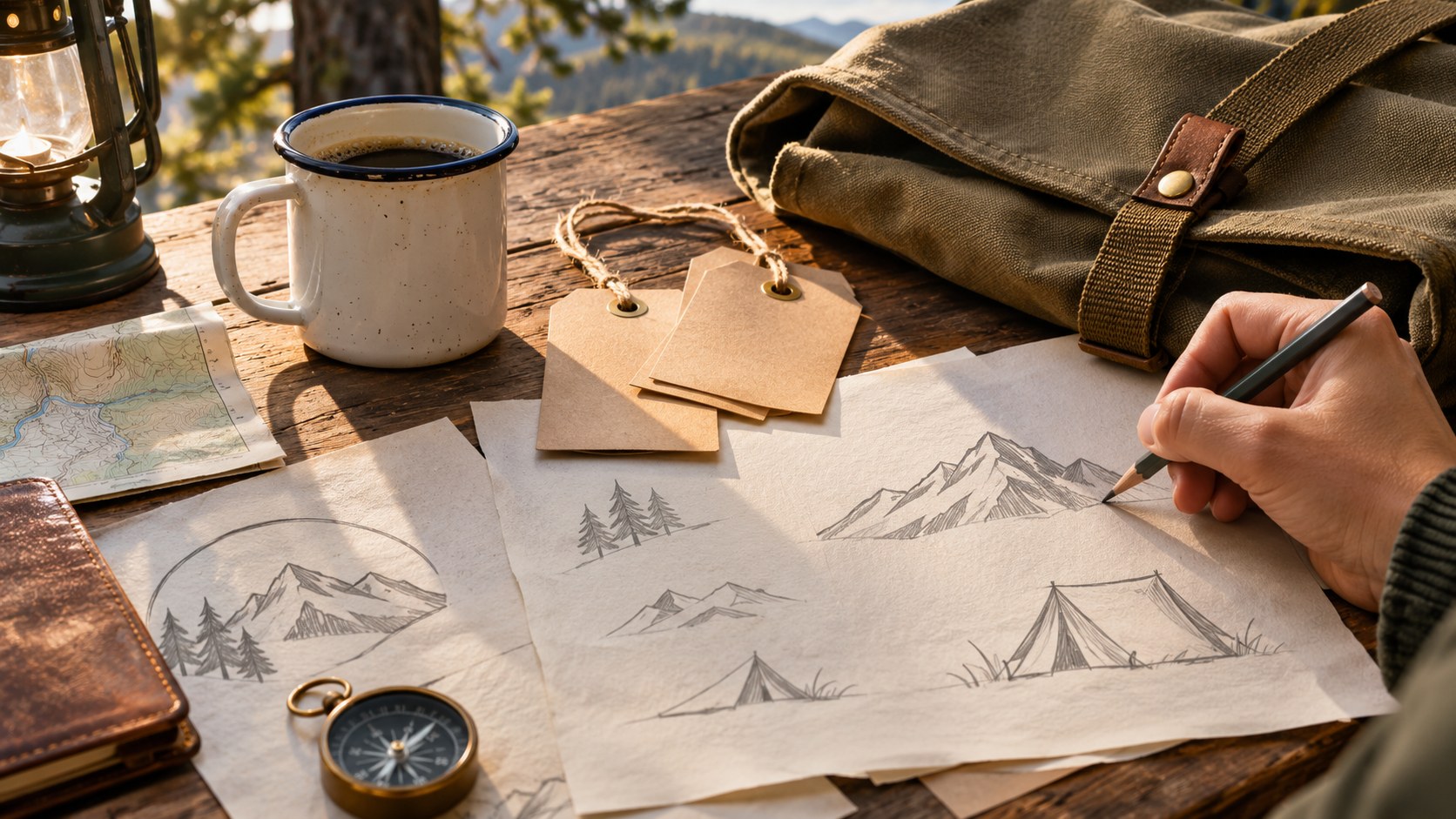
A camping badge can make an outdoor project feel established before a photograph or a long explanation enters the layout. A mountain silhouette, a trail object, and a compact ring of lettering communicate a familiar world. The challenge is turning that familiar language into a useful identity rather than collecting attractive emblems that never work beyond the presentation board.
These free camping logo badges from Lettersiro offer several starting points. This workshop compares the published artwork, explains how to assign type and illustration roles, and suggests a small identity system for an imaginary outdoor club. The application ideas are design exercises; they do not represent a commissioned brand or a test of every downloaded EPS file.
Meet the Campnation collection
Campnation Logo Badge presents four editable EPS outdoor logos. The preview includes mountain and camping imagery, a boot, and a backpack. The useful feature is the variety of visual structures: some treatments feel like compact stamps, while others organize a larger illustration with supporting lettering.

Choose the emblem that matches the activity. A walking club might have a reason to use the boot; a campsite might prefer the tent or mountain direction. Selecting an image because its meaning fits is a stronger first decision than picking whichever badge contains the most detail.
Read the current resource listing and the terms delivered with the download before starting production. A reusable template does not make an identity exclusive. If the project needs a distinctive trademark, develop the artwork further and obtain appropriate advice about the final mark rather than treating a public template as unique ownership.
Write the name before editing the shape
Use a working name such as “Pine Ridge Club,” then add the shortest necessary descriptor. Keep the real name visible throughout the exercise. A template that works with a short sample word may feel crowded when the actual organization has a longer title.
Make three text versions: the main name, a compact abbreviation, and a practical information line. Decide which belongs inside the badge and which can live beside it. Putting the website, founding year, activity, and full slogan into one small emblem rarely improves its usefulness.
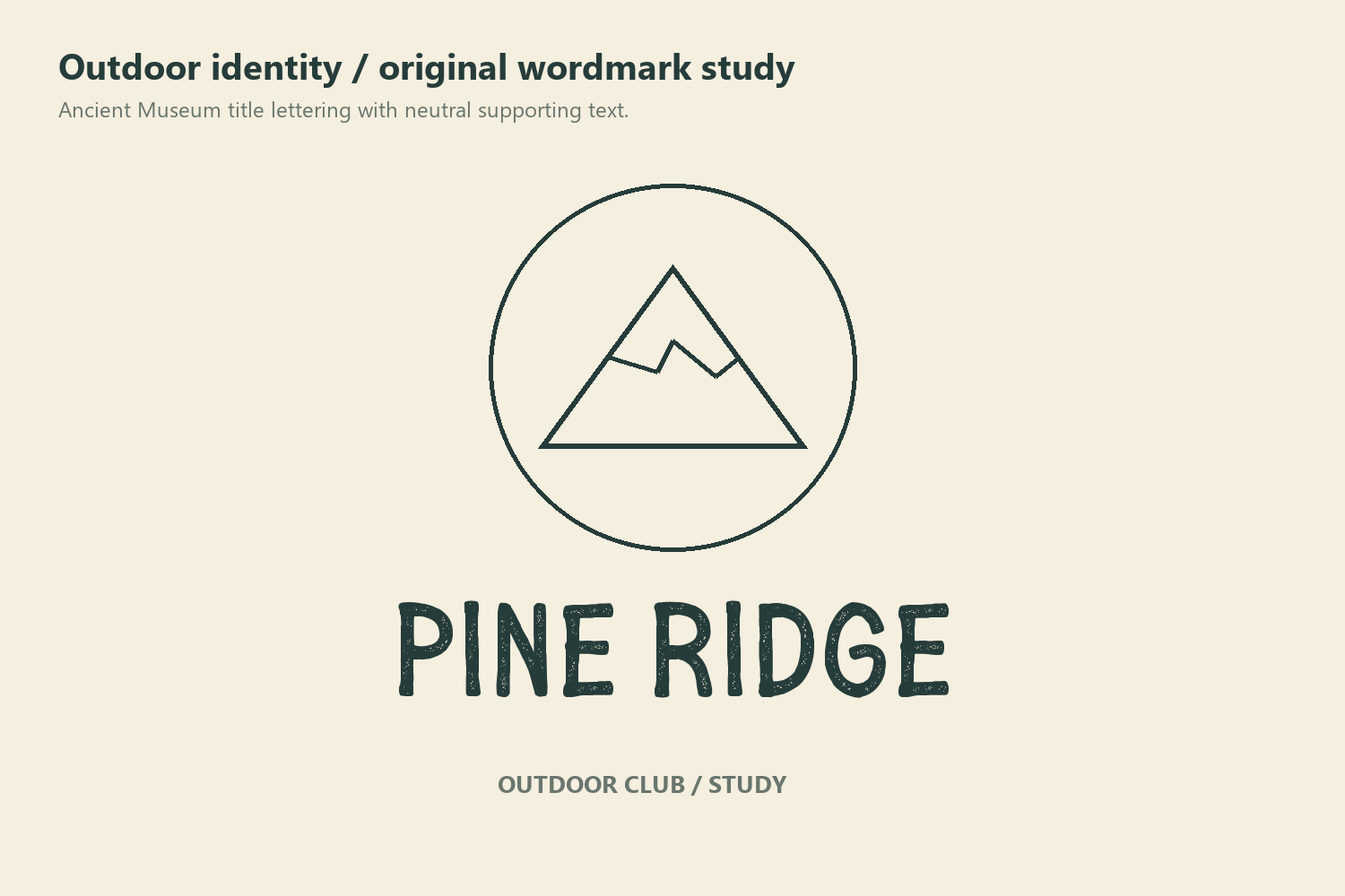
An expressive title face can help a longer identity develop its own voice. Ancient Museum is a separate Lettersiro option to consider when the brief calls for a vintage display direction. Check its own license and features; downloading a badge does not grant rights to an unrelated font.
Compare badges by their jobs
The Adventure Logo Badge Collection offers another group of four EPS emblems. Its preview includes mountains, a lantern, a mug, and a tent. These familiar objects can support a quieter outdoor mood than a composition built around a large central equipment illustration.

Keep the project name and intended output stable when comparing the collections. A detailed presentation at a generous size can make every candidate look viable. The meaningful comparison happens when each badge occupies the same space on the same label, card, or screen.
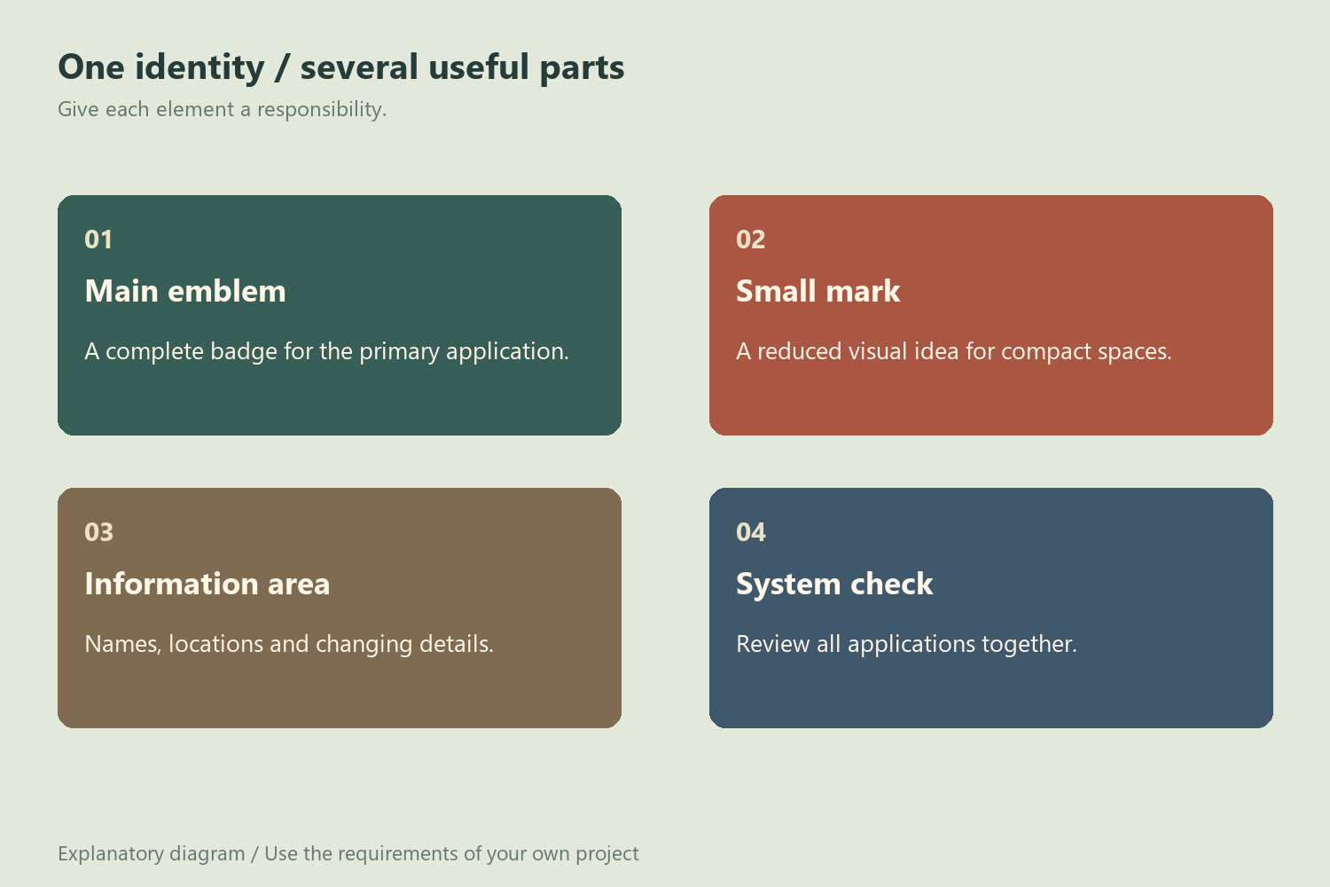
| Identity job | Useful question | First proof |
|---|---|---|
| Main badge | Is the name recognizable without extra explanation? | One-color version on plain paper |
| Small mark | Which detail survives reduction? | Compact label at its intended size |
| Supporting motif | Can the illustration work without the entire badge? | A simple corner or divider treatment |
| Information block | Where do changing details belong? | Separate address and activity line |
This comparison also prevents an easy mistake: choosing one badge for every application when a small family of related parts would be clearer. The badge can carry recognition while a separate text block handles information that changes.
Build a restrained outdoor palette
Start with one dark ink and a light background. Forest green on cream is one possible direction; charcoal on natural paper is another. These are composition choices, not color specifications supplied by the resource. Add a second accent only when it serves a visible purpose, such as identifying an event series.
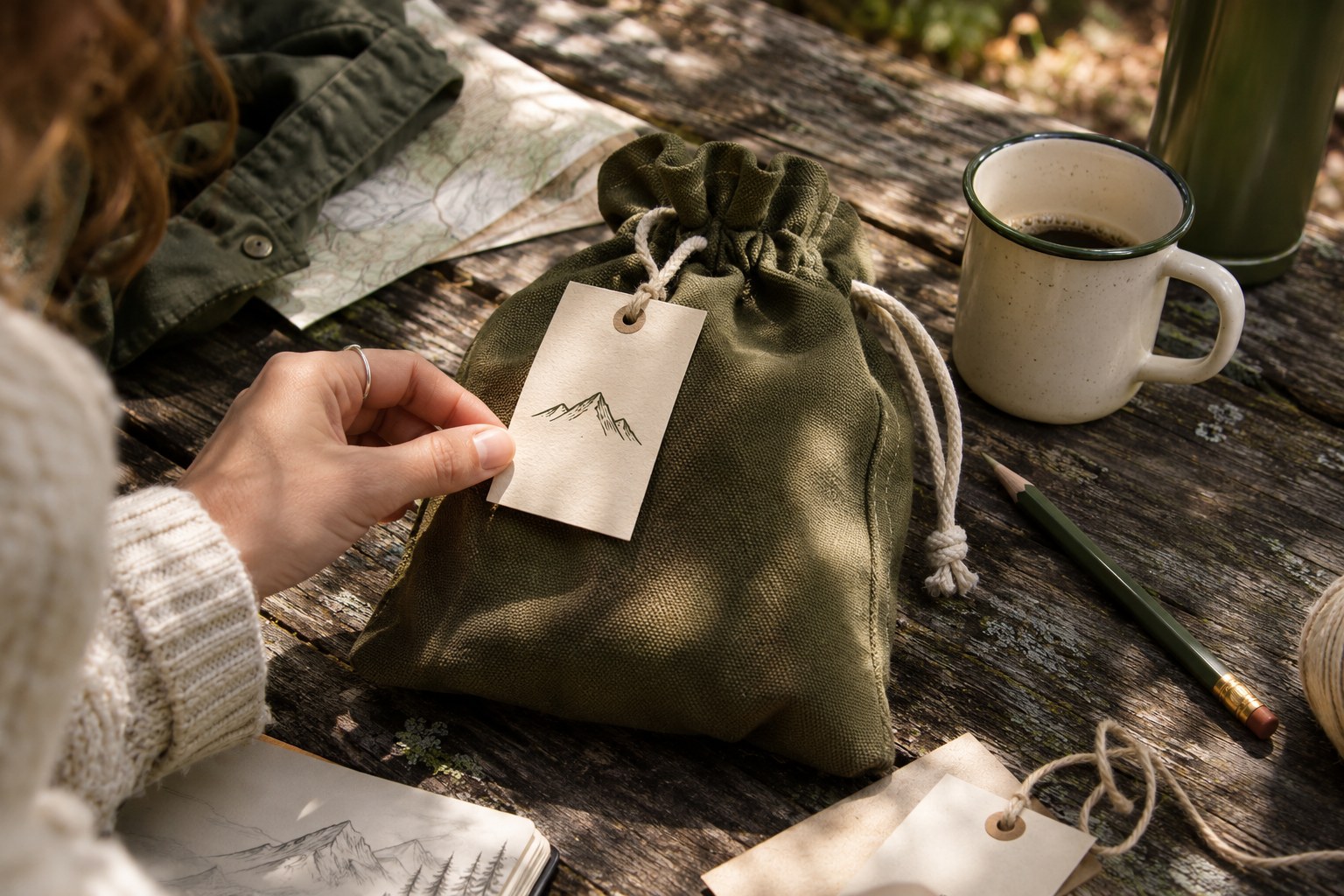
Material changes the apparent detail. A fine outline that reads cleanly on a monitor may lose definition on textured stock or woven fabric. Ask the actual production provider about the intended process and make a physical proof when possible. A photograph of a handsome canvas bag cannot establish that an intricate mark will embroider cleanly.
Let the material contribute some character. When kraft paper, canvas, and illustration already create a rustic atmosphere, additional scratches and distressed effects can make the name harder to read. Compare the clean version before applying texture.
Create three connected applications
Use a small sequence rather than a large mockup collection. Begin with a plain badge sheet, then a compact tag, then a wider information card. The sequence tests recognition, reduction, and flexibility without hiding the underlying artwork behind scenery.
For the tag, keep the hole, fold, and trim area out of the artwork's essential space. For the information card, give directions or contact details their own readable block. For the badge sheet, include both light and dark backgrounds so that reversed details can be checked before production.
The Wild Camping collection provides a third source to compare if the first two groups do not suit the brief. Its published set contains four camping logo directions. Review the actual selection instead of mixing several unrelated emblems into one identity simply because they share an outdoor theme.

Move from a preview to editable artwork
The resource previews are useful for selection; the downloaded artwork is where editing decisions must be checked. Save an untouched original, then work in a separate project copy. Inspect how objects and text are organized before recoloring or replacing anything.
Adobe's guide to importing EPS artwork in Illustrator explains the distinction between placing and opening EPS content. Choose the workflow that fits your editing needs, and inspect the resulting objects rather than assuming every preview element remains live text.
Before approving the identity, compare the three applications together. The name should feel like the same organization across them, practical details should remain readable, and the chosen illustration should have a clear reason to be there. Keep the resource URL and license information with the editable project. More outdoor assets are available in the Lettersiro freebies library, but a small, coherent selection will usually make a stronger identity than an overloaded folder.


