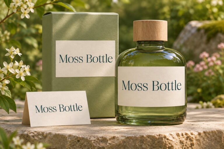
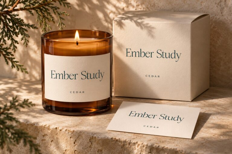
An AI-generated background can give a product campaign a new atmosphere: warm limestone, soft fabric, evening light, or an abstract studio setting. The difficult part is preserving the product and brand while the scene changes. A convincing image is not enough if the bottle shape drifts, the label becomes unreadable, or the campaign's typography changes from picture to picture.
The most reliable creative approach separates three responsibilities: the verified product image, the background environment, and the editable brand text. Each can then be reviewed for the job it actually performs. The image tool helps explore a setting, while the designer controls the identity and final composition.
Plan the advertisement before generating the scene
Consider a fictional skincare campaign for a moisturizing lotion. The artwork needs a product, a short headline, one supporting line, and a call to action. Decide where those elements will sit before asking for a background. If the bottle occupies the center and every corner contains fabric, flowers, or dramatic shadows, there may be nowhere useful for the message.
Make a rough layout with rectangles and real copy. Identify the intended crop, the product's approximate scale, and the side reserved for text. This small planning step can prevent a long sequence of attractive images that all fail for the same compositional reason.
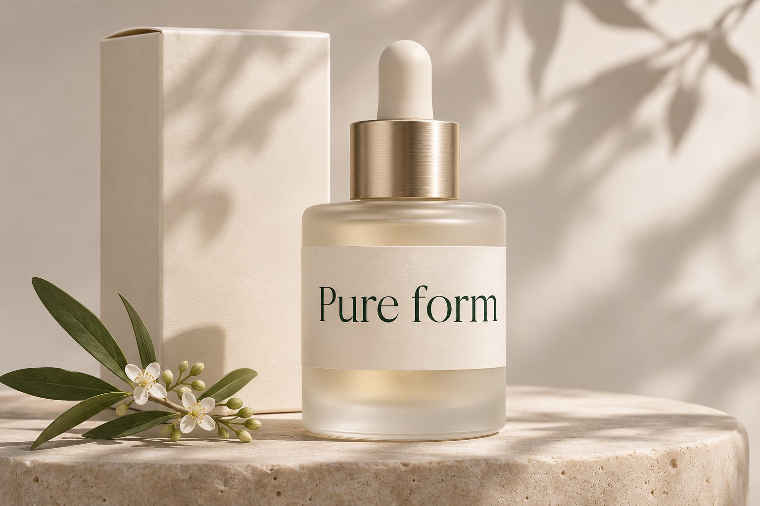
The concept above leaves room to discuss placement, but it should not substitute for an accurate product asset in a real advertisement. Use approved photography or a verified render when the shape, material, quantity, packaging, or label must represent an item customers can buy.
Describe the environment precisely
A useful prompt names the surface, light direction, atmosphere, and composition. For example: “Pale limestone surface beside a window, soft light from the left, gentle contact shadows, restrained peach fabric at the far edge, generous uncluttered space on the right for later text, no labels or readable words.” This gives the model a scene to construct without asking it to make final brand lettering.
Avoid contradictory instructions such as a dark dramatic setting with no shadows and bright even daylight. Choose the visual priority and evaluate the output against it. The Adobe Firefly prompt guidance is a useful reference for describing subjects, composition, and visual qualities clearly; individual tools still differ in their controls and results.
Keep the generated background's lighting compatible with the product asset. A bottle photographed with a strong highlight on the right may feel disconnected from a scene lit entirely from the left. Sometimes the better decision is to choose another background rather than forcing a difficult composite.
Add the real typography afterward
Use a design application to place the approved product and set the headline as editable text. This preserves spelling, font choice, spacing, and the ability to revise a price or message. It also makes it easier to build alternate crops without asking an image model to reconstruct the same lettering repeatedly.
Luxury Stylish provides a visual reference for a restrained beauty direction. Its editorial examples show how expressive serif typography can sit within a calm composition. Evaluate the actual headline in the font rather than assuming that any short luxury-themed word will produce the same balance.

Keep a simpler supporting face for product information and action text. The headline can establish tone; the supporting copy needs to communicate clearly. Check both over the lightest and darkest parts of the chosen background, including the areas that become visible in alternate crops.
Review the product at full attention
Before approving the scene, temporarily hide the headline and inspect the product. Look at the cap, pump, edges, reflections, label boundary, and contact shadow. Compare them with the approved source. Small inconsistencies can become obvious when an image appears beside genuine product photography elsewhere in the store.

Do not let an attractive background imply unverified product properties. A generated botanical ingredient, certification seal, clinical setting, or packaging claim can change what the advertisement communicates. Use only approved product information and review any visual cue that might suggest a specific composition, endorsement, or benefit.
Build three crops from one visual idea
Test a wide banner, a square social image, and a tall mobile placement. The text may need to move between them. Preserve the brand's recurring relationships—font roles, color, spacing, and product treatment—while allowing the composition to adapt to the available space.
| Review area | Wide banner | Square or tall placement |
|---|---|---|
| Product | Enough presence beside the headline | Avoid cropping important packaging details |
| Text | Comfortable line length | Fewer words and deliberate line breaks |
| Background | Space can establish atmosphere | Simplify distracting details near the focal point |
Do not reduce a finished wide advertisement to a narrow crop and assume it is done. Check the smallest viewing size and the visual route from product to message. If the headline becomes a thin decorative stripe, change the layout rather than merely increasing sharpness.

Save the parts that make revision possible
Keep the product source, generated background, mask, typography, and export settings organized in the project. Record which visuals are generated concepts and which are approved product assets. This is especially useful when a campaign needs another language, a new size, or an updated label.
AI product backgrounds are most useful when they extend an art direction without taking over the identity. Preserve the real product, add the actual licensed typography in a controlled layout, and judge the finished advertisement at the sizes where customers will encounter it.