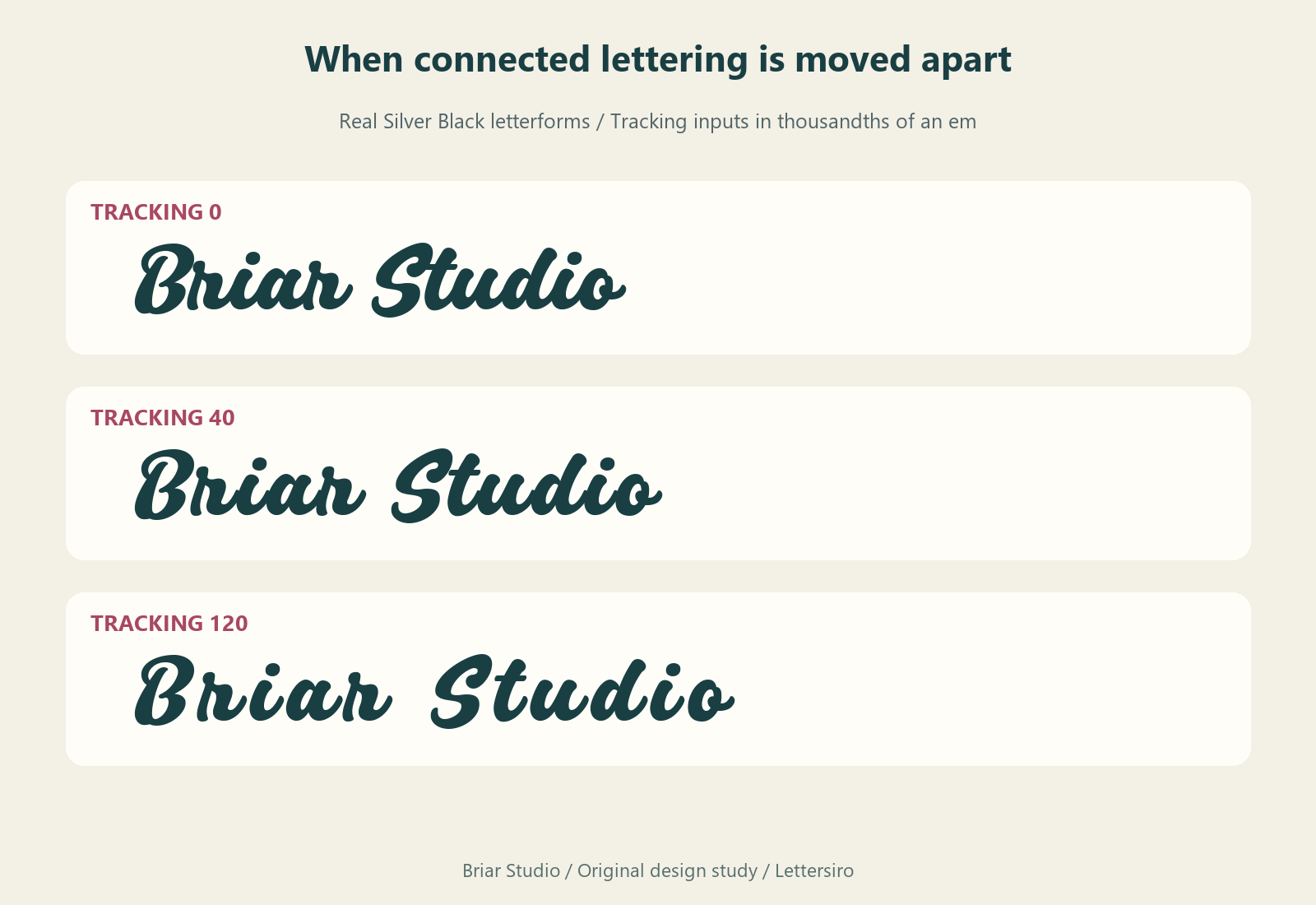
A script wordmark can look comfortably connected at first, then fall apart as soon as you add letter spacing. The individual letters have not necessarily changed. Their positions have moved, so an exit stroke that previously reached the next letter now ends in open space. Adding more spacing to make the word feel luxurious can produce a result that looks accidentally broken.
Start by returning the affected text to its ordinary spacing. Then decide whether you need to adjust a single letter pair, the gap between words, or the entire name's position in the layout. Those are different problems. This illustrated study uses the fictional name Briar Studio in the actual Silver Black typeface, so the connection issue can be examined in a real set of letterforms.
Identify which kind of spacing changed
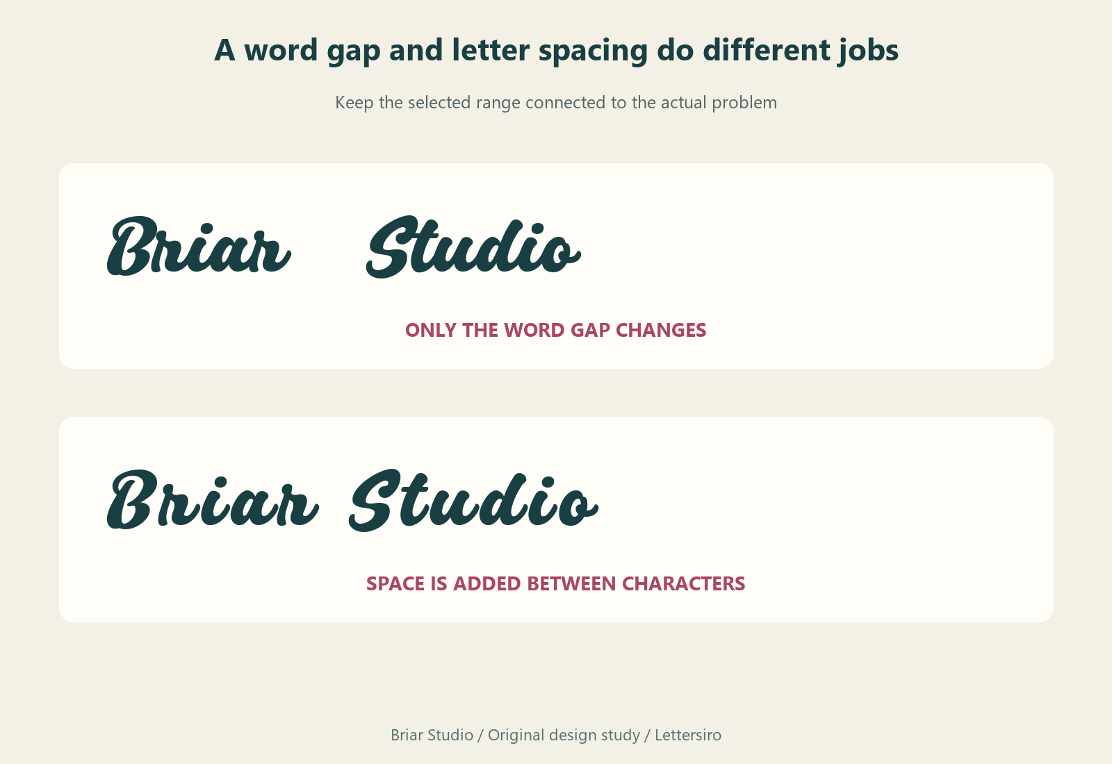
Tracking changes spacing across a selected range of text. Kerning changes the relationship between a particular pair. Word spacing concerns the gaps separating words. A large word gap can make a two-word name feel disjointed even when the letters within each word connect correctly. Conversely, a perfectly reasonable word gap cannot repair individual letters pushed away from their neighbors.
Adobe's Illustrator spacing guide distinguishes these controls and documents tracking and kerning in thousandths of an em. That unit matters: a setting operates in relation to the type size. Avoid copying a number from another design without checking what it does to your actual name.
Inspect the joins before changing the font
Read through the word from left to right and note where one stroke is intended to meet another. Look at the outgoing stroke, the receiving shape, and the vertical position of both. A gap after every letter suggests a global spacing change. One awkward relationship within an otherwise connected word suggests a more local problem.
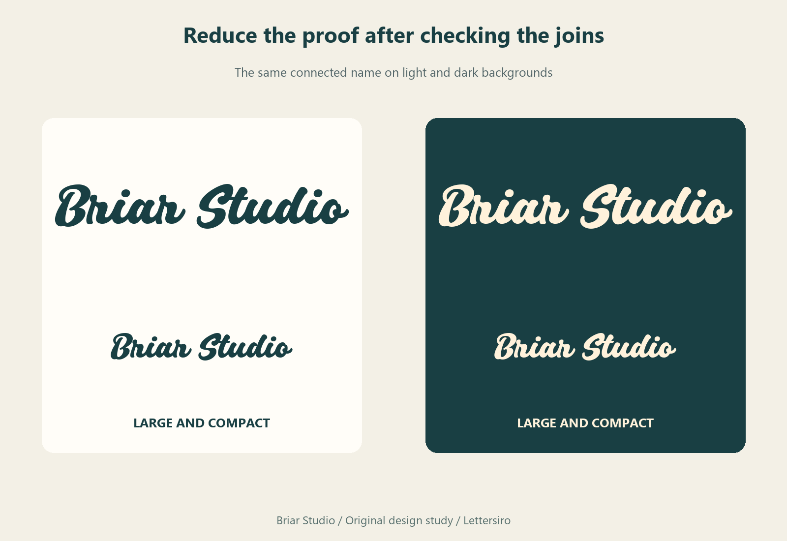
Zoom in to identify the issue, then return to the size at which the name will be used. A tiny gap that is prominent on a large monitor may be inconspicuous in an ordinary presentation. A join that looks adequate when enlarged can also become a dark clump when reduced. Both views contribute information; neither replaces the other.
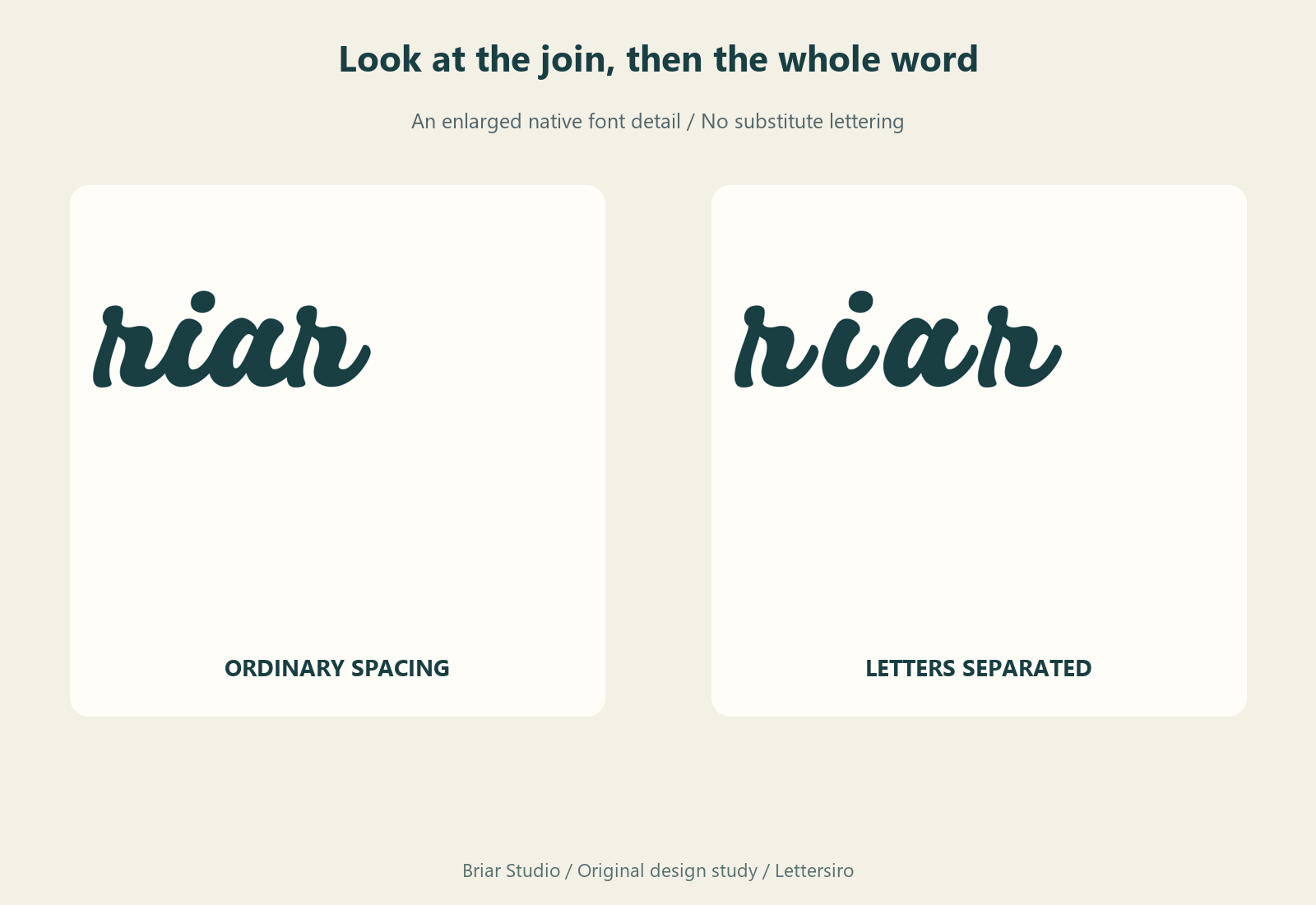
Before editing spacing, check that the intended font and style are active. A substituted font changes the shapes themselves. Also check whether the chosen application supports the font features you intend to use. An alternate letter may change an entry or exit stroke, but it should be selected deliberately and examined in the complete word.
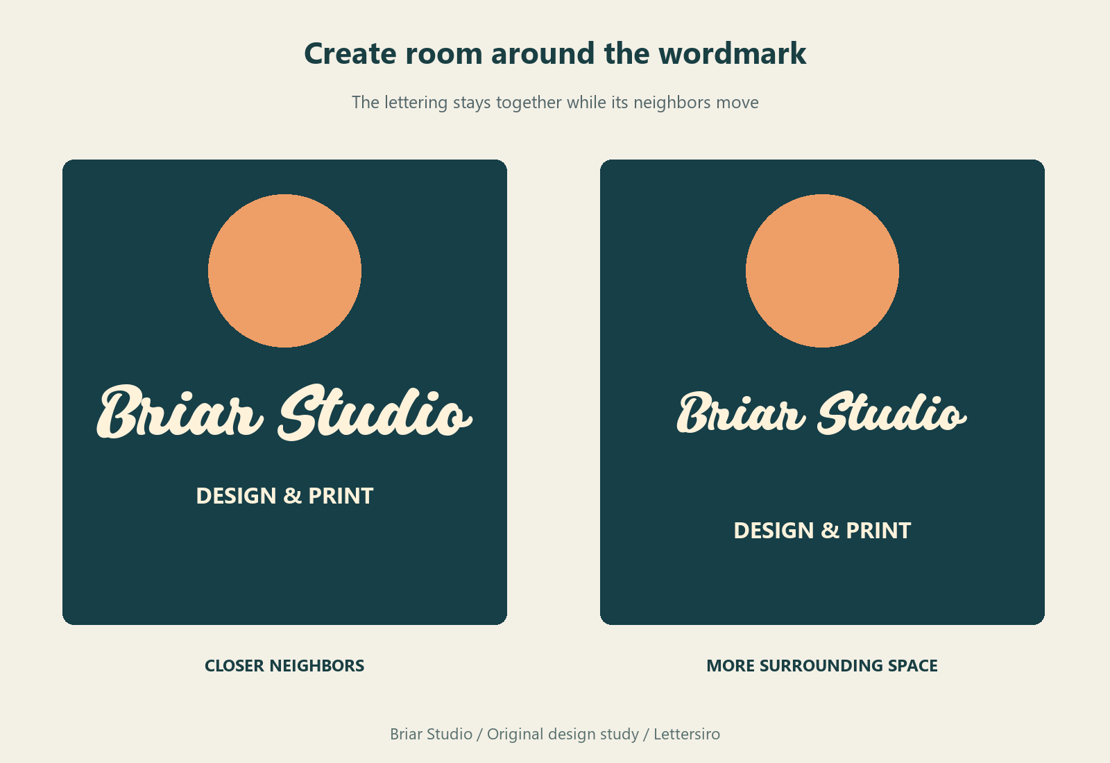
Give the name breathing room around its edges
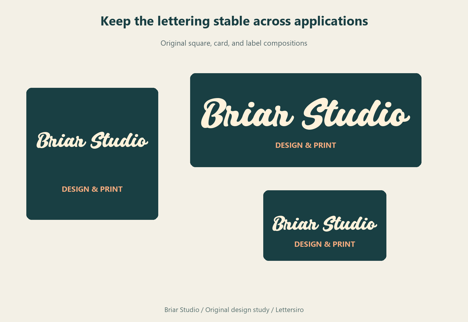
If the name feels crowded in a label or poster, increasing the gaps inside the script is only one possible response. Try enlarging the available area, moving a nearby graphic, reducing the size of a supporting line, or adjusting the wordmark's overall size. These changes can create space around the name while preserving its internal rhythm.
For Briar Studio, the layout proof keeps the connected name together and moves the surrounding information farther away. The result demonstrates a useful distinction: space around a word and space inside a word have different jobs. A more open composition does not require every letter to behave like a separate object.
Treat a word gap separately from a letter gap
Select the smallest range that corresponds to the problem. If the difficulty is the relationship between Briar and Studio, review that boundary first. If one pair inside Briar feels too tight, adjust that pair and compare it with neighboring joins. Preserve an ordinary copy of the wordmark so you can judge whether the revision actually improved the reading.
Avoid pulling letters together until they collide merely to hide a visible gap. The shapes should form a convincing word, not a chain of forced overlaps. Inspect counters and repeated upright strokes as well as the connecting lines. A local correction that creates a new dark patch is a tradeoff to reconsider.
Reduce the complete design before approving it
Once the joins look intentional, review the name in its actual application. A business-card credit, a social tile, and a shop sign offer different amounts of space. Keep the name's letterforms stable as you adapt the arrangement. If a supporting descriptor disappears, revise its role rather than assuming the script must carry all the information.
Ask a reader who has not seen the project to identify the name without being told the spelling first. Record a specific hesitation or misreading if one occurs. This article provides visual comparisons, not participant-test results; your own reader check can help determine whether the final arrangement communicates the intended name.
Use the Lettersiro Logo Tester to begin comparing your own wording, then inspect the Silver Black product page for the available files and features. Keep your editable source alongside the approved export, and check the current license options for the project. The practical goal is a name that reads as one deliberate piece of lettering, with enough room to work in the complete design.