Top 10 Mistakes in Web Design to Avoid for an Engaging Website
Designing an effective website is about creating an experience that’s functional, engaging, and easy to navigate. From fast loading times and mobile-first layouts to clear messaging, strong typography, and SEO-friendly structure, avoiding the top 10 mistakes in web design is key to building a good site.
Key takeaways
- With most users browsing on mobile, your site must be responsive and easy to navigate on every screen.
- Compress media, structure content clearly, and include basic SEO elements to improve visibility and performance.
- Avoid vague language; guide users with specific, actionable buttons and value-driven headlines.
- Maintain visual clarity with white space, clean typography, and a well-organised content hierarchy for a better user experience.
Top 10 Mistakes in Web Design
Here are 10 top mistakes in web design to avoid if you want a responsive, high-performing website that keeps your audience engaged.
1. Typography Contrast Issue

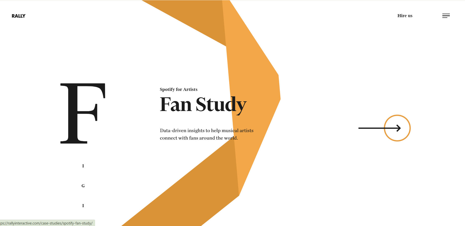
Fonts play a far more critical role in design than many people realise, but this is one of the 10 most common web design mistakes small business make. They can either elevate or completely undermine the visual message, even though they’re just text.
A frequent issue in DIY web design is the lack of contrast between headline and body fonts. Simply changing the size isn’t enough; you should use a noticeably bolder weight for headlines. This enhances readability while also directing the viewer’s attention smoothly across your content.
Also Read: 25 Best Fonts for UI/UX Design That Enhance Readability
2. Slow Loading Speed
A slow-loading website can seriously impact user experience and often causes visitors to leave before the page fully appears, increasing your bounce rate. Common causes of slow performance include oversized media files, outdated code, and excessive use of plug-ins.
To improve load times, compress your images and videos, and use lazy loading so content only loads when it’s needed. Also, reduce reliance on heavy scripts and avoid using Flash elements that can delay how quickly your site displays.
3. Too Many Popups or Overlays

Let users access the content they came for without distractions; this is one of the common web design mistakes to avoid. Pop-ups, overlays, and auto-triggered messages—like surveys or chat windows—may seem useful, but they often interrupt the experience and frustrate visitors.
4. Poor Navigation
Poor navigation can quickly frustrate users and reduce trust in your website. Understanding the difference between UI and UX design helps you create user-friendly pathways that keep people engaged.
To improve navigation, use a clear menu hierarchy and place it where users expect—usually at the top. Choose specific, descriptive labels like “Small Business Tools” instead of vague ones.
Also Read: Reasons Why Responsive Design Matters in 2025
5. Lack of Responsive Design

At a minimum, your website should follow a mobile-first design approach. Most users usually access sites from mobile devices, making it essential to create a mobile-friendly experience.
If your site isn’t optimized for smaller screens, content may appear distorted or difficult to navigate. This leads to user frustration, reduced engagement, and ultimately, lost opportunities for your business.
6. Vague Messaging
Vague messaging can weaken your website’s impact by failing to clearly explain what your brand offers or why it matters. When visitors don’t immediately understand your value, they’re more likely to leave without engaging.
To avoid this, place a clear and compelling message above the fold that highlights your unique value proposition. A strong example is Stündenglass, which clearly states its product offering in the hero image, removing any guesswork and encouraging users to stay, explore, and convert.
7. Generic Calls to Action

A call-to-action (CTA) is a crucial part of web design that encourages users to take a specific action, such as “Subscribe Now” or “Shop the Collection.” Generic phrases like “Learn More” or “View More” can create confusion, potentially reducing engagement and conversions.
8. Unoptimized Images
Using high-resolution images can make your website visually appealing, but they often slow down loading times. To fix this, compress and resize images using tools like Adobe Photoshop or WordPress plugins such as WP Smush to reduce file sizes without sacrificing quality.
Also Read: How to Redesign a Website? 6 Steps to Boost Online Presence
9. Cluttered Website Design

An overcrowded website can confuse and overwhelm users, leading to higher bounce rates and lower engagement. When too many elements compete for attention—without proper spacing or hierarchy—visitors struggle to focus on what matters most.
To create a more user-friendly layout, use a clear grid system, consistent spacing, and plenty of white space to give your design room to breathe. Break up dense text, group related content, and avoid distractions like excessive pop-ups or auto-playing videos.
10. Ignoring SEO Best Practices
Even the most visually appealing website won’t be effective if it isn’t optimized for search engines. Without proper SEO—like meta tags, alt text, fast load times, and clear structure—your site may struggle to rank, limiting visibility, traffic, and overall performance.
Also Read: Best Font Size for Responsive Website to Improve User Experience
Now You Know Top 10 Mistakes in Web Design
Avoiding the top mistake in website design ensures your site is user-friendly, responsive, and search-optimised. A well-designed website with clear messaging and fast performance drives better engagement, visibility, and results across all devices and platforms.
Moreover, typography plays a crucial role in how you communicate with your audience—you need fonts that not only complement your visuals but also convey your message with clarity. That’s where Lettersiro comes in, offering an exclusive collection of premium fonts to elevate your website design. Discover the perfect typeface for your brand—browse Lettersiro’s premium font collection and elevate your design today!
