Many iconic designs hide clever details known as a logo secret message by adding meaning, sparking curiosity, and making the brand more memorable to those who spot the hidden touch. Here are 16 hidden meanings in famous logos that you never noticed.
Key takeaways
- Logos often carry hidden messages that reflect a brand’s story, values, or history that sometimes people can’t see.
- Clever design elements like negative space or symbolism can make logos more engaging and memorable.
- Hidden meanings spark curiosity, encouraging deeper connection and brand recognition.
- Understanding these secrets can inspire more thoughtful and impactful logo design for your own brand.
The Importance of Hidden Messages in Logos
Logos are designed to communicate a message or idea, and many include hidden elements to add depth. These subtle features, like clever imagery or wordplay, are often missed at first glance but contribute to a more memorable and meaningful design.
Hidden messages create stronger emotional connections between brands and audiences. These visual Easter eggs spark curiosity, encourage deeper engagement, and help logos achieve distinctiveness. Those make the brand more intriguing and inviting for people to explore and remember.
Logo Secret Message Examples
Here are 16 brand logos you should see, each hiding a clever message that reflects the identity and values of the brand.
1. Toblerone
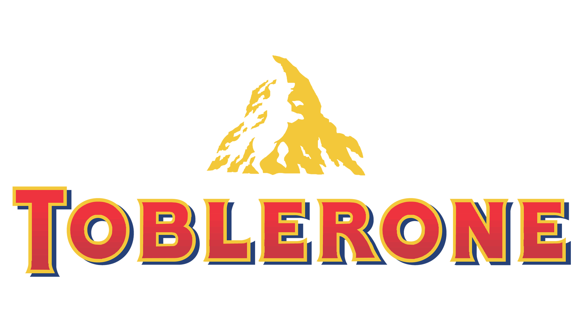
Toblerone with the mountain and bear | Image Source: 1000Logos
Toblerone’s iconic mountain logo cleverly hides a bear within its design, a subtle tribute to Bern, the Swiss city where the chocolate originated. This is one of the most famous logos with a secret message that you may consider putting the inspiration on your logo design.
2. NBC
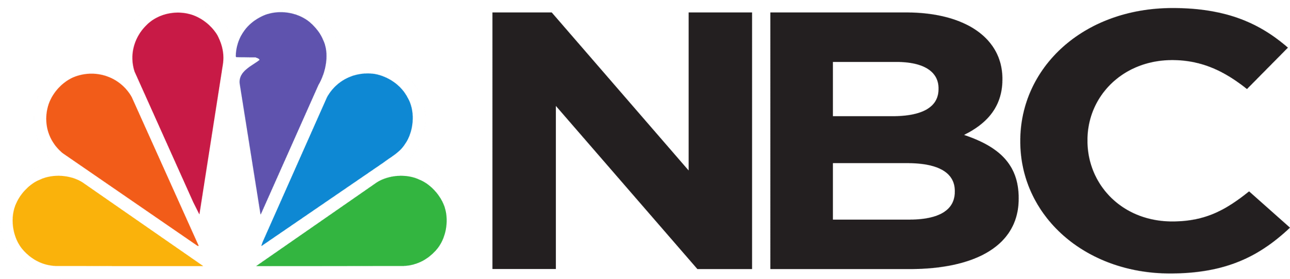
The peacock in NBC logo | Image Source: 1000Logos
NBC features a peacock with six colorful feathers representing its divisions and the bird’s shape hidden in the negative space.
Also Read : Understanding Color Contrast for Accessibility in Logo Design
3. Baskin Robbins
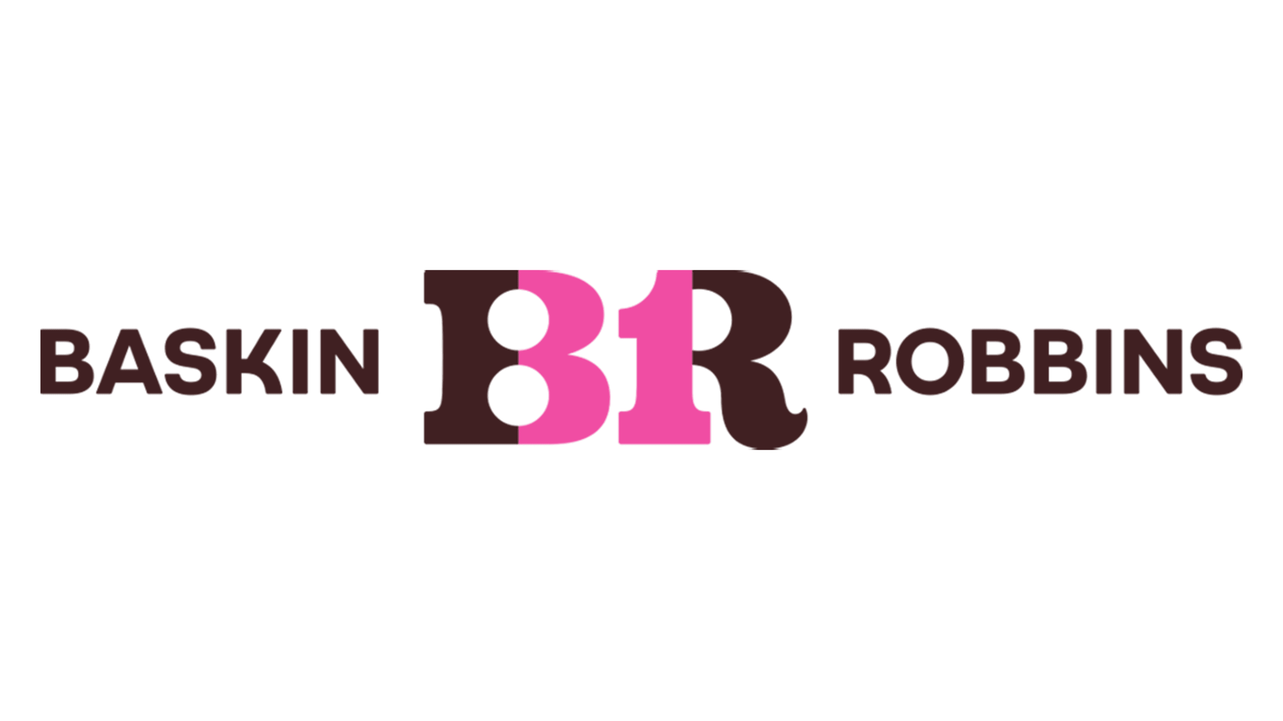
Number 31 in the logo to represent original flavor | Image Source: 1000Logos
Baskin-Robbins’ logo hides the number “31” within the “BR” lettering. The number is a nod to the brand’s original 31 flavors, symbolizing a different ice cream for every day of the month.
4. Adidas
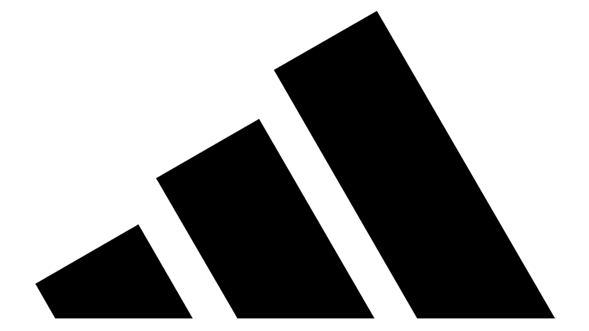
Three stripes on Adidas logo| Image Source: 1000Logos
People still debate the meaning of Adidas’s three-stripe logo. Some say it’s a mountain for strength; others say it represents the Dassler brothers. Either way, it’s a powerful design that gets people talking.
Also Read : What Is a Good Web Design? Key Elements for Your Website
5. Wendy’s
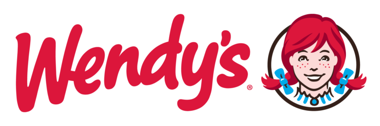
The word MOM on Wendys’ logo | Image Source: 1000Logos
Wendy’s logo features the founder’s red-haired daughter with the word “mom” subtly hidden in her collar, symbolizing a warm, home-like feeling that reflects the brand’s friendly, welcoming vibe.
6. Toyota
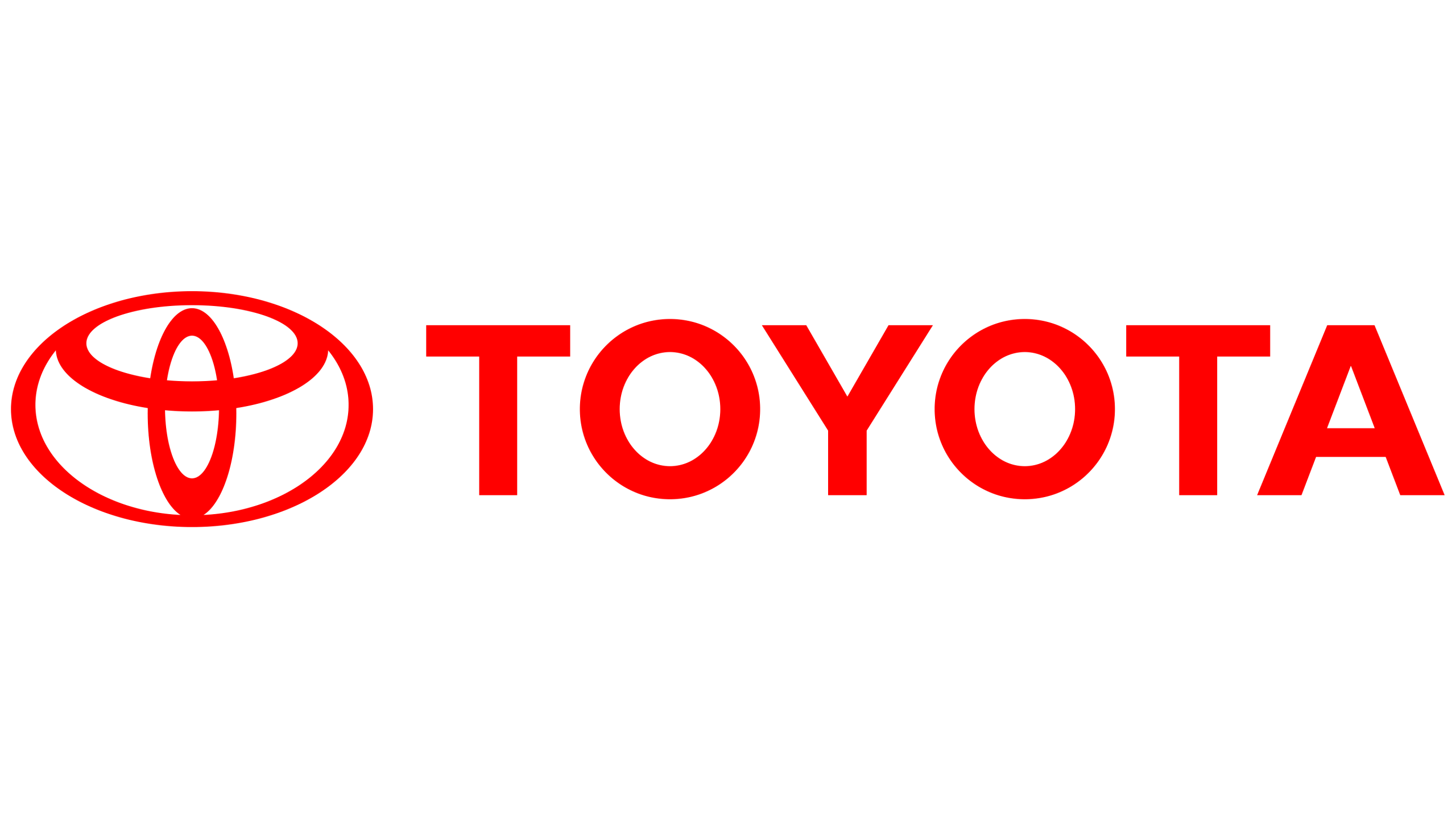
The logo represents the brand’s name | Image Source: 1000Logos
Toyota’s logo may look like a simple trio of ovals, but it cleverly forms every letter of the word “Toyota” while also symbolizing a steering wheel.
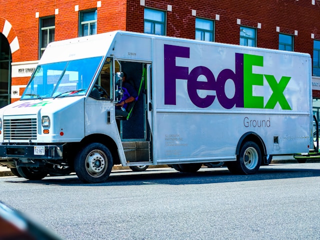
7. FedEx
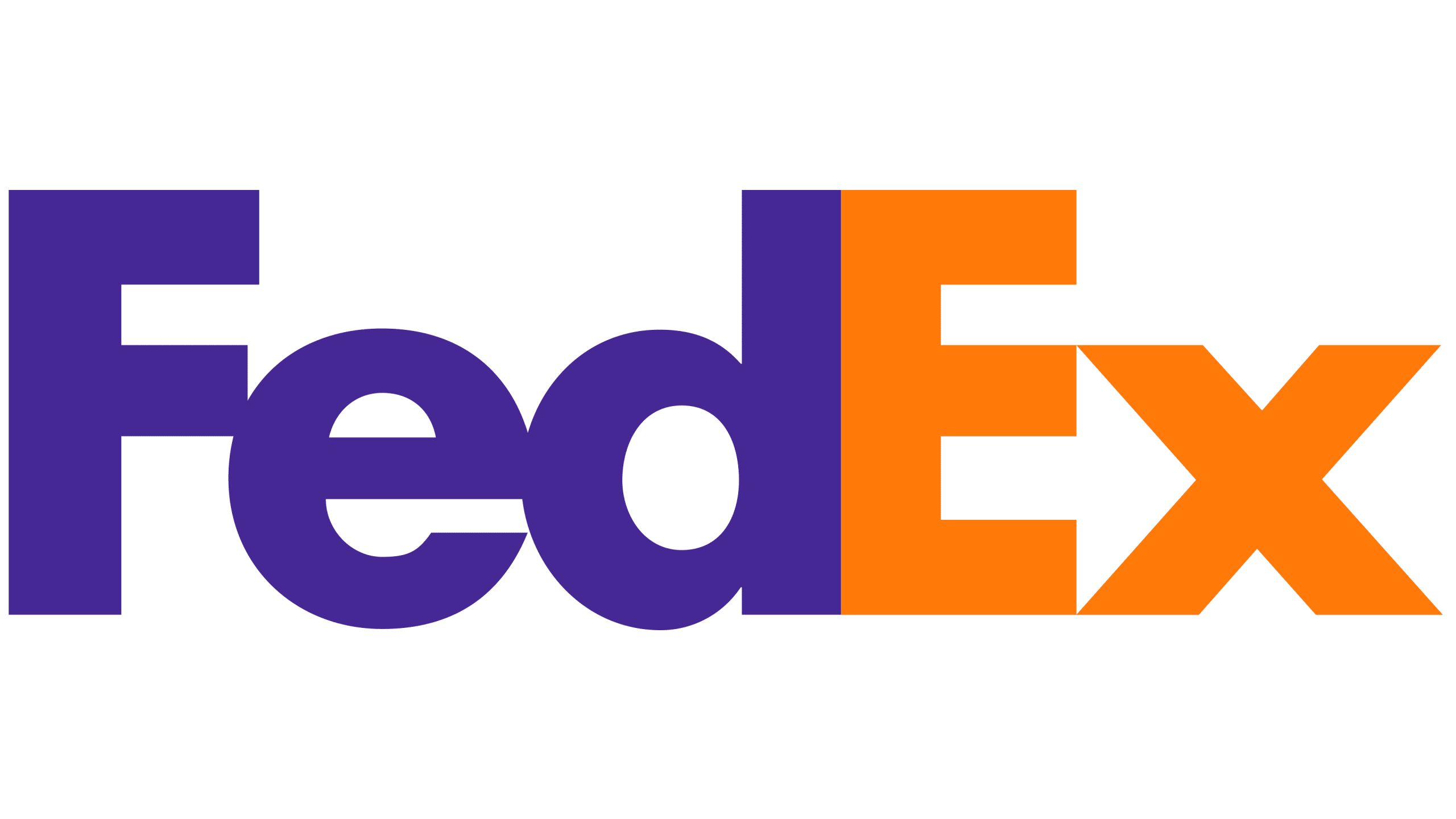
Arrow on the logo | Image Source: 1000Logos
FedEx’s logo features a hidden arrow between the letters “E” and “X”. It subtly represents speed, accuracy, and the brand’s promise of swift, dependable service.
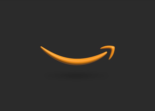
8. Amazon
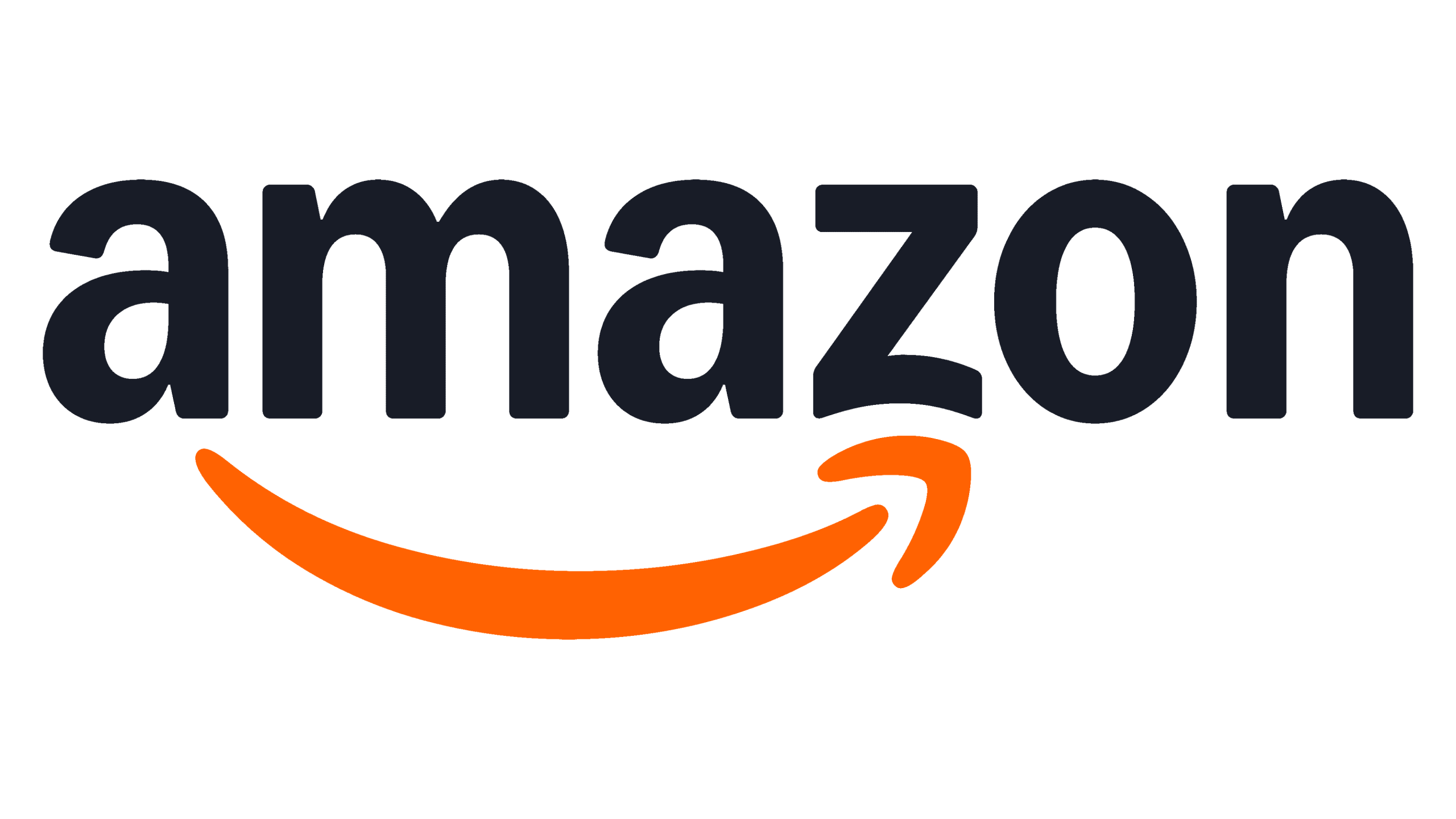
Smile symbol on the Amazon logo | Image Source: 1000Logos
Amazon’s logo includes a yellow arrow from “a” to “z”, highlighting their vast product range while also forming a smile to represent customer happiness and a smooth shopping experience.
9. BMW
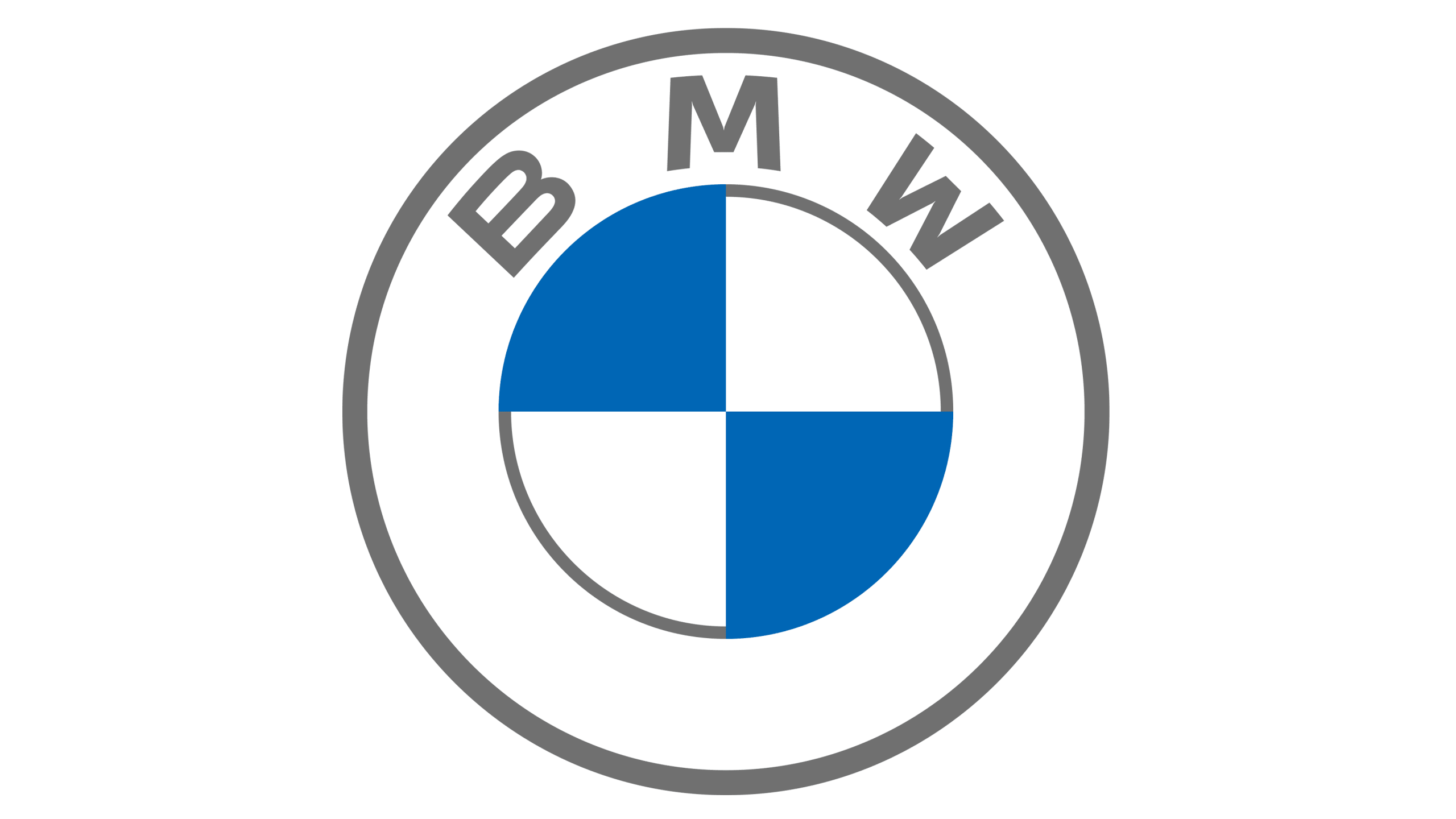
Blue and white color to honour the Bavarian flag | Image source: 1000Logos
BMW’s logo features blue and white quadrants that honour the Bavarian flag. The logo also symbolizes a spinning propeller, paying tribute to the company’s origins in aircraft engine manufacturing during World War I.
10. Apple
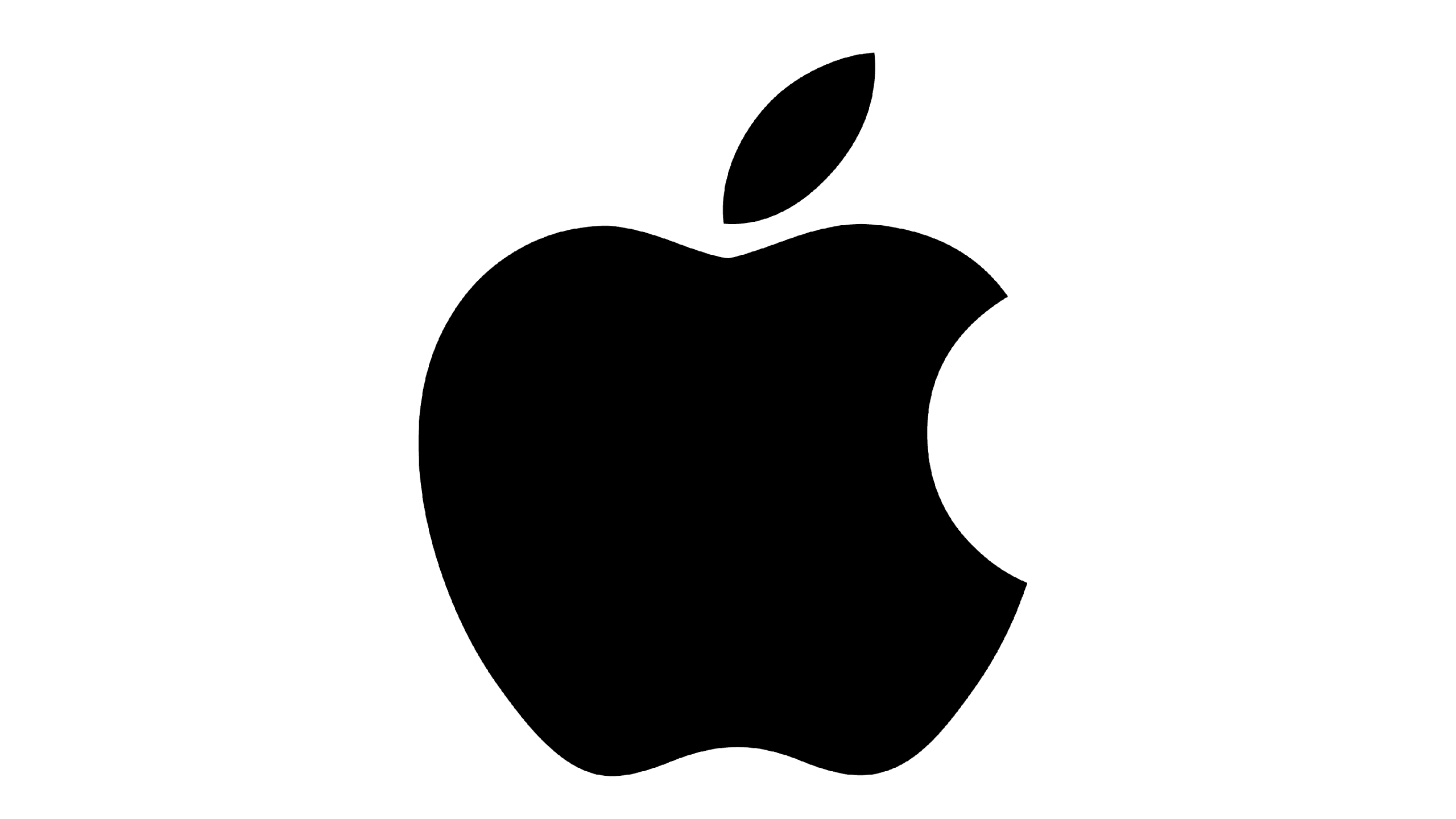
Apple’s famous bitten logo | Image Source: 1000Logos
Apple’s famous bitten apple logo is one of the logos with hidden meaning and is often linked to the idea of knowledge. However, Steve Jobs, the founder, once said it was simply a creative choice made while experimenting.
11. LG
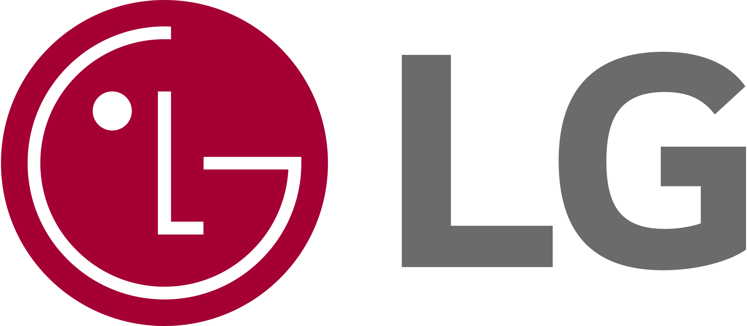
Smile on LG logo | Image source: 1000Logos
The LG logo creatively uses the letters “L” and “G” to form a winking face, reflecting the brand’s emphasis on innovation, approachability, and strong connections with its customers.
12. Pinterest
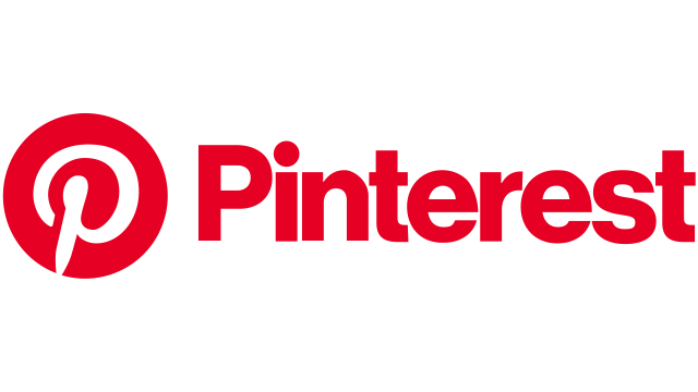
P symbolizes pin on Pinterest logo | Image Source: 1000Logos
The Pinterest logo features a stylized “P” that doubles as a pin, reflecting the platform’s purpose of helping users “pin” ideas and inspirations.
13. Carrefour
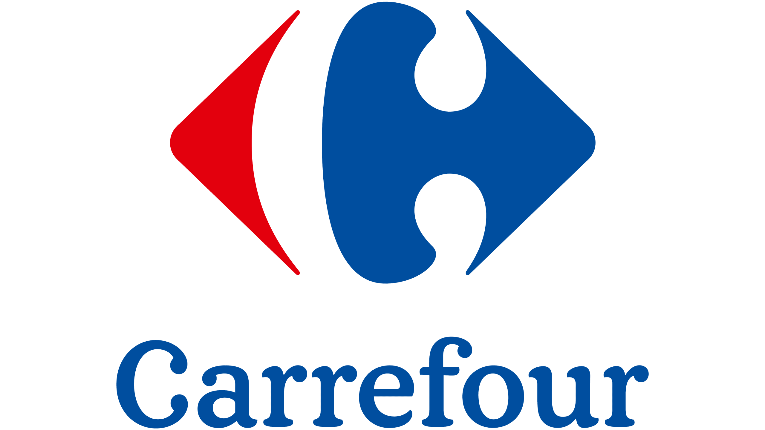
The logo represents intersection | Image source: 1000Logos
Carrefour’s logo features two opposing arrows to represent an intersection. Not only that, the negative space between them subtly forms the letter “C,” tying the design to both the brand name and its meaning in French.
Also Read : Why Bad Web Design Websites Drive Visitors Away
14. Unilever
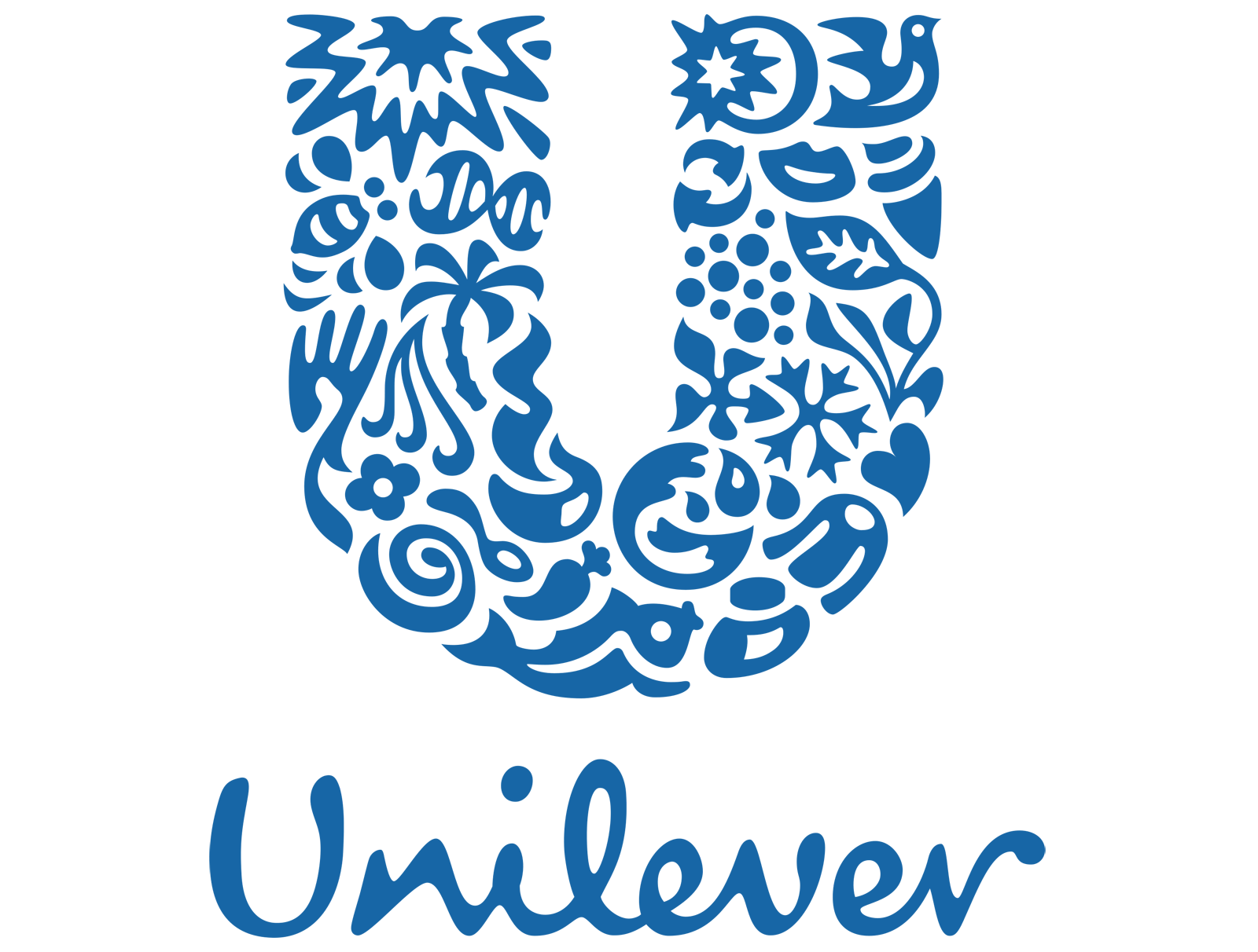
U is filled with what Unilever serves to customers | Image Source: 1000Logos
Unilever’s logo features a large “U” made up of various icons representing the wide range of products it offers, making the design both meaningful and fun to explore.
15. Audi
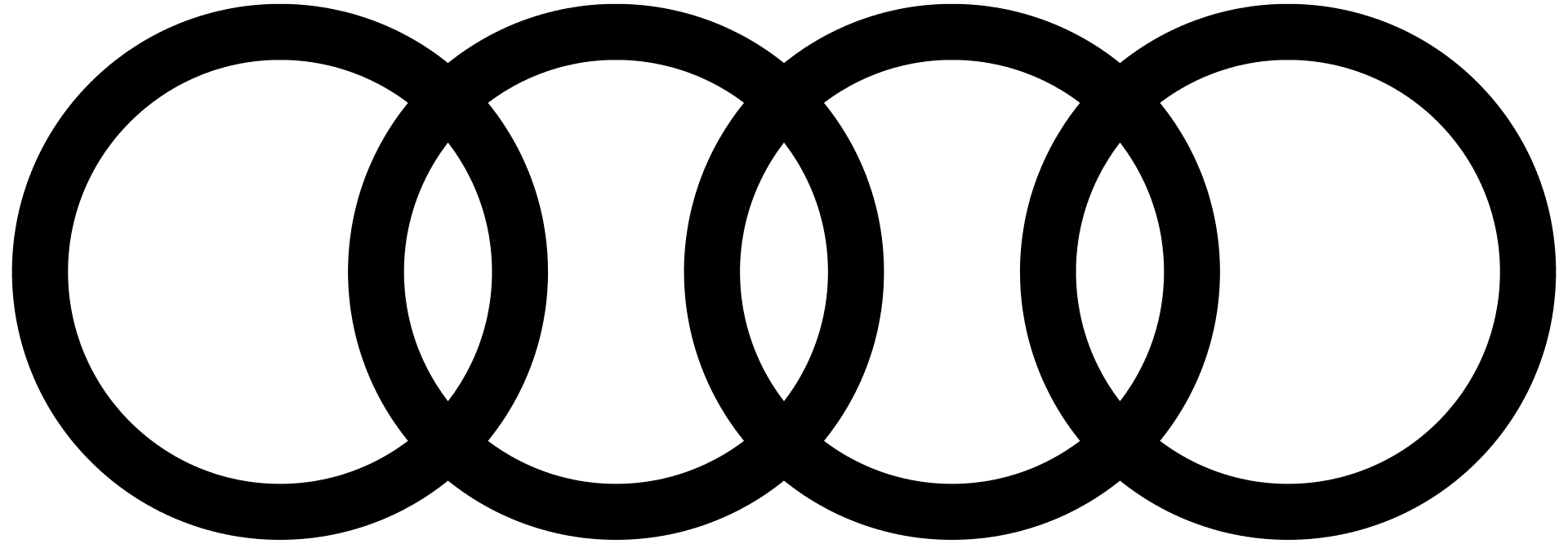
Four rings on Audi logo | Image Source: 1000Logos
Audi’s four interconnected rings represent the merger of four car companies (Audi, DKW, Horch, and Wanderer) that came together to form Auto Union, the origin of today’s Audi brand.
16. Gillette
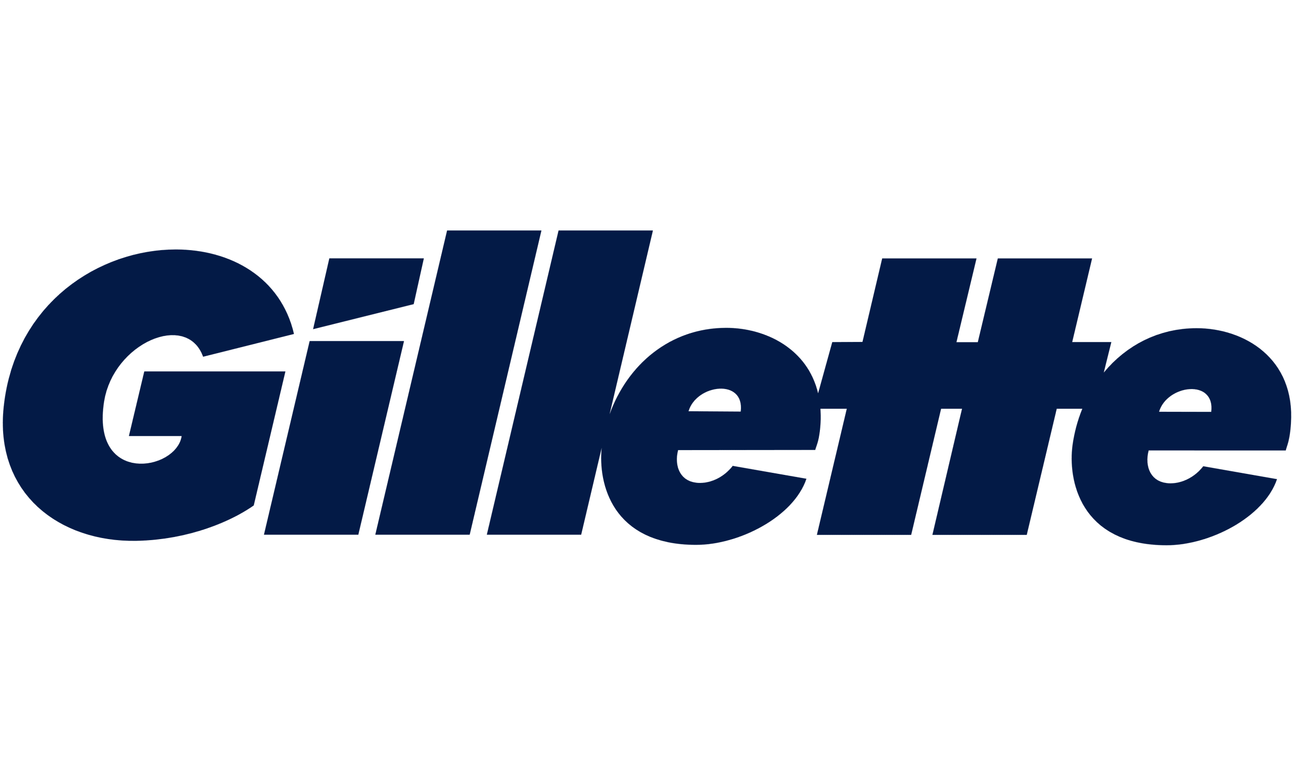
The letters represent the sharp blade | Image Source: 1000Logos
Gillette’s logo features sharp, clean cuts in the letters “G” and “i”, subtly mimicking the precision of a razor blade and reinforcing the brand’s identity as a leader in sharp, high-performance shaving tools.
Also Read : Bad Web Design Examples and What to Learn
Now You Know The Logo Secret Message You Never Noticed!
Logo secret messages add depth and personality to brand identities. These clever details often go unnoticed at first but create lasting impressions. You can take away the inspirations and apply them to your logo design projects.
Designing a logo is all about using the right symbolism to represent the brand identity. One simple yet powerful way to achieve this is by matching the right typography with your visual message. Lettersiro makes this easy, offering a wide range of fonts that add personality and make your logo truly unforgettable.
Explore Lettersiro’s font collection to make your logo stand out and stay memorable!