A bold script font can give a company name a confident, personal voice. Its substantial strokes create presence, while the movement of handwritten lettering can bring warmth to an otherwise structured brand identity. Used with care, that combination works especially well for wordmarks, campaign headlines, packaging, and selected corporate touchpoints.
The key is to give the script a clear role. A distinctive company name can lead the identity while a simpler companion typeface handles descriptions, contact details, navigation, and longer reading. Professional results come from that complete system: the lettering, spacing, hierarchy, color, and consistent application.
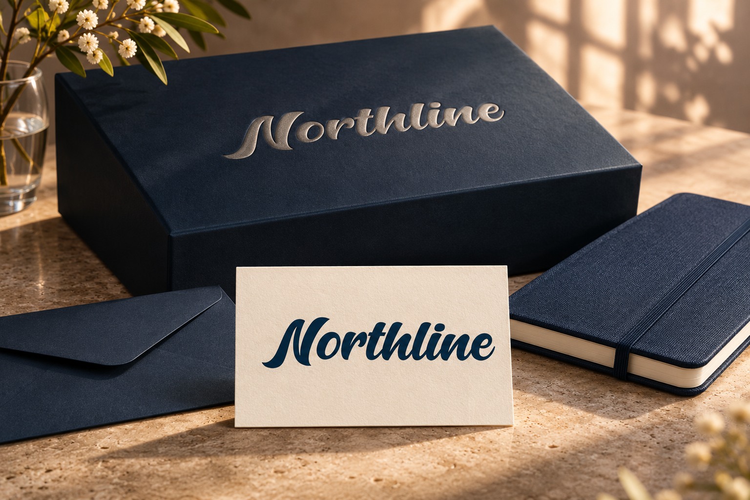
This guide explains how to use bold script fonts for corporate branding and compares four Lettersiro examples: Hunters, Silver Black, Mentega, and Brocky. Ten visuals accompany the article, including the cover: seven product mockups and three technical studies. Northline is a fictional identity. The product scenes are AI-generated concepts based on wordmarks rendered from actual Lettersiro preview fonts; the native technical studies show the source letterforms directly.
What is a bold script font?
A bold script font combines the movement of written or brushed lettering with a substantial visual weight. Common characteristics include connected lowercase forms, broad curves, expressive capitals, and a strong overall word shape. The exact balance varies: one design may feel polished and flowing, while another has a rounder, more nostalgic character.
Here, “bold” describes the appearance of the lettering. A typeface can look substantial even when the file's style name is Regular. Adding an artificial bold effect is a separate operation and can change the joins, counters, and finishing strokes. Start with the intended design of the font before adding effects.
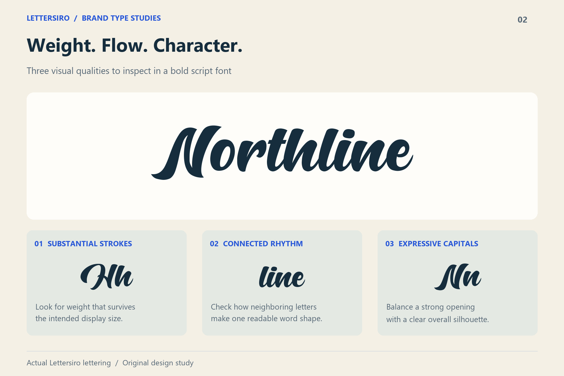
Also distinguish a bold script font from a casual handwritten font or an italic sans serif. The useful question is how the letters behave together in your actual wording. A font that looks attractive in its own name may create a very different silhouette when you type your company's name.
Why can bold script work for corporate branding?
Corporate identity needs a recognizable voice and a reliable system for using it. A bold script can contribute to both when its character matches the company and the surrounding design remains organized.
It gives a short company name a distinctive shape
The opening capital, connected rhythm, and ending stroke can make a wordmark feel like one considered graphic. This is useful when the company name is the main identifying element on a card, sign, presentation cover, or product.
Test the complete name rather than approving a font from one attractive letter. Pay attention to awkward joins, confusing letter combinations, and a flourish that dominates the rest of the word.
It can balance confidence with a human tone
Substantial lettering can carry visual weight, while a handwritten rhythm can suggest a more personal approach. That direction may suit a hospitality group, a consumer-facing company, a creative business, or an organization with a heritage-led story.
These are design possibilities, not universal meanings or measured promises about customer trust. Compare the type against the brand's actual positioning, audience, and reading needs. A restrained technical identity may need a different main voice, even if script works for an occasional campaign.
It creates a useful focal point in a structured layout
An expressive name can sit comfortably alongside plain supporting information. The contrast gives readers an obvious starting point and lets the secondary content stay practical.
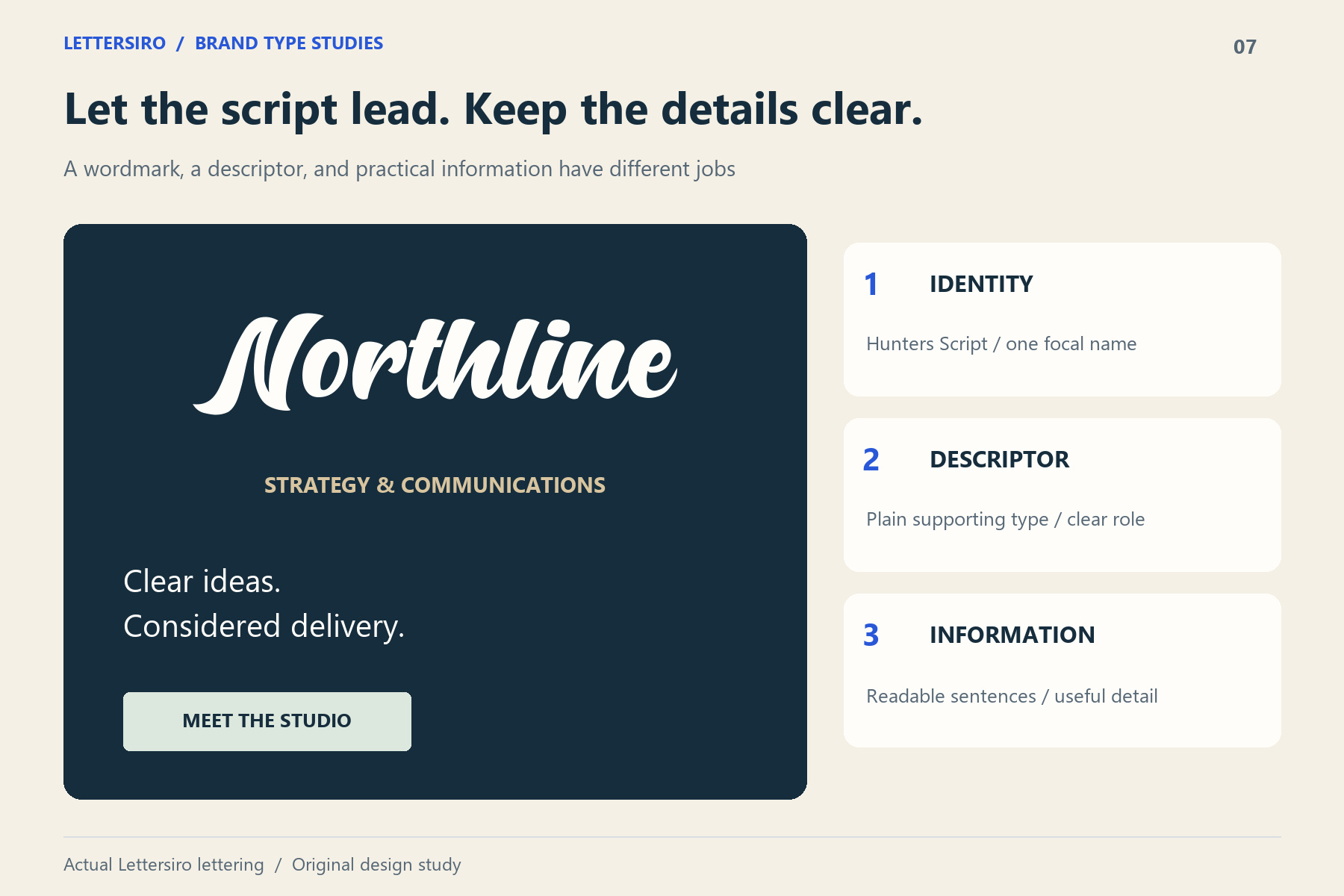
The script does not need to appear in every line. Keeping it to a few defined roles often makes the identity easier for a team to apply consistently.
Where should a company use bold script lettering?
The strongest applications usually involve short, deliberate wording and enough room to preserve the word shape.
| Application | Useful role for the script | What to check |
|---|---|---|
| Corporate wordmark | The main company or brand name | Recognition, joins, clear space, and small versions |
| Campaign headline | A short message with a strong voice | Reading speed and competition with imagery |
| Product packaging | A product name or a prominent brand mark | Shelf context, print size, and separation from details |
| Presentation cover | A name or selected statement | Hierarchy, projection, and a readable subtitle |
| Reception or event signage | A large identifying phrase | Viewing distance and production constraints |
| Branded stationery | A consistent identity accent | Balance with correspondence and contact information |
For longer paragraphs, dense specifications, or essential interface labels, a simpler companion usually offers a more manageable reading experience. A corporate type system can include an expressive display role without asking that face to carry every kind of content.
Four bold script fonts from Lettersiro to compare
The following recommendations combine the product descriptions with a visual assessment of the default letterforms. Each product concept begins with the same fictional name, Northline, rendered from the relevant preview font. The mockups explore how the different directions can work on signs, textiles, and packaging. They illustrate a design concept rather than every alternate or feature in a full font package.
1. Hunters: a confident, flowing corporate wordmark
Hunters is a useful starting point for a bold script corporate identity. Its substantial connected strokes, broad movement, and distinctive opening forms can give a short name a strong silhouette.
Consider it for a main wordmark, a campaign name, or a large identity accent. The design can carry presence without requiring an additional outline, shadow, or decorative border. In the Northline reception concept, a quiet navy wall gives the script room to remain the main identifying element.
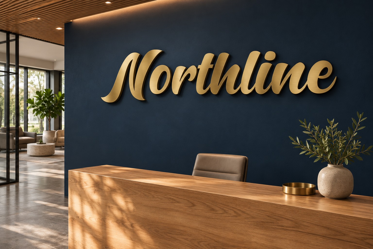
Before choosing it, check your real name at the smallest size you expect to use. Leave space around the capital and finishing strokes, and assess both a dark-on-light and light-on-dark version.
2. Silver Black: expressive energy for a brand-led company
Silver Black has thick curves and a strong logotype character. Its product page lists alternates and swashes, which can provide additional ways to develop a beginning or ending when supported by your application.
This direction is worth exploring for lifestyle companies, product-led brands, apparel, or a more expressive promotional identity. It can also work within a corporate system that deliberately wants a warm, nostalgic visual voice.
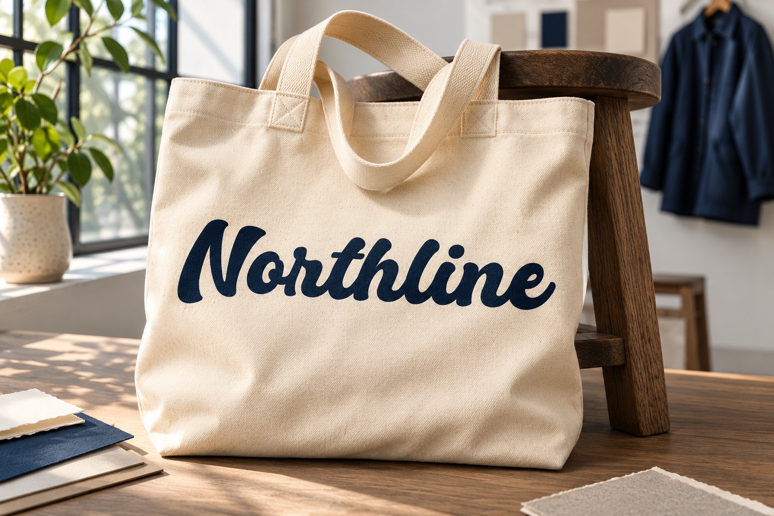
Start with a clean default word shape. Add a swash only when it helps the composition and leaves the surrounding information readable. The tote concept begins with a default preview-file wordmark; use the actual font in your application to review available alternates.
3. Mentega: a rounded, approachable direction
Mentega brings rounded curves and substantial connected lettering to a wordmark. Its friendly appearance makes it an interesting option to test for food businesses, hospitality, casual retail, and other consumer-facing identities.
For a corporate brand with an approachable personality, the rounded rhythm can become an identifying asset across labels, campaigns, and the main name. Balance that softness with clear alignment and practical supporting typography.
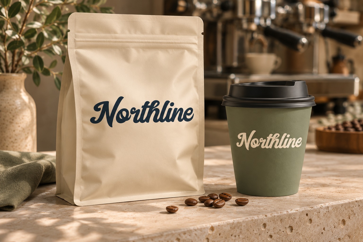
Check the specific letters in your company name, including any accents or punctuation required by the project. A short Latin-letter specimen does not establish complete language coverage.
4. Brocky: a bold script option with a retro rhythm
Brocky is presented as a logotype duo with handwritten and sans serif styles. Its script can provide a confident vintage character for a retail identity, a heritage-led company, product labels, or a badge-style composition.
The useful lesson is to think in related roles: one treatment leads the name, and another carries the practical detail. Explore the actual included styles and features before deciding which combinations belong in the final identity.
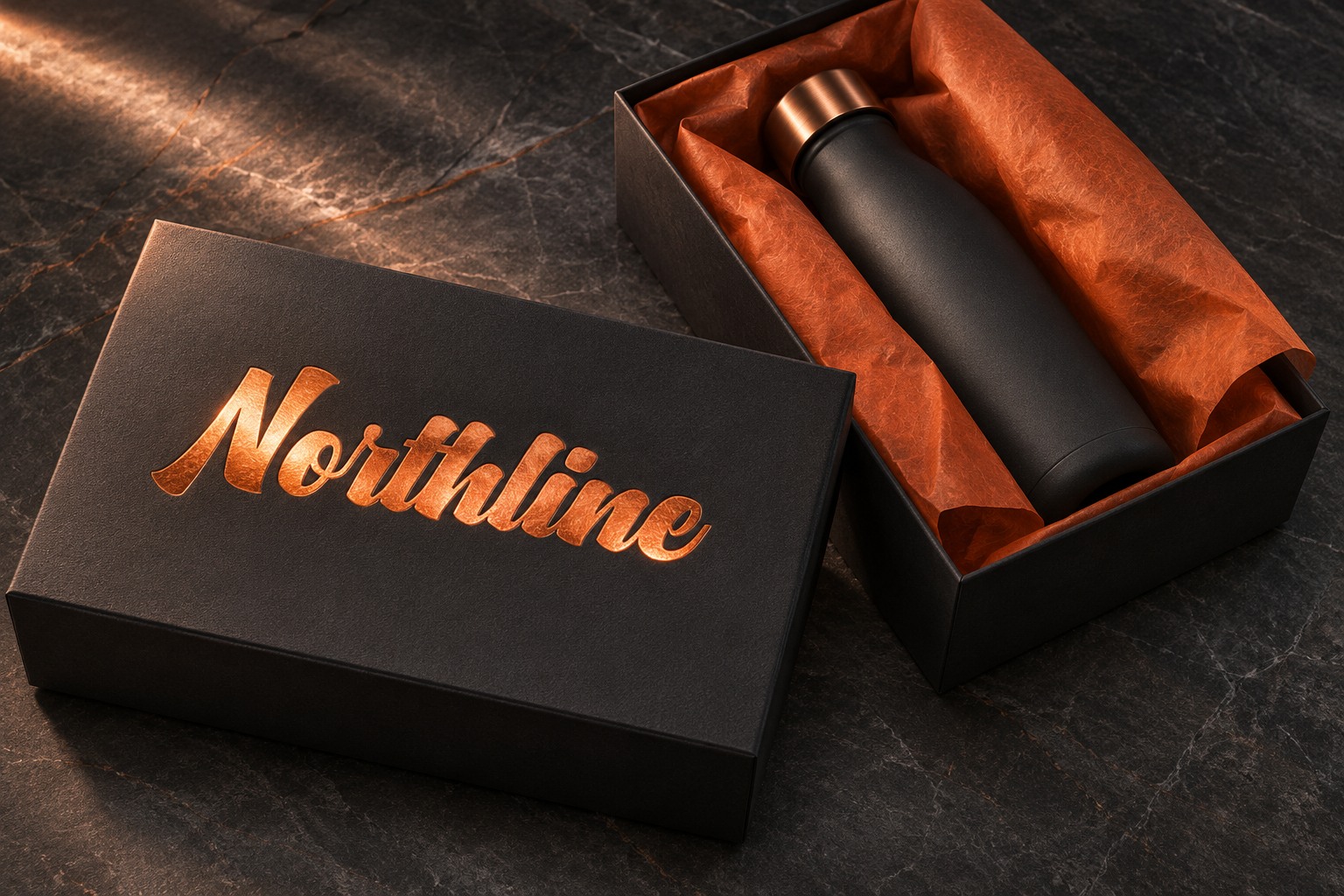
A retro script direction benefits from restraint. Avoid surrounding the name with so many ribbons, borders, or alternate endings that the basic word becomes harder to identify.
How to make bold script feel professional
Define the role before choosing the flourishes
Write a simple rule for the identity: for example, the script is used for the wordmark and a small set of campaign headings. Use the companion face for job titles, contact details, product descriptions, and longer messages.
This gives colleagues and vendors a repeatable approach. It also makes it easier to review a new layout against the identity instead of making a fresh styling decision for every document.
Protect the connections between letters
Extra character spacing can separate letters that were designed to flow together. If the wordmark needs more breathing room, first consider the space around the entire name, the distance to its descriptor, or a more suitable size.
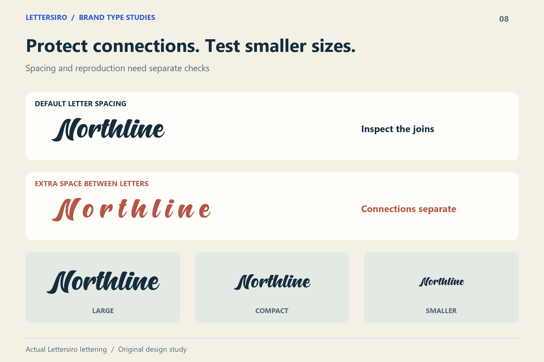
Inspect the final exported artwork as well as the editable text. The smallest joins and counters deserve attention when the mark is reduced, reversed out of a dark background, or reproduced on a textured surface.
Use OpenType options selectively
Where the font and application support them, alternates and swashes can help refine a wordmark. Adobe's OpenType panel guide explains how Illustrator exposes features such as ligatures, stylistic alternates, and swashes. Available options differ between fonts.
Change one part of the name at a time and compare the result with the default setting. Keep an ordinary version alongside the experiment so you can judge whether an alternate improves the whole name or merely adds decoration.
Check contrast and practical reading conditions
Test the name on its actual backgrounds, including photography, colored packaging, and presentation slides. Ask someone unfamiliar with the project to read it without a prompt.
For supporting website text, the WCAG contrast guidance gives minimum contrast ratios of 4.5:1 for ordinary text and 3:1 for large text, subject to the criterion's definitions and exceptions. Logotypes have an exception, but that is not a reason to make a brand name difficult to see. Test it in the conditions where customers will encounter it.
Turn the wordmark into a corporate identity system
A strong script name becomes more useful when the team can carry it consistently across real materials. Define a primary color version, a one-color option, an approved reversed version, and enough clear space for the letterforms to remain intact.
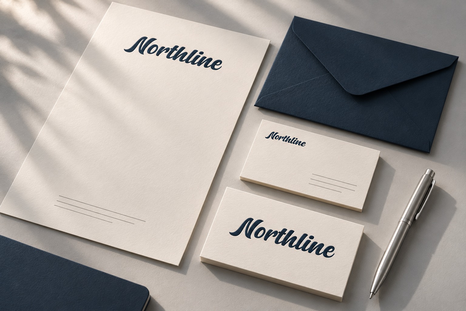
Start with two or three important touchpoints rather than a large collection of decorative mockups. A business card tests compact use, a letterhead tests the relationship with longer content, and a sign or website banner tests the identity at a different scale.
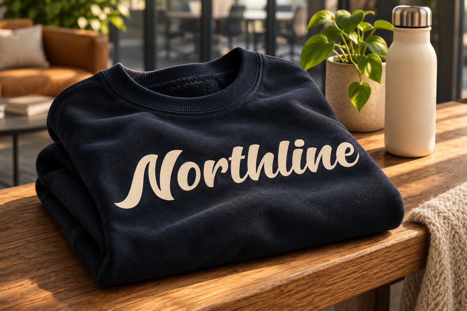
Keep the name's proportions stable as the layout changes. Adjust surrounding content and margins to suit each format. For a physical sign, embroidery, foil, or other specialist process, ask the production supplier to check the artwork before approving the final version.
Corporate branding and a Corporate License are different decisions
A typeface's corporate appearance describes a design direction. A license describes permitted use. Selecting a font for a company does not, by itself, tell you which license covers the project.
Compare the current Lettersiro font license guide with the options offered for your selected font. Consider the actual uses: a trademark-oriented wordmark, website embedding, paid advertising, packaging, applications, the number of users, and any vendor access needed by the team. Broader company use may require broader coverage, while a narrower project has its own scope.
Keep the licensed font files and approved identity assets organized so the team knows what can be installed, shared, embedded, or supplied to a production partner. Check the current terms for the chosen product rather than assuming that every font and every application has identical coverage.
A practical selection checklist
- Type the real company name. Include its actual capitalization and any required accents or punctuation.
- Compare the whole silhouette. Check the opening, joins, counters, and ending together.
- Choose a supporting typeface. Test a descriptor, a short paragraph, and essential details alongside the script.
- Proof several sizes and backgrounds. Review a compact version and a one-color reproduction, then check the final exports.
- Try two real applications. A compact piece and a larger piece reveal different problems.
- Confirm the licensing scope. Match the selected product's current terms to the planned uses and team.
- Record the approved rules. Save the wordmark, variants, spacing guidance, and usage examples in an accessible brand document.
Frequently asked questions about bold script fonts
Are bold script fonts professional enough for a company?
They can be when the lettering matches the brand's personality and is used within an organized identity. A bold script is especially useful for a short name or display message, with simpler typography carrying practical information.
Which Lettersiro font should I try first for corporate branding?
Hunters is a useful starting point for a confident, flowing wordmark. Compare Silver Black for a more expressive logotype, Mentega for a rounded tone, and Brocky for a retro direction. Test your actual name before choosing.
Should a company use script for all its text?
Usually, a focused role is easier to manage. Keep the expressive font for selected identity moments and use a companion suited to paragraphs, forms, navigation, and small information.
Should I add tracking to a connected script font?
Check the joins before doing so. Added space between letters can interrupt the intended flow. Adjusting the space around the wordmark or its relationship with other elements may solve the layout problem more effectively.
Does corporate branding always require the Corporate License?
The required coverage depends on the actual project and the selected font's current terms. Review the product options and licensing guide against the planned uses, number of users, and any broader distribution needs.
Choose a clear role for a distinctive voice
A bold script font can give corporate branding a recognizable focal point, especially when a company wants its name to feel confident and personal. Its effectiveness depends on the complete identity: readable lettering, appropriate supporting type, careful spacing, and consistent application.
Explore Lettersiro's font collection, compare a few candidates using the same company name, and build a small set of practical proofs. The strongest choice is the one that fits the brand and keeps working across the materials people actually use.