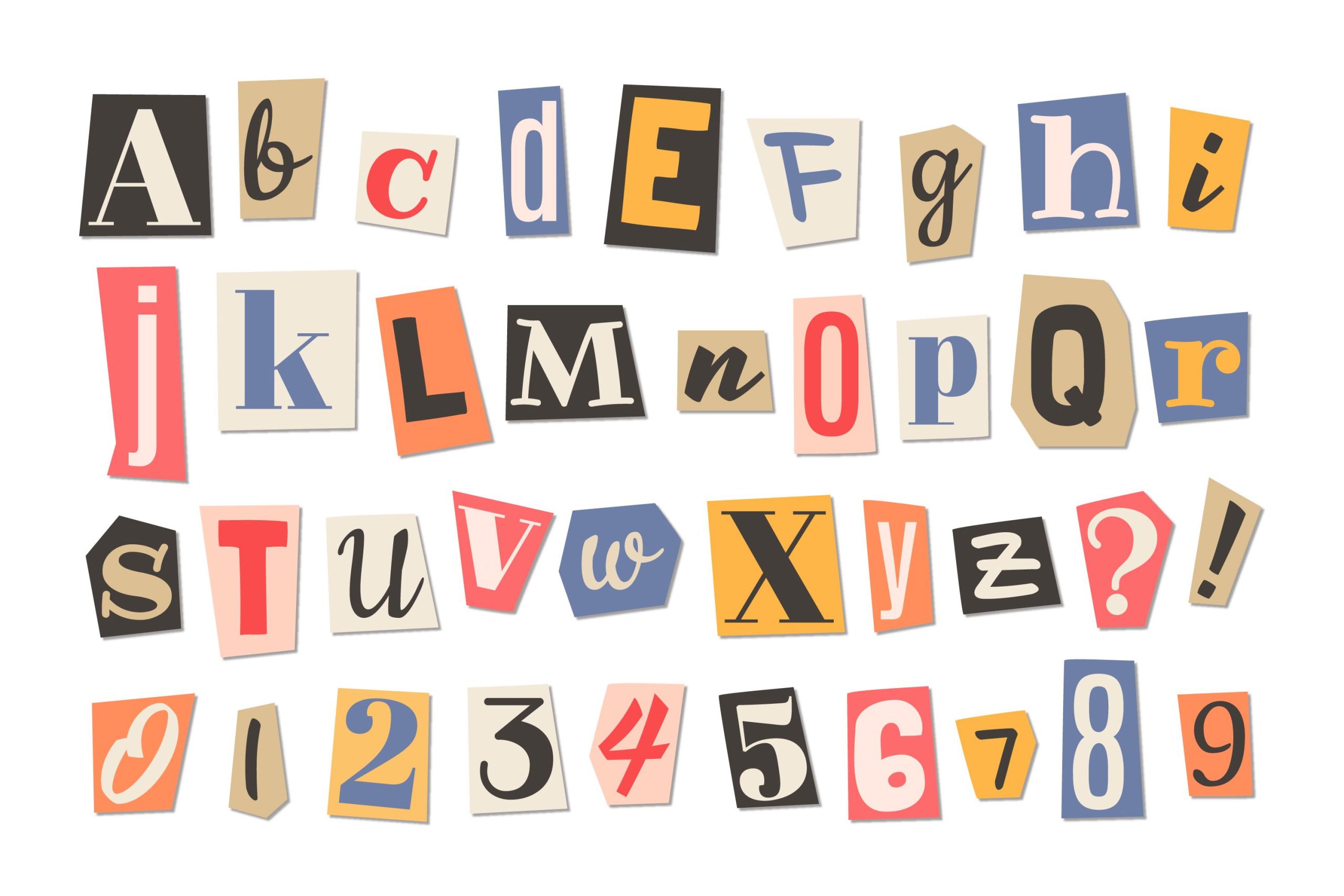
When it comes to typography styles, the font sans serif vs serif is always an ongoing debate. While both look alike, they’re aesthetically not the same. But how do they differ, exactly?
Simply put, serif fonts have special tails at the endings of lines. Those that don’t are called sans serif. Seeking a crash course? Let’s break down the complete difference between sans serif and serif fonts!
Key Takeaways:
- Font sans serif vs serif lies in typography style, legibility, and tone.
- While serif hues formality, sans serif gives modernity essence.
- Serifs are likely used in lengthy text on printed products, while sans works well for small digital products.
3 Key Differences of Font Sans Serif vs Serif
Here are the main differences between the two fonts to consider.
1. Style
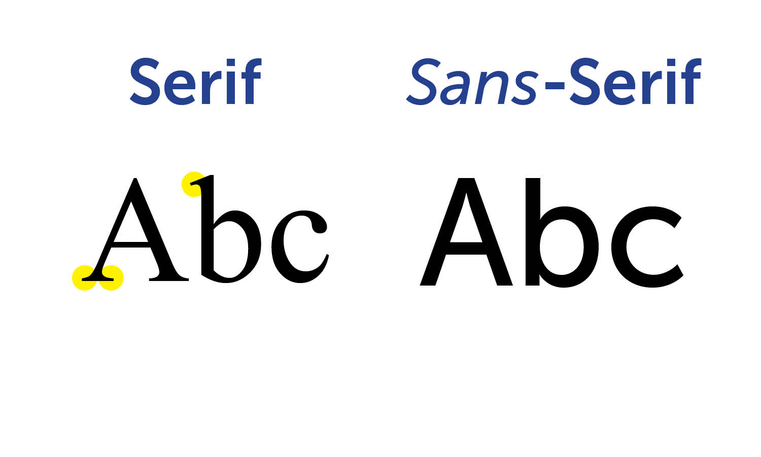
In terms of style, serif has small lines attached to letters. It deliberately adds embellishment at the end of the letters, sometimes referred to as “feet” or “tails.” This special ornament comes in both regular and artful ways on all letters, including uppercase and lowercase.
In contrast, sans-serif typefaces have lower stroke contrast compared to serif typefaces. It also lacks extra ligatures and ornaments, making a clean appearance. The absence of extra swooshes also creates a more generous spacing between letters.
Also Read: Personal Use Vs Commercial Use Fonts Explained!
2. Legibility
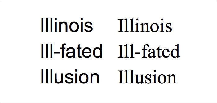
This might be a more practical matter, but the font you use should have high legibility. Take serifs as an example. Its subtle extensions boost a natural flow, guiding the reader’s eye across lines of text to “push” from one letter to the next. Serif might thus help readers read faster and reduce fatigue.
That said, many sans serif fonts exist that are more legible at any size than some serif designs. Thanks to sans serif’s open spaces and more spaces between letters without decorative elements at all.
3. Tone
The next serif vs sans serif difference is the tone. Serif fonts tend to be more classic or formal, evoking a tone of tradition and reliability. On the contrary, sans serif creates an approachable and innovative feel. It typically projects a more minimalist and contemporary design but is still trustworthy and serious.
Also Read: The Difference Between Kerning, Tracking, and Leading
When to Use Sans Serif vs Serif?
Generally, both sans serif and serif fonts have their own niche. Take serif, for example. It’s not just about aesthetics, serif fonts serve a real functional purpose. They’re preferred for lengthy reads due to their perceived readability.
Hence, serif fonts work best for printed copy, like books, posters, magazines, or newspapers. Additionally, certain serif typefaces convey elegance, making them popular in artistic fields such as creative exhibitions and film festivals.
Meanwhile, sans serif became the most prevalent font for showing text on digital mediums, like websites and mobile apps. It is partly because screens tend to struggle to show fine serif details in small type and with lower screen resolutions.
For this reason, tech companies often use sans serif fonts to create high-end accessibility and flexibility in a typographic design.
Also Read: Hierarchy of Typography: How to Make Fonts Speak
Font Sans Serif vs Serif Examples
Here are some examples to help you effectively construct both sans serif vs serif font sets.
1. Modern Deluxe Font

Modern Deluxe, a strong sans serif style, offers both authenticity and flexibility at once. The font style looks modest yet luxurious, expressing your creative artwork with its clean lines.
Plus, it features ligatures and stylistic sets, which you can easily adjust to keep legibility with every size. This font is dedicated to logos, headings, and promotions, especially high-end branding.
2. Night Mango
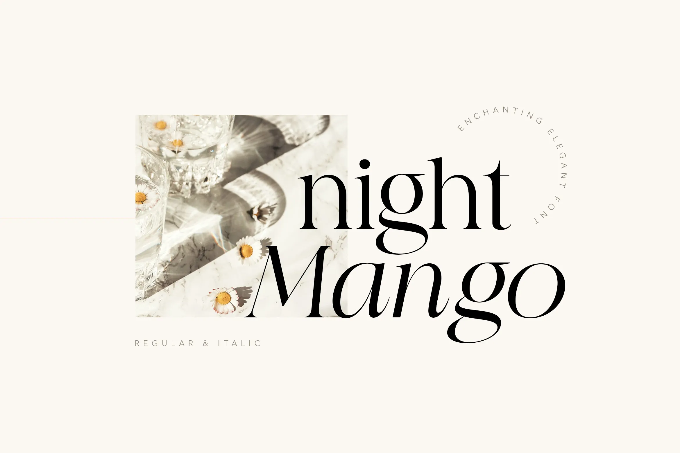
Introducing Night Mango, a captivating serif style that leans into contemporary projects. The bold curves and sharp straight lines give your typography an elegant look to ensure every letter has a subtle and modern appeal.
What’s more interesting is that Night Mango comes in two versions, regular or italic, allowing you to mix and match your typography design. It’s perfect for any wedding invitation or restaurant menu.
Also Read: Discover the Integrity of 6 Font Classifications in Typography
Font Sans Serif vs Serif: Which One Is Right For You?
Which is better: sans serif or serif? While they differ in style, legibility, and tone, both sans serif and serif stand out with their typography characteristics to complement any creative project. No matter your interests, grab your perfect sans serif and serif font collection at Lettersiro.
From modest to elegant styles, we offer premium fonts that provide versatility and high quality. With an affordable price, you can use the fonts for various creative and commercial uses to best suit your design’s needs. Let’s buckle the premium font up and unlock your creativity!