As design becomes more complex, understanding the difference between kerning, tracking, and leading is a must. These three lesser-known elements must work together to produce a visually pleasing final product and create more proportional text. Without these combos, your design will look messy and meaningless.
However, what is leading, kerning, and tracking in typography, exactly? How do they differ? Let’s explore the glossary through this article!
Key Takeaways:
- Kerning, tracking, and leading are not the same, but they all improve readability and user experience.
- Both kerning and tracking are horizontal spacing, while leading is vertical spacing.
- Kerning and leading work best for design completion, while tracking can come at any point.
Also Read: Hierarchy of Typography: How to Make Fonts Speak
What is Kerning?
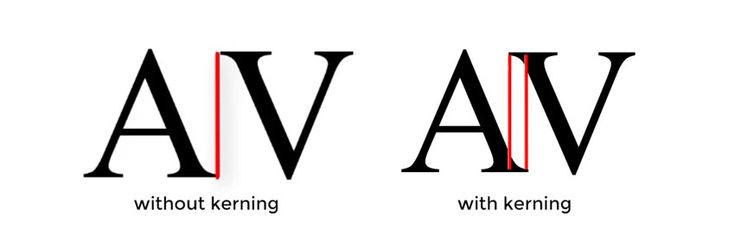
Kerning refers to the horizontal space between pairs of letters. Getting kerning proper means that everything looks clean and readable to enhance the essence of professionalism.
However, some characters require more space between them, and other characters require less. Too-short kerning makes indecipherable words. Set too far apart, and the text also becomes awkward to read. Worst of all, inconsistent kerning can be extremely frustrating to read.
What is Tracking?
Kerning and tracking both relate to adjusting the space between characters in typography, yet they serve another purpose.
Tracking usually entails spacing across the full phrase to better occupy a space or to make a single word appear light, airy, and significant. However, you should be very careful with the tracking process, as it can quickly lead to reading fatigue.
Also Read: 10 Best Books to Learn Typography and Elevate Your Design Skills
What is Leading?

Leading, or line spacing, is an essential design aspect that determines how text is spaced vertically in lines. The default leading is typically based on the font size.
However, some fonts may require varying spacing. If the line spacing is too close, the text will look crowded and mess up the reading flow. The far apart will force eyes to work harder, shifting from one line to the next.
Why is Knowing the Difference Between Kerning, Tracking, and Leading Important?
Whether you’re a lettering artist or a graphic designer, understanding the lettering spacing concepts is crucial for the following reasons.
- Enhance Readability: Kerning, leading, and tracking are the typography tools that improve text readability, allowing you to highlight certain words or phrases.
- Improve User Experience: Proper spacing in typography can enhance comprehension and user engagement.
- Elevate Visual Hierarchy: Adjusting letter spacing between pairs, fine-tuning kerning, leading, and tracking can create visual balance and an attractive look to make a meaningful impact on viewers.
Also Read: Impact of Typography in Advertising: 5 Secrets to Eye-Catching Ads
What’s the Difference Between Kerning, Tracking, and Leading?
While kerning, tracking, and leading are essential for refining typography, their purpose and application are not the same. Here’s why.
1. Visual Outcome
Generally, kerning, tracking, and leading can boost the visual aesthetics of letters or words in the design. In its implementation, designers tend to use kerning for a dynamic and attractive outcome, tracking when they don’t like the font spacing, and leading for bold effects that capture readers’ attention.
2. Design Process
The way you employ kerning, tracking, and leading can also vary. Kerning and leading complete the design while tracking can be done anytime during the design process. Tracking adjusts the spacing between words first, then leading follows the same thing for text lines, and kerning fine-tunes the headings or logos at the end.
3. Usage and Consideration
What’s the difference between kerning, tracking, and leading regarding usage and consideration?
Let’s think about kerning, for instance. It typically focuses on individual letter relationships, creating a flawless harmony text. Kerning is most commonly used with medium to large-sized fonts. Perfect for boosting high-impact design elements, such as headlines and professional logos.
Meanwhile, tracking applies across entire sections of text. Loose tracking creates an airy feel, while tight tracking conveys compactness. It’s more appropriate for managing large blocks of text in both print and digital formats. However, you can also make tracking adjustments across the small body text of legal documents or captions to enhance legibility.
Leading is essential for multi-line text. It is useful to prevent overlapping letters when using certain fonts within the same document. Designers frequently utilize leading to correct ascenders or descenders. You can put a leading in dense blocks of text to maintain the clarity of long paragraphs or academic literature.
Also Read: Discover the Integrity of 6 Font Classifications in Typography
Make Memorable Letters Spacing with Fonts!
Leading, kerning, and tracking are the typography’s fundamental pillars that boost legibility, aesthetics, and user experience at once. No matter what the medium is, mastering the difference between leading, kerning, and tracking can construct a visually pleasing and highly functional typography.
However, those spacings won’t look credible if you skip the typefaces. When it comes to the exclusive fonts for letter spacing, the offer is only available in Lettersiro.
From freebies to paid fonts, the platform gets you competitive prices and easy licensing options. Plus, the platform offers installation for up to 2 computers, making it highly versatile. Don’t wait; embrace your artwork with high-quality font from Lettersiro!