A ligature joins two or more characters into a single glyph. Sometimes the change quietly improves an awkward collision. Sometimes it creates a distinctive shape that becomes the most noticeable feature of a wordmark. Knowing which kind of change you are making is essential when using font ligatures in logos and headlines.
The presence of a ligature does not mean it should be switched on everywhere. A combination that looks beautiful in one word can feel distracting in another. Evaluate it with the final wording, at the actual size, and alongside the other typography the design will use.
What a ligature changes
In ordinary text, standard ligatures can resolve combinations such as an overhanging letter touching a neighboring character. Discretionary ligatures are often more expressive and may alter the visual rhythm substantially. The exact features and combinations available depend on the font, its version, and the application displaying it.
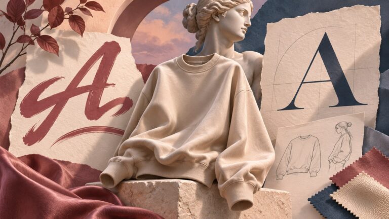
Do not confuse ligatures with alternate characters. An alternate replaces one character with another drawing; a ligature replaces a sequence with a combined glyph. Both may appear in an application's glyph or OpenType panels, but they solve different problems. A decorative capital is not automatically a ligature.

Master Modern is a relevant visual reference for exploring expressive connections in branding and short editorial text. Use its available features in a supported application and compare the exact word you need. Do not assume that a feature shown for one letter combination will exist for every other combination.
A wordmark exercise: one name, several readings
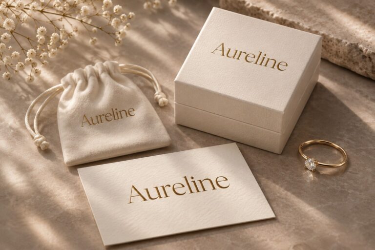
Take an illustrative studio name, “Creating Approach.” Set it with the default characters, then make a second version using a suitable available ligature. Keep the size, color, and surrounding space identical. The comparison should reveal what the feature contributes rather than hide the change behind a different layout.
Read both versions aloud and ask another person to identify the words without a hint. A joined form that resembles an unfamiliar letter can slow recognition. This matters especially for a new business whose audience has not yet learned the name. Distinctiveness works best when the name remains recoverable.
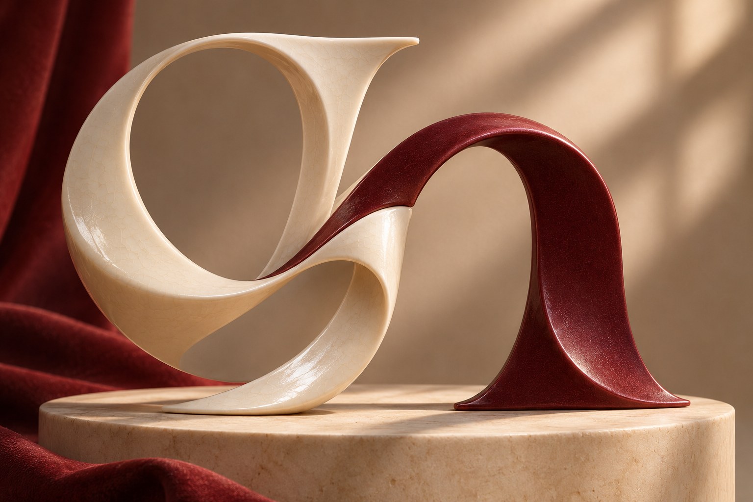
Look at the spaces around the ligature as well as the shape itself. A more elaborate connection can create a dense patch in the middle of an otherwise airy word. You may need to adjust neighboring spacing or choose a quieter alternative. Avoid correcting a single dense join by applying extreme tracking to the entire wordmark.
Keep one expressive idea in charge
A logo can become visually confused when a ligature competes with a swash, an unusual capital, an underline, and a symbol. Choose the feature that best supports the identity and reduce the others. A small, distinctive interaction can be more memorable than a collection of decorative details.
The alternates in Silver Black provide a useful comparison. They show how different character choices can change the tone of a word without making every letter equally elaborate. Studying alternates alongside ligatures helps you decide whether a connection is really necessary.

For a fashion label, an expressive join might become a recognizable detail on a large campaign. For a utility service, the same join might introduce unnecessary ambiguity. Neither result is inherent in the feature. The audience, business name, scale, and surrounding design determine whether it helps.
Inspect features in the application you will deliver
Open the type or OpenType controls in your design software and check which options the font exposes. Feature names and interfaces vary between applications. Keep an untouched version of the original text so you can compare the result and recover the default characters easily.

If a ligature does not appear, first confirm the correct font and style are selected. Then check whether the relevant feature is enabled and whether the exact character sequence is supported. Copying a screenshot from a specimen is not a substitute for using the actual font feature in an editable design.
For live website text, CSS can control standard and discretionary ligatures through font-variant-ligatures. The MDN ligatures reference explains the available values. The font must still contain the corresponding feature; CSS cannot invent a missing ligature. Test the result in the browsers and languages the project supports.
Review a headline differently from a logo
A wordmark repeats the same name and can be refined character by character. An editorial headline changes from article to article. It needs a more flexible system, with rules that accommodate different words and line lengths. A highly specific treatment that works once may not be a practical default for a publication.

Test headlines with short words, long names, punctuation, and multiple lines. Check whether a ligature crosses a visual boundary or creates an unexpectedly heavy area near a line break. If only a handful of titles work, reserve the feature for selected display moments rather than enabling it across the entire site.
Preserve the decision at handoff
Save an editable master with the font name, style, and selected feature settings recorded. If the production workflow needs an outlined logo, export that as an additional delivery file while preserving the editable source. Verify the outlined result at small size and on a one-color background; conversion should not conceal a readability problem.
Include a short note describing where the expressive version belongs and where a simpler form should be used. A social avatar, embroidery, or small label may need a reduced treatment. Good ligature use is deliberate at both ends of the scale: interesting enough to give the word character, and clear enough that the audience can still read the name.