Accessible fonts for dyslexia are essentially typefaces designed to improve readability for individuals with dyslexia. This neurological condition affects reading abilities, often causing jumbled letters, mirrored, or rotated. So, what font is best for dyslexia? Let’s find out!
Key Takeaways:
- Dyslexia readers prefer simplistic, spacious, and distinct letters to prevent flipping, rotating, or letter crowding;
- On top of font selection, other aspects like background colors, minimum font size, and straightforward discussion contribute to more accessible content.
Finding Out Accessible Fonts for Dyslexia
Dyslexia-friendly fonts are practically grounded in cognitive science and readability research. Dyslexic readers frequently experience letter crowding, where characters appear too close together, making words hard to distinguish. Also, mirror confusion, in which letters like ‘b’ and ‘d’ are easily flipped because of their symmetrical letterforms.
Studies indicate that fonts with differentiated letterforms, increased spacing, and distinctive weight distribution can reduce reading errors. These principles guide the development of accessible fonts tailored for dyslexic users.
The Particularity of the Dyslexia-Friendly Fonts
There are some unique, necessary features for fonts to help dyslexic readers. Here are some key characteristics of dyslexic-friendly fonts:
1. Unique Letter shapes
Traditional fonts often use symmetrical or mirrored letters, which may confuse dyslexic readers. Accessible fonts for dyslexia should incorporate asymmetrical letterforms to prevent this mirroring effect.
2. Weighted Letter Bases
A heavy base on each letter gives the letter a grounded appearance. This technique provides a sense of anchoring to the letter. For the reader’s eye, this effect reduces the tendency for letters to appear rotated or flipped.
3. No Serif Fonts
The serif is essentially a decorative element, which can create visual noise and interfere with word recognition. Most dyslexia-friendly fonds favor a sans-serif look with clean, simple letterforms that reduce distractions.
Also Read: Font Sans Serif vs Serif: What’s the Difference?
4. Ample Spacing
One of the reading difficulties of dyslexic readers is letter crowding. Providing a wider spacing between letters and words can help with visual stress and allows the brain to process information more comfortably.
5. No Excessive Style
More importantly, every letter should be practical, helping dyslexic readers and ensuring readability. Even italics may be a problem because the effect distorts letter shapes, making them harder to recognize.
Recommended Fonts for Dyslexia
Several fonts have been developed particularly to cater to dyslexic readers. Some are regarded as good enough to help dyslexic readers even though they’re not made explicitly for said condition. Here are the most recommended fonts:
1. OpenDyslexic
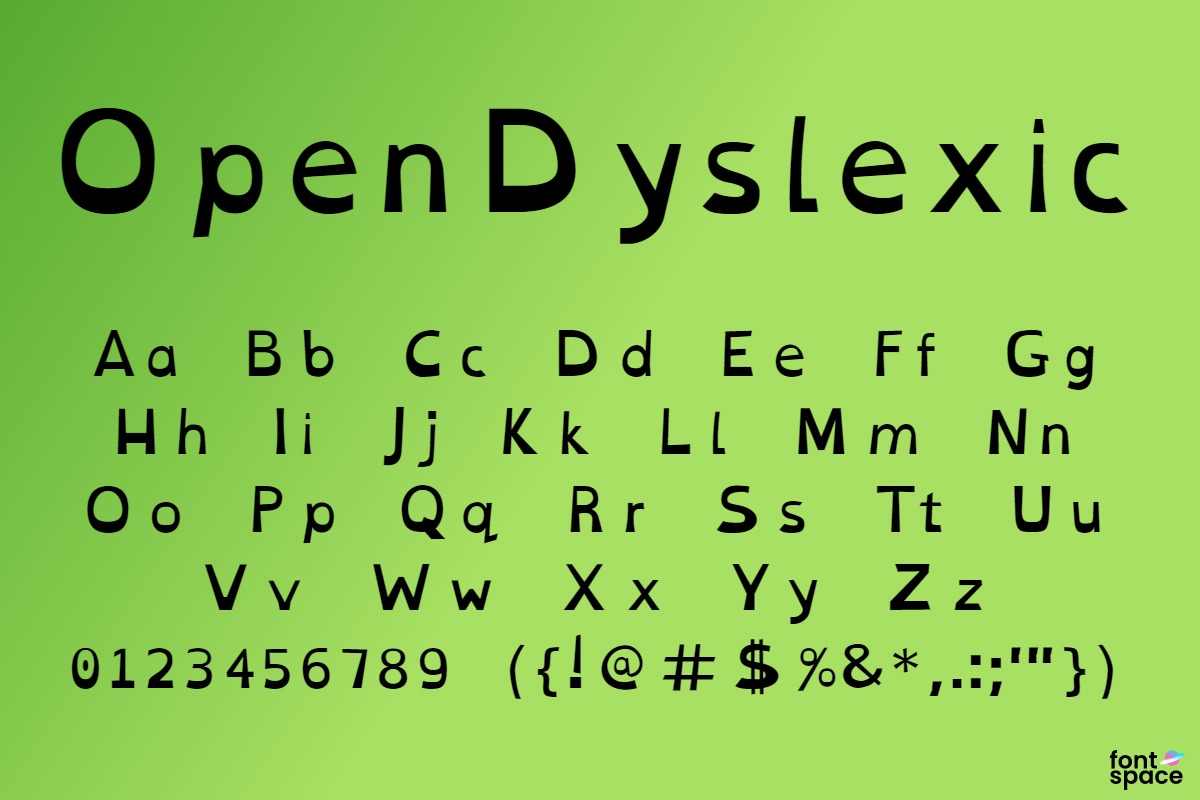
An open-source font designed specifically for dyslexic users, featuring weighted bottoms that help letter orientation.
Also Read: 10 Common Typography Mistakes Every Designer Should Know
2. Dyslexie
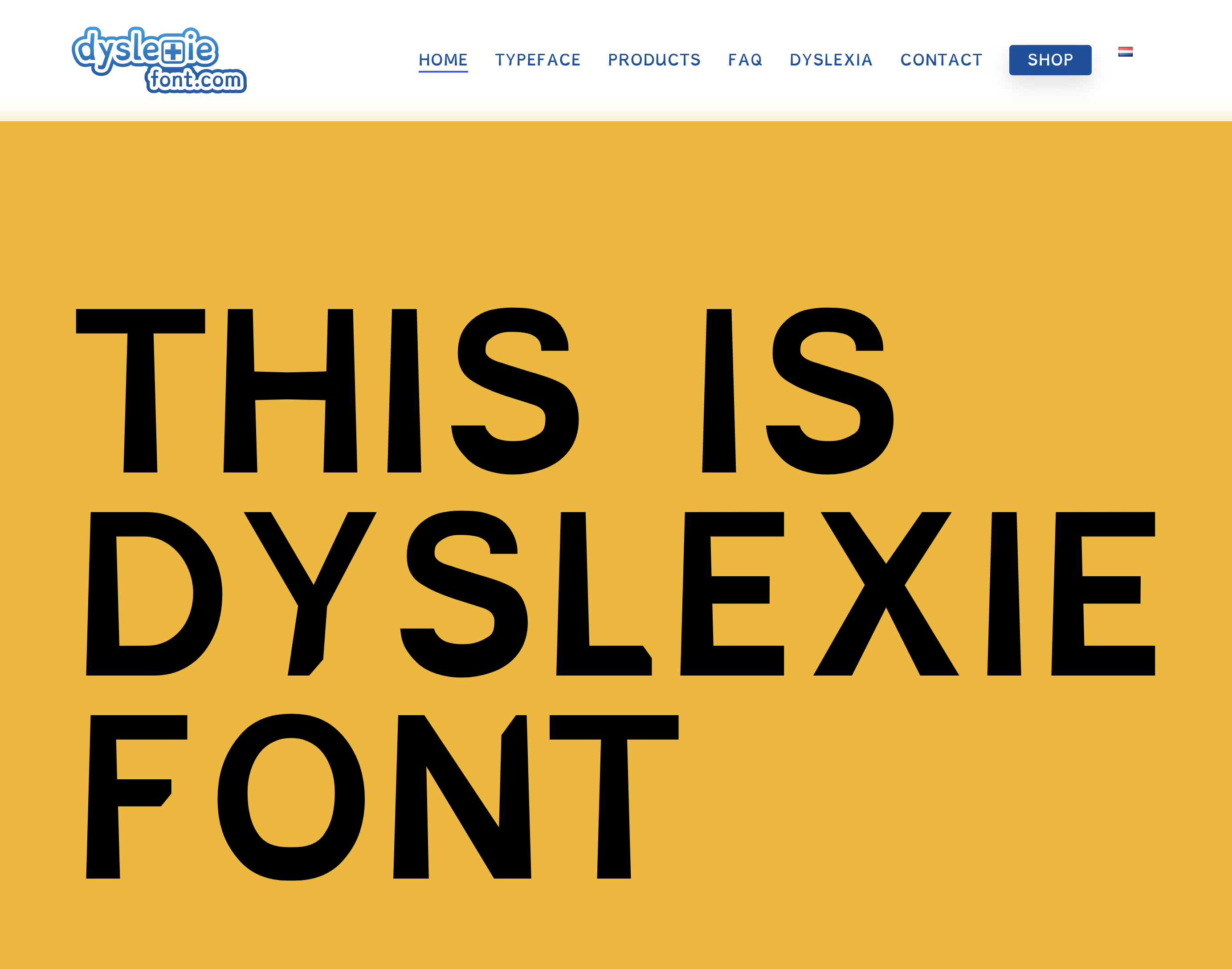
Created by a dyslexic designer this font includes more subtle weighted bottoms or flared bottoms. This font features clear spacing to minimize letter flipping and subtle longer strokes on the ascenders and descenders.
3. Lexend

Lexend excels in readability, the font incorporates clear letter shapes and consistent spacing.
4. Lexie Readable
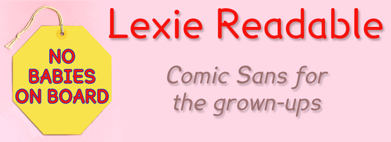
Lexie Readable is one of the most readable fonts for dyslexic readers. This font provides a distinct design for each letter, ensuring letter mirroring is reduced. The font looked fun, almost like Comic Sans but with gaps, portution, and curved details to differentiate every letter.
5. Comic Sans
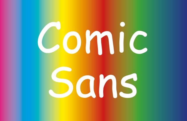
Though not particularly made for dyslexic readers, its informal and playful style helps dyslexic readers distinguish each letter. This font also reduces confusion among similar-looking characters, making it a favored choice in educational settings for younger audiences.
6. Open Sans

Open Sans is a humanist sans-serif font that emphasizes clarity and readability. Its open letterforms and generous spacing facilitate easier reading for dyslexic individuals.
Also Read: Hierarchy of Typography: How to Make Fonts Speak
7. Arial
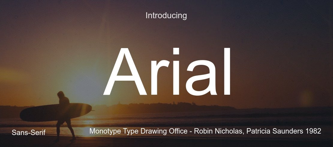
Arial is a widely used sans-serif font with a straightforward design and lear letterforms. Its simplicity aids dyslexic readers by minimizing distractions, ensuring the focus remains on the context rather than the typography.
8. Verdana
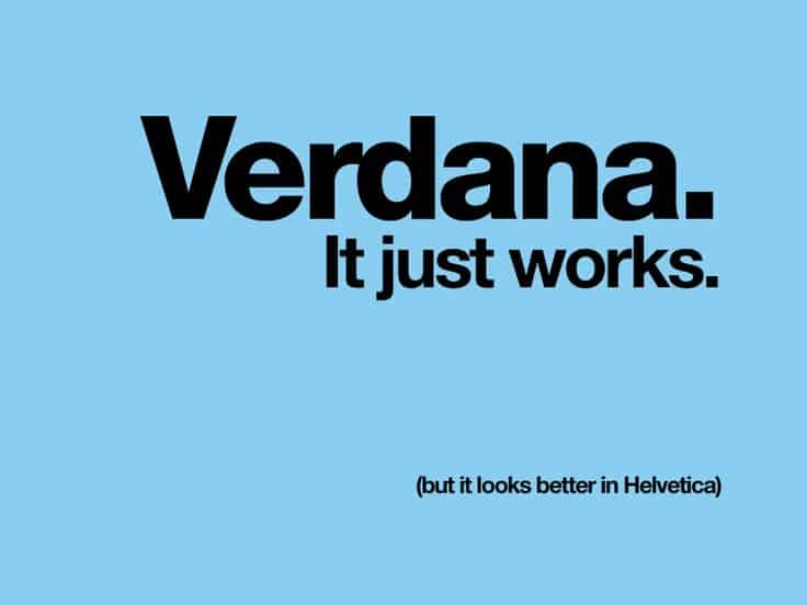
Verdana features wide letter spacing and tall x-heights. This design choice helps dyslexic readers by preventing letter crowding, ensuring smooth reading flow, and better character recognition.
9. Tahoma
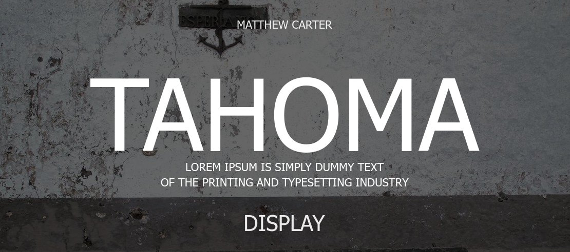
Tahoma is another sans-serif font that offers a clean appearance with generous spacing between letters. This font opts for a more modern aesthetics while helping dyslexic individuals have a visually accessible reading experience.
10. Century Gothic

One thing about Century Gothic is that this font has spacious visuals. Combined with its simplistic, easy-to-distinguish letters, and modern, rounded shapes, this font helps prevent confusion between similar characters.
Also Read: How to Create a Font from Your Handwriting in 7 Easy Steps
Additional Consideration for Accessible Fonts for Dyslexia
To further enhance readability beyond font choice, you can also consider these parameters:
- Minimum font size of 12 points;
- Align text to the left to improve reading flow;
- Ensure content is clear and easy to digest;
- For background colors, many dyslexic readers prefer black text on yellow or peach backgrounds;
By selecting appropriate fonts and implementing these additional strategies, your project can become significantly more accessible for individuals with dyslexia.
The Future of Dyslexia-Friendly Typography
Emerging technologies, such as customizable fonts and adaptive text rendering are also shaping the future. Accessible fonts for dyslexia are also tools for inclusion, empowerment, and learning. By understanding the science behind dyslexia-friendly typography, we can create a more welcoming, and more effective reading experience.
You can easily find our premium fonts for dyslexia by selecting the sans-serif tab. Here at LetterSiro, we provide fonts like Think Smart, Halva, Hulk Comic, and Aged Machine which are dyslexia-friendly fonts. You will no longer need to research more. Purchase your favorite from our platform!