A free font becomes useful when you can imagine it inside a real project. A beautiful sample word is a starting point, but it does not tell you how a long product name will fit, whether small details remain readable, or which permissions apply to the final design. A short, considered selection can help you make those decisions before filling a folder with downloads.
These five free fonts from Lettersiro offer different starting points for expressive typography: Mileadilan, Ausberg, Hey Brush, Petersburgh, and Monica Stories. The examples below introduce their visible character and suggest practical ways to evaluate them. They are project ideas, not claims that the fonts have been used for a particular client or commercial campaign.
Start with a small project brief
Write down the words the font must carry and the format where they will appear. A personal card, a poster headline, and a compact product label ask different things of the lettering. Include the longest likely name and any numbers or punctuation that matter to the project.
Decide whether the expressive font will act as the main title, a signature, or an occasional accent. Give practical information a separate reading role. A price, address, or explanation should remain easy to find even when the display lettering is elaborate.
All five resources link to their official Lettersiro pages. Check the current listing and the terms supplied with the download. Free access and permission for a particular use are separate questions. In particular, Petersburgh's description specifies Desktop use; do not assume that a commercial label automatically covers web embedding, apps, or cloud uploads.
1. Mileadilan: a personal handwritten direction
Mileadilan introduces a flowing handwritten voice. Its presentation gives the lettering a personal, informal character. That can be a useful direction for a short message, a personal project, or a name treatment that needs a softer pace than a substantial display headline.
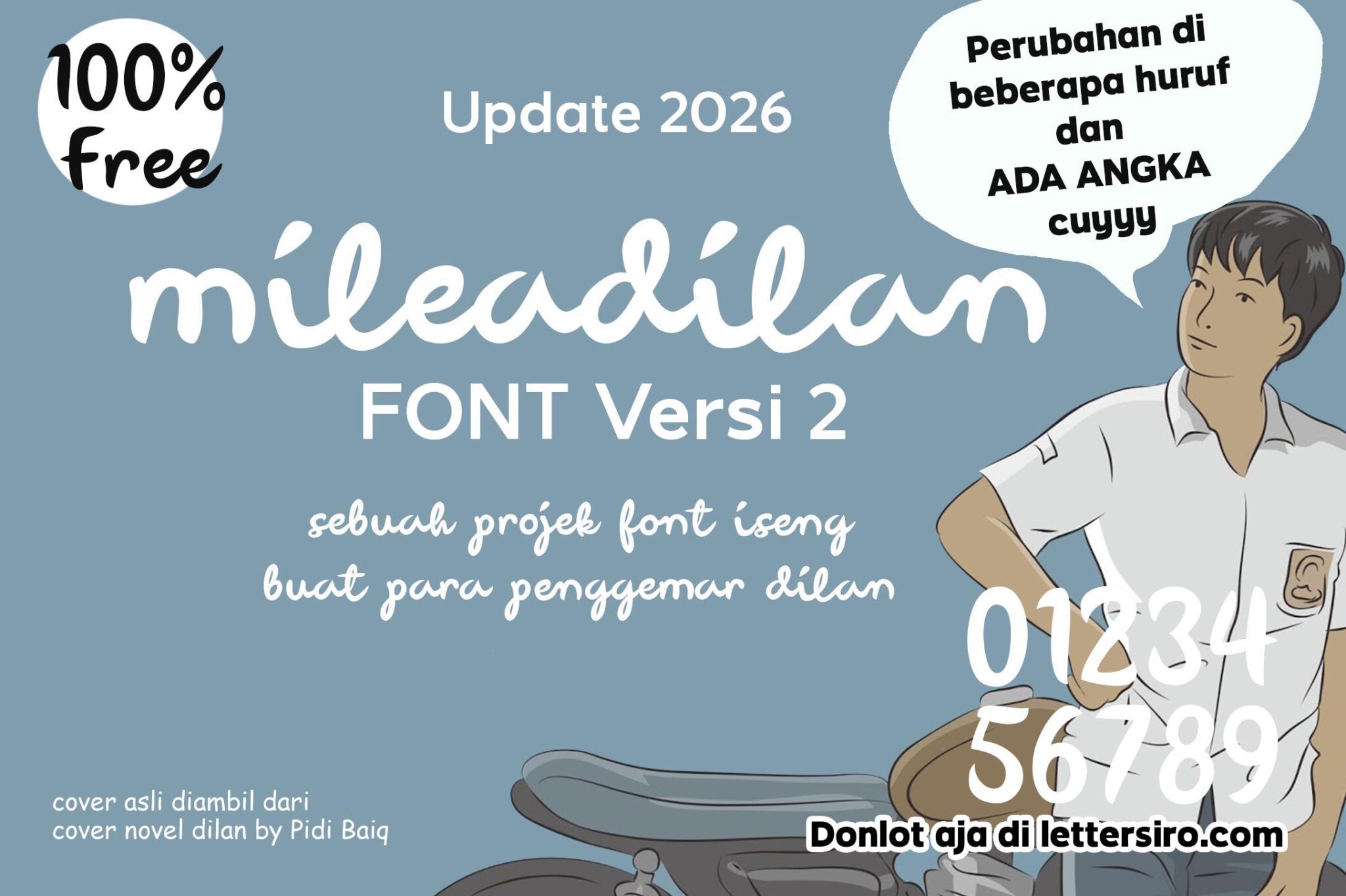
Try a brief phrase first, then the longest name in the project. Look at the beginning and ending shapes, the space between words, and the room required above and below the main line. Flowing lettering often needs more vertical breathing room than a rectangular text box initially suggests.
For a personal card, let the expressive line carry the greeting while a simpler supporting face handles the longer message. Print the design at its intended size. The relationship that looks attractive on a large screen should still feel comfortable when the card is held in the hand.
2. Ausberg: a lighter signature direction
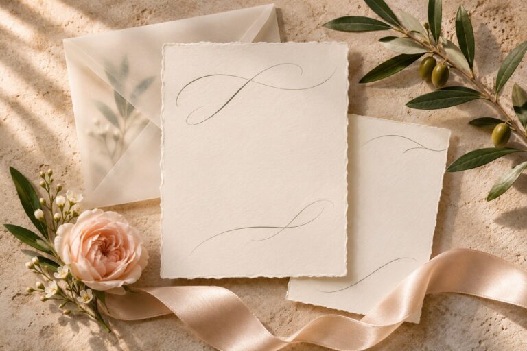
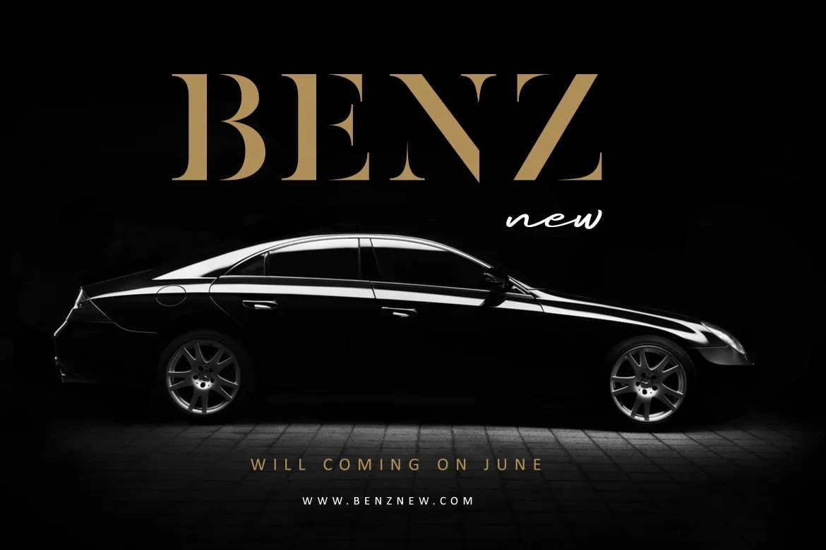
Ausberg introduces thin, elegant signature lettering. Its generous extensions offer a lighter visual rhythm alongside the more substantial handwritten choices in this selection. Test the actual name before deciding how much space its beginning and ending strokes need.

A useful first exercise is a personal name on a card with one supporting sentence. Keep the background simple so the lettering can be judged independently. Compare a generous signature treatment with a compact version, observing which fine details remain visible at the intended size.
Avoid stretching the letters to fill an arbitrary box. Change scale or line breaks first. Once the name has a coherent shape, introduce the image or graphic element that belongs to the project. This keeps the font choice connected to the message instead of allowing a polished mockup to make the decision by itself.
3. Hey Brush: an informal brush-led headline
Hey Brush is presented as a handwritten brush font with natural strokes and a relaxed personality. It offers a starting point for expressive quotes, short campaign phrases, and informal branding explorations.

Try a phrase that sounds natural when spoken. A clear, direct message usually gives expressive lettering a stronger purpose than a long string of decorative adjectives. Keep the first proof to one color and inspect any areas where neighboring strokes appear to merge.
For a campaign image, reserve a quieter region of the photograph for the headline. If the background is already full of branches, fabric texture, or bright highlights, move the type or choose another crop. The lettering's character should remain visible without requiring a heavy effect around every stroke.
4. Petersburgh: substantial handwritten expression
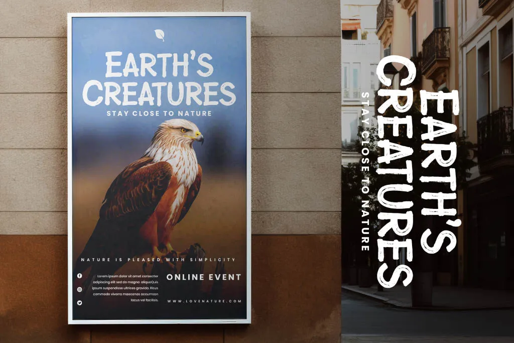
Petersburgh is described as a bold handwritten font with energetic strokes and playful curves. That combination suggests a different pace from delicate signature lettering: the main phrase can feel more substantial within a poster or packaging concept.

Test a short headline against a quieter information area. Give the main words room to form a recognizable silhouette, then make sure supporting details have their own entry point. Large expressive type does not automatically make an entire design easy to navigate.
Review the license included with the actual file before using it in a new environment. The product description's Desktop limitation matters when a project moves from finished artwork into live website text or uploaded font software. Ask the provider about a specific use when the supplied terms do not resolve it.
5. Monica Stories: a friendly handwritten voice
Monica Stories is presented with tall handwritten letterforms and a playful, friendly personality. It can provide a useful starting point for a short card message, a creative label, or a cheerful heading in a personal design.

Try the name within the actual container rather than an oversized presentation canvas. A tag hole, folded edge, or ribbon can reduce the usable space. If the phrase feels crowded, simplify the wording or choose a more generous layout before shrinking every element.
Pair the expressive line with clear supporting text for information that changes. A product description or care note should remain editable and readable. Keeping those roles separate makes the design easier to update and helps the friendly lettering retain its main purpose.
Compare the same words before choosing
Build one controlled proof using the real name, a short sentence, and any required practical characters. Hold the wording and dimensions stable while comparing the candidates. That makes differences in the type easier to judge than a row of unrelated promotional covers.
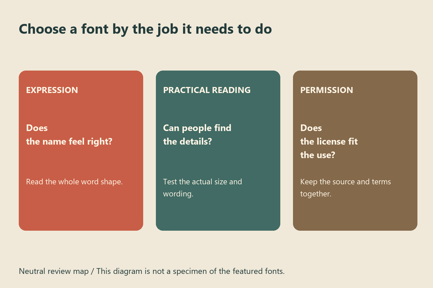
When using Illustrator, the Glyphs panel documentation explains how to inspect available characters. Check the actual font rather than assuming every decorative feature or language is supported.
For a wider range of voices, explore the Lettersiro font collection alongside the freebies library. Save the original download, its license information, and an editable proof together. The most useful free font is the one whose character, practical behavior, and permissions fit the project you are actually making.