Script fonts for wedding invitations can make a pair of names feel intimate, expressive, or quietly formal. The difficulty is choosing a style that still reads clearly once the invitation becomes a real card, rather than a large image on a designer’s screen.
Imagine an invitation for Amelia and Noah: two names, a date, a venue, and a short note about the celebration. The script has one important job—to give the names a memorable character. The rest of the typography needs to help guests understand the event without having to decode decorative lettering.
Instead of choosing a font from a long alphabet preview, build a small set of realistic design directions. Compare the same names, the same supporting information, and the same card dimensions. The differences between the fonts become much easier to judge.
Begin with the invitation’s personality
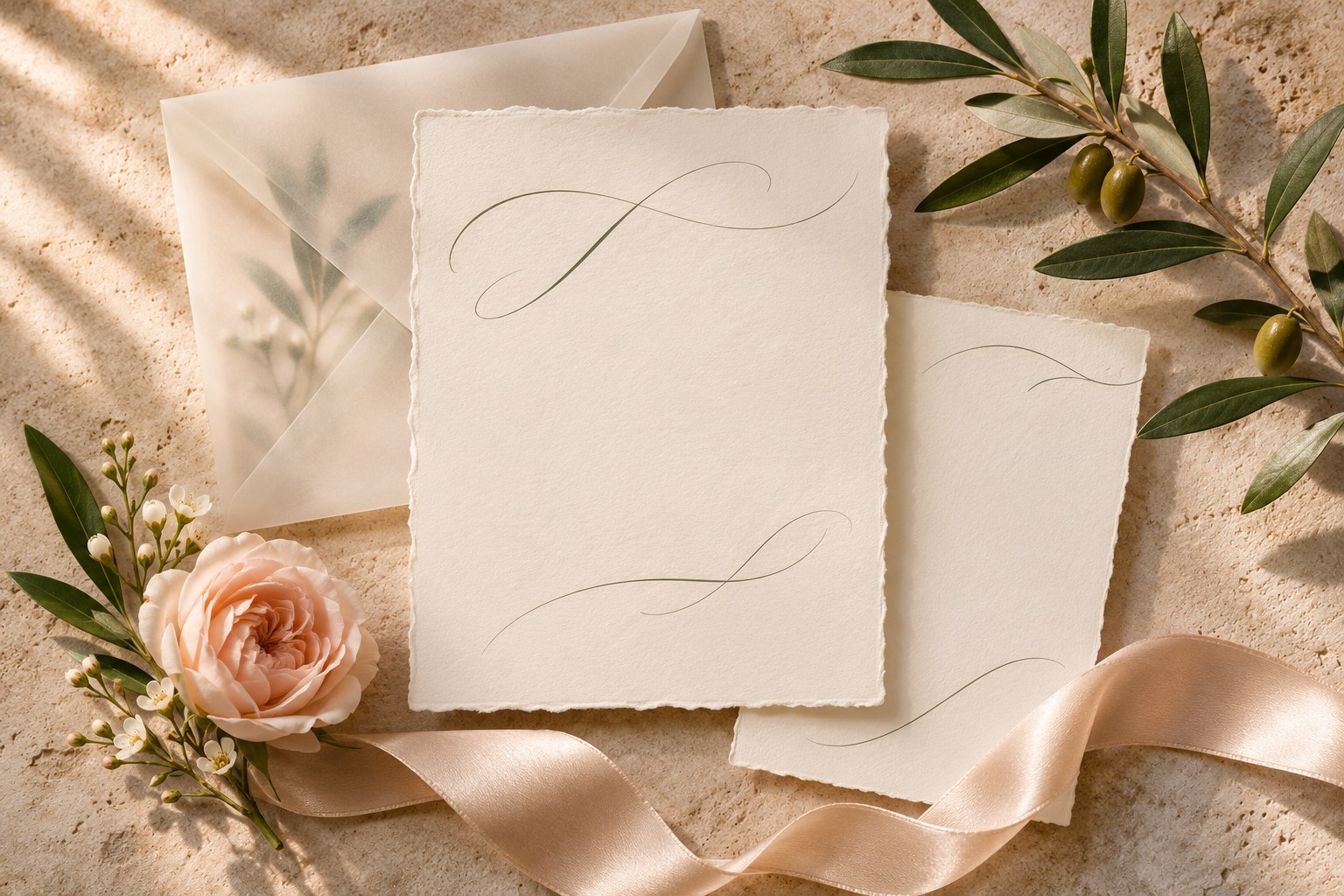
Before opening the font menu, decide what the stationery should feel like. A relaxed garden wedding might use loose handwriting, natural paper, and generous space. A formal evening celebration might need a more composed signature with restrained supporting typography. A contemporary city wedding could use a small handwritten accent within a mostly serif layout.
These are starting points for design, not rules about the couple or the event. A useful brief names visible choices: a quiet cream background, dark ink, a long name line, or a small floral detail. Once those choices are clear, it becomes easier to reject a font that sends the design in another direction.
Amsterdam: compare the rhythm of the names
Amsterdam’s signature collection offers several treatments of a flowing handwritten style. The variation sheet below is more useful than a single large decorative word because it shows how the overall rhythm can change within the same family.
Look at the height of the capitals, the length of horizontal strokes, and the way the letters connect. A sweeping capital may suit a short name beautifully but need extra room when paired with a longer surname. Keep the name line large enough to show the character of the lettering without making the date feel like an afterthought.
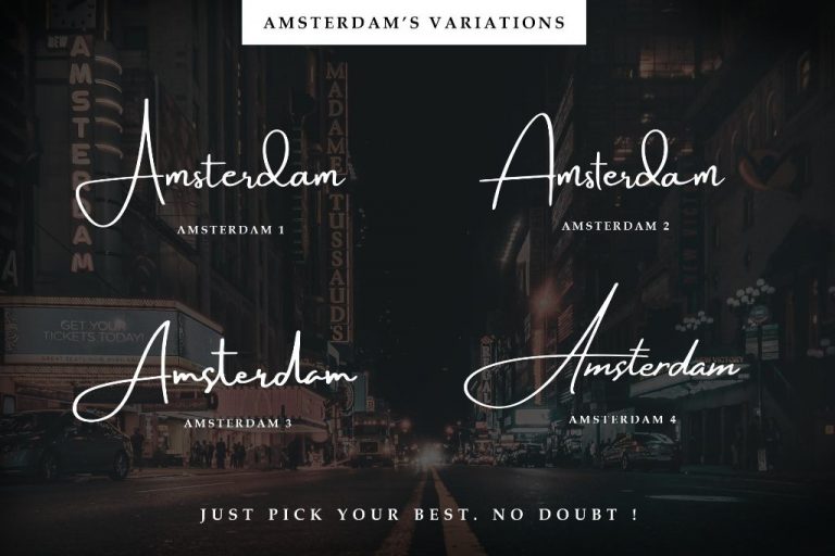
Type the actual names before making a decision. Include accents, hyphens, and punctuation where they belong. If you already know the names well, ask someone else to read the line: familiarity can hide a letter combination that another person finds ambiguous.
Hamilton: an airy signature direction
Hamilton Modern Signature is another direction for a fine, personal name treatment. Its presentation below illustrates the value of giving light handwritten strokes enough breathing room against a quiet setting.
Use this kind of signature as the focal accent and keep the rest of the wording more stable. A venue address, a time, and an RSVP instruction are different reading tasks from a couple’s names. They do not have to inherit the same decorative movement to belong to the same invitation.

When comparing Hamilton and Amsterdam, keep the layout unchanged at first. Changing the paper color, name size, and decorative frame at the same time makes it difficult to identify which font decision actually improved the design.
A serif companion can make the script feel more deliberate
A useful invitation pairing creates different roles. The script provides a personal accent; the supporting face organizes the information. That companion can be a quiet sans serif or a restrained serif, depending on the invitation’s visual direction.
Flower Factory demonstrates a more composed serif treatment on stationery. Its example is useful when deciding whether the invitation should be mainly handwritten or mainly editorial with one script accent. Read the small information separately from the decorative name line and make sure both have a clear purpose.

| Invitation element | Useful starting treatment | What to check |
|---|---|---|
| Couple’s names | Expressive script | Recognizable letters and clear swashes |
| Date and venue | Calm supporting type | Easy scanning and sensible grouping |
| Longer note | A comfortable text style | Line length and a relaxed reading size |
Treat this as a role map rather than a fixed font recipe. The real wording and the card’s dimensions should guide the final proportions.
Work through one complete invitation
Return to Amelia and Noah’s hypothetical card. Start by placing all the approved wording into the final dimensions. Let the names lead, group the date with the time, and keep the venue and address together. Leave the RSVP instruction close to the information it explains.
Now choose the script. If a long cross stroke reaches into the date, move the supporting group or reduce the flourish before shrinking the whole invitation. If a name wraps awkwardly, compare another style or a different line arrangement. The solution should preserve the words and make their relationships clearer.
Print this first layout at actual size, even on ordinary paper. A quick physical proof reveals whether the supporting text has become too small and whether the names still feel balanced when held in the hand.
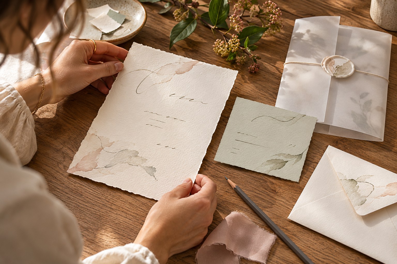
Do the review with the full suite in mind. A large invitation, a small RSVP card, and a narrow place card provide very different areas for the same typography. Preserve the roles and mood, while allowing the arrangement to adapt to each format.
Contrast matters as much as the font choice
Delicate lettering needs a background that lets the strokes remain visible. A pale signature on a detailed photograph may lose definition, while very dark ink can make a fine script feel more stable on light stock.
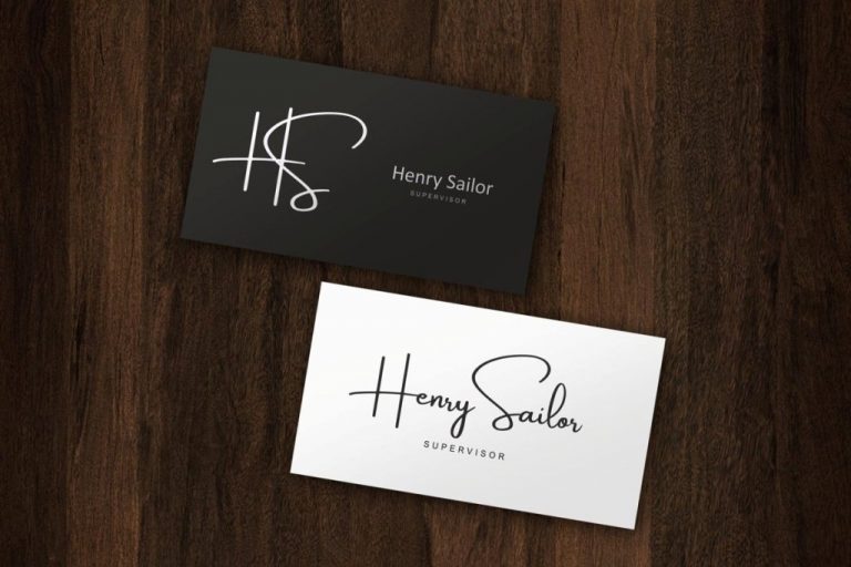
Amsterdam’s light and dark stationery examples show how strongly the background changes the presentation of a similar name treatment. Study the clear area around the signature as well as the lettering itself. A small amount of uncluttered space can be more helpful than adding an outline or a shadow to every stroke.
Finish with a proof that guests can read
Ask the print provider about paper, ink, and any foil or letterpress finish before approving production. The supplier’s requirements should guide fine lines, safe margins, and the final file preparation. Keep an editable source and an approved proof together so later wording changes can be checked against the same reference.
The final review is simple: can a guest identify the names, find the date and place, and understand what to do next? Choose the font license for the actual delivery, including any editable template or website use, and approve the typography only after the real-size card answers those questions clearly.