A short handwritten title can feel substantial without becoming formal. That is the territory suggested by Petersburgh's published presentation: bold strokes, playful curves, and a word shape that can anchor a creative composition. The font is worth examining when a delicate signature would be too quiet for the main message.
This guide looks at the authentic Petersburgh preview, compares related free fonts, and develops a practical headline exercise. It also keeps an important selection detail visible: the freebie description specifies Desktop use. Visual suitability and permission for the intended application both belong in the decision.
Identify the voice before choosing the project
The Petersburgh free font is presented as a bold handwritten typeface. Its cover uses a substantial handwritten word against a strong visual background, making the lettering's energetic curves and fuller presence easy to notice.

Possible study directions include a creative-workshop title, an informal editorial heading, or a short phrase within finished artwork, subject to the applicable terms. These are ideas for evaluation, not a promise that every application is licensed or that every word will behave like the cover sample.
Write the project message in ordinary text first. Decide whether it should feel cheerful, assertive, personal, or relaxed. A font can contribute to that voice, but it should not be asked to rescue wording that does not say anything clearly.
Keep the Desktop-use note attached to the choice
The listing's free commercial label appears alongside a description specifying Desktop License Only. Read the current page and the license supplied with the actual download together. Do not extend a desktop permission statement to webfont embedding, an app, a server, or a font uploaded to a cloud service without checking the relevant terms.
This distinction matters even when the final picture looks the same. A finished image containing lettering and a website serving editable live text can involve different uses of the font software. If the terms do not settle a specific plan, ask Lettersiro about that application before deploying it.
Keep a short record of the source, download date, and intended use with the project. That makes a later handoff easier and helps prevent an expressive font chosen for one output from quietly spreading into several environments with different requirements.
Build a headline with room to move
Choose a concise phrase and give it a clear area of the page. A workshop poster might use one expressive title followed by a straightforward description. Treat the title as a complete visual shape before adding an image or decorative frame.
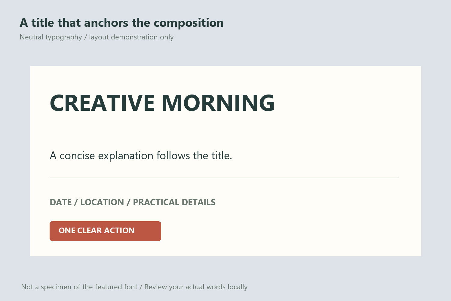
Try a single line and a deliberate two-line arrangement. Compare how the line endings balance and where the title connects with the information below. Do not force every line to exactly the same width by stretching the characters; an uneven but intentional silhouette can feel more natural.
Give the title an edge relationship it can sustain. A large initial or an energetic ending may need more room than a plain rectangular text box suggests. Check the first and last strokes against nearby artwork rather than measuring only the central letters.
Compare tall handwritten forms
Monica Stories presents a tall, narrow handwritten direction. It is useful to compare when the project wants a friendly voice but may not need the fuller visual mass suggested by Petersburgh.

Use the same actual phrase when making your own local proofs. A longer narrow word and a shorter bold word can appear equally wide while communicating very different rhythms. Keep the format and wording stable so that the typeface remains the main variable.
Write down the reason for the preference. Perhaps the fuller version anchors a sparse poster, or the taller alternative leaves more room for a supporting illustration. These observations are useful during revisions because they connect the selection to the composition rather than a general preference for a font cover.
Compare brush-led expression
Hey Brush offers another informal direction. Its published preview emphasizes loose brush strokes and a different rhythm between individual letters. It can help clarify whether the project wants substantial handwritten curves or a more open, brush-led pace.

Avoid combining both expressive voices as equal headlines in a small layout. That creates a second typographic personality before the reader understands the first. If you need a second face, give it a quieter job: a description, location, or brief supporting line.
The relationship between title and details is often more important than finding a decorative match. Clear alignment, consistent spacing, and a predictable order can connect two different typefaces without making them imitate each other.
Choose an image that leaves space for the words
A substantial handwritten headline can sit comfortably beside a strong illustration, but both need boundaries. Plan the image area and title area together. If the image fills every quiet region, adding a thick outline to the title may create more visual noise than clarity.
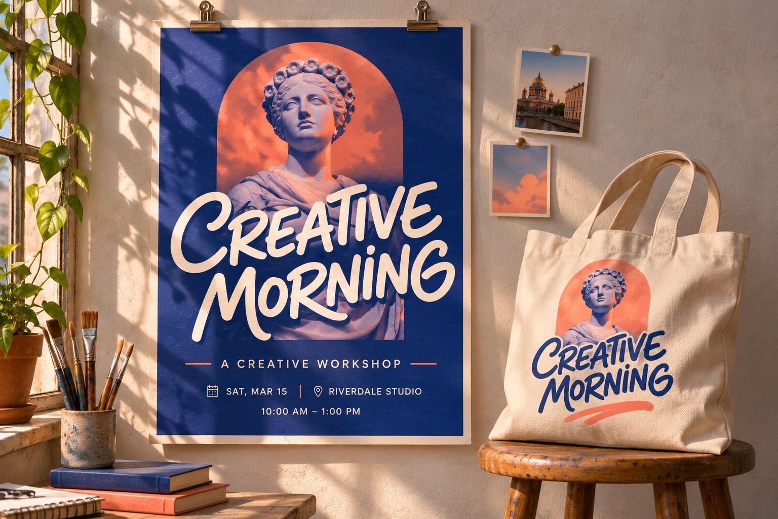
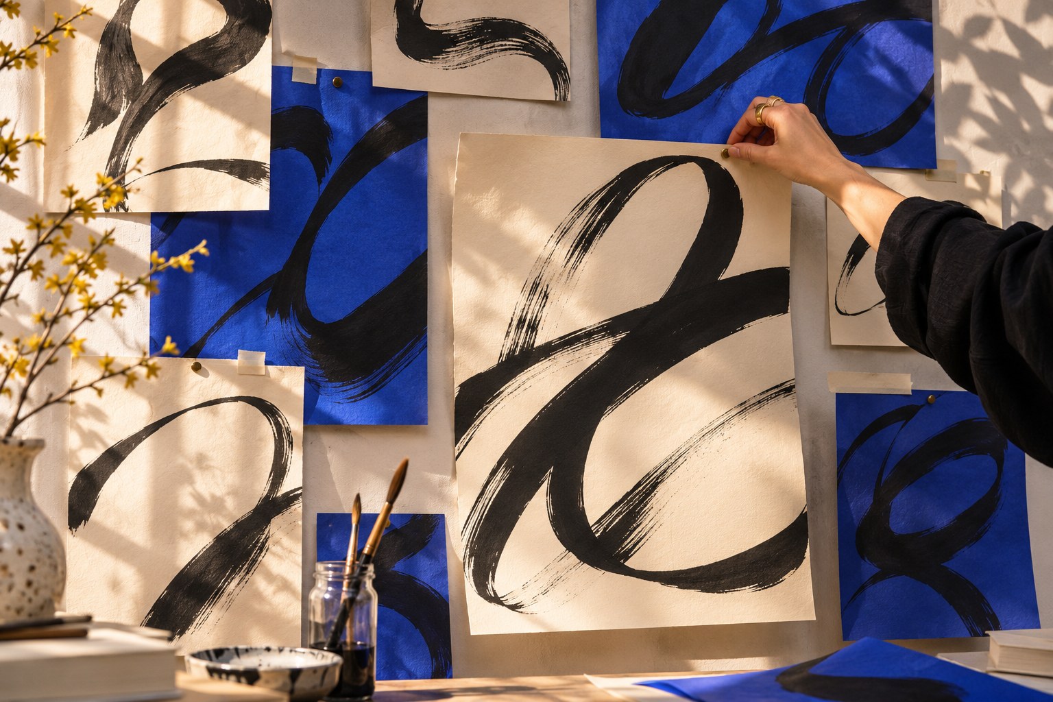
First review a flat composition. Once the title, image, and details work together, a paper or wall scene can help present the idea. Keep the flat proof in the presentation so that the atmosphere does not hide spacing or reading problems.
For a separate advertisement-oriented reference, Letter Heaven shows another Lettersiro display voice. Its gallery is useful for comparing tone; it is a distinct product with its own features and license.

Make one comparison worth keeping
Save a plain proof of the selected title beside the composed version. When a collaborator requests more energy or a quieter tone, compare the actual difference in words, scale, and surrounding space. Changing the typeface is only one available response. A shorter phrase or a stronger title-to-description relationship may solve the problem while preserving the chosen handwritten voice. Record the reason so that a later revision does not restart the selection from a cover image.
Review the phrase in its final environment
Check the actual words, required punctuation, and any accented characters in the downloaded font. Adobe's Glyphs panel overview explains how to inspect the characters available in Illustrator. A short English preview cannot establish support for every language or special character.
Then review the exported artwork at its intended size. The title should remain recognizable, and the smaller information should be readable without depending on a close-up. If a physical format is planned, make a print proof when possible and compare it with the digital version.
The Lettersiro freebies library provides more voices to explore. Keep the shortlist purposeful: choose Petersburgh when the actual headline benefits from its visible character, the supporting composition stays clear, and the terms fit the way the font will be used.