The impact of typography in advertising often goes unnoticed, yet it subtly shapes how we perceive messages. Every detail serves a purpose, working behind the scenes to create meaningful impressions. Even small changes in fonts can transform a brand’s image, making it feel more trustworthy, modern, or playful.
More than just aesthetics, typography is a powerful force that influences perception in ways we rarely realize.
Key Takeaways:
- Typography quietly influences how messages are perceived.
- Slight font variations shape a brand’s trust, character, and appeal.
- Beyond visuals, it strengthens identity and stirs emotions.
Also Read: Discover the Integrity of 6 Font Classifications in Typography
The Hidden Persuader in Advertising Typography
Typography in advertising is the art of arranging text to influence how messages are perceived, draw attention, and reinforce credibility. The right font reinforces a brand’s message, while the wrong one can weaken it. A playful typeface on a severe ad may seem out of place, while a bold one can add authority.
More than just aesthetics, typography is a strategic tool in branding and marketing. Market trends reflect the growing focus on typography in advertising. According to Global Growth Insight, the global font market, valued at $1,090.44 million in 2023, is expected to reach $1,531.74 million by 2032.
Businesses recognize how thoughtful typography choices contribute to brand recognition and audience engagement. As more brands refine their visual identity, the impact of typography in advertising continues to shape consumer perception in quiet yet powerful ways.
The Impact of Typography in Advertising, The Unseen Game-Changer
The right font does more than enhance a design. Perception, tone, and readability depend on typography, affecting how audiences interpret a message. A strong typeface builds trust and reinforces a brand’s identity, while a poor choice can weaken credibility and create confusion.
Spacing, weight, and style influence aesthetics and how effectively information is communicated. No matter how small, every design decision shapes how people engage with content. Typography continues to shape branding as design trends evolve.
Knowing what type of font is impact helps create stronger connections, making advertising more engaging and memorable.
1. Typography Defines Brand Personality and Trust
Fonts shape how a brand feels and communicates, influencing perception before a word reads. A bold sans serif conveys strength and confidence, while a flowing script adds elegance and sophistication. Tech startups prefer modern sans serifs to reflect innovation and simplicity.
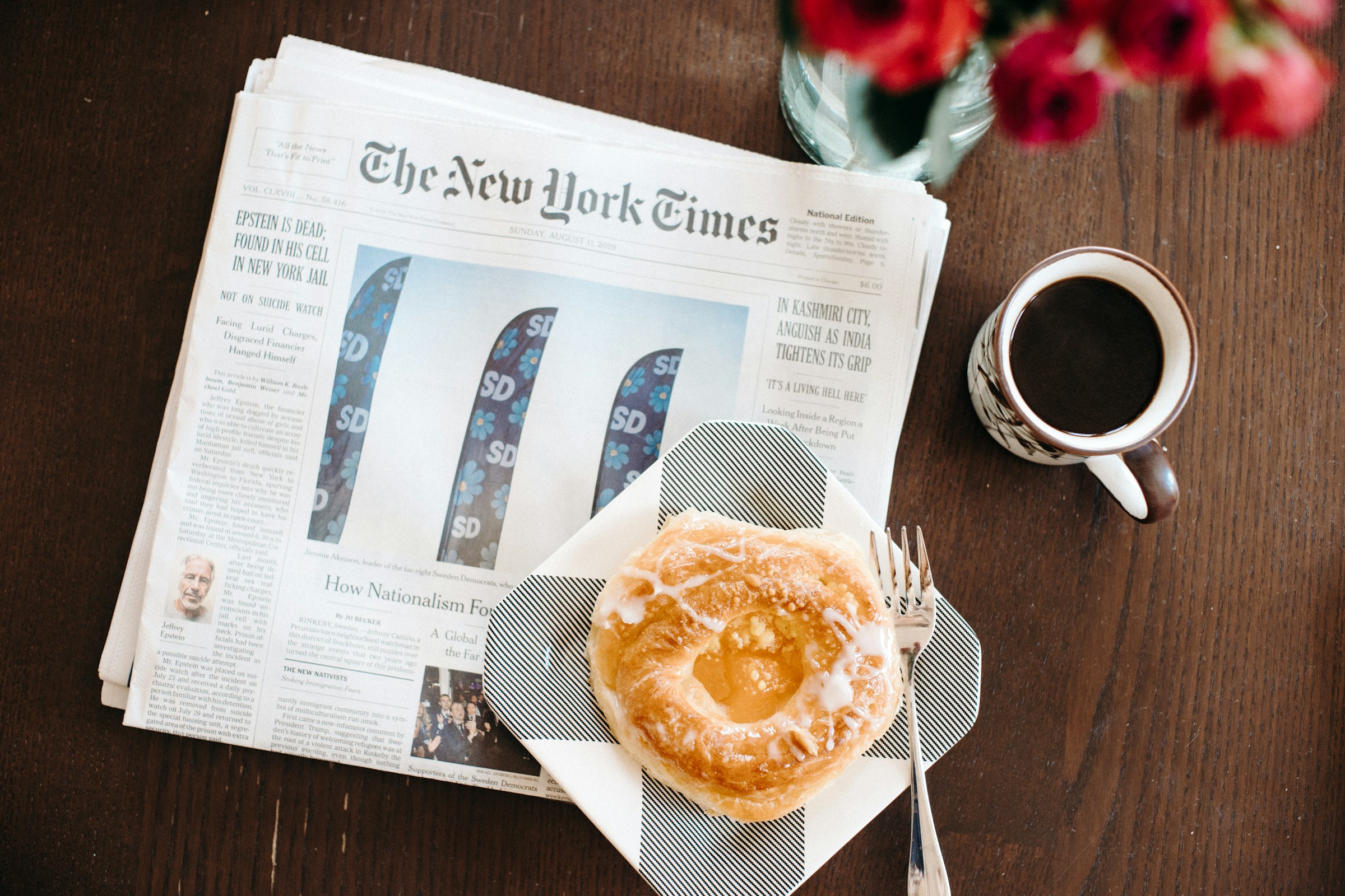
The New York Times uses consistent serif typography across print and digital platforms, reinforcing professionalism and credibility. A unified typographic style enhances readability, strengthens brand identity, and builds trust, making messaging more impactful.
Also Read: Current Trends in Typography: Top 12 Trends Emerging in 2025
2. Font Choices Turn Logo into Icons

Logos do more than represent a brand. The right typography transforms them into instantly recognizable symbols, strengthening brand identity and recall. A consistent typeface across platforms builds familiarity, making it easier for customers to connect with a brand at a glance.
FedEx chose Futura Bold and Univers 67 for its logo to create a clean, modern feel. The hidden arrow between the “E” and “X” is a subtle yet powerful detail, reinforcing speed, precision, and reliability. This strategic use of typography ensures the logo remains distinctive and memorable, even without additional graphic elements.
3. Grabbing More Attention with Font Choices
The impact of typography in advertising goes beyond displaying words. A well-crafted typeface draws the eye, turning a passing glance into focused attention. The right balance of visuals and text makes an ad more memorable and engaging.
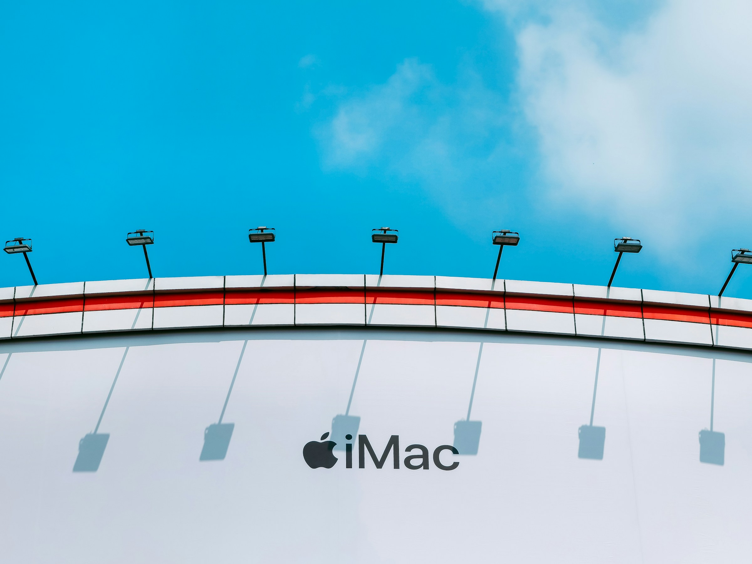
Apple, known for its minimalist design, exemplifies the impact of typography in advertising by using clean, sleek fonts that reflect the simplicity of its products. The brand extensively uses Helvetica for its modern appeal, ensuring crisp, uncluttered typography that keeps the focus on the message while reinforcing its identity.
Also Read: What is Font Licensing and Why Does it Matter?
4. How Typography Shapes Communication and Culture
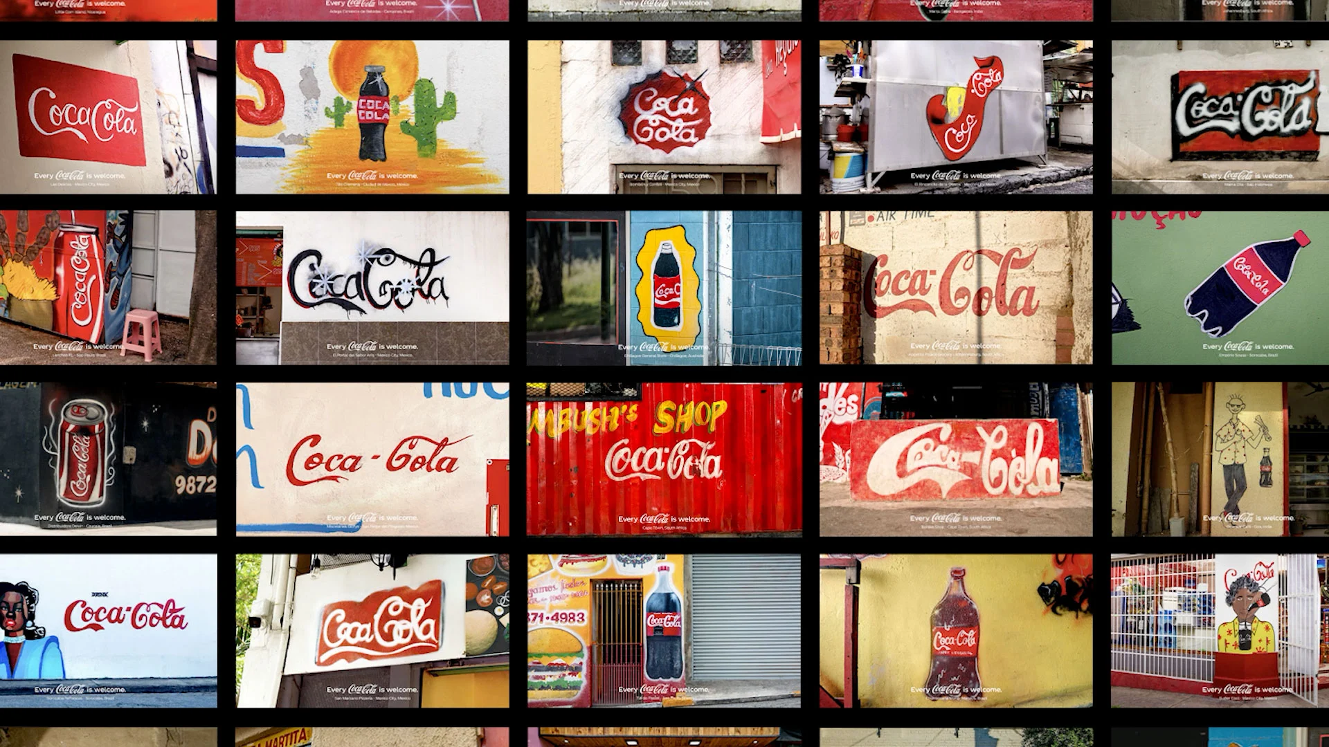
Beyond decoration, typography has shaped history, law, and ideas. It frames discourse, guides perception, and amplifies meaning. Designers do not just choose fonts. They cast voices, set moods, and shape messages. Coca-Cola’s flowing script is a cultural icon.
The ‘Every Coca-Cola is Welcome’ campaign highlights how typography reflects culture as bodegas, shopkeepers, and artists reinterpret the logo in their style. Supported by Essence Mediacom and Ogilvy PR, it proves that type is more than design. It carries identity, tradition, and local expression.
5. Font Psychology Shapes Perception in Design
Typography does more than decorate a page. The psychological impact of fonts influences how users perceive and interact with a brand. The right typeface reinforces personality, strengthens messaging, and enhances user experience. Poor font choices create confusion and weaken engagement.
Selecting the right typography ensures clarity, consistency, and recognition. The impact of typography in advertising highlights the need for high-quality fonts that align with a brand’s identity, creating a strong and cohesive visual presence.
Also Read: 7 Best AI Font Generator for Unique Custom Fonts
Making Messages Memorable with Type
Font choices shape identity and strengthen recognition. The impact of typography in advertising influences how messages connect and engage, making thoughtful selections essential for clarity and brand expression.
Breaking Mad from Lettersiro captures raw energy with handcrafted strokes, natural texture, and expressive movement. OpenType ligatures and alternates enhance fluidity, while multilingual support ensures adaptability across various markets. It is designed for branding, logos, and apparel and delivers character and versatility. Every design tells a story. The various fonts collection provides unique styles that bring depth and distinction to any creative work.