Whether you’re new to design or an experienced professional, understanding how to choose colors for UI design using color theory is essential for creating visually engaging and user-friendly interfaces. Poor color choices can lead to confusion, accessibility issues, and a weak brand identity.
Therefore, by mastering fundamental principles such as hue, contrast, harmony, and color psychology, you can develop designs that enhance the user experience and increase engagement. Let’s break them down in this discussion!
Key Takeaways
- Understanding hue, saturation, brightness, and color categories helps create visually appealing and harmonious UI designs.
- Use colors strategically to influence user perception while ensuring contrast and inclusivity for all users.
- Regularly test UI color choices through A/B testing and adhere to brand guidelines for a cohesive user experience.
Also Read: 25 Best Fonts for UI/UX Design That Enhance Readability
6 Ways on How to Choose Colors for UI Design with Color Theory
If you want to know how to choose color for UI design to communicate the right message, this guide will help you understand color theory principles. Keep reading to explore more!
1. Understand the Basics of Color Theory
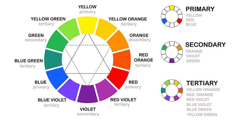
Before selecting a UI color palette, it is essential to understand the fundamentals of color theory. Color theory is the study of how colors interact, blend, and create visual harmony.
A key tool for understanding its basics is the color wheel, which visually organizes primary, secondary, and tertiary colors. It helps identify color relationships for effective use in UI design.
- Primary Colors: red, yellow, and blue; cannot be created by mixing other colors.
- Secondary Colors: purple, green, and orange; formed by mixing two primary colors.
- Tertiary Colors: created by blending a primary and a secondary color, such as bluish-green or reddish-purple.
Additionally, there are three important aspects to understand when learning how to choose colors for UI design that define a color’s appearance, as follows.
- Hue: the pure form of a color.
- Saturation: the intensity or vibrancy of a color.
- Brightness: the lightness or darkness of a color.
Also Read: How to Be a Good UI/UX Designer Without a Design Degree
2. Use the Right Color Harmony
Color harmony refers to how colors work together to create balance and visual appeal. Below are several harmony principles that designers can use in UI design, which you should know!
- Complementary Colors: colors opposite each other on the color wheel (e.g., blue and orange) create strong contrast and vibrancy.
- Analogous Colors: colors next to each other on the color wheel (e.g., blue, teal, and green) offer a more natural and calming effect.
- Triadic Colors: three evenly spaced colors on the color wheel (e.g., red, blue, and yellow) provide a balanced yet vibrant look.
- Monochromatic Colors: variations of a single color with different shades and tints offer a clean and professional appearance.
3. Consider Color Psychology
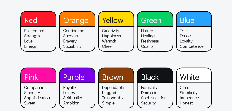
The most important aspect of learning how to choose a color palette for UI design is understanding the psychological effects of colors, which influence user emotions and behavior. Here are some common associations.
- Red: evokes urgency, passion, or excitement (used in error messages or call-to-action buttons).
- Blue: represents trust, security, and calmness (commonly used by financial and tech brands).
- Green: symbolizes growth, health, and positivity (used in eco-friendly and wellness brands).
- Yellow: conveys warmth, happiness, and attention (often used for highlights and alerts).
- Black & White: offer simplicity, sophistication, and clarity (ideal for minimalist UI designs).
Successful brands like Facebook, Coca-Cola, and Starbucks use color psychology strategically to build their identity and engage users effectively.
Also Read: 10 Free UI Design Tools in 2025 for Beginner and Pro
4. Ensure Accessibility and Contrast
UI design must be accessible to all users, including those with visual impairments. The Web Content Accessibility Guidelines (WCAG) provide recommendations for ensuring sufficient contrast between text and background colors. Key principles include the following.
- Maintaining a contrast ratio of at least 4.5:1 for normal text and 3:1 for large text.
- Avoiding color combinations that are difficult for colorblind users, such as red-green or blue-yellow.
- Using tools like Contrast Checker, Stark, or Color Safe to test and optimize contrast levels.
5. Maintain Brand Consistency
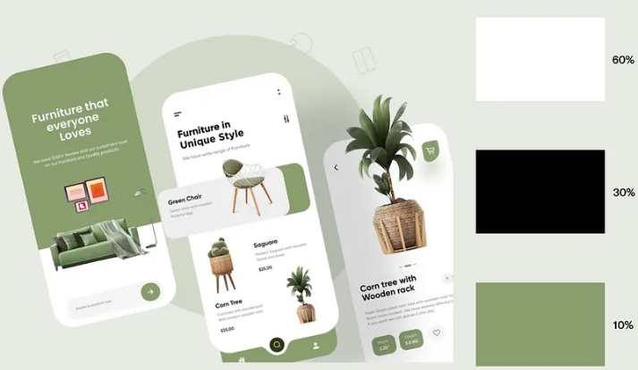
Consistency in UI color choices strengthens brand identity and improves user recognition. Thus, when learning how to choose colors for UI design, it’s essential to establish a cohesive color system. To achieve this, follow these steps.
- Use the 60-30-10 color rule by allocating 60% to the primary/dominant color, 30% to the secondary color, and 10% to accent colors for a balanced design.
- Maintain consistency across different screens, buttons, and UI components.
- Refer to established brand guidelines to ensure uniformity.
For example, Google’s Material Design and Apple’s Human Interface Guidelines provide structured color systems to maintain consistency across various applications and platforms.
6. Test and Optimize Your Color Choices
Finally, choosing UI colors is not a one-time decision. Instead, it requires testing and optimization. A/B testing and user feedback can help determine the most effective color combinations for usability and engagement. Consider the following methods.
- Conduct A/B tests to compare different color schemes and analyze user response.
- Use heatmaps and eye-tracking tools to see how users interact with UI elements.
- Gather feedback through usability testing to refine the color palette.
Using tools like Adobe Color, Coolors, and Figma’s color features can further assist in refining UI color choices for the best results.
Also Read: Biometric-Driven Design Future Web Design: Improving Experiences
Enhance User Engagement with Thoughtful UI Color Selection!
In short, boosting user engagement begins with understanding how to choose colors for UI design effectively. A well-structured color palette enhances usability, accessibility, and brand consistency. Thoughtful selection of hues, contrasts, and harmonies results in interfaces that are both intuitive and visually appealing.
Yet, color alone isn’t enough; typography plays a vital role in shaping a strong UI identity. The right fonts improve readability, complement the color scheme, and create a cohesive visual experience. Plus, using high-quality fonts ensures design consistency across all elements, from buttons to headings, for a polished and professional look.
So, for a refined UI, explore professional fonts for UI design that seamlessly match your color choices. Whether you need fonts for apps, games, or sites’ UIs, Lettersiro offers lifetime licenses and budget-friendly options to help you build standout designs effortlessly. Act now and elevate your user interface today!