
Top 15 Avenir Font Pairing Ideas for Modern Branding
Avenir font pairing is key for a clean, modern, and professional look. Designed by Adrian Frutiger in 1987, Avenir blends Futura’s structure with a humanist touch. Its open letterforms and tapered terminals improve legibility. This makes it a versatile choice for various design needs.
With six weights and oblique styles, Avenir offers great flexibility. Pairing it with complementary fonts enhances contrast and readability. It works well with elegant serifs or contrasting sans-serifs. The right combination can elevate any design effortlessly.
Key Takeaways
- Pairing Avenir with serif or sans-serif fonts creates balance and enhances readability.
- The right font combination elevates branding, web design, and editorial layouts.
- Avenir works well with elegant serifs like Didot and Minion or geometric sans-serifs like Futura PT.
15 Avenir Font Pairing Options for Professional Designs
No matter if you’re crafting a website, building a brand identity, or designing for print, we’ve compiled 15 top-tier fonts that pair with Avenir to enhance its modern elegance. Follow through!
1. Didot
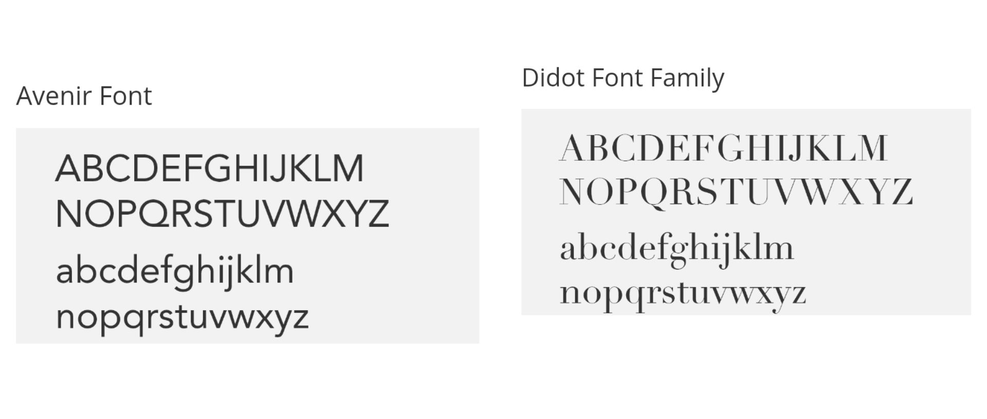
Didot is a stylish and sophisticated serif typeface with high contrast and sharp edges. When paired with Avenir, it creates a perfect balance between modern simplicity and timeless elegance. This combination works well for luxury branding, fashion magazines, and high-end editorial designs.
Also Read: 12 Montserrat Font Pairing Ideas for a Clean and Modern Look
2. Minion Pro
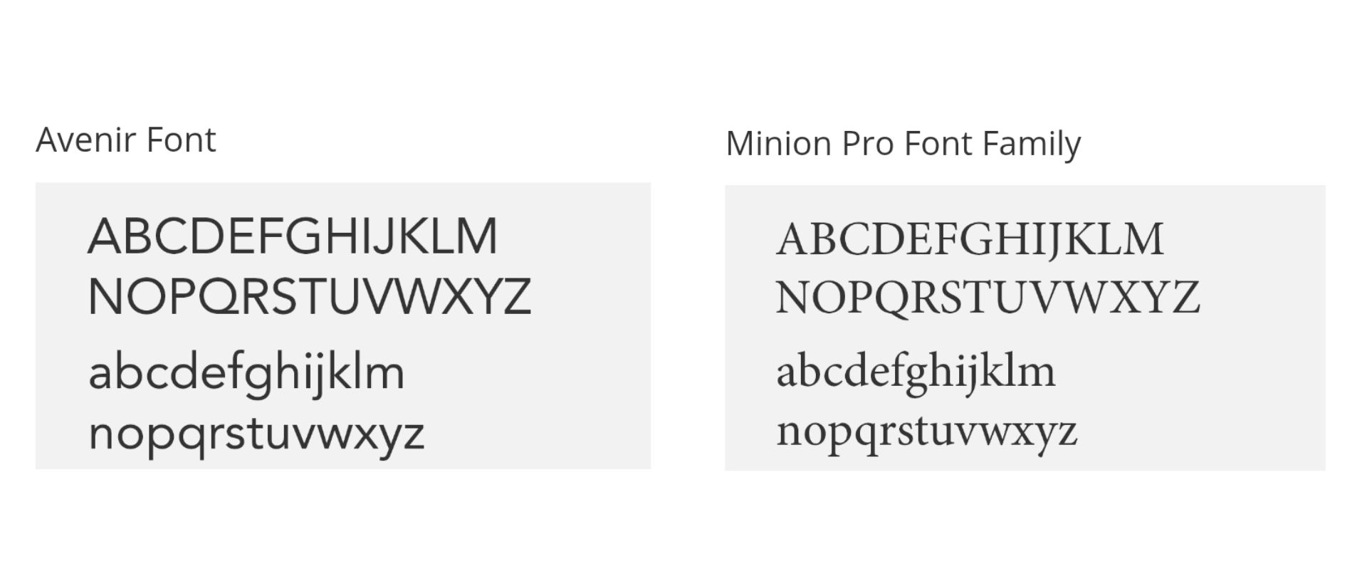
Minion Pro is a classic serif typeface designed for readability. It is an excellent companion for Avenir. Its traditional letterforms contrast beautifully with Avenir’s clean and modern appearance, making this pair ideal for books, magazines, and professional documents.
3. Georgia

Georgia is an excellent Avenir next font pairing. With its strong structure and legibility, Georgia complements Avenir’s sleek geometric look. This combination is often used in web design, providing a professional and accessible reading experience.
4. Helvetica Neue

Helvetica Neue and Avenir share a similar design philosophy, emphasizing clarity and modernism. Although both are sans-serif fonts, Helvetica Neue has a neutral tone that allows Avenir’s unique geometric design to stand out. This pairing works well for branding and corporate identities that require a clean, contemporary feel.
5. Gotham

Gotham is a modern serif font that was designed for newspapers and magazines. This is another perfect Avenir font pairing that offers a contrast between classic and contemporary design. The combination is great for editorial layouts, ensuring excellent readability while maintaining a stylish appearance.
6. Century Gothic

Century Gothic is a traditional serif font known for its readability and classic appeal. When paired with Avenir, it creates a professional and trustworthy look, making it an excellent choice for academic publications, law firms, and financial institutions.
Also Read: 15 Top Fonts that Pair with Oswald for a Professional Look
7. Futura

Futura is another geometric sans-serif font, but it has a slightly different structure compared to Avenir. While both are clean and modern, using them together creates an interesting typographic contrast. This pairing is great for branding, advertising, and packaging design.
8. Sabon

Sabon is a refined serif font that pairs beautifully with Avenir’s modernity. This Avenir font pairing offers a classic touch that enhances its geometric structure, making it a great choice for book publishing, high-end branding, and invitations.
9. Jost

Jost is a geometric sans-serif font that pairs well with Avenir due to its modern and minimalist design. This combination is perfect for digital interfaces, branding, and contemporary editorial layouts.
10. Ubuntu

Ubuntu is a humanist sans-serif typeface with a unique personality that adds warmth to Avenir’s clean structure. This pairing works well for tech-related designs, corporate identities, and modern UI/UX projects.
Also Read: 10 Font Pairing Tools for Stunning Websites and Designs
11. Muli

Muli is a lightweight and highly readable sans-serif font that complements Avenir’s sleek look. Together, they create a harmonious and professional feel, ideal for web design, branding, and corporate presentations.
12. Rubik

Rubik’s slightly rounded corners soften Avenir’s geometric precision, making this duo an excellent choice for playful yet modern branding, mobile apps, and engaging website designs.
13. Fira Sans

Fira Sans is a strong and versatile sans-serif font that enhances Avenir’s contemporary appeal. This pairing is great for high-tech designs, corporate materials, and clean editorial layouts.
14. Titillium Web

Titillium Web’s sharp and modern appearance contrasts well with Avenir, creating a bold yet professional look. This is a noteworthy Avenir font pairing for startup branding, modern websites, and tech-related projects.
15. Mukta

Mukta is a multi-script typeface that brings a distinct and stylish touch to Avenir’s simplicity. This combination works well for creative branding, cultural projects, and inclusive design layouts.
Also Read: 10+ Fonts That Pair Well with Anton for Stunning Designs
Start Designing with Avenir’s Best Font Combinations Now!
Finding the right Avenir font pairing can transform your design into a perfect balance of modern style and readability. Whether you’re working on branding, web design, or editorial layouts, the right font combination enhances visual impact. Experimenting with different pairings will help you craft a professional and polished look that stands out.
If you’re looking for what font pairs well with Avenir, check out the curated font collections at Lettersiro. We offer high-quality typefaces, including elegant serifs and stylish sans serifs, to complement Avenir beautifully. So, don’t wait any longer, take your design to the next level with our paired fonts collection!